DESIGN.md
# Vessel — Design System

## Concept

**Vessel refuses to sell itself.** Every other roastery site is an argument for
its own importance: a staged hero, a persuasive accent color, a headline set
loud enough to be believed. This design makes the opposite bet — that a
well-made coffee needs no decoration around it, and that the way to prove it is
to remove everything until only the coffee and the paper it rests on remain.
There is no shouting the roastery's name. There is no hero photograph dressed in
gradient. There is no color reaching for your attention. The restraint is not a
style applied on top of the content; **the restraint is the claim.** If a
visitor leaves thinking "there was almost nothing there, and the coffee looked
excellent," the design has done its entire job.

The name comes from the governing idea behind the reference language (Muji, and
Kenya Hara's art direction of it): the brand should be an **empty vessel** into
which the customer pours their own meaning — *"this is enough"* (これでいい),
never *"this is best."* It is also, conveniently, a brewing vessel. So the page
is built emptiness-first: decide the air, then place the minimum content inside
it. Warm uncoated paper (`#F7F4EE`) is the floor — never a sterile blue-white.
True white is not a background at all; it is **reserved for the catalogue
plate** under a product photograph, so the only pure-white rectangles on the
site are the ones the coffee is standing on. The single chromatic voltage in the
whole system is a maroon that is **locked inside a logo box** and is forbidden
from doing any work: it is never a button, never a link, never an accent. Its
scarcity *is* the brand.

**This is not the brief's cream-paper serif design, and it must never be
mistaken for it.** Bloom is warm-editorial and literary — a serif display voice,
a copper accent running through its links and CTAs, and dark monospace "recipe
windows" showing brew data as code. Vessel is a **silent catalogue**: no serif
anywhere, no copper, no monospace, no code windows, no bold display tier of any
kind. Where Bloom *narrates* the coffee, Vessel merely *shelves* it — name,
plate, spec, air. Nor is it Counter, the brief's Swiss poster, which composes on
a visible modular grid with oversized numerals and a vermilion marker that is
allowed to do jobs. Vessel's grid is invisible, its numerals are tiny, and its
one color is forbidden from doing any job at all. Counter fills a page
beautifully. Vessel empties one.

## Palette

| Token               | Hex       | Role                                                                  |
| ------------------- | --------- | --------------------------------------------------------------------- |
| `--canvas`          | `#F7F4EE` | Warm uncoated paper. The page floor and dominant surface. Never white. |
| `--plate`           | `#FFFFFF` | True white. **Product-photography plates only** — never a page background. |
| `--beige`           | `#EDE7DA` | Pale beige. Alternating interlude bands (roasting process, brew guide). |
| `--kraft`           | `#C7B299` | Raw kraft-paper brown. The signature full-width band. Once per page.   |
| `--kraft-deep`      | `#A8916E` | Deeper kraft — pressed state for a control sitting on the kraft band.  |
| `--panel`           | `#FBF9F4` | Near-white warm panel, one hair above canvas. Info-card fill.          |
| `--maroon`          | `#7F0019` | The one color. **Logo box only**, plus at most one emphasis line per page. |
| `--maroon-deep`     | `#5E0013` | Hover/press of the single maroon emphasis element, if it is a link.    |
| `--ink`             | `#1A1A1A` | Near-black. Headlines, button fills, the focus border. Never pure black. |
| `--body`            | `#333333` | Default running text.                                                 |
| `--ink-soft`        | `#595959` | Secondary text, captions, all-caps labels. Body-legal on paper, **not on kraft**. |
| `--ink-faint`       | `#8A8A8A` | Placeholder + disabled only. **Below AA on every surface** — never essential text. |
| `--on-maroon`       | `#FFFFFF` | The wordmark inside the logo box.                                     |
| `--on-ink`          | `#FFFFFF` | Label on the neutral ink button.                                      |
| `--hairline`        | `#E4DECF` | The 1px warm rule. The structural workhorse — it replaces borders and shadows. |
| `--hairline-strong` | `#CFC6B2` | Input borders and emphasized separators.                              |
| `--hairline-on-white` | `#EAEAEA` | 1px rule **on plate white only** — the warm hairline looks muddy there. |

Rules:

- **The maroon scarcity law.** `--maroon` appears inside the logo box and
  nowhere else, with one exception: at most **one** emphasis line per page (a
  single sentence, or the sale/feature line). It is never a button fill, never a
  link color, never an icon, never a border, never a hover state. Because
  nothing else on the page is maroon, the box carries the whole brand. **If a
  maroon button and the logo box are visible at the same time, the emphasis is
  already destroyed** — the box has stopped being special. Buttons are
  `--ink`. A maroon CTA does not exist in this system; adding one is not a
  variant, it is a defect.
- **No second brand color.** No blue, no green-as-accent, no copper, no
  vermilion, no gradient anywhere in the system. Roast levels are **never
  color-coded** — "LIGHT ROAST" is a word, not a swatch.
- **Contrast (measured, WCAG AA).** On `--canvas`: `--ink` 15.9:1, `--body`
  11.5:1, `--ink-soft` 6.4:1 — all body-legal. On `--plate`: `--ink-soft`
  7.0:1. On `--beige`: `--ink-soft` 5.7:1. **On `--kraft`, `--ink-soft` measures
  only 3.4:1 and FAILS AA** — inside the kraft band, secondary text steps up to
  `--body` (6.2:1) or `--ink` (8.5:1). There is no `--ink-soft` on kraft, ever.
- **`--ink-faint` is label-only.** It measures 3.1:1 on canvas, 3.5:1 on plate,
  2.8:1 on beige — below AA everywhere. Use it for input placeholders and
  disabled states only; never for a caption, a spec value, or any text a
  visitor must read.
- **The 13px body must not be thin.** Body is 13px at weight **400** on
  `--body`/`--canvas` (11.5:1). Weight **300 is never used below 15px** — a
  13px/300 face on warm paper is too fragile to read. The tiny size is only
  affordable because the weight and the contrast are not.
- **Pure black `#000000` does not exist here.** The darkest value is `--ink`
  (`#1A1A1A`); pure black is harsher than the paper wants.

## Typography

One face, self-hosted. **Inter** woff2 at **300 and 400 only**, under
`assets/fonts/` via `@font-face` — no font CDN, no Google Fonts `<link>`.
Helvetica Neue (the reference's Latin face, chosen precisely because it is the
emptiest grotesque in circulation) is licensed and cannot ship; Inter is its
documented open substitute — SIL OFL, neutral, evenly-rhythmed, and content to
disappear. **A geometric or humanist display sans is forbidden** (no Poppins, no
Futura, no Nunito): those faces add exactly the personality this brand exists to
remove. No serif, no monospace, no display face of any kind. This is a
Latin-only build, so the reference's Japanese Gothic pairing (Noto Sans JP) is
**out of scope** — do not load a second family for it.

Type scale (desktop / mobile). **There is no bold tier:**

| Role       | Desktop         | Mobile        | Face      | Tracking |
| ---------- | --------------- | ------------- | --------- | -------- |
| Display XL | 40px / 1.2      | 28px / 1.25   | Inter 300 | -0.4px   |
| Display L  | 28px / 1.3      | 24px / 1.3    | Inter 300 | -0.2px   |
| Display M  | 22px / 1.4      | 20px / 1.4    | Inter 300 | 0        |
| Lead       | 15px / 1.8      | 15px / 1.8    | Inter 300 | 0        |
| Heading M  | 16px / 1.5      | 16px / 1.5    | Inter 400 | 0        |
| Heading S  | 14px / 1.5      | 14px / 1.5    | Inter 400 | 0        |
| Body       | 13px / 1.7      | 13px / 1.7    | Inter 400 | 0        |
| Body S     | 12px / 1.6      | 12px / 1.6    | Inter 400 | 0        |
| Spec       | 13px / 1.4      | 13px / 1.4    | Inter 400 | 0 (tnum) |
| Caption    | 11px / 1.5      | 11px / 1.5    | Inter 400 | 0        |
| Button     | 12px / 1.0      | 12px / 1.0    | Inter 400 | +0.3px   |
| Nav        | 12px / 1.4      | 12px / 1.4    | Inter 400 | +0.2px   |
| Micro-cap  | 10px / 1.4      | 10px / 1.4    | Inter 400 | +1px, uppercase |

Principles:

- **Hierarchy comes from size and space, never from weight.** The ladder is
  300 / 400 and stops. **Never introduce a 600 or 700** — a bold headline breaks
  the quiet instantly and is the single fastest way to destroy this design.
  Emphasis is achieved by giving something more air, not more ink.
- **Type that almost disappears.** Body is a genuinely tiny **13px**, leaded at
  1.7. Do not bump it to 15 or 16 "for readability" — the smallness is the
  brand, and it is bought honestly with 11.5:1 contrast and generous leading.
  Body holds at 13px across every breakpoint; the small size is intentional, not
  a desktop-only luxury.
- **Tracking is neutral.** Body and headings track at 0. Only Display XL/L take
  slight negative tracking (-0.4px / -0.2px); only the all-caps Micro-cap opens
  to +1px.
- **Every numeral is tabular.** The brief is full of figures — 1,950 m, 1,700 m,
  1,400 m, 15 g, 250 g, 94 °C, 18 g, 36 g, 28 s, 93 °C, 8:00–15:00. All of them
  use the Spec role with `font-feature-settings: "tnum"` so the catalogue
  columns align down the page. Misaligned figures are the loudest possible
  failure in a catalogue — this is the quiet retail signal that the whole design
  depends on.

## Spacing & layout

**Emptiness first: decide the air, then place the minimum content inside it.**
Whitespace is not the gap between elements — it *is* the primary element. Never
fill negative space just because it exists. As a working rule: **when the layout
feels finished, remove one more element and widen the margins** — the page is
almost always improved by the subtraction.

- **8px base unit**, with a 4px sub-step and a wide top end. Tokens:
  4 · 8 · 12 · 16 · 24 · 40 · 64 · 96.
- **Section padding: 96px** top/bottom desktop, **64px** mobile. This is the
  default, not a special case for hero sections.
- Content centers in a calm **1200px** container on the warm canvas. Editorial
  and story passages drop to a single **640px** column with enormous top and
  bottom margins — a single sentence is allowed to own most of a viewport.
- **The catalogue grid.** The three origins are a **3-up** grid of plates with
  wide **24px** gutters, stepping to **2-up** below 640px. The white plate field
  and the gutters do all the separating: **no border, no shadow, no card fill
  behind the caption.** The last row of a 2-up grid is ragged (two tiles, then
  one) — that is a normal catalogue property; **do not center the orphan** and
  do not stretch it to full width to tidy it up.
- Info-card padding **40px**. Kraft-band padding **64px** (24px mobile). Button
  padding 14×24px, 44px tall. Caption stack sits **12px** beneath its plate.
- **Radius is sharp by default.** `0px` on the logo box, all cards, all bands,
  and all images. `2px` — the maximum anywhere — on buttons and inputs, just
  enough to feel touchable. `9999px` exists only for the category pill. Nothing
  in this system is bubbly.

**Band rhythm.** Canvas dominates; beige is the interlude; **kraft appears
exactly once per page — a second kraft band turns an interruption into a
pattern, and the band stops meaning anything.** Beans has no kraft band at all.

- **index** — hero (canvas) → sourcing statement (**kraft band**) → featured
  origins, 3 plates (canvas) → roasting process (beige) → CTA band (canvas,
  bracketed by hairlines).
- **beans** — origins grid, 3 plates with full detail: process, elevation, roast
  level, tasting notes (canvas) → brew guide, pour-over + espresso as two
  tabular spec columns (beige).
- **about** — story (**kraft band**) → visit info: address, cafe hours, Saturday
  cupping, as info cards (canvas) → roast schedule (beige).

## Signature

Four elements. Each is a direct translation of the reference's own signatures.

### 1. The maroon logo box

The brand's one piece of color and its single most-reproduced object. A flat
`--maroon` (`#7F0019`) rectangle, `0px` radius, **no gradient, no shadow, no
border**, padding 6×12px, carrying the roastery wordmark **"First Crack"** in
`--on-maroon` white at the Button role (12px / 400 / +0.3px). White on maroon
measures 11.0:1.

This is the *only* place the maroon appears by default. It sits far left in the
top nav and again, small, in the footer. **Do not restyle it** — a radius, a
gradient, or a shadow on this box breaks the mark. And do not let the color
escape the box: the moment maroon shows up on a button, the box is just another
red thing on the page instead of the one point of color in a silent system.

### 2. The kraft band

The signature "brown paper" section — the recycled-packaging tone standing in
for the physical coffee bag, and the one warm interruption in an otherwise
off-white page. Full-width `--kraft` (`#C7B299`) fill, `0px` radius, **64px**
padding, headline at Display M (22px / 300) in `--ink`, body in `--body`
(6.2:1 — **not** `--ink-soft`, which fails AA on this surface).

It carries the **sourcing statement on index** and the **story on about**, and
appears nowhere else. Nothing sits on top of it but type: **never place a
product-on-white plate inside the kraft band** — a white rectangle on kraft
destroys the paper logic that the band exists to assert.

### 3. The catalogue product-on-white card

The brand's workhorse and its core repeating unit — a paper catalogue rendered
as a web grid. Each origin is a plate:

- The bag or the beans centered on true `--plate` (`#FFFFFF`), softly and evenly
  lit, shot **straight-on**, with a gentle contact shadow *inside the
  photograph*, **no props**. `0px` radius, full-bleed in its grid cell.
- Beneath it, a tight caption stack, left-aligned, 12px below the plate:
  origin **name** at Heading M (16px / 400) in `--ink`; a one-line **descriptor**
  at Body S (12px / 400) in `--ink-soft`; then **specs** at the Spec role with
  `tnum` — process, elevation, roast level, tasting notes.
- **No border, no shadow, no fill behind the caption.** The wide 24px gutters
  and the white field do the separating. In a dense grid, at most a 1px
  `--hairline-on-white` divider.

There is no "featured origin" treatment. San Agustin gets no badge, no flip, no
highlight — in a catalogue, the three plates are equals, and the design has no
mechanism for shouting about one of them.

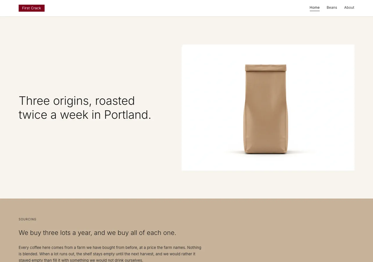
### 4. The vast-whitespace hero

Emptiness as the hero; the space is the statement. The index hero is **one line**
of Display XL (40px / **weight 300**) and **one photograph**, floating in a field
of `--canvas` with **96px** margins. Nothing else: no subhead stack, no dual CTA,
no scroll cue, no background texture. The photograph is a single product-on-white
plate — so the first thing on the page is a white rectangle with coffee on it,
sitting on paper, which is the entire thesis in one frame.

If the hero looks empty, it is correct. The instinct to add a second line, a
secondary button, or a "learn more" arrow is the instinct this design exists to
refuse.

## Components

- **Top nav.** `--plate` white bar, 56px tall, `0px` radius, padding 16×24px,
  with a 1px `--hairline` bottom rule. It is a hairline, not a slab. Far left:
  the **maroon logo box** ("First Crack"). Right: a spare horizontal list of
  links (Home, Beans, About) at the Nav role (12px / 400 / +0.2px) in `--body`,
  ~24px apart. The active link takes a 1px `--ink` underline and
  `aria-current="page"` — never a maroon underline. Collapses below 640px to
  logo box + a thin hamburger line-icon.
- **Neutral ink button** (primary — "Order beans", → beans page). `--ink`
  (`#1A1A1A`) fill, `--on-ink` white label at the Button role, **2px** radius,
  padding 14×24px, 44px tall. Press state lifts the fill to `--body` (`#333333`).
  **This is the primary CTA of the entire site, and it is not maroon.**
- **Outline button** (secondary). Transparent fill, `--ink` label, 1px
  `--hairline-strong` border, same 2px radius and 44px height (the border is
  absorbed into 13×23px padding). On the kraft band, its press state fills
  `--kraft-deep`.
- **Text input.** `--plate` white fill, `--ink` text at Body, placeholder in
  `--ink-faint`, 1px `--hairline-strong` border, **2px** radius, padding 10×12px,
  40px tall. **Focus:** the border darkens to a 1px `--ink` near-black — even
  focus is quiet here; there is no bright ring, no glow, no colored halo. The
  error border is the one sanctioned non-logo maroon, and a visible error
  **consumes that page's single emphasis budget**.
- **Product card.** As Signature 3: `--plate` fill, `0px` radius, zero padding on
  the image, caption stack beneath. The origin grid on index and beans.
- **Info card.** `--panel` (`#FBF9F4`) fill, `0px` radius, **40px** padding,
  optional 1px `--hairline` outline. Flat, quiet, hairline-bounded — **no
  shadow.** Carries the visit info on about: address (412 Foundry Lane,
  Portland, Oregon), cafe hours (Wednesday–Sunday, 8:00–15:00), and the Saturday
  public cupping (10:00, free, no reservation). Title at Heading M, detail at
  Body, all figures at Spec with `tnum`.
- **Kraft band.** As Signature 2.
- **Category pill.** `--plate` fill, `--body` text at Caption (11px), 1px
  `--hairline-strong` border, `9999px` radius, padding 6×14px. The single place
  full-round geometry is permitted. Selected state fills `--ink` with white text.
  Used sparingly — a roast-level filter on beans, if at all.
- **All-caps section label.** Transparent, `--ink-soft` (6.4:1 on canvas), the
  Micro-cap role (10px / 400 / +1px / uppercase). The quiet eyebrow above a
  section — `SOURCING`, `ORIGINS`, `BREW`, `VISIT`. **Never colored.**
- **Hairline rule.** A 1px `--hairline` (`#E4DECF`) line — or
  `--hairline-on-white` on plate surfaces. **This is the structural workhorse of
  the system:** where another design would draw a boxed card or drop a shadow,
  Vessel draws one thin line and lets the paper hold the rest. It divides list
  rows, brackets the CTA band, underlines the nav, and separates footer columns.
- **CTA band** (index). Not a colored slab — a `--canvas` section, 96px padding,
  bracketed above and below by a 1px `--hairline` rule, holding one Display M
  line and one neutral **ink** button. The restraint of the CTA is the point:
  the site asks once, quietly, and does not ask again.
- **Footer.** `--canvas` fill, `--ink-soft` text at Caption (11px), `0px` radius,
  padding 64×24px. Quiet multi-column link groups, the small maroon logo box, the
  address, and a legal row — hairline-separated, **never boxed**, never inverted
  to a dark slab.

## Motion

Almost none, and it fades. Text links and nav items transition **color only**
(120ms ease-out). Buttons change fill on press with no transform — **no scale,
no lift, no bounce.** An above-fold photograph may fade in once on load over
~200ms; nothing else animates. No parallax, no scroll-jacking, no reveal-on-
scroll, no looping motion, no hover-zoom on a product plate — a catalogue page
does not move when you look at it.

The **only** shadow permitted anywhere in the system is on a sticky top nav once
the page has scrolled: `box-shadow: rgba(26, 26, 26, 0.06) 0 1px 3px`, and it
should be barely perceptible. Nothing else — no card, no button, no input, no
plate, no band — ever has a shadow. Under `prefers-reduced-motion: reduce`,
every element renders in its final state with no transition and no fade.

## Image treatment

Photography is the brand's real depth and its real color — which is exactly why
the interface has none. Two treatments, and no third:

**Product-on-white plates.** The object centered on true `#FFFFFF`, lit softly
and evenly, shot **straight-on** (never a three-quarter hero angle), with a
gentle contact shadow beneath it, **no props, no styling, no surface texture, no
hands.** This is the paper-catalogue plate. It is the only place true white
appears on the site.

**Muted lifestyle frames.** A room, a machine, a tray of green coffee — warm,
neutral, evenly daylit, and equally unstyled. No saturated color, no dramatic
light, no bokeh romance, no latte art, no smiling-customer stock, no people at
all. The photographic restraint mirrors the type restraint: nothing shouts.

All images render at **`0px` radius**, full-bleed inside their cell, with **no
filter, no overlay, no gradient scrim, and no text set on top of them.** Product
crops stay identical across breakpoints — this design never art-directs a
product shot into a dramatic mobile crop.

Needed images (referenced `./assets/<id>.png`):

- `index-hero` — **plate.** A single sealed kraft coffee bag standing upright,
  centered on pure white, straight-on, soft even light, gentle contact shadow. No
  props. The one photograph in the vast-whitespace hero.
- `index-sourcing` — **muted lifestyle frame.** Raw green (unroasted) coffee
  beans in a shallow steel tray, flat even daylight, warm-neutral tones, shot
  from slightly above. Sits full-width on canvas beneath the kraft sourcing band.
- `index-process` — **muted lifestyle frame.** A drum roaster in a quiet
  workshop, no people, even daylight, no dramatic flame or glow — the machine as
  a plain object.
- `origin-yirgacheffe` — **plate.** A coffee bag and a small pile of **light**
  roast beans on pure white, straight-on (Gedeo Zone, Ethiopia; washed;
  1,950 m; jasmine, bergamot, dried apricot).
- `origin-san-agustin` — **plate.** Bag and **medium** roast beans on pure white,
  identical lighting and camera angle to the other two — no featured treatment
  (Huila, Colombia; washed; 1,700 m; caramel, red plum, cocoa nib).
- `origin-kerinci` — **plate.** Bag and **dark** roast beans on pure white,
  identical lighting and angle (Sumatra highlands, Indonesia; wet-hulled;
  1,400 m; dark chocolate, cedar, molasses).
- `beans-brew` — **plate.** A pour-over cone, carafe, and a scale arranged
  centered on pure white, straight-on, catalogue-style — brewing equipment as
  product, beside the brew-guide spec columns.
- `about-space` — **muted lifestyle frame.** The roastery interior at 412 Foundry
  Lane: architectural, people-free, plain walls, even daylight through a window.
- `about-cupping` — **muted lifestyle frame.** The Saturday cupping table — a row
  of identical cups with spoons laid beside them, still, unstyled, no people.

## Do / Don't

Do:

- Keep `--maroon` inside the logo box. One emphasis line per page is the entire
  budget outside it.
- Make the primary CTA a **neutral ink** button (`#1A1A1A`, 2px radius) —
  every time.
- Build every surface on warm paper: `--canvas`, `--beige`, `--kraft`. Reserve
  true `--plate` white for product photography.
- Set type at 300/400 only; body at 13px / 400 / 1.7; let size and space carry
  every bit of hierarchy.
- Design emptiness first — decide the air, then place the minimum content in it.
- Structure with 1px `--hairline` rules instead of borders, fills, and shadows.
- Shoot every product as catalogue product-on-white: straight-on, soft even
  light, no props.
- Render every elevation, dose, temperature, and time with `tnum` so the columns
  align.
- Keep the kraft band to exactly one per page (index: sourcing; about: story).
- Step secondary text up to `--body` inside the kraft band, where `--ink-soft`
  fails AA.

Don't:

- **Maroon `#7F0019` is never a button, a link, an icon, or a general accent.**
  If a maroon button and the logo box are both visible, the emphasis is already
  destroyed.
- No second brand color — no blue, no green-as-accent, no copper, no gradient
  anywhere. No color-coded roast levels.
- No pure black `#000000`. The darkest ink is `--ink` (`#1A1A1A`).
- **No bold display type and no bumping the 13px body.** There is no 600 and no
  700 in this system; a bold headline breaks the quiet.
- No weight 300 below 15px — the tiny body stays at 400.
- No drop-shadow tiers, glows, or glassmorphism. The only shadow in the system is
  the barely-there sticky-nav rule.
- No radius beyond 2px on controls; `0px` on the logo box, cards, bands, and
  images. Nothing bubbly.
- **Never fill negative space just because it exists.** When the layout feels
  finished, remove one more element and widen the margins.
- Never set a product shot on a colored or gradient background — catalogue white
  only. And never put a white plate inside the kraft band.
- No cold blue-white canvas — the surface is always warm paper.
- **No serif display face and no monospace data block** — those belong to another
  design in this brief. No visible modular grid or oversized numerals either.
- No `--ink-soft` on kraft (3.4:1, fails AA); no `--ink-faint` for anything a
  visitor must actually read.
- No emoji, no decorative icons doing a label's job. Icons are thin single-weight
  monochrome line pictograms at 16–20px in `--ink-soft` — never filled, never
  colored, never maroon.
- **The reference brand is named in this document's prose only.** The built page
  never shows the source brand's name, its logotype, its Japanese wordmark, or
  its licensed fonts. The logo box carries **"First Crack"** and nothing else,
  and the page copy is English throughout.