DESIGN.md
# Ticker — Design System

## Concept

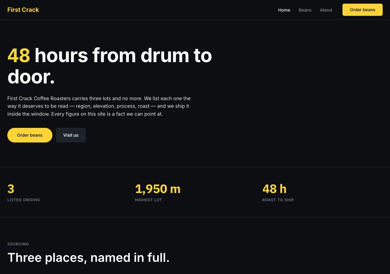
**A roastery read as a trading platform.** First Crack Coffee Roasters already
speaks in numbers — a 1,950 m lot, 18 g in and 36 g out, a 48-hour window from
drum to door — and this system takes that literally: it presents the roastery
the way a financial platform presents an asset. Facts sit in tables, stat
callouts, and a dedicated tabular number voice instead of dissolving into
marketing prose. An origin is a listed lot; a brew ratio is a ledger line; the
roast calendar is a trading calendar that happens to describe an all-factual
Tuesday-and-Thursday schedule. Nothing is invented to sell the metaphor — every
number rendered anywhere in the system is a fact this brief already supplied.

The source language is **Binance's** — the near-black canvas, the single
voltage of brand yellow spent nowhere but the primary action, the split
between a marketing surface and a transactional one, and a numeral voice that
locks to a monospaced-feeling grid so a price (or, here, an elevation or a
gram count) never wobbles down a column. That lineage is named here and
nowhere else in this document, and never in the built page: the site carries
only First Crack's own name and copy, in English throughout.

Two spine devices carry the whole system. The first is a **surface flip**:
index and about run the dark marketing register, beans flips to a light
transactional register — because beans is where a visitor actually orders —
and every page, dark or light, closes on the same light footer, the
deliberate inversion the reference itself uses to visually reset a page. The
second is a **dual-voice type system**: prose is set in one face, and every
numeral on the site — without a single exception, down to the founding year —
is set in a second, tabular face. The two devices are what let a black page
and a white page read as one platform rather than two designs stapled
together.

Ticker is not this brief's only dark design, and the distinction matters.
**Onyx** stages the roastery as nocturnal theater — true black, a shouting
condensed display face, zero radius, one gold CTA spent as spectacle. Ticker's
near-black is not a stage; it is a ledger, and its yellow is not drama, it is
a UI convention borrowed from a platform that uses it the same way on every
page, dark or light. Nor is it **Dose**, this brief's other numbers-first
design: Dose is a single-column fintech *instrument* with one blue action and
no photography at all. Ticker keeps photography, keeps a conventional
multi-column site grid, and runs two surface registers rather than one —
where Dose reduces, Ticker tabulates.

## Palette

CSS custom properties, exact hex, brand-neutral names:

```css
--canvas-dark: #0b0e11;      /* index + about page floor — near-black, never pure */
--surface-card: #1e2329;     /* elevated cards on dark; secondary buttons on dark */
--surface-elevated: #2b3139; /* no secondary text: shares its hex with --hairline-dark, and is the one-step-lighter surface the hovered secondary button fills to */
--canvas-light: #ffffff;     /* beans page floor */
--surface-footer: #fafafa;   /* the light footer on every page, dark ones included */
--surface-chip: #f5f5f5;     /* tasting-note chips on light */
--accent: #fcd535;           /* the single brand voltage */
--accent-active: #f0b90b;    /* hover/press darkening */
--ink: #181a20;              /* text on light surfaces AND on accent — invariant */
--body-on-dark: #eaecef;     /* running text on dark (16.4:1) */
--on-dark: #ffffff;          /* headlines on dark (15.8:1 on card) */
--muted-on-dark: #8b95a5;    /* 6.4:1 on canvas-dark, 5.2:1 on surface-card */
--muted-on-light: #66707f;   /* 5.0:1 on white */
--hairline-dark: #2b3139;
--hairline-light: #eaecef;
--credit: #0a7c50;           /* ledger credit — 5.2:1 on white; ledger only */
--debit: #d6304b;            /* ledger debit — 4.8:1 on white; ledger only */
--focus: #3b82f6;            /* 2px focus ring */
```

The reference's muted `#707a8a` and ledger pair `#0ecb81`/`#f6465d` fail AA on
their canvases and are replaced by the tuned values above (the spec's
≈`#0b8f5c` credit measured 4.1:1 and was darkened to `#0a7c50`). The build's
REVIEW pass re-measured every pair; the ratios are recorded below and
throughout this document.

**Contrast (measured, WCAG AA, ≥4.5:1 for body text):**

- `--body-on-dark` on `--canvas-dark`: **16.4:1** — the default running-text
  pairing on both dark pages.
- `--on-dark` on `--surface-card`: **15.8:1** — headline pairing on elevated
  dark cards.
- `--muted-on-dark`: **6.4:1** on `--canvas-dark`, **5.2:1** on
  `--surface-card` — both pass; this is the only secondary-text token
  permitted on dark surfaces, and it is permitted on **only these two**
  surfaces. It is never set on `--surface-elevated`, where it measures
  **4.33:1** and fails AA — `--surface-elevated` carries no *secondary* text
  (see the surface-stepping rule below). High-contrast `--on-dark` text is a
  different matter: it measures **13.1:1** on `--surface-elevated`, which is
  why the hovered `.btn--secondary-dark` label is licensed to sit there (see
  Motion's one-step surface lightening).
- `--muted-on-light`: **5.0:1** on `--canvas-light` — the secondary-text
  token on the beans page and the light footer.
- `--credit` on white: **5.2:1**; `--debit` on white: **4.8:1** — both pass,
  and both are scoped to the brew ledger only (Signature 3).
- `--accent` as text (the wordmark, stat callouts): **13.55:1** on
  `--canvas-dark`, **11.08:1** on `--surface-card` — both pass, and both are
  dark-surface uses. On white, `--accent` measures **1.43:1** and fails even
  the 3:1 large-text floor — accent-as-text is licensed on dark surfaces
  only. On the light beans nav the wordmark is set in `--ink` on
  `--canvas-light` instead (**17.4:1**).
- `--ink` on `--accent`: **12.2:1** — the invariant black-on-yellow button
  pairing.

**Rules:**

- `--accent` is spent on exactly four things: primary CTAs, the wordmark, stat
  callouts, and the schedule grid's "Roast day" label. It never sets body
  text, never fills a decorative surface, and never appears as pure
  decoration. **Accent-as-text is a dark-surface license only**: the
  wordmark and stat callouts render in `--accent` on `--canvas-dark` and
  `--surface-card` (13.55:1 and 11.08:1), never on a light surface —
  `--accent` on `--canvas-light` measures 1.43:1 and fails even the 3:1
  large-text floor. On the light beans nav the wordmark is `--ink` on
  `--canvas-light` (17.4:1) instead; see the `top-nav` component.
- Text set on `--accent` is always `--ink` — never white. Inverting this
  pairing is a defect, not a variant.
- `--credit` and `--debit` appear only inside the brew ledger card (Signature
  3), always as text color, never as a fill and never repurposed as a generic
  success/error state elsewhere in the system.
- No pure black: the darkest surface is `--canvas-dark` (`#0b0e11`), never
  `#000000`.
- No gradients, no shadows, no atmospheric backdrops anywhere. Depth is
  surface stepping (`--canvas-dark` → `--surface-card` → `--surface-elevated`)
  and hairlines only. `--surface-elevated` carries **no secondary text**: its
  two live roles are sharing its hex with `--hairline-dark` (the dark
  hairline tone) and being the one-step-lighter surface the hovered
  `.btn--secondary-dark` fills to — `--muted-on-dark` measures only 4.33:1
  there, below AA, so secondary text is never set on it. A high-contrast
  `--on-dark` label is a different matter (13.1:1 there), which is why that
  hovered button keeps its `--on-dark` label — see Motion's one-step surface
  lightening.

## Typography

Two voices, both self-hosted as woff2 under `assets/fonts/` via `@font-face`
— no font CDN, no Google Fonts `<link>`.

**Prose voice — Inter.** Carries every headline, every line of running copy,
navigation, and button labels.

| Role        | Size / Weight / Line-height / Tracking | Use                                   |
| ----------- | --------------------------------------- | -------------------------------------- |
| hero        | 64px / 700 / 1.1 / -1px                 | Index hero stat-claim line             |
| display-lg  | 48px / 700 / 1.1 / -0.5px               | Major section openers                  |
| display-md  | 40px / 600 / 1.15                       | Section heads                          |
| display-sm  | 32px / 600 / 1.2                        | CTA-band headline                      |
| title-lg    | 24px / 600 / 1.3                        | Sub-section titles                     |
| title-md    | 20px / 600 / 1.35                       | Card and panel titles                  |
| title-sm    | 16px / 600 / 1.4                        | Step-card labels, trust-badge labels   |
| lede        | 16px / 400 / 1.6                        | Hero sub, section ledes, story prose   |
| body        | 14px / 400 / 1.5                        | Dense copy: cards, tables, footer      |
| body-sm     | 13px / 400 / 1.5                        | Secondary copy                         |
| caption     | 12px / 500 / 1.4                        | Metadata, small labels                 |
| button      | 14px / 600 / 1                          | Button labels                          |
| nav         | 14px / 500                              | Top-nav links                          |

Display stays weight 700 — softening it toward 400 breaks the platform
character this system depends on.

The reference runs a single 14px body role, because its pages are almost all
table and card. This system keeps that 14px for dense copy — card bodies,
table cells, the footer — but adds a 16px **lede** for the places where the
page actually asks someone to read a paragraph (the hero sub, section ledes,
the about story). A trading platform can set running prose at 14px because it
barely has any; a roastery's story is prose, and 14px would make reading it a
chore.

**Number voice — IBM Plex Sans**, with `font-variant-numeric: tabular-nums`,
weights 500 and 700. Every numeral on the site — elevations, grams, seconds,
hours, clock times, the founding year — renders in this voice, with zero
exceptions.

| Role            | Size / Weight / Line-height | Use                                              |
| ---------------- | ---------------------------- | ------------------------------------------------- |
| number-display   | 40px / 700 / 1.1             | Stat callouts, ledger's leading brew number       |
| number-md        | 16px / 500 / 1.4             | Origin-card spec figures, market-table elevations |
| number-sm        | 14px / 500 / 1.4             | Inline figures, schedule times                    |

**Mobile:** the hero drops from 64px to 36px; stat numbers scale down rather
than wrap.

## Spacing & layout

- **4px base scale.** Tokens: 4 · 8 · 12 · 16 · 24 · 32 · 48.
- **Section bands: 80px** top and bottom — deliberately denser than the
  airier siblings in this brief, matching a platform that mixes marketing
  bands with dense tabular surfaces.
- **Card padding: 24px.** **CTA-band padding: 48px.**
- **Table rows: 12px vertical padding**, separated by hairline dividers —
  never a shadow or a fill change between rows.
- **Content container: ~1280px**, centered.
- **Page floors:** index and about run on `--canvas-dark`; beans runs on
  `--canvas-light`; the footer is `--surface-footer` on all three pages,
  including the two dark ones — the deliberate inversion that visually closes
  even a dark page.
- **Radius scale:** 4px chips; 6px buttons and inputs; 8px content cards; 12px
  elevated containers. The pill radius appears **exactly once** in the whole
  system — the index hero's primary CTA.
- **Elevation** is flat color-block steps and hairlines only: no shadows, no
  gradients, no atmospheric backdrops anywhere on any page.
- **Breakpoint: 768px.** Below it, the nav collapses to a hamburger sheet, the
  origins market table reflows to a horizontally scrollable card-per-origin
  list, and the week calendar grid collapses to a vertical list.

## Signature

Five devices, each a direct translation of the reference's own signatures.

### 1. Two-mode surface flip

Index and about run dark — the marketing voice; beans runs light — the
transactional voice, because it is where ordering actually happens. The same
yellow CTA, the same hairline grammar, and the same number voice thread both
registers, so the flip reads as one platform switching context rather than
two different sites. Every page, dark or light, closes with the light
`--surface-footer` footer — the deliberate inversion that visually ends even
the dark pages, borrowed directly from the reference's own light-footer-on-
dark-body convention.

### 2. Origins market table (index)

The three origins presented as listed lots inside one elevated
`--surface-card` card (12px radius): a static label header row — Origin /
Elevation / Process / Roast — in `--muted-on-dark` caption type, then three
rows, each a 32px circular origin image paired with a name-pair ("Yirgacheffe
/ Gedeo Zone, Ethiopia"), the elevation in the number voice (`1,950 m` /
`1,700 m` / `1,400 m`), the process (Washed / Washed / Wet-hulled), the roast
(Light / Medium / Dark), and a row-end chevron linking to `./beans.html`. No
prices, no tabs, no invented data — only the three origin facts this brief
supplies. Under 768px the table reflows to a horizontally scrollable
card-per-origin list.

### 3. Brew ledger (beans)

Pour-over and Espresso presented as two light transaction cards (8px radius,
hairline border): a large leading number set in number-display (`15 g` for
pour-over, `18 g` for espresso), then parameter rows as hairline-divided
cells — `250 g water · 94°C · medium-fine grind · 3:00` on the pour-over
card, `36 g out · 28 s · 93°C` on the espresso card — and, on the espresso
card only, the ledger pair: `−18 g in` set in `--debit`, `+36 g out` set in
`--credit`, text color only, never a fill. Neither card carries a button
inside it — the cards close on data, not on a pretend checkout.

### 4. Numbers-in-Plex rule

The dual-voice system applied with zero exceptions: every numeral on the
site, in every component, renders in the IBM Plex Sans number voice. It is
this rule, more than any single component, that makes the dark marketing
pages and the light transactional page read as one platform.

### 5. Week calendar grid (about)

Monday through Sunday as seven `--surface-card` cells: "Roast day" — the
page's only `--accent`-colored label — marks Tuesday and Thursday; "Café
8:00–15:00" marks Wednesday through Sunday; "Cupping 10:00" marks Saturday;
Monday sits empty, labeled "Closed." A trading-calendar read applied to a
schedule that is entirely factual. The grid collapses to a vertical list
under 768px.

## Components

- **hero-band** — Dark, 80px padding, index only. A stat-claim h1 set in the
  hero type role, its real number rendered in `--accent` and the number
  voice — for example "48 HOURS FROM DRUM TO DOOR"; the wording is the
  design's own, but the number is always a content.md fact. A one-line sub in
  `--body-on-dark`. Dual CTA: `button-primary-pill` "Order beans" →
  `./beans.html`, and `button-secondary-on-dark` "Visit us" →
  `./about.html`.
- **top-nav** — 64px tall; dark variant on index and about, light variant on
  beans. Wordmark "First Crack" is `--accent` on the dark variant
  (`--canvas-dark`, 13.55:1) and **`--ink` on the light variant**
  (`--canvas-light`, 17.4:1) — `--accent` on white measures only 1.43:1 and
  is never used there; this split is reference-faithful, not a deviation
  (the source platform renders its own wordmark in ink on its light,
  transactional theme). Links Home / Beans / About, with
  `aria-current="page"` on the active link. Right-aligned primary button
  "Order beans" → `./beans.html`. Collapses to a hamburger sheet under 768px,
  with the yellow CTA anchored at the bottom of the sheet.
- **button-primary** — `--accent` fill, `--ink` label, 14px / 600 button
  type, padding 12px 24px, height 40px, radius 6px. Press state darkens to
  `--accent-active`. The black-on-yellow pairing is invariant — it is never
  inverted.
- **button-primary-pill** — Hero only: same fill and label as
  `button-primary`, padding 14px 32px, pill radius. The one place in the
  system the pill radius appears.
- **button-secondary-on-dark** — `--surface-card` fill, `--on-dark` label.
- **button-secondary-on-light** — White fill, 1px `--hairline-light` border,
  `--ink` label.
- **stat-callout** — Transparent background, `--accent` text in the
  number-display role. Used for the index stat row (`3` origins / `1,950 m`
  highest lot / `48 h` roast to ship) and for about's inline `2019`.
- **market-table** — Signature 2.
- **step-card** — Dark 8px-radius card, a number-voice ordinal paired with a
  title-sm label. Used for the index process row: Source → Roast (Tue · Thu)
  → Rest → Ship (≤ 48 h).
- **photo-strip** — Three `--surface-card` cards in a row, images running
  edge-to-edge inside a 12px crop.
- **origin-card** — White background, hairline border, photo in a 12px crop,
  origin name and region, spec rows (Elevation / Process / Roast) in the
  number voice, and tasting-note chips in `--surface-chip` with `--ink`
  caption text.
- **brew-ledger-card** — Signature 3.
- **visit-card** — Three trust-badge-style `--surface-card` cards on about:
  address / café hours / cupping ("free, no reservation").
- **cta-band** — Elevated `--surface-card` card, 12px radius, 48px padding,
  display-sm headline, `button-primary` right-aligned.
- **footer** — Light `--surface-footer` on every page, 64px vertical padding,
  columns for Visit / Roast schedule / Cupping / page links, wrapping 4 → 2 →
  1 with viewport width.

## Motion

Near none. Hover takes exactly three forms: `--accent-active` darkening on
the primary CTA, a one-step surface lightening on the secondary dark button,
and a text-color shift on links — nav links, the market-table row chevron,
and footer links. Nothing else moves. No scroll animation, no parallax, no
transition on layout. Keyboard focus is a 2px
`--focus` ring on every interactive element. Under
`prefers-reduced-motion: reduce`, the (already minimal) color transitions are
removed and every element renders in its resting state.

## Image treatment

Photography exists only inside cards — 12px-radius crops — and the canvas
itself stays flat everywhere else. One photographic mode for all seven
images: clean documentary light, neutral grading that does not fight the UI
palette, and — hard rules for the generator — no rendered text, labels, or
logos anywhere in frame (unlabeled bags, unmarked equipment), and
compositions that keep negative space rather than filling the frame.

**No people, and no hands.** The rooms and the equipment are photographed
empty. This is a working rule, not a mood: the generator reliably fuses
fingers into a knuckleless mass, and a single bad hand is the one artifact a
visitor always sees. The subject is the machine, the bean, and the room —
none of which need a person in the frame to read as work.

Needed images (referenced `./assets/<id>.webp`):

- process-roast (1:1) — A steel drum roaster discharging freshly roasted
  beans into its cooling tray, beans caught mid-drop, warm workshop light,
  documentary photograph, unmarked machinery with no text or logos,
  composition with breathing room.
- process-green (1:1) — Green unroasted coffee beans cascading from a plain
  jute sack into a steel hopper, motion frozen, neutral daylight, documentary
  style, no text or labels in frame.
- process-pack (1:1) — Plain unlabeled kraft coffee bags standing on a steel
  workbench beside a steel heat sealer, neutral workshop light, documentary
  photograph, no text or printed labels anywhere.
- origin-yirgacheffe (1:1) — Pale matte light-roast coffee beans filling a
  shallow steel tray level to the rim, centered on plain white, shot directly
  overhead with an even white margin, bright shadowless studio light, sharp
  macro detail, natural bean-to-bean variation, no text.
- origin-san-agustin (1:1) — Mid-brown medium-roast coffee beans with a faint
  sheen, the same shallow-tray-on-white staging: filled level, centered, shot
  directly overhead, even white margin, bright shadowless studio light, sharp
  macro, natural bean-to-bean variation, no text.
- origin-kerinci (1:1) — Dark oily dark-roast coffee beans with visible gloss,
  the same shallow-tray-on-white staging: filled level, centered, shot
  directly overhead, even white margin, bright shadowless studio light, sharp
  macro, natural bean-to-bean variation, no text.
- about-cafe (16:9) — A roastery café interior in morning window light: steel
  counter, empty stools, a drum roaster visible at the back, no people, no
  signage or written menus, calm documentary photograph.

## Do / Don't

Do:

- Reserve `--accent` for exactly four jobs: primary CTAs, the wordmark, stat
  callouts, and the schedule grid's "Roast day" label — the wordmark and stat
  callouts render in `--accent` on dark surfaces only; the light nav
  wordmark is `--ink`.
- Keep text on `--accent` always `--ink` — never white.
- Set every numeral, everywhere, in the IBM Plex Sans number voice with
  tabular figures — elevations, grams, seconds, hours, clock times, the
  founding year, with zero exceptions.
- Run index and about dark, beans light, and close every page — dark or
  light — with the `--surface-footer` footer.
- Build depth from surface stepping and hairlines only; when a surface feels
  flat, step the surface color rather than adding a shadow.
- Keep `--credit`/`--debit` scoped to the brew ledger card, as text color
  only.

Don't:

- No shadows, gradients, or mesh backdrops anywhere in the system.
- No fake interactivity of any kind — no carts, no checkout, no search
  fields, no tabs that don't switch.
- Never soften display weight below 600.
- Never let `--credit`/`--debit` become fills, or repurpose them as generic
  success/error colors outside the brew ledger.
- Never invert the black-on-yellow button pairing.
- Never use `--accent` as body text, a surface fill, or decoration.
- No naming of the source reference anywhere in the built page — the site
  carries only First Crack's own name, in English, and nothing else. The
  reference is named in this document's Concept section only.