DESIGN.md
# Plinth — Design System

## Concept

**A roastery presented as a quiet print catalogue.** Not a shop, not a cafe with
a story to tell you — a catalogue: warm cream stock, one object per page, a
formulation printed underneath it, and a great deal of paper left alone. The
premise is apothecary-editorial. Coffee is treated the way a compounding
pharmacy treats a preparation: sourced from a named place, measured to the gram
and the second, and set down in a ledger that trusts the reader to read it.

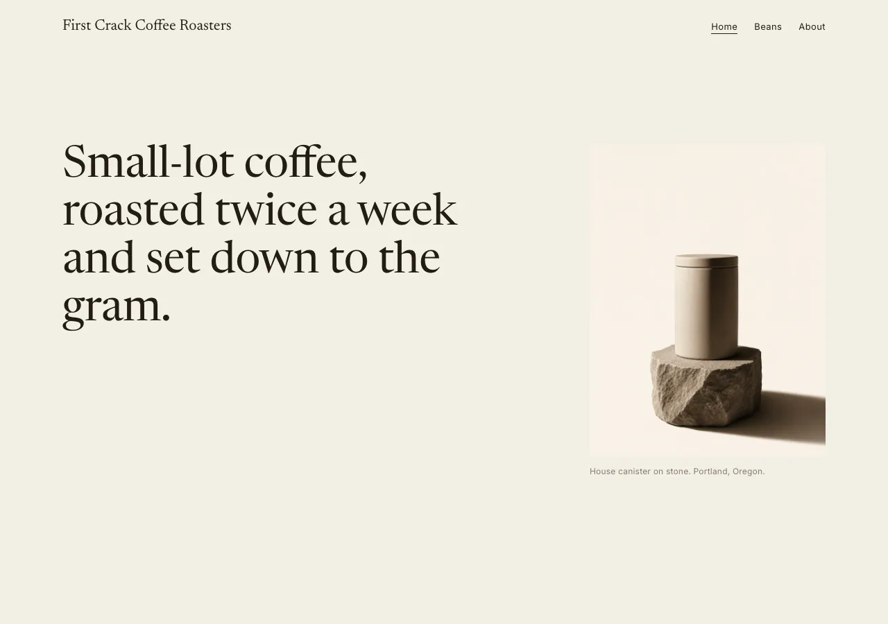
The name is the load-bearing device. **Every product photograph in this system is an
object standing on a plinth** — a rough stone block, a walnut plank, a slab of
basalt — lit low and warm, throwing one deep soft shadow across an empty cream
ground. The plinth is what raises a bag of coffee to the height of a specimen.
It is also the whole depth model of the design: *photography does the depth,
paper does the calm.* There are no gradients here, no drop shadows, no card
elevation tiers. The only real shadow on the site lives inside a photograph, and
it is the reason the flat cream interface never feels thin.

The source language is **Aesop's** — the apothecary-editorial system whose
surfaces read as printed matter rather than e-commerce: warm cream paper
(`#F3EFE5`) holding a warm near-black ink (`#211C15`), no saturated CTA color at
all, muted earth accents that are never allowed to become buttons, square corners
everywhere, and sepia product-on-plinth photography framed by vast whitespace.
Its two licensed voices are substituted here: the flared serif display (Optima /
Zapf Humanist) becomes **Newsreader** at weight 400, and the neutral grotesque
body (Suisse Int'l) becomes **Inter**. That lineage is named in this document and
**nowhere else** — the built page carries only the roastery's own name, **First
Crack Coffee Roasters**, and its copy is English throughout.

**This is not the brief's other cream-paper design.** Bloom is also warm and
serif, but it runs a copper accent through its links and renders brew data as
dark monospace "recipe windows" — code as proof. Plinth has **no accent color at
all** and **no monospace anywhere**: its brew data is a *ledger*, set dense in
the grotesque — tight leading, a hanging-indent label/value grid, tabular
figures locked into a column — printed on sepia paper. Nor is it Vessel, which
also empties the page but does so on clinical pure-white plates under flat even
light and refuses the serif entirely. Vessel's photography is a product catalogue
under a softbox; Plinth's is a specimen under a single warm lamp. Vessel is a
silent room. **Plinth is a lit stage with one object on it.**

## Palette

Warm cream paper, warm near-black ink, and an earth family that never raises its
voice. There is **no CTA color in this system** — the primary action is the ink
itself.

| Token               | Hex       | Role                                                                        |
| ------------------- | --------- | --------------------------------------------------------------------------- |
| `--canvas`          | `#F3EFE5` | Warm cream paper — the page floor and dominant surface. Never pure white.    |
| `--canvas-deep`     | `#EBE4D5` | Tonal band and plinth-card fill. A step, not a shadow.                       |
| `--canvas-sepia`    | `#E4D9C6` | Warmer paper for formulation / ledger panels and the roast schedule.         |
| `--panel-dark`      | `#26211A` | The single inverted surface — **footer only**. Warm dark, never black.       |
| `--ink`             | `#211C15` | Text, rules, and the only "CTA color" — the filled button is filled ink.     |
| `--ink-soft`        | `#5E5647` | Secondary copy, ledgers, descriptors. AA on canvas.                          |
| `--ink-faint`       | `#867C69` | Eyebrows, captions, metadata — **short labels only.**                        |
| `--on-ink`          | `#F1ECE0` | Cream text on `--ink` and `--panel-dark`. A warm off-white, never `#FFFFFF`. |
| `--hairline`        | `#D6CDBB` | The 1px warm rule — store rows, table rules, section separators.             |
| `--hairline-strong` | `#C4B9A3` | Input borders and emphasized dividers.                                       |
| `--sepia`           | `#4A3626` | Deep amber-brown. Editorial accents only — **never a fill.**                 |
| `--taupe`           | `#9C8F79` | Muted neutral — colored dividers, quiet markers, disabled states.            |
| `--olive`           | `#5C5A3C` | Herbal accent — origin markers, a rare editorial rule.                       |
| `--clay`            | `#9A6F53` | Warm terracotta, the most sparing accent of all. Default to earth-neutral.   |

Rules:

- **There is no saturated CTA color, and adding one is not a variant — it is a
  defect.** Where another roastery reserves a voltage for its buttons, this one
  reserves restraint: `button-primary` is filled `--ink`, `button-outline` is
  outlined `--ink`. If you find yourself reaching for a brand-green or a copper,
  stop and widen the margin instead.
- **The earth accents never become fills.** `--sepia`, `--taupe`, `--olive`, and
  `--clay` exist as hairlines, category markers, and emphasis text on cream. None
  of them is ever a button, a badge fill, a band background, or a roast-level
  swatch. Roast level is a **word**, not a color.
- **Contrast (measured, WCAG AA).** On `--canvas`: `--ink` 14.7:1, `--ink-soft`
  **6.3:1 — body-legal**, `--sepia` 9.9:1, `--olive` 6.1:1. On `--canvas-deep`:
  `--ink-soft` 5.7:1. On `--canvas-sepia` (the ledger panels): `--ink` 12.1:1,
  `--ink-soft` **5.2:1 — the 14px ledger passes AA**. On `--panel-dark`:
  `--on-ink` 13.6:1. On `--ink` (the filled button): `--on-ink` 14.4:1.
- **`--ink-faint` (`#867C69`) does NOT hold AA and is label-only.** It measures
  **3.6:1 on `--canvas`** and 3.3:1 on `--canvas-deep` — below the 4.5:1 body
  threshold. Use it for eyebrows, captions, and placeholders (short, large-ish,
  non-essential labels) and nowhere else. **It never sets a paragraph, a spec
  value, a ledger line, or anything a visitor must actually read** — those step
  up to `--ink-soft` (6.3:1). And it never appears on `--canvas-sepia`, where it
  falls to 3.0:1.
- `--clay` (3.8:1 on canvas) and `--taupe` (2.8:1) are **not text colors** at
  body size — taupe is a divider, clay is a large editorial mark.
- **No pure white and no pure black.** The paper is `--canvas`; the darkest value
  is `--ink`; the footer is warm `--panel-dark`, not `#000000`; cream type on
  dark is `--on-ink`, not `#FFFFFF`.
- **No gradients anywhere.** Every surface is flat color. Depth is tonal step +
  hairline + the shadow inside a photograph.

## Typography

Two voices, cleanly split, **both self-hosted as woff2 under `assets/fonts/`**
via `@font-face` — no font CDN, no Google Fonts `<link>`.

**Display — Newsreader, weight 400 only.** A warm, low-contrast text serif
standing in for the reference's licensed flared serif. It holds editorial calm at
hero size and is **never bolded**: there is no 600 and no 700 of this face in the
system. A bold serif headline is the fastest way to destroy this design.

**Body — Inter.** The neutral grotesque. It carries running copy, navigation,
labels, buttons, and — importantly — **all of the data**. The ledger is set in
the grotesque, never in the serif.

| Role         | Face       | Size / Leading | Tracking | Features | Use                                        |
| ------------ | ---------- | -------------- | -------- | -------- | ------------------------------------------ |
| Display XXL  | Newsreader | 64px / 1.08    | -0.5px   | liga     | Index hero line                            |
| Display XL   | Newsreader | 48px / 1.12    | -0.4px   | liga     | Section openers, story headline            |
| Display L    | Newsreader | 36px / 1.16    | -0.2px   | liga     | Origin names on beans, editorial sub-heads |
| Display M    | Newsreader | 28px / 1.25    | 0        | liga     | Compact headings                           |
| Card title   | Newsreader | 22px / 1.3     | 0        | liga     | Plinth-card names, store-row names          |
| Lead         | Inter      | 17px / 1.6     | 0.1px    | liga     | Editorial lead paragraphs                  |
| Body         | Inter      | 15px / 1.6     | 0.1px    | liga     | Default running copy, descriptors           |
| Ledger       | Inter      | 14px / 1.7     | 0.1px    | **tnum** | Brew parameters, origin specs, schedule     |
| Figure       | Inter      | 15px / 1.4     | 0        | **tnum** | Aligned figures in columns                 |
| Nav          | Inter      | 13px / 1.4     | 0.4px    | liga     | Top-nav links                              |
| Eyebrow      | Inter 500  | 12px / 1.2     | 1.5px    | case     | Uppercase section eyebrow                  |
| Button       | Inter 500  | 12px / 1.0     | 1.2px    | case     | Uppercase button label                     |
| Caption      | Inter      | 12px / 1.5     | 0.2px    | liga     | Photo captions, metadata                   |
| Micro-cap    | Inter 500  | 11px / 1.3     | 1.4px    | case     | Quiet tags                                 |

Principles:

- **Hierarchy by size, never by weight.** The serif sits at 400 forever; the
  grotesque runs 400 with 500 reserved for the three small-caps roles (eyebrow,
  button, micro-cap). Emphasis is bought with air, not ink.
- **Letter-spaced small caps are the only typographic flourish this design
  permits.** Eyebrows, tags, and button labels are uppercase Inter at 1.2–1.5px
  tracking. No italics for emphasis, no underlines except on links, no ornament.
- **Density is the signature, not a figure style.** The Ledger role sets tight
  1.7 leading in a hanging-indent label/value grid, with
  `font-feature-settings: "tnum"` so every numeral locks to the same width and
  lines up straight down the column — the apothecary-ledger read. Every brew
  parameter and origin spec is set this way: `15 g coffee / 250 g water / 94°C /
  3:00`, `18 g in / 36 g out / 28 s / 93°C`, `1,950 m / 1,700 m / 1,400 m`.
- **Tabular figures where figures must align.** The Figure role sets `tnum` for
  any numeral rendered in a column that must line up down the page.
- **Never set body copy in the serif, and never set a headline in the
  grotesque.** The split is absolute.
- Negative tracking belongs to the large serif tiers only (-0.5px to -0.2px);
  the grotesque sits at a near-neutral +0.1px.

## Spacing & layout

Whitespace is the primary material. The design does as little as possible, as
precisely as possible. **When a layout feels off, the fix is almost always more
paper and less ornament** — remove an element, widen a margin, drop a rule.

- **8px base unit.** Tokens: 4 · 8 · 12 · 16 · 24 · 40 · 64 · 96 · 128.
- **Section rhythm: 96px** top and bottom between major bands. **Hero and
  campaign bands take 128px** — the luxurious breathing room is the whole point,
  not a hero-only indulgence.
- **Card padding: 40px** on both the plinth card and the formulation card.
- Content centers in a restrained **~1180px container** with generous outer
  margins. Content rarely runs edge-to-edge; the whitespace widens before the
  content does. Editorial passages drop to a single narrow column offset in a
  wide grid, with deliberately empty columns beside them.
- **Origins grid: 3-up on desktop → 1-up on mobile**, with wide 40px gutters.
  **Never a dense 2-up on mobile** — a cramped pair of plinth cards is a
  catalogue that has stopped respecting its objects.
- **Radius is 0px. Everywhere.** Buttons, cards, inputs, image frames, tags.
  There are no pills and no soft cards in this system.

Breakpoints:

| Width          | Behavior                                                                                 |
| -------------- | ---------------------------------------------------------------------------------------- |
| Mobile <768px       | Display steps to **34px**; nav collapses; origins grid 1-up; margins tighten but stay generous |
| Tablet 768–1024px   | Display **48px**; grid folds toward a single offset column                                |
| Desktop ≥1024px     | Display **64px**; full 3-up origins grid with wide gutters                                |

Band rhythm — canvas dominates, `--canvas-deep` and `--canvas-sepia` are the only
tonal steps, and the single dark band is the footer:

- **index** — hero (canvas, 128px: one serif line, one tall plinth photograph)
  → sourcing statement (canvas, narrow column) → featured origins, three plinth
  cards (`--canvas-deep`) → roasting process (canvas, full-width photograph and a
  short editorial column) → CTA band (canvas, hairline-bracketed, one ink button).
- **beans** — origins grid, three plinth cards with full detail: process,
  elevation, roast level, tasting notes (canvas) → a full-width bean-texture band
  → brew guide, pour-over and espresso as two formulation cards
  (`--canvas-sepia`) with the ledger type.
- **about** — story (canvas, editorial column beside a tall interior photograph)
  → visit info as hairline-divided store-list rows (canvas) → roast schedule as a
  ledger on a `--canvas-sepia` panel.

## Signature

Four devices. Each is a direct translation of the reference's own signatures.

### 1. Product-on-plinth photograph

The one photographic motif and the core repeating unit of the site. **One object,
one plinth, one shadow.** A sealed bag, a canister, a dish of beans stands on a
stone or timber plinth in warm low-key directional light, throwing a deep soft
shadow across an empty warm-cream ground that matches `--canvas` so the photograph
appears to be *printed on the page* rather than pasted onto it.

- Frames are **square-cornered — 0px, no CSS border, no CSS shadow, no overlay,
  no gradient scrim.** The crop and the surrounding paper do all the framing.
- **All shadow lives inside the photograph.** This is the only literal depth in
  the design, and it is why the flat interface reads rich rather than flimsy.
- **Images never bleed under text** and never carry type on top of them. A caption
  sits beneath a photograph in `--ink-faint`; it does not sit *on* it.
- Never composite, never gradient-backed, never a lifestyle scene with a person
  in it.

### 2. Formulation ledger

The apothecary signature, and the reason the data never becomes a code block.
Brew parameters and origin specs are set as a dense **hanging-indent ledger** in
the 14px Ledger role — 1.7 leading held tight, labels hung against a fixed
column so every value falls into place beneath the last, and `tnum` tabular
figures so a numeral never shifts the column's width — in `--ink-soft` on a
`--canvas-sepia` panel (5.2:1). Density is *intentional* here and nowhere else:
the ledger stays tight at every breakpoint while the rest of the page keeps its
air.

```
Pour-over    15 g coffee / 250 g water / 94°C / 3:00   medium-fine grind
Espresso     18 g in / 36 g out / 28 s / 93°C
```

Origin specs run the same way — elevations `1,950 m / 1,700 m / 1,400 m` and
processes washed / washed / wet-hulled, hung against their labels so the values
form a column. The roast schedule on about is a ledger too: roast days Tuesday
and Thursday, orders shipped within 48 hours of roast.

### 3. Store-list row

The apothecary-directory counterpart to the airy grids: the visit information on
about, set as **hairline-divided full-width rows** rather than boxed cards. Each
row is 24px of vertical padding, separated by a 1px `--hairline`, with the name
in the 22px serif and the detail in 15px `--ink-soft`.

```
Roastery      412 Foundry Lane, Portland, Oregon
Cafe hours    Wednesday–Sunday, 8:00–15:00
Cupping       Saturday, 10:00 — free, no reservation
```

No card fills, no shadows, no icons. The hairline and the paper carry it.

### 4. Mega whitespace

Sections separate by **empty paper and tonal steps — never rules-first, never
shadows.** A single photograph may hold a band with 40–50% empty margin around
it. A hero is one serif line and one image at 128px of air; the instinct to add a
subhead stack, a second button, or a scroll cue is exactly the instinct this
design exists to refuse. If a section looks empty, it is correct.

## Components

- **Nav bar.** `--canvas` ground (no slab, no fill change), padding 24px 40px.
  Left: the wordmark **First Crack Coffee Roasters** in the 22px serif. Right: a
  restrained horizontal list — Home, Beans, About — at the Nav role (13px / 400 /
  0.4px) in `--ink`. The active link takes `aria-current="page"` and a 1px `--ink`
  underline. **A 1px `--hairline` appears under the bar only on scroll** — never
  a shadow. Collapses below **768px**.
- **`button-primary`.** Filled `--ink`, label in `--on-ink` at the Button role
  (12px / 500 / 1.2px, uppercase), padding **16px 32px**, radius **0px**. This is
  the site's primary action — **"Order beans" → `./beans.html`** — and it is not
  a color; it is the ink.
- **`button-outline`.** Transparent fill, `--ink` label, 1px solid `--ink` border,
  same small-caps label, same 0px corners, padding 15px 31px (border-adjusted).
- **`button-on-dark`.** Transparent fill, `--on-ink` label, 1px `--on-ink`
  border, 0px corners. Exists for the footer band only.
- **Plinth card.** `--canvas-deep` fill, **40px** padding, 0px radius, no border,
  no shadow — the tonal step separates it. Inside: the centered product-on-plinth
  photograph, the origin name in the 22px serif, a one-line descriptor at 15px in
  `--ink-soft`, and a spec line beneath it. **The spec line carries no price** —
  this is a catalogue of coffees, not a checkout — so the tabular figures are
  spent on elevation, process, and roast level instead.
- **Formulation card.** `--canvas-sepia` fill, **40px** padding, 0px radius,
  holding the ledger type. The brew guide is two of these side by side; the roast
  schedule on about is one.
- **Eyebrow label.** Transparent, `--ink-faint`, 12px / 500 / 1.5px uppercase.
  The quiet marker above a serif headline — `SOURCING`, `ORIGINS`, `BREW`,
  `VISIT`. Never colored, never a paragraph.
- **Quiet tag.** Transparent fill, `--ink-soft` text at 11px / 500 / 1.4px
  micro-caps, 1px `--hairline` border, **square** (0px — not a pill), padding
  6px 10px. Used for range markers such as roast level. **There are no
  colored-fill tags in this system.**
- **Hairline rule.** A 1px `--hairline` (`--hairline-strong` for emphasis). It
  divides store rows and brackets the CTA band. **Reach for whitespace before you
  reach for a hairline, and reach for a shadow never.**
- **Footer.** The one inverted band: a single `--panel-dark` (`#26211A`) slab,
  96px 40px padding, cream `--on-ink` links in quiet grotesque columns, an
  optional `button-on-dark`, and a 12px caption legal row. The only place the
  design goes dark, and it is warm dark, not black.

## Motion

**Essentially none.** No scroll animation, no reveal-on-scroll, no parallax, no
scroll-jacking, no hover-zoom on a photograph, no looping anything. A catalogue
page does not move when you look at it.

Hover and focus are **underlines and border swaps only**: a link gains a 1px
underline, an outline button's border darkens, an input's border steps to `--ink`.
Transitions are color-only at ~120ms ease-out, with **no transform — no scale, no
lift, no bounce.** No element in this system carries a `box-shadow`, at rest or on
hover, including the nav. Under `prefers-reduced-motion: reduce`, everything
renders in its final state with no transition.

## Image treatment

**One photographic mode for the entire bundle**, and no second one. Every image
is a sepia-toned still: warm low-key **directional** light, a deep soft shadow
falling *inside* the frame, no people, and a square-cornered crop with no CSS
frame, border, filter, or overlay around it. The four product-on-plinth stills
carry an **empty warm-cream ground** matching `--canvas`; the three scene and
texture images carry a quiet, uncluttered frame instead of a literal cream
sweep — the split is scoped precisely below. The photography is where all the
depth and all the color of this design live — which is precisely why the
interface has neither.

**How every image in this system is prompted.** These are not stylistic
preferences; they are binding rules, and a generated image that breaks either one
is rejected and re-generated rather than accepted and cropped around.

1. **Nothing in frame carries language.** Every prompt must state, explicitly and
   in its own clause, that the image contains **no text, no lettering, no
   numerals, no labels, no logos, no brand markings, no packaging print, and no
   engraved or stamped marks of any kind** — on the bag, the canister, the
   machinery, the dish, the wall, or anywhere else in the frame. Bags are
   *sealed and unlabeled*; canisters are *unlabeled*; machinery is *unmarked*.
   This is not merely an aesthetic preference. Invented lettering is the single
   most common failure in a generated still, it reads as counterfeit branding,
   and a catalogue whose objects are anonymous is exactly the point of the design:
   the type on the page names the coffee, the photograph never does.
2. **The emptiness must be commanded, not implied — on the four plinth stills.**
   The cream ground behind each plinth (`index-hero`, `origin-yirgacheffe`,
   `origin-san-agustin`, `origin-kerinci`) is a *subject* of the photograph, not a
   leftover. State it forcefully in each of those four prompts: **empty
   warm-cream paper background, nothing else in the frame, no props, no secondary
   objects, no scattered beans, no tools, no plants, no background clutter, no
   visible room or horizon.** An image that fills its corners with incidental
   detail has broken the design even if every object in it is beautiful, because
   the negative space is the material this system is built from. The same rule
   governs the paper margin around every editorial frame: the margin is empty and
   stays empty.

   The three scene and texture images — `index-process` (the drum roaster's lip),
   `beans-texture` (the macro bean field), and `about-interior` (the roastery
   corner) — are a **named exception** to that literal cream-ground demand: a
   working roaster, a frame-filling macro crop of beans, and a furnished room
   cannot show an empty cream sweep and still be the honest photograph each
   description calls for. For these three, the emptiness rule still binds, but
   scoped to what each frame actually contains: **no incidental clutter beyond the
   subject the description names, no people, no added props, tools, or objects
   that aren't part of that named subject** — a quiet, uncluttered, still frame
   rather than a busy or lived-in one. An image that surrounds the drum roaster
   with extra machinery, litters the interior corner with objects beyond the
   named shelving, jars, and scale, or lets the bean macro sprawl into a wider
   scene has broken the design just as surely as clutter on an empty plinth
   ground would.

Beyond those two, each prompt carries the constant tone words: **sepia-toned,
warm low-key directional light, deep soft in-photo shadow, still and quiet,
apothecary product photography, no people**. Crops hold identical framing across
breakpoints — this design never art-directs a still into a dramatic mobile crop —
and no image ever has type set on top of it.

Needed images (referenced `./assets/<id>.png`):

- `index-hero` (3:4) — A single unlabeled matte ceramic coffee canister centered
  on a rough stone plinth, warm low-key directional light, deep soft shadow
  inside the frame, empty warm-cream paper background, sepia-toned apothecary
  product photograph, tall portrait.
- `origin-yirgacheffe` (1:1) — A sealed unlabeled kraft coffee bag on a pale
  limestone plinth beside a shallow ceramic dish of pale light-roast beans,
  warm low-key light, empty cream ground, sepia editorial product photograph.
- `origin-san-agustin` (1:1) — Same staging on a walnut timber plinth: sealed
  kraft bag, dish of mid-brown medium-roast beans with a faint sheen, warm
  low-key light, empty cream ground.
- `origin-kerinci` (1:1) — Same staging on a dark basalt plinth: sealed kraft
  bag, dish of dark oily dark-roast beans with visible gloss, warm low-key
  light, empty cream ground.
- `index-process` (4:3) — The mouth of a cast-iron drum roaster with a small
  trickle of green coffee beans at its lip, warm low-key side light, deep
  shadow, sepia tones, no people, still and quiet.
- `beans-texture` (4:3) — Roasted coffee beans filling the frame edge to edge,
  warm low-key raking light, sharp macro detail, sepia-toned.
- `about-interior` (3:4) — A quiet roastery interior corner: timber shelving
  with unlabeled ceramic jars and a brass scale, warm window light, empty and
  still, no people, sepia editorial photograph, tall portrait.

## Do / Don't

Do:

- Keep the paper warm cream (`--canvas` `#F3EFE5`) and the ink warm near-black
  (`--ink` `#211C15`) — never pure white, never pure black.
- Let the ink be the primary action: filled `button-primary`, outlined
  `button-outline`. "Order beans" leads to the beans page.
- Split the two voices cleanly: Newsreader at 400 for display, Inter for
  everything else — including all the data.
- Set brew parameters and origin specs in the 14px Ledger role — tight 1.7
  leading, a hanging-indent label/value grid, `tnum` tabular figures — on
  `--canvas-sepia`; use `tnum` wherever else figures must align in a column.
- Render eyebrows, tags, and button labels as letter-spaced uppercase small caps.
- Set every button, card, input, tag, and image frame at **0px**.
- Separate sections with empty paper and tonal steps (`--canvas-deep`,
  `--canvas-sepia`), and give hero bands 128px of air.
- Photograph one product on one plinth against an empty cream ground, and let the
  photograph's own shadow be the only depth on the page.
- Keep `--ink-soft` (6.3:1) for anything a visitor must read; keep `--ink-faint`
  for short labels only.

Don't:

- **No saturated CTA color anywhere.** There is none in this system; introducing
  one is not a variant, it is a defect.
- **No gradients** — every surface is flat color.
- **No drop shadows, no elevation tiers, no glows, no glassmorphism.** Depth is
  tonal step + hairline + in-photo shadow, and nothing else.
- **Never bold the serif** (no 600, no 700 of Newsreader) and **never set body
  copy in the serif**.
- **No rounded corners.** Every corner is 0px; there are no pills in this design.
- **The earth accents never become fills.** `--sepia`, `--taupe`, `--olive`, and
  `--clay` are hairlines, markers, and rare emphasis text — never a button, a
  badge, a band, or a roast-level swatch.
- **`--ink-faint` (`#867C69`) is never body copy** — 3.6:1 on canvas fails AA.
  Short labels only, and never on `--canvas-sepia`.
- **Don't crowd the page.** Density belongs to the formulation ledger and the
  store rows; everything else wants air. Never a dense 2-up origins grid on
  mobile.
- No monospace data block and no copper accent — those belong to another design
  in this brief. No pure-white product plate under flat even light either.
- No icons or illustration as decoration; if it is not a photograph or type, it
  probably does not belong. No emoji anywhere.
- No text, no lettering, no logo, and no invented brand marking inside any
  generated photograph — and **no naming of the source reference in the built
  page**. The reference is named in this document's prose only; the site carries
  the roastery's own name, in English, and nothing else.