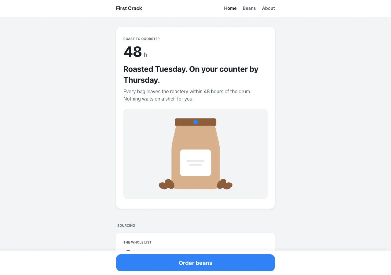
DESIGN.md
# Dose — Design System

## Concept

A roastery asks you to trust it, and most of them answer with atmosphere: burlap
texture, warm gradients, a hand-lettered promise about passion. **Dose** answers
with the opposite argument, borrowed whole from Toss — the Korean fintech whose
entire language reduces to one sentence: *trust comes from clarity, not depth.*
Toss earns confidence around money by showing one number, one action, and nothing
else. A roastery's trustworthiness is the same substance: it is the precision of
the recipe. So Dose rewrites First Crack Coffee Roasters as a **measuring app**.
48 hours from roast to shipped. 1,950 m of elevation. 18 g in, 36 g out. The
figures are not garnish on the prose — the figures *are* the prose.

Everything structural follows from that. A cool grey app floor with white cards
floating on it, separated by a contrast step rather than a border or a shadow.
Every card anchored by exactly one enormous tabular figure, set larger than any
heading on it. Exactly one action on the entire site — a 56px blue bar pinned to
the bottom of the viewport — and because blue appears nowhere else, blue *means*
"press this." Whitespace is the layout, not the leftover: when a card feels
crowded, an element is removed, never a margin.

The two inheritances that hurt are the ones that matter. Toss is an app language,
and its own reference is explicit that a web rendering is the mobile column
centered on the background field, **not** a re-gridded desktop layout — so Dose
is the only design in this brief with **no multi-column grid at any breakpoint**,
one 560px column all the way down on a 27-inch monitor. And Toss illustrates in
flat vector rather than shooting product — so Dose is the only design in this
brief with **no photography at all**. Soften either constraint and Dose becomes a
website. Dose is not a website. It is an instrument.

## Palette

| Token | Hex | Role |
| --------------- | --------- | ------------------------------------------------------------- |
| `--bg` | `#F2F4F6` | The app floor. Fills the viewport; every card floats on it. |
| `--canvas` | `#FFFFFF` | Card and app-bar surface — the thing content sits *on*. |
| `--canvas-soft` | `#F9FAFB` | Inset fills inside a card (illustration frame, zebra rows). |
| `--hairline` | `#E5E8EB` | 1px rule between list rows. The only border in the system. |
| `--blue` | `#3182F6` | THE action. Fill of the one CTA and of nothing else. |
| `--blue-press` | `#2272EB` | Pressed state of the CTA fill. |
| `--blue-wash` | `#E8F3FF` | Tinted field behind the CTA band. |
| `--blue-ink` | `#1B64DA` | The only blue that may hold text: in-copy links, focus ring. |
| `--brand-blue` | `#0064FF` | Documented, **never rendered**. The reference's marketing blue. |
| `--ink` | `#191F28` | Headings and every amount. The darkest ink in the system. |
| `--ink-strong` | `#333D4B` | Strong labels, non-numeric spec values. |
| `--grey-700` | `#4E5968` | Running body, eyebrows, spec labels. Legal on every surface. |
| `--grey-600` | `#6B7684` | Captions and unit suffixes — **white cards only**. |
| `--grey-500` | `#8B95A1` | Hairline/illustration fills. Never holds text. |
| `--grey-400` | `#B0B8C1` | Disabled fills. Never holds text. |
| `--on-blue` | `#FFFFFF` | The CTA label. |

Contrast law — measured against both surfaces a token can land on, not assumed:

| Token | on `#FFFFFF` | on `#F2F4F6` | Verdict |
| -------------- | ------- | --------- | -------------------------------------------- |
| `--ink` | 16.6:1 | 15.0:1 | Body-legal everywhere. |
| `--ink-strong` | 11.0:1 | 10.0:1 | Body-legal everywhere. |
| `--grey-700` | 7.1:1 | 6.5:1 | Body-legal everywhere. The safe floor. |
| `--blue-ink` | 5.4:1 | 4.9:1 | Body-legal everywhere (4.8:1 on `--blue-wash`). |
| `--grey-600` | 4.6:1 | **4.2:1** | Body-legal on white **only** — fails AA on the app floor. |
| `--blue` | 3.7:1 | 3.4:1 | **Never text.** It is a fill. |
| `--grey-500` | 3.0:1 | 2.8:1 | **Never text.** |
| `--grey-400` | 2.0:1 | 1.8:1 | **Never text.** |

Rules:

- **`--blue` is a fill, never a letter.** At 3.7:1 it cannot legally carry text, so
  the reference's habit of tinting links Toss-Blue is dropped: every blue word,
  link, and focus ring is `--blue-ink` (5.4:1). This is the one place Dose
  knowingly leaves the reference's token map, and it leaves *toward* the
  philosophy — clarity is the brand, so the brand has to be readable.
- **White-on-`--blue` measures 3.7:1, so the CTA label is 19px / 700** — clearing
  the WCAG large-text threshold (≥18.66px bold → 3:1). Its size and weight are
  load-bearing for contrast, not styling. Do not shrink it to 17px.
- **Never more than one blue element per section.** The pinned bar belongs to no
  section and is exempt; nothing else is. If two things inside one section are
  blue, the "what to press" signal is dead — delete one.
- **Nothing lighter than `--grey-700` holds text on the app floor**; `--grey-600`
  is confined to captions and unit suffixes inside white cards. The darkest ink is
  `#191F28` — `#000000` appears nowhere, and the whole ramp carries a blue
  undertone so the neutrals read cool rather than muddy.
- **The reference's semantic ramp is dropped entirely** — no success green, error
  red, warning amber. This site has no transactional states, and every hue not
  shipped is one fewer thing competing with the blue. **There is no blue chip
  either:** a chip is a fact, and facts are grey.
- **`--brand-blue` (`#0064FF`) is never rendered.** It is in the table only so
  nobody reaches for it thinking it is the interactive blue. `#0064FF` is a
  wordmark color; `#3182F6` is a button. Not interchangeable.

## Typography

One face, self-hosted. **Pretendard**, woff2 under `assets/fonts/`, via
`@font-face` with `font-display: swap`. No CDN, no Google Fonts `<link>`.
Pretendard is the documented open-source substitute for the reference's
proprietary Toss Product Sans: same geometric-humanist fintech character, near
identical metrics, and — critically — the tabular figures the whole system
depends on. The copy is English-only, so ship the Latin subset builds:
`Pretendard-Regular.subset.woff2` (400), `Pretendard-SemiBold.subset.woff2` (600),
`Pretendard-Bold.subset.woff2` (700). Three files, three weights, no more. (Inter
400 / 600 / 700 is an acceptable fallback if the subset is unavailable — a hair
less geometric, no other change.) Stack: `'Pretendard', -apple-system, system-ui,
sans-serif`.

| Role | Desktop | Mobile | Face |
| ------------- | -------------------- | -------------------- | ----------------------- |
| Amount | 48px / 1.1 / -1.2px | 40px / 1.1 / -1.0px | Pretendard 700 · `tnum` |
| Display XXL | 30px / 1.33 / -0.6px | 26px / 1.33 / -0.5px | Pretendard 700 |
| Display XL | 26px / 1.38 / -0.4px | 23px / 1.38 / -0.3px | Pretendard 700 |
| Heading L | 22px / 1.36 / -0.3px | 20px / 1.36 / -0.3px | Pretendard 700 |
| Heading M | 20px / 1.4 / -0.2px | 18px / 1.4 / -0.2px | Pretendard 600 |
| Subtitle | 16px / 1.5 / 0 | 16px / 1.5 / 0 | Pretendard 600 |
| Body L | 16px / 1.5 / 0 | 16px / 1.5 / 0 | Pretendard 400 |
| Body M | 14px / 1.57 / 0 | 14px / 1.57 / 0 | Pretendard 400 |
| Amount inline | 15px / 1.4 / -0.2px | 15px / 1.4 / -0.2px | Pretendard 600 · `tnum` |
| CTA label | 19px / 1.0 / 0 | 19px / 1.0 / 0 | Pretendard 700 |
| Caption | 12px / 1.5 / 0 | 12px / 1.5 / 0 | Pretendard 400 |
| Micro cap | 11px / 1.4 / +0.3px | 11px / 1.4 / +0.3px | Pretendard 600 |

Principles:

- **Three weights: 400 body, 600 emphasis, 700 headings and amounts.** No 300, no
  800. A fourth weight breaks the even, calm texture that makes the amounts read
  as *measurements* rather than as marketing.
- **The amount is the loudest thing on its card** — always larger than the heading
  above it, because in an instrument the number is the message.
- **Every figure is tabular.** `font-feature-settings: "tnum" 1;` on `.amount`,
  `.amount-inline`, and every `.spec-value`. It is what lets `1,950 m` and
  `1,400 m` align down a column, and what lets the hero counter run without the
  layout twitching. A figure without `tnum` is a bug.
- **Negative tracking on display only** (-0.2px to -1.2px). Body stays at 0.
- **The reference's Tossface emoji layer is dropped in full** — no emoji anywhere,
  not in copy, not as icons, not as bullets. That layer carried the brand's
  warmth; here the flat-vector illustrations carry it, and they carry it alone.

## Spacing & layout

- **8px base.** Tokens: 4 · 8 · 12 · 16 · 20 · 24 · 32 · 48.
- **One column, at every width.** `max-width: 560px`, centered on the `--bg` floor,
  **20px gutter** → a 520px content measure. It holds at 375px and at 2560px. The
  app bar and the pinned CTA plinth span the full viewport; their *contents* are
  constrained to the same 520px measure.
- **No multi-column content grid exists.** No `grid-template-columns` with more
  than one track, at any breakpoint, anywhere in `styles.css` — not for the three
  origins, not for the brew guide, not for the footer. Label/value spec rows are
  `display: flex; justify-content: space-between`: a row, not a grid. **If two
  cards ever sit side by side, the design is wrong.**
- **Rhythm:** 32px between cards, 48px between a section's last card and the next
  section's eyebrow. Card padding 24px; hero card 32px 24px.
  `body { padding-bottom: 96px }` so the pinned bar never covers the footer.
- **Radii are soft everywhere; 0px exists nowhere.** Chips 4px · illustration
  frames and standard cards 12px · hero card, CTA, and CTA band 16px · pips
  9999px.
- **Elevation has exactly two shadows.** Level 1 = a white card on the grey floor
  with **no shadow at all** — the contrast step does the separating. Level 2 =
  `0 2px 8px rgba(0,0,0,0.08)`, permitted **only** on the hero card. Level 3 =
  `0 -2px 12px rgba(0,0,0,0.06)` (upward), permitted **only** on the pinned CTA
  plinth. Nothing else casts a shadow — not a chip, a list row, an illustration,
  or a hovered card.

## Signature

Two elements. Each is the philosophy made structural, not a motif laid on top.

### 1. The amount-cell — one number per card

The load-bearing unit. An `.amount` is a **48px / weight-700 figure in `--ink`
with `tnum`**, tracking -1.2px, plus an optional unit suffix at 20px / 600 in
`--grey-600` on the same baseline. Above it, a Micro-cap eyebrow in `--grey-700`
names what is being measured; below it, the supporting prose.

The law: **every white card contains exactly one amount-cell, and nothing on that
card is typographically larger than it.** One card, one idea, one number. The
mapping to the brief's real figures is fixed:

| Page · card | Amount | Suffix | Eyebrow |
| ------------------------- | ------- | --------------- | -------------------- |
| index · hero | `48` | `h` | ROAST TO DOORSTEP |
| index · sourcing | `3` | `origins` | THE WHOLE LIST |
| index · roasting process | `2` | `roast days` | TUESDAY · THURSDAY |
| index+beans · Yirgacheffe | `1,950` | `m` | GEDEO ZONE, ETHIOPIA |
| index+beans · San Agustin | `1,700` | `m` | HUILA, COLOMBIA |
| index+beans · Kerinci | `1,400` | `m` | SUMATRA, INDONESIA |
| beans · pour-over | `15` | `g dose` | POUR-OVER |
| beans · espresso | `18` | `g in` | ESPRESSO |
| about · story | `2019` | — | FOUNDED |
| about · visit | `5` | `days a week` | WED–SUN, 08:00–15:00 |
| about · cupping | `10:00` | `every Saturday` | PUBLIC CUPPING |
| about · roast schedule | `2` | `roast days` | TUESDAY · THURSDAY |

The remaining facts do not vanish — they descend into the card's spec ladder as
`amount-inline` values. Espresso's `36 g out`, `28 s`, `93 °C` and pour-over's
`250 g`, `94 °C`, `3:00` live there, tabular and right-aligned.

**Exactly one card on the site has no amount-cell: the CTA band.** It carries no
figure because it is not a fact. It is the action.

**No origin is featured.** In this system, featuring something means making it
blue, and blue is the action. The three origins are three identical cards ordered
by elevation descending — 1,950 → 1,700 → 1,400 — so the number does the ordering
and no editor's thumb is on the scale. (A deliberate break from the other designs
in this brief, which promote San Agustin.)

### 2. The pinned CTA bar — one action, and it docks

A full-viewport-width `--canvas` plinth fixed to the bottom of the screen with the
Level-3 upward shadow, padded `12px 20px` plus `env(safe-area-inset-bottom)`.
Inside it, constrained to the 520px measure: a **56px, full-measure `--blue`
button, radius 16px**, label "Order beans" in `--on-blue` at 19px / 700. It
persists over the scrolling content on every page.

**It is the only action on the site.** No secondary button exists anywhere — no
"Read more", no "Visit us", no second CTA in the hero. Where another design puts a
secondary button, Dose puts a `--blue-ink` text link, or nothing.

**Docking.** A sentinel `#cta-dock` sits at the bottom of the column. On `index` it
*is* the CTA band (a `--blue-wash` block, radius 16px, padding 32px 24px: a Display
XXL line, one Body L line, and an identical 56px `--blue` button in flow). An
`IntersectionObserver` toggles `.is-docked` on the plinth when the sentinel's own
in-flow button enters the viewport: it slides down 24px, fades to 0 over 180ms, and
goes `pointer-events: none`. The floating bar and the in-flow button are the same
action in two states — the plinth stands down only because the button it duplicates
has taken the screen.

**A sentinel without a button is not a sentinel.** `beans` and `about` end in the
footer, and the footer carries no "Order beans" — so docking into it would hand the
action off to nothing. On those two pages the plinth therefore stays pinned all the
way through the footer, and only `index` ever docks. The rule is the handoff, not the
sentinel: **dock only into an element that carries its own in-flow action.** That is
what makes "exactly one 'Order beans' is visible at every scroll position on every
page" true — the doctrine, enforced by the DOM.

Destination `beans.html`; on `beans.html` itself the href becomes `#origins` — the
action does not change, only its destination goes local. There is never a second
action, and never zero.

## Components

- **Global app bar.** 56px, `--canvas`, `position: sticky; top: 0`, full-viewport;
  contents constrained to 520px. Left: wordmark "First Crack" in `--ink` 17px / 700,
  tracking -0.2px. Right: Home · Beans · About at 15px / 600 in `--grey-700`, 20px
  apart. **The active link is `--ink`, not blue** (plus `aria-current="page"`) —
  navigation is not the action. Borderless at rest; a scroll listener adds
  `.is-scrolled` → `border-bottom: 1px solid var(--hairline)` once a white card
  would otherwise slide invisibly beneath it.
- **Amount-cell.** Per Signature 1. `.amount` 48/700/`tnum`/`--ink`; `.amount-unit`
  20/600/`--grey-600`, baseline-aligned, 6px right; `.amount-eyebrow` 11/600/+0.3px
  uppercase `--grey-700`, 8px above. Transparent — no fill, no border, no chip.
- **Pinned CTA bar.** Per Signature 2. Press: fill → `--blue-press` over 100ms. No
  scale, no shadow change, no ripple.
- **Card (standard).** `--canvas`, radius 12px, padding 24px, **no shadow, no
  border** — it floats on `--bg` by contrast alone. Order inside: eyebrow →
  amount-cell → Heading M title → Body L prose (≤3 lines) → optional illustration
  frame → optional spec ladder. Used for sourcing, roasting process, each origin,
  each brew method, story, visit, cupping, roast schedule.
- **Card (hero).** `--canvas`, radius 16px, padding 32px 24px, the system's only
  Level-2 shadow. Holds the `48 h` amount-cell, a Display XL headline ("Roasted
  Tuesday. On your counter by Thursday."), one Body L line, and `index-hero`.
- **List row / spec ladder.** The workhorse. Rows stacked inside a card, separated
  by 1px `--hairline` rules (none after the last). Each row: `display: flex;
  justify-content: space-between; align-items: baseline; padding: 14px 0`. Label
  left in `--grey-700` at Body M; value right in `--ink` at Amount-inline
  (15/600/`tnum`), so every figure aligns down the card's right edge. Non-numeric
  values (an address, `medium-fine`) take the same slot at 15px / 600 `--ink-strong`.
- **Origin card.** Standard card: region eyebrow → elevation amount-cell → Heading M
  origin name → Body L tasting notes ("Jasmine, bergamot, dried apricot.") → two
  neutral chips (roast level, process) → the 1:1 illustration → on `beans.html`
  only, a spec ladder (Process · Elevation · Region · Roast · Tasting notes).
  Identical treatment for all three; only the data differs.
- **Brew spec card.** One per method; the two stack vertically (never side by side —
  see the layout law). Pour-over: amount-cell `15 g dose`; ladder = Water `250 g` ·
  Temp `94 °C` · Grind `medium-fine` · Time `3:00` · Ratio `1:16.7`. Espresso:
  amount-cell `18 g in`; ladder = Yield `36 g out` · Time `28 s` · Temp `93 °C` ·
  Ratio `1:2`. This card is where the design gets its name: the *dose* is the anchor
  and everything else is what follows from it.
- **Chip.** A fact, not an action. Fill `--bg` (the floor color reused as an inset on
  white), text `--grey-700`, 11px / 600 / +0.3px uppercase, radius 4px, padding
  4px 8px, 6px gap. `LIGHT ROAST`, `MEDIUM ROAST`, `DARK ROAST`, `WASHED`,
  `WET-HULLED`, `FREE`, `NO RESERVATION`. Never blue, bordered, or interactive.
- **Text link.** `--blue-ink`, 16px / 600, 1px underline at `text-underline-offset:
  3px`; hover thickens to 2px. A section's one permitted blue element, at most one
  per section ("See all three origins", "Read the story"). Focus: 2px solid
  `--blue-ink` outline, 2px offset.
- **CTA band (index only).** `--blue-wash` block, radius 16px, padding 32px 24px; the
  `#cta-dock` sentinel. Display XXL line in `--ink` ("Three origins. Two roast days.
  Forty-eight hours."), one Body L line in `--grey-700`, then the in-flow 56px
  `--blue` button. No amount-cell — the only card on the site without one.
- **Footer.** A `--canvas` card, radius 16px, padding 24px, last in the column. One
  stacked column, `--grey-700` at Body M: wordmark, `412 Foundry Lane, Portland,
  Oregon`, `Cafe Wed–Sun, 08:00–15:00`, `Roasting since 2019`, then the three nav
  links stacked at 2.0 leading. No link columns — the layout law applies here too.

## Motion

Calm and confident; almost nothing moves.

- **Press** is the only interaction feedback: the CTA fill darkens to
  `--blue-press` over 100ms `ease-out`. No scale, no lift, no ripple.
- **The hero counter.** The index hero's `.amount` counts 0 → 48 once on load over
  600ms `ease-out`. Because the figure is `tnum` its box never changes width while
  it runs — that width-stability is the entire reason tabular figures are
  mandatory, and this is where you can see it. **One counter per page, ever.**
- **The dock** (Signature 2): 180ms `ease-out` on `transform` and `opacity`.
- **Nothing else.** No parallax, no scroll-jacking, no reveal-on-scroll, no looping
  motion, no card hover lift (a lift needs a shadow, and cards have no shadow).
- `@media (prefers-reduced-motion: reduce)`: the hero amount renders at its final
  value immediately, the plinth docks by toggling `visibility` with no transform or
  transition, and every remaining transition is `none`. Press feedback becomes an
  instant color change.

## Image treatment

**No photography. Anywhere.** The reference illustrates in flat vector rather than
shooting product, so Dose does too — and this is the rule that makes Dose
recognizable at thumbnail size, because every other design in this brief is
photographic.

Every image is a **simple, rounded, friendly flat-vector illustration**: a single
subject, front-on or in a plain 2D side view, soft geometry, 4–8px rounded corners
on every shape. **No gradients. No skeuomorphism. No photorealism. No perspective,
no cast shadows, no texture, no stroke thinner than 2px.** Subjects sit on a
transparent or `#F2F4F6` field with ≥8% internal margin, inside a **12px-radius
frame** (`--canvas-soft` fill when the frame sits on a white card). Aspect: 16:10
for scene images, 1:1 for the three origins.

The nine share a **sealed palette** so they read as one set: `#191F28`, `#4E5968`,
`#D1D6DB`, `#E5E8EB`, `#F2F4F6`, `#FFFFFF`, plus two coffee tones — `#8C5E3C`
(roasted bean) and `#D8B08C` (kraft) — and **at most one `#3182F6` accent shape per
illustration**. No more than five fills per image. The coffee tones are
*image-only*: if a brown ever appears as a UI fill, a border, or a letter, the
design is wrong.

Needed images (referenced `./assets/<id>.png`):

- `index-hero` — a flat-vector kraft coffee bag standing front-on, its label a plain
  rounded rectangle, one small blue seal dot at the top, three beans at its base.
  Nothing else in frame. 16:10.
- `index-sourcing` — three flat-vector coffee cherries in a simple ascending row,
  soft rounded shapes on a `#F2F4F6` field, standing for exactly three origins.
  16:10.
- `index-process` — a drum roaster reduced to primitives: a circle drum, a
  rounded-rectangle body, a small hopper, one blue dial face. Front-on, no flame, no
  smoke realism; a single soft rounded curl of steam is allowed. 16:10.
- `origin-yirgacheffe` — a flat-vector jasmine sprig beside two pale beans; the
  lightest palette of the three (mostly `#D8B08C`, `#E5E8EB`, `#FFFFFF`), for the
  washed, 1,950 m, light-roast Ethiopian lot. 1:1.
- `origin-san-agustin` — a flat-vector plum and a cocoa nib beside two mid-brown
  beans, mid-tone palette, for the washed, 1,700 m, medium-roast Colombian lot. 1:1.
  Same frame, same weight, same treatment as its siblings — no promotion.
- `origin-kerinci` — a flat-vector cedar sprig and a chocolate square beside two
  darkest beans (heaviest use of `#8C5E3C` and `#191F28`), for the wet-hulled,
  1,400 m, dark-roast Sumatran lot. 1:1.
- `beans-brew` — a flat-vector pour-over cone on a carafe beside a small espresso
  cup, side view, one blue water stream as the single accent shape. 16:10.
- `about-space` — the 412 Foundry Lane roastery as flat architecture: a simple
  facade, a rounded doorway, a window, one awning. People-free, perspective-free.
  16:10.
- `about-cupping` — five identical cupping bowls in a straight row with one spoon
  laid across the front, flat and front-on; the row's evenness *is* the image. 16:10.

## Do / Don't

Do:

- Anchor every white card on exactly one amount-cell (48px / 700 / `tnum`), larger
  than any heading on that card.
- Keep the whole site to one 560px column on the `--bg` floor, at every breakpoint,
  on every page.
- Separate surfaces with the white-on-grey contrast step before reaching for a
  border or a shadow.
- Keep exactly one action on the site — the pinned `--blue` bar — and let it dock
  into the CTA band so one, and only one, "Order beans" is ever on screen.
- Give every figure `font-feature-settings: "tnum"`: elevations, hours, grams,
  seconds, temperatures, the year.
- Let the spec ladder carry the supporting facts, right-aligned to each other down
  the card's edge.
- Illustrate in flat vector from the sealed palette, one subject per frame.
- Remove an element when a card feels crowded.

Don't:

- **Never put two blue elements in one section.** If two things are blue, the "what
  to press" signal is dead. The pinned bar is exempt; nothing else is.
- **Never shrink a margin to fit an element — remove the element instead.**
  Whitespace is the layout, not the leftover.
- **No fourth type weight.** The ladder is 400 / 600 / 700. No 300, no 800, no
  decorative display face.
- **No pure black (`#000000`) anywhere.** The darkest ink is `--ink` (`#191F28`).
- **No sharp 0px corners anywhere** — not on a card, a button, a chip, an image
  frame, or the app bar. Nothing in this brand is hard-edged.
- **No money, weight, time, elevation, or temperature figure without `tnum`.**
  Jittering digits destroy the instrument.
- **No photography** — not a hero shot, not a texture, not a background.
- **Never conflate `--brand-blue` (`#0064FF`) with `--blue` (`#3182F6`).** The first
  is a wordmark color and is never rendered here; the second is the button.
- **Never set text in `--blue`, `--grey-500`, or `--grey-400`** — all three fail AA.
  Blue text is `--blue-ink`; the lightest text on the app floor is `--grey-700`.
- No multi-column grid, no side-by-side cards, no second accent color, no gradient,
  no card hover lift, no shadow outside the two permitted tokens.
- No emoji, and no icon standing in for a label.
- No "featured" origin, no badge, no highlight — the elevation figure orders the
  three, and that is the only ranking the page makes.