DESIGN.md
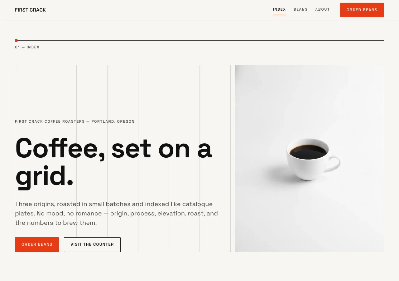
# Counter — Design System

## Concept

Most coffee sites sell a mood. Counter sells the facts, and lets the facts look
magnificent. It is a Swiss modernist poster for a coffee counter: objective,
systematic, confident. The International Typographic Style supplies the whole
grammar — a strict modular grid, one grotesque family doing every job, ruled
hairlines, oversized numerals, generous white space, and a single saturated
accent used like a marker on a technical drawing.

Where the other designs in this brief run warm and hand-kept — cream paper,
serif or stencil display, copper glow — Counter is the deliberate opposite:
bright, graphic, near-monochrome, and grid-forward. There is no texture, no
shadow, no romance. The three origins are not "featured products"; they are
catalogue entries — **01 / 02 / 03** — set on a grid you can sometimes see,
the way a rigorous exhibition catalogue numbers its plates.

The register is the technical catalogue, not the lifestyle feed. The coffee is
data — origin, process, elevation, roast, grams, degrees, seconds — and the
design's whole job is to set that data on a grid so cleanly that the rigor reads
as beauty. First Crack Coffee Roasters, indexed.

## Palette

Near-monochrome — bright canvas, near-black ink, two neutral grays — plus one
scarce vermilion. No blue, no gold (other designs own those).

| Token               | Hex       | Role                                                              |
| ------------------- | --------- | ---------------------------------------------------------------- |
| `--canvas`          | `#f7f6f2` | Bright off-white. Page floor, dominant surface. Not warm cream.  |
| `--panel`           | `#efeee9` | One-step panel fill. Table stripes, occasional flat blocks.      |
| `--ink`             | `#111111` | Near-true-black. Headlines, body, rules, grid lines, footer.     |
| `--slate`           | `#504d47` | Secondary text, sub-labels, meta values. AA on canvas (~7:1).    |
| `--stone`           | `#6b6862` | Captions, fine print, faint meta. AA on canvas (~5.1:1).         |
| `--rule`            | `#111111` | Primary 1px structural rules: dividers, table rules, nav base.   |
| `--grid`            | `#d8d6cd` | Faint 1px lines when the modular grid is deliberately exposed.   |
| `--hairline`        | `#e3e1d9` | Quiet in-panel dividers, input borders.                          |
| `--vermilion`       | `#e63b16` | THE accent. Index numerals, key markers, primary CTA, active nav.|
| `--vermilion-press` | `#c22f10` | Hover / active variant of vermilion.                             |
| `--on-ink`          | `#f7f6f2` | Canvas-tinted text on the ink footer / CTA band.                 |
| `--on-ink-soft`     | `#b8b5ac` | Secondary text on ink surfaces.                                  |

Rules:

- Canvas dominates. `--vermilion` never exceeds roughly 5% of any viewport. It
  appears as thin type (the index numerals), as small markers (an 8px square on
  a rule), as the active-nav underline, and as the single primary CTA fill —
  never as a large decorative fill or a colored panel.
- No gradients. No box shadows. Depth comes only from 1px rules, the `--panel`
  step, and white space. Flat design, full stop.
- The grid is a first-class visual: `--grid` lines are shown on purpose on the
  index catalogue and section openers; one rule per section is promoted to full
  `--ink` as the structural divider.
- On the ink footer / CTA band, text is `--on-ink`; vermilion still marks the
  one live element (a rule tick or link) and nothing more.

## Typography

One face, every job. Space Grotesk is a grotesque with distinctive, geometric
numerals — the reason it anchors both the UI and the oversized 01/02/03 index.
Self-hosted woff2 under `assets/fonts/` via `@font-face`; no font CDN.

- **Space Grotesk 700** — the poster voice: hero headline, section headlines,
  the index numerals when set in ink. Tight negative tracking at display sizes.
- **Space Grotesk 500** — titles, origin names, labels, buttons, the vermilion
  index numerals, active nav.
- **Space Grotesk 400** — running body, meta rows, table data. Use tabular
  figures (`font-variant-numeric: tabular-nums`) for every number so columns and
  the index align to the grid.

Type scale (desktop / mobile):

| Role          | Desktop        | Mobile        | Weight              |
| ------------- | -------------- | ------------- | ------------------- |
| Index numeral | 168px / 0.9    | 84px / 0.9    | 500, tabular        |
| Poster (hero) | 88px / 1.0     | 44px / 1.04   | 700                 |
| Display L     | 56px / 1.05    | 36px / 1.1    | 700                 |
| Display M     | 34px / 1.15    | 26px / 1.2    | 500                 |
| Title         | 20px / 1.35    | 18px / 1.4    | 500                 |
| Body          | 17px / 1.6     | 16px / 1.6    | 400                 |
| Data / meta   | 14px / 1.5     | 13px / 1.5    | 400, tabular        |
| Label         | 12px / 1.3     | 12px / 1.3    | 500, uppercase      |

Tracking: index numeral `-0.03em`, poster `-0.02em`, Display L `-0.02em`,
Display M `-0.01em`, Title/Body `0`, Label `+0.14em` uppercase. Everything is
**left-aligned**, always — no centered headlines anywhere, including the CTA
band. At most one poster/Display-L headline per viewport.

## Spacing & layout

The modular grid is the design. It is not a container hint; it is drawn.

- **Base unit 8px. 8px baseline grid** — every type block and rule snaps to it,
  so exposed grid lines and text share one rhythm.
- Content max-width **1280px**, outer margins 48px desktop / 20px mobile.
- **12 columns, 24px gutters** (desktop); collapse to 4 columns on mobile.
- **Modular fields**: horizontal field rules divide the page into rows a
  multiple of the baseline tall. Each origin index entry is one field. Section
  padding is 112px top/bottom desktop, 64px mobile — always a baseline multiple.
- **Visible-grid treatment**: on the index catalogue and each section opener,
  the column lines and the field's top rule are drawn in `--grid` (1px) so the
  scaffold shows. Exactly **one** rule per section is promoted to full `--ink`
  1px as the structural divider, and a single **8px `--vermilion` square** sits
  on that rule at the left margin as the section marker.
- Section dividers are 1px `--rule`, annotated at the left with a Label eyebrow
  sitting on the rule (`01 — INDEX`, `02 — BEANS`, `03 — ABOUT`) — a running
  catalogue index across the site.
- **Border radius 0 by default; 2px maximum** on buttons and tags. Images are
  square-cornered and aligned to their grid cell (no bleed outside the field).
- No box shadows, no gradients, no rounded panels. Alignment and rules carry all
  the structure.

## Signature: the numeric origin index

One element carries the identity: the three origins set as catalogue entries
**01 / 02 / 03**, each a full-width field on the visible modular grid.

- Each entry is a modular field opened by a 1px `--ink` top rule (the ruled
  hairline), with that field's column lines faintly exposed in `--grid`.
- **Columns 1–2**: the giant **Index numeral** (168px, Space Grotesk 500,
  tabular, `--vermilion`), baseline-aligned to the field's floor. This is the
  one loud thing on the page; vermilion lives here first.
- **Columns 3–7**: origin name (Display M, `--ink`) over a `--slate` meta stack
  in Data type — country / zone, process, elevation — each on its own baseline.
- **Columns 8–12**: tasting notes (Body), a roast-level Label, and on the beans
  page a square origin image aligned to the cell.
- Nothing else in the entry uses vermilion. The numeral does all the accent
  work; the rest is quiet ink and slate on canvas, so the index reads as a
  precise, oversized catalogue — Swiss exhibition plates, numbered.

On **index (home)** the three appear compact — numeral + name + one-line note,
a numbered list. On **beans** they expand to full-detail entries with images,
process, elevation, and the brew data below. The numbering is consistent across
both: 01 Yirgacheffe, 02 San Agustin, 03 Kerinci.

## Components

- **Grid nav.** Slim top bar on canvas, 1px `--rule` bottom line flush to the
  content grid. Wordmark left ("FIRST CRACK", Space Grotesk 500, tight). Page
  links right in Label style (INDEX · BEANS · ABOUT). Primary "Order beans"
  button at the far right. Active page gets a 2px `--vermilion` underline and
  `aria-current="page"`. The nav's left/right edges sit on the outer grid
  margins, exposing the structure from the first pixel.
- **Buttons.** Primary: solid `--vermilion` fill, `--on-ink` text, 2px radius,
  Space Grotesk 500; hover/active darkens to `--vermilion-press`. Secondary:
  `--canvas` fill, `--ink` text, 1px `--ink` border, 2px radius; hover flips to
  `--ink` fill with `--on-ink` text. On the ink CTA band the secondary inverts —
  1px `--on-ink` border, `--on-ink` text — never a light-on-dark fill.
- **Numeric origin index entry.** The signature, as specified above. The single
  most important component; every origin surface is built from it.
- **Brew-parameter table.** A strict Swiss table on `--canvas`, 1px `--rule`
  header underline and 1px `--hairline` row rules, optional `--panel` zebra.
  Columns left-aligned, values in tabular Data type so grams/degrees/seconds
  align vertically. Two tables — POUR-OVER and ESPRESSO — each opened by a Label
  eyebrow. Example rows:
  ```
  POUR-OVER
  DOSE        15 g
  WATER       250 g @ 94°C
  GRIND       medium-fine
  TIME        3:00 total
  RATIO       1:16.7

  ESPRESSO
  DOSE        18 g in
  YIELD       36 g out
  TIME        28 s
  TEMP        93°C
  RATIO       1:2
  ```
- **Visit info block.** For About: address, cafe hours (Wed–Sun, 8:00–15:00),
  and the free Saturday 10:00 cupping, set as a Label/Data spec list on the
  grid — key in Label, value in Data, one per field row, hairline between.
- **Roast schedule note.** "Roast days: Tuesday & Thursday · ships within 48h"
  as a Data line under a Label eyebrow; the two roast days may carry a small
  `--vermilion` square marker each — accent as annotation, not decoration.
- **Section marker.** The 8px `--vermilion` square + Label eyebrow sitting on a
  promoted ink rule that opens every major section.
- **Footer.** Full-width `--ink` band, `--on-ink` text, wordmark + the running
  index (01/02/03), column links, address. One `--vermilion` element only — the
  live "Order beans" link or a rule tick. The footer never inverts to canvas.

## Motion

Swiss work is static; motion is nearly absent. On load, each section's promoted
ink rule may draw once left-to-right (0.6s ease-out) and the index numerals rise
8px and fade in once, staggered 80ms — a single, quiet reveal of the grid. Hover
transitions are 100ms ease-out on color and the nav underline only. Nothing
loops, parallaxes, or drifts. Under `prefers-reduced-motion: reduce`, everything
renders complete and still — no draw, no rise, no fade.

## Image treatment

Clean, high-key, systematic — the catalogue plate, not the mood board.
Origin and product photography on neutral seamless backgrounds (paper-white to
light gray), bright even lighting, minimal shadow, objective framing. Beans,
bags, the pour-over kit, the counter — each shot square-on or plan-view and
cropped to sit exactly inside its grid cell. No filters, no overlays, no
gradients, no warm color grade, no bokeh, no hands-and-latte-art lifestyle.
Color stays true and high-key so images read as specimens indexed on the grid.

Needed images:

- `hero-cup.png` — index hero: a single white cup of black coffee, plan or 3/4
  view, on a bright neutral seamless background; high-key, catalogue-objective.
- `bags.png` — index/sourcing: a straight row of three plain labeled retail bags
  on seamless, evenly spaced like a shelf plate.
- `origin-01.png` — beans: Yirgacheffe light-roast beans, flat specimen shot on
  neutral seamless, top-down, even light.
- `origin-02.png` — beans: San Agustin medium-roast beans, same specimen system.
- `origin-03.png` — beans: Kerinci dark-roast beans, same specimen system.
- `brew-kit.png` — beans: pour-over kit (dripper, server, scale) arranged
  square-on on seamless, product-catalogue style.
- `counter.png` — about: the roastery counter / space shot straight-on in bright
  even light, architectural and high-key, no people.

## Do / Don't

Do:

- Anchor every page on the bright `--canvas`; keep it near-monochrome and let
  the grid and rules do the work.
- Set the origins as the numbered index 01 / 02 / 03 — the oversized numerals
  are the identity.
- Expose the modular grid on purpose: faint `--grid` lines, one promoted ink
  rule per section, an 8px vermilion marker on it.
- Use one grotesque (Space Grotesk) for everything; tabular figures for all
  numbers so they align to the grid.
- Keep vermilion scarce — numerals, markers, active nav, the single CTA. If it
  stops feeling rare, remove some.
- Left-align everything, including the CTA band.

Don't:

- No warm cream, no paper-green, no gold or blue — the canvas stays bright
  off-white, the accent stays vermilion.
- No serif, no second display family; Space Grotesk carries every size.
- No shadows, no gradients, no rounded panels; radius never exceeds 2px.
- No vermilion as a large fill or decorative sprawl; no colored panels.
- No centered headlines; no drifting, looping, or parallax motion.
- No latte-art lifestyle photography, no warm color grade, no textured paper.
- No emoji. No decorative icons doing a label's job.