DESIGN.md
# Charge — Design System

## Concept

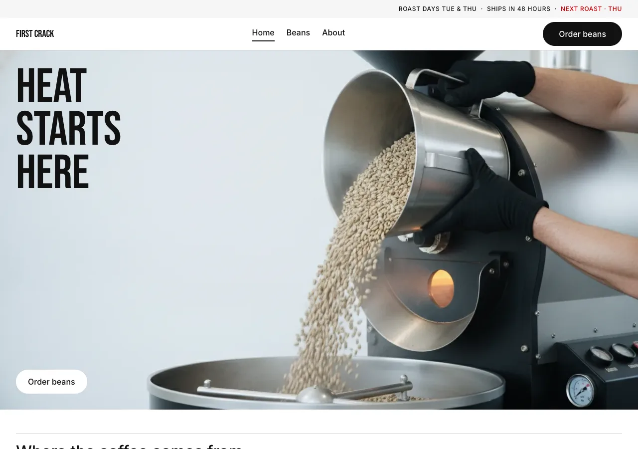
The argument underneath **Charge** is a division of labor: *photography speaks,
the chrome doesn't*. Everything expressive — heat, motion, the cascade of green
coffee into a hot drum — is spent inside the image. Everything outside the image
is reduced to mechanism: black, white, one gray, pill buttons, flat cards, an
8px grid. The site does not decorate. It stages a photograph and then gets out
of its way, and the discipline of the chrome is what gives the photograph its
force. A system that tries to be beautiful *everywhere* has nowhere left to
shout.

*Charge* is the roasting term for dropping green coffee into the hot drum — the
instant heat begins — and it is also an athletic word for a surge forward. That
double meaning sets the register: First Crack Coffee Roasters is presented as an
athletic campaign for a single moment. The structure is literally **a billboard
above, a catalog below**. A 96px uppercase condensed lockup is burned *into*
full-bleed photography, and the type ladder then falls off a cliff — straight to
32px section headers and 16px UI, with **nothing in between**. That empty gap is
not an oversight; it is the load-bearing element. Fill it and the billboard
becomes a headline and the whole effect collapses.

Charge is a **white** system, and this matters because it would be easy to
mistake "uppercase display type" for "nocturnal drama." It is not that. The
canvas is `#ffffff`, the stage is `#f5f5f5` soft-cloud, the light is daylight,
and the geometry is **pills** — every button in the system is a rounded capsule,
without exception. Black appears as a full-bleed surface exactly once per page,
as a single CTA band, and never as the page floor. The shout is a condensed
billboard burned into a bright photograph, not a name floating in a void. Where
a dark design builds tension out of absence, Charge builds it out of
**contrast** — 96px against 16px, ink against paper, one red word against a page
with no other color in it at all.

## Palette

| Token             | Hex       | Role                                                                    |
| ----------------- | --------- | ----------------------------------------------------------------------- |
| `--ink`           | `#111111` | True black. Primary CTA fill, all headlines, body text, active chip, CTA band. |
| `--canvas`        | `#ffffff` | Pure white. Every page background, on-image pill, inverse text on ink.  |
| `--soft-cloud`    | `#f5f5f5` | The studio floor. Every product photo's backdrop, utility bar, secondary pill, icon button. |
| `--charcoal`      | `#39393b` | Long-form body where full ink is too heavy. 11.5:1 on canvas.           |
| `--ash`           | `#4b4b4d` | Low-emphasis utility text. 8.7:1 on canvas, 8.0:1 on soft-cloud.        |
| `--mute`          | `#707072` | THE secondary text token: card subtitles, spec labels, footer links, breadcrumb. |
| `--stone`         | `#9e9ea0` | Inverse secondary text on `--ink` only. Fails AA on light — see Rules.  |
| `--hairline`      | `#cacacb` | 1px dividers: disclosure rows, filter rows, footer top rule, section rules. |
| `--hairline-soft` | `#e5e5e5` | The inset bottom-line under sticky strips. The system's only "shadow."  |
| `--signal`        | `#d30005` | The freshness signal. Text only, one job — see Rules. 5.6:1 on canvas.  |

Rules:

- **The single-chromatic-moment law.** `--ink`, `--canvas`, and `--soft-cloud`
  carry ~95% of the chrome. `--signal` (`#d30005`) is the **only** non-neutral
  color in the entire system, and it is bound to exactly one job: the
  roast-freshness signal — `NEXT ROAST · THU` and the roast-day markers
  (`TUE` / `THU`). It renders as **bare text with no container**. Never a
  background, never a badge fill, never a border, never an icon, never a
  headline, never a hover tint. In the reference this red is a *money* signal
  (sale price). Charge inherits the slot and the restraint and changes the fact:
  here it is a *time* signal. There are no prices on this site — do not invent
  any.
- **The signal appears at most once per fold**, and site-wide in exactly three
  places: the utility bar, the product card's freshness row, and the about
  page's roast schedule. Everywhere else, roast days are stated in `--mute`.
- **The roast ramp stays neutral.** The three roast-level dots (light / medium /
  dark) are *not* bean-brown. They are `--hairline-soft` → `--mute` → `--ink`, a
  grayscale value ramp. Introducing a warm brown would be a second chromatic
  moment, and the law above forbids it. The photography carries every warm tone
  on the page.
- **Contrast (measured, WCAG AA = 4.5:1 for normal text):**
  - `--mute` `#707072` → **4.94:1** on canvas, **4.53:1** on soft-cloud. **Body-legal on both.** This is the only secondary token permitted for essential text.
  - `--stone` `#9e9ea0` → **2.67:1** on canvas, **2.45:1** on soft-cloud. **Fails.** Permitted only as inverse secondary text on `--ink` (**7.06:1**). Never for essential text on a light surface.
  - `--signal` `#d30005` → **5.57:1** on canvas, **5.11:1** on soft-cloud. Legal as text on both, which is exactly why it is allowed to be text and nothing else.
  - `--hairline` and `--hairline-soft` are non-text tokens. They never carry type.
- **Never substitute a near-black for the ink.** The primary pill, the CTA band,
  and every headline are true `#111111`. `--charcoal` is a *body* token; it is
  never a CTA fill.

## Typography

Two faces, self-hosted as woff2 under `assets/fonts/` via `@font-face` — no font
CDN, no Google Fonts `<link>`. The reference's Futura ND and Helvetica Now are
proprietary and **must never appear in the built page**, not in a family
declaration and not in a fallback stack.

- **Bebas Neue 400** (SIL OFL) — the campaign tier. A free geometric condensed
  that carries the 96px uppercase lockup at line-height 0.9. Bebas is
  uppercase-only by design, which suits a tier that is uppercase-only by rule.
  **Tracking:** set `letter-spacing: -0.005em` at 96px to approximate Futura
  ND's tight optical fit at scale; relax to `0` at 48px, because condensed faces
  need their default air back at small sizes. Fallback: `"Arial Narrow",
  sans-serif`.
- **Inter 400 / 500** (SIL OFL) — all chrome. Nav, buttons, cards, captions,
  body, spec figures. Fallback: `system-ui, sans-serif`.
- **There is no bold in this system.** Inter runs at **400 and 500 only**. If
  something needs more weight than 500, it either belongs to the campaign tier
  or it does not deserve emphasis. Weights 600 and 700 are absent.

Type scale (desktop / tablet / mobile):

| Role            | Desktop      | Tablet      | Mobile      | Face            |
| --------------- | ------------ | ----------- | ----------- | --------------- |
| Campaign Lockup | 96px / 0.9   | 64px / 0.9  | 48px / 0.9  | Bebas Neue 400  |
| Wordmark        | 20px / 1.0   | 20px / 1.0  | 20px / 1.0  | Bebas Neue 400  |
| Section Header  | 32px / 1.2   | 28px / 1.2  | 26px / 1.2  | Inter 500       |
| Row Label       | 16px / 1.75  | 16px / 1.75 | 16px / 1.75 | Inter 500       |
| Body Strong     | 16px / 1.5   | 16px / 1.5  | 16px / 1.5  | Inter 500       |
| Body            | 16px / 1.5   | 16px / 1.5  | 16px / 1.5  | Inter 400       |
| Button          | 16px / 1.5   | 16px / 1.5  | 16px / 1.5  | Inter 500       |
| Link            | 16px / 1.75  | 16px / 1.75 | 16px / 1.75 | Inter 400, underlined |
| Caption         | 14px / 1.5   | 14px / 1.5  | 14px / 1.5  | Inter 500       |
| Chip / Badge    | 12px / 1.5   | 12px / 1.5  | 12px / 1.5  | Inter 500       |
| Fine print      | 12px / 1.3   | 12px / 1.3  | 12px / 1.3  | Inter 400       |

Principles:

- **The 96 → 32 cliff is the design.** There is no 24px tier, no 20px tier, no
  40px tier. The reference keeps a 24px heading; Charge deletes it deliberately.
  The jump from Campaign Lockup (96) to Section Header (32) to chrome (16) must
  be a cliff on every page. **If a new size is invented between 32px and 16px,
  the design is wrong.**
- **Bebas appears at exactly two scales**: the 96px lockup tier and the 20px
  wordmark. Nowhere else, ever — not a section header, not a card title, not a
  number in the brew guide.
- **Uppercase is not the house voice.** It belongs to the lockup tier, filter
  chips, badges, and the freshness signal (`+0.06em` tracking on the small
  uppercase runs). Section headers, card titles, and body are **sentence case**.
  Charge shouts in one voice only — the billboard — and speaks plainly in all
  the others.
- **Letter-spacing is 0** everywhere except the lockup (`-0.005em`) and small
  uppercase runs (`+0.06em`). Inter is cut for a tight optical fit; leave it
  alone.
- **Numerals are tabular.** Every figure — 15 g, 250 g, 94°C, 28 s, 1,950 m —
  uses `font-variant-numeric: tabular-nums` so values align down a spec column.
- The reference sets its legal fine print at 9px. Charge raises it to 12px. Nine
  pixels is below the legibility floor; this is the one place the reference is
  overruled.

## Spacing & layout

- **8px base unit.** Tokens: 2 · 4 · 8 · 12 · 16 · 24 · 32 · 48.
- **Section rhythm: 48px** between major blocks (desktop), 32px tablet, 24px
  mobile. Sections **butt directly against each other** — there is no decorative
  band, no divider ornament, no extra air at a boundary.
- **Whitespace is a tool for separation, not for breath.** Photographs tile
  edge-to-edge inside their grid with 8px gutters (4px on mobile). The "air" on
  the page is the `--soft-cloud` inside the photograph, not layout margin. A
  section header sits **immediately** under its 1px `--hairline` section rule
  (16px gap, no more). Never add empty space above a headline to "let it
  breathe" — that is the opposite of this system.
- **Container:** content max-width 1440px; outer gutters grow toward 80px at
  1920px+ (wide viewports breathe rather than stretch). Full-bleed campaign
  tiles and the CTA band break the container and run edge-to-edge.
- **Grid collapse:** origins grid 3-up desktop → 2-up at 1023px → 1-up at 599px.
  Gutters 8px → 4px at mobile. Disclosure rows are always full-width single
  column.
- **Card internal padding is 0px.** The image is full-bleed inside the card and
  metadata sits directly beneath it with 8px between rows. This is non-negotiable
  (see Signature 2).
- **Radius scale:**

| Token      | Value    | Use                                                                      |
| ---------- | -------- | ------------------------------------------------------------------------ |
| `--r-none` | `0px`    | Every container: cards, campaign tiles, images, nav, utility bar, footer, CTA band. |
| `--r-md`   | `24px`   | Text-input pill (the site ships no search field; if one is ever added, this is its radius). |
| `--r-lg`   | `30px`   | Every CTA pill and filter chip.                                          |
| `--r-full` | `9999px` | Roast-level dots and circular icon buttons.                              |

## Signature

Two elements, both direct translations of the reference's own signatures.

### 1. The campaign lockup

A **96px uppercase Bebas Neue** headline, line-height **0.9**, burned **into**
full-bleed photography — not above it, not beside it, not in a caption bar under
it. It sits *on the image*, in whichever of `--canvas` or `--ink` reads against
that particular photograph (chosen per asset, never parameterized). Copy is 2–4
short words, stacked 2–3 lines: `HEAT / STARTS / HERE`. When a tile carries both
a lockup and a pill, the **lockup takes the upper-left third and the pill keeps
bottom-left**; when it carries only a lockup, the lockup may take the lower-left
third instead.

The lockup is why the type ladder has a hole in it. 96px directly above 32px and
16px produces the "billboard above, catalog below" reading — the page feels like
a printed campaign poster stapled over a parts catalog. **Never place two
campaign lockups at the same scale in one row.** A full-bleed editorial tile
always alternates with a product/category grid or a stack of disclosure rows.

### 2. Pill geometry and the flat photographic card

Two shapes, and they are opposites.

**Every actionable thing is a pill.** CTA, filter chip, badge, input: radius
`--r-lg` (30px) or `--r-full`. Icon controls are circles. **There is no
square-cornered button anywhere in this system** — pill or circular-icon is the
entire button vocabulary, and a third shape must not be introduced. Hierarchy is
two-tone: **black pill** (primary) → **soft-cloud pill** (secondary) → **crisp
white pill** (on photography). Never two blacks in one fold: the nav already
spends the fold's one black on its `Order beans` pill, so the CTA on the hero
image is always the white pill.

**Every card is flat and square.** Radius `0`, internal padding `0`, shadow
none. The photograph *is* the card — it runs full-bleed to the card's edges on
its `--soft-cloud` plate, and the metadata sits directly beneath it with 8px
gaps. No border, no lift, no rounded corner, no hover elevation.

**The shadow law.** Any `box-shadow` in the stylesheet must have **0 blur and 0
offset**. There are exactly two in the whole system: the inset bottom-line under
sticky strips (`box-shadow: inset 0 -1px 0 var(--hairline-soft)`) and the
concentric ring on the selected roast dot (`box-shadow: 0 0 0 2px var(--canvas),
0 0 0 4px var(--ink)`). Both are *rings and rules*, not elevation. **If a shadow
in this system has a blur radius, the design is wrong.**

## Components

- **Utility bar.** Full-width `--soft-cloud`, 36px tall, radius 0, no border.
  Right-aligned Chip/Badge text (12px / 500 / uppercase / `+0.06em`) in `--ink`:
  `ROAST DAYS TUE & THU · SHIPS IN 48 HOURS ·` then the freshness signal
  `NEXT ROAST · THU` in `--signal` as bare text. Not sticky; it scrolls away.
- **Primary nav.** Full-width `--canvas`, 56px tall (64px desktop), radius 0,
  1px `--hairline` bottom rule. Left: `FIRST CRACK` wordmark, Bebas Neue 20px
  uppercase `--ink`. Center: `Home · Beans · About` in Body Strong `--ink`, 24px
  apart. Right: the black **Order beans** pill (→ beans page). The active nav
  item gets a **2px `--ink` bottom underline** and `aria-current="page"` — no
  background fill, no pill, no color change. At ≤960px the center cluster
  collapses into a circular icon button (hamburger) that opens a full-height
  left drawer; drawer rows use 24px vertical padding and Body Strong.
- **Campaign tile.** Full-bleed photography, radius 0, zero padding, no overlay
  gradient. Carries one campaign lockup and at most one **white pill** anchored
  bottom-left at 32px inset — the system's universal shop-this-image position.
  A `--ink`-filled variant (no photograph) exists for the CTA band: white lockup,
  white pill, full-bleed. **`--ink` may fill a full-bleed surface exactly once
  per page.** If a second black band appears on a page, one of them is wrong.
- **Product card (origin card).** Container `--canvas`, radius 0, padding 0, no
  shadow, no border. Anatomy, top to bottom, 8px between rows:
  1. **Image:** 1:1 origin photograph, full-bleed, on a `--soft-cloud` plate.
  2. **Roast dot row:** three 12px circles, `--r-full`, in the neutral roast ramp
     — light `--hairline-soft`, medium `--mute`, dark `--ink` — with 8px between
     them. The light dot carries a 1px `--hairline` outer ring so it stays
     visible on `--canvas`.
  3. **Origin name:** Body Strong (16 / 500) `--ink` — "Yirgacheffe".
  4. **Subtitle:** Caption (14 / 500) `--mute` — "Washed · Ethiopia · Light roast".
  5. **Freshness row** (the slot the reference gives to price): elevation in Body
     Strong `--ink` with tabular numerals ("1,950 m"), then `NEXT ROAST · THU` in
     `--signal` at Caption size, uppercase, no container.
  On the beans page each card gains a compact spec list below the freshness row:
  `Process`, `Elevation`, `Region`, `Notes` as label/value pairs in Caption —
  label `--mute` left, value `--ink` right, 1px `--hairline` under each.
- **Roast-level swatch ring (selected state).** The active roast dot keeps its
  12px size and takes the concentric ring: `box-shadow: 0 0 0 2px var(--canvas),
  0 0 0 4px var(--ink)` — a 2px white interior gap inside a 2px ink outer ring.
  **No size change, no fill change** between default and selected. This ring is
  the single most distinctive mark carried over from the reference; do not
  replace it with an outline, a scale, or a checkmark.
- **Primary pill CTA.** `--ink` fill, `--canvas` text, Button type, padding
  `16px 32px`, height 48px, radius `--r-lg`. One per fold. Label: **Order beans**
  (→ beans page).
- **Secondary pill CTA.** `--soft-cloud` fill, `--ink` text, same type, padding,
  height and radius. The lower-emphasis partner when a primary already exists —
  e.g. "Read the story" beside "Order beans".
- **On-image pill CTA.** `--canvas` fill, `--ink` text, padding `12px 24px`,
  radius `--r-lg`. The crisp white pill anchored bottom-left of every campaign
  tile and of the `--ink` CTA band.
- **Circular icon button.** `--soft-cloud` fill (or transparent on photography),
  `--ink` glyph, `--r-full`, 40px — with padding extending the hit target to
  48px. Used for the mobile menu toggle and the disclosure chevron. Icons are
  1.5px stroke line icons, never filled shapes, never emoji.
- **Filter chip.** Beans page, above the grid: `All · Light · Medium · Dark`.
  Default `--canvas` fill, 1px `--hairline` border, `--ink` text at Chip size
  uppercase, radius `--r-lg`, padding `8px 16px`, height 40px. **Active flips
  fully inverted**: `--ink` fill, `--canvas` text, no border. There is no middle
  state and no hover fill.
- **Sub-nav strip** (beans page, under the primary nav). `--canvas`, radius 0,
  `box-shadow: inset 0 -1px 0 var(--hairline-soft)`. Left: breadcrumb
  `Home / Beans` in Caption `--mute`. Right: the filter chip row.
- **Disclosure row.** The workhorse of the lower half of the site. Full-width,
  `--canvas`, radius 0, **24px vertical padding**, 1px `--hairline` beneath each
  row. Label left in Row Label (16 / 500) `--ink`; value right in Body with
  tabular numerals; a chevron replaces the value when the row expands. Used for:
  - **Brew guide — Pour-over:** `Dose 15 g` · `Water 250 g` · `Temperature 94°C`
    · `Grind medium-fine` · `Time 3:00` · `Ratio 1:16.7`.
  - **Brew guide — Espresso:** `Dose 18 g in` · `Yield 36 g out` · `Time 28 s` ·
    `Temperature 93°C` · `Ratio 1:2`.
  - **The roast** (index): `Charge` · `First crack` · `Drop` — the three stages,
    each with a one-line description on the right.
  - **Visit** (about): `Address 412 Foundry Lane, Portland, Oregon` ·
    `Cafe hours Wednesday–Sunday, 8:00–15:00` · `Cupping Saturday 10:00`.
  Each group is titled by a Section Header sitting immediately under a 1px
  `--hairline` section rule.
- **FAQ row block** (about page, the Saturday cupping). Identical geometry to
  the disclosure row — 24px padding, 1px `--hairline` beneath — with an expanding
  answer in Body `--charcoal`. Three rows: "Do I need to reserve a seat?" (No —
  it is free and open, no reservation), "What happens at a cupping?", "How long
  does it take?". The circular icon button carries the chevron at the right.
- **Roast schedule** (about page). A row group where the roast-day markers
  `TUE` and `THU` render in `--signal` uppercase Caption as bare text, beside
  `Orders ship within 48 hours of roast` in Body `--charcoal`, and closing with
  the freshness signal `NEXT ROAST · THU`. The only red on the page.
- **Footer.** `--canvas` with a single 1px `--hairline` top rule, radius 0. Three
  columns — *Coffee* (Origins, Brew guide, Order beans), *Visit* (412 Foundry
  Lane, Cafe hours, Saturday cupping), *Roastery* (Our story, Roast days,
  Sourcing) — headers in Body Strong `--ink`, links in Caption `--mute`. Beneath,
  a horizontal `--hairline` rule and a fine-print row: `First Crack Coffee
  Roasters · Roasting in Portland since 2019` in Fine print `--mute`. The footer
  states the roast days in `--mute`; it does **not** repeat the red signal.
- **Focus.** Every interactive element takes `outline: 2px solid var(--ink);
  outline-offset: 2px;` on `:focus-visible` — flipping to `var(--canvas)` on
  `--ink` surfaces and on photography. Never remove the outline.

## Motion

The reference's press feedback is a **tap-collapse**, not a tint: on `:active`
the surface *shrinks and half-vanishes* at once. Charge keeps it —
`transform: scale(0.97); opacity: 0.5;` over **100ms ease-out** on every pill,
chip, and circular icon button. (The reference's raw token reads `scale(0.5)`,
which is an overlay artifact; applied literally to a 48px pill it would make the
button disappear under the thumb. The scale is tuned to 0.97 so the pill *dents*
— but the half-opacity drop is kept verbatim, because the simultaneous shrink and
fade is what makes the press read as a collapse rather than a highlight.)

Everything else: 120ms ease-out color transitions on links and chip inversion,
and nothing more. **The campaign lockup never animates** — it is burned into the
photograph, and burned-in things do not move. No parallax, no scroll-jacking, no
counters, no reveal-on-scroll, no looping motion, no image zoom on hover.

Under `prefers-reduced-motion: reduce`, all `transform` and all transitions are
removed: every element renders in its final state, and the press feedback becomes
an instant `opacity: 0.5` step with no scale and no easing.

## Image treatment

Photography-first, athletic, cinematic — and there are **exactly two classes of
image** in the system. A third class must not be introduced.

**Class A — the full-bleed campaign crop.** 16:9 or wider on desktop,
art-directed to 4:5 on mobile so the subject stays centered and the lockup keeps
its burn-in space. Bright, high-key daylight; steel, white, steam, motion. Fast
shutter, real motion frozen mid-air — falling beans, a pour hitting the bed, the
trier pulled from the drum. Human energy is welcome; posed lifestyle warmth is
not. Each crop must contain a **clean zone** in the upper-left third (or
lower-left) with enough tonal uniformity for a 96px lockup in white or ink to
read. No overlay gradient, no scrim, no vignette — if the lockup does not read,
re-crop the photograph; do not darken it.

**Class B — the 1:1 soft-cloud product plate.** The bag, the beans, the kit,
photographed flat-on against `#f5f5f5` under even, diffuse light. No props, no
burlap, no scattered spoons, no wooden table, no gradient backdrop, no cast
texture. The gray is the studio floor, and the point of it is that **the product
is the only thing in the frame with form**. The plate's gray must match
`--soft-cloud` so the photograph is continuous with the card it sits on.

Forbidden in both: latte art, smiling-customer stock, warm sepia grading, filter
grain, rounded frames, brown backdrops.

Needed images (referenced `./assets/<id>.png`):

- `index-hero` — **Class A, full-bleed campaign crop.** The charge itself: hands
  tipping a steel hopper of green coffee into the open drum mouth, beans frozen
  mid-fall, heat shimmer rising off the steel, bright daylight roastery, high
  key. Wide 16:9. Upper-left third open and light for an **ink** lockup.
- `index-sourcing` — **Class B, 1:1 soft-cloud plate.** Raw green coffee: a
  single handful spilled onto the gray, hard-edged and evenly lit, every bean
  distinct. Nothing else in the frame.
- `index-process` — **Class A, full-bleed campaign crop.** Roasted beans mid-
  tumble inside the drum, seen through the open trier port; the trier itself
  pulled and held, beans cascading off it. Daylight, steel, sharp. 16:9, with a
  darker left third for a **white** lockup.
- `origin-yirgacheffe` — **Class B, 1:1 soft-cloud plate.** A sealed First Crack
  bag with a light-roast scatter of pale, dense Yirgacheffe beans on `#f5f5f5`.
  Washed, Ethiopia; jasmine, bergamot, dried apricot. Cool, dry, matte beans.
- `origin-san-agustin` — **Class B, 1:1 soft-cloud plate.** Same staging, same
  gray, same light: medium-roast beans, mid-brown, faint sheen. Washed,
  Colombia; caramel, red plum, cocoa nib. **No featured treatment** — the plate
  is identical to its siblings.
- `origin-kerinci` — **Class B, 1:1 soft-cloud plate.** Same staging: dark-roast
  beans, deep and oily, visible surface gloss. Wet-hulled, Sumatra; dark
  chocolate, cedar, molasses.
- `beans-brew` — **Class A, full-bleed campaign crop.** A pour-over mid-pour:
  the water column hitting the coffee bed, bloom rising, gooseneck kettle in
  frame, bright and clean against a white wall. 16:9, clean zone lower-left for
  an **ink** lockup.
- `about-space` — **Class A, full-bleed campaign crop.** The 412 Foundry Lane
  roastery: an architectural, people-free interior — the drum roaster, the
  concrete floor, tall windows, hard daylight. Wide, cinematic, cool. Carries the
  white on-image pill at bottom-left.
- `about-cupping` — **Class B, 1:1 soft-cloud plate.** The Saturday cupping laid
  out on `#f5f5f5`: a row of cupping bowls and spoons, perfectly aligned,
  overhead, even light, still and clinical.

## Do / Don't

Do:

- Burn the 96px Bebas lockup **into** full-bleed photography, in white or ink,
  and reserve that tier for campaign moments only.
- Keep the type ladder a cliff: 96 → 32 → 16, with the middle deliberately empty.
- Stage every product photograph on `--soft-cloud` (`#f5f5f5`) — the gray is the
  system's studio floor.
- Keep every button a pill (`--r-lg` 30px) or a circle (`--r-full`). Two-tone
  hierarchy: black pill, soft-cloud pill, white pill on photography.
- Let cards be the photograph: radius 0, padding 0, no shadow, metadata directly
  beneath with 8px gaps.
- Give the selected roast dot the concentric ring — 2px ink outer ring, 2px white
  interior gap, no size change.
- Butt sections against each other at the 48px rhythm; put a section header
  immediately under its hairline rule.
- Spend `--signal` (`#d30005`) on the roast-freshness text and nothing else.
- Alternate one full-bleed editorial tile with a grid or a stack of rows.

Don't:

- **No square-cornered button, ever.** Pill or circular-icon is the entire button
  vocabulary. A third button shape is a bug.
- **No middle type tier between 32px and 16px.** No 24px heading, no 20px lead.
  If a size is needed there, the layout is wrong, not the scale.
- **No drop shadow and no card elevation.** Every `box-shadow` must have 0 blur
  and 0 offset; the only two are the inset sticky rule and the swatch ring. Cards
  sit flat.
- **No padding inside product cards.** The image is full-bleed and the metadata
  sits directly below it.
- **`#d30005` never becomes a background, a badge fill, a border, an icon, or a
  headline.** It is the roast-freshness signal, as text, and nothing else. No
  second chromatic color is added — no coffee-brown, no amber, no green.
- **Never substitute a near-black gray for the ink.** The primary pill, the CTA
  band, and the headlines are true `#111111`.
- **Never place two campaign lockups at the same scale in one row**, and never
  two black surfaces in one fold — the nav's black pill already spends the hero
  fold's black, so the on-image CTA is white.
- **`--ink` fills a full-bleed surface exactly once per page** (the CTA band). It
  is never the page floor. Charge is a white system.
- **No underline** except inline links and the active nav indicator. Buttons,
  headings, card titles, and spec values stay un-underlined.
- No `--stone` (`#9e9ea0`) as essential text on a light surface — it fails AA
  there and is inverse-only.
- No decorative air: no empty band above a headline, no padding added "to let it
  breathe," no gradient, no texture, no ornament.
- No emoji, no decorative icons doing a label's job, no bold Inter (400/500 only).