DESIGN.md
# Spec — Design System

## Concept

**An image API you configure the way you spec a car.** A white canvas, one
corporate blue as the single thing that acts, rectangular 0px corners on every
surface, and one heavy-700 headline weight standing against a thin-300 body —
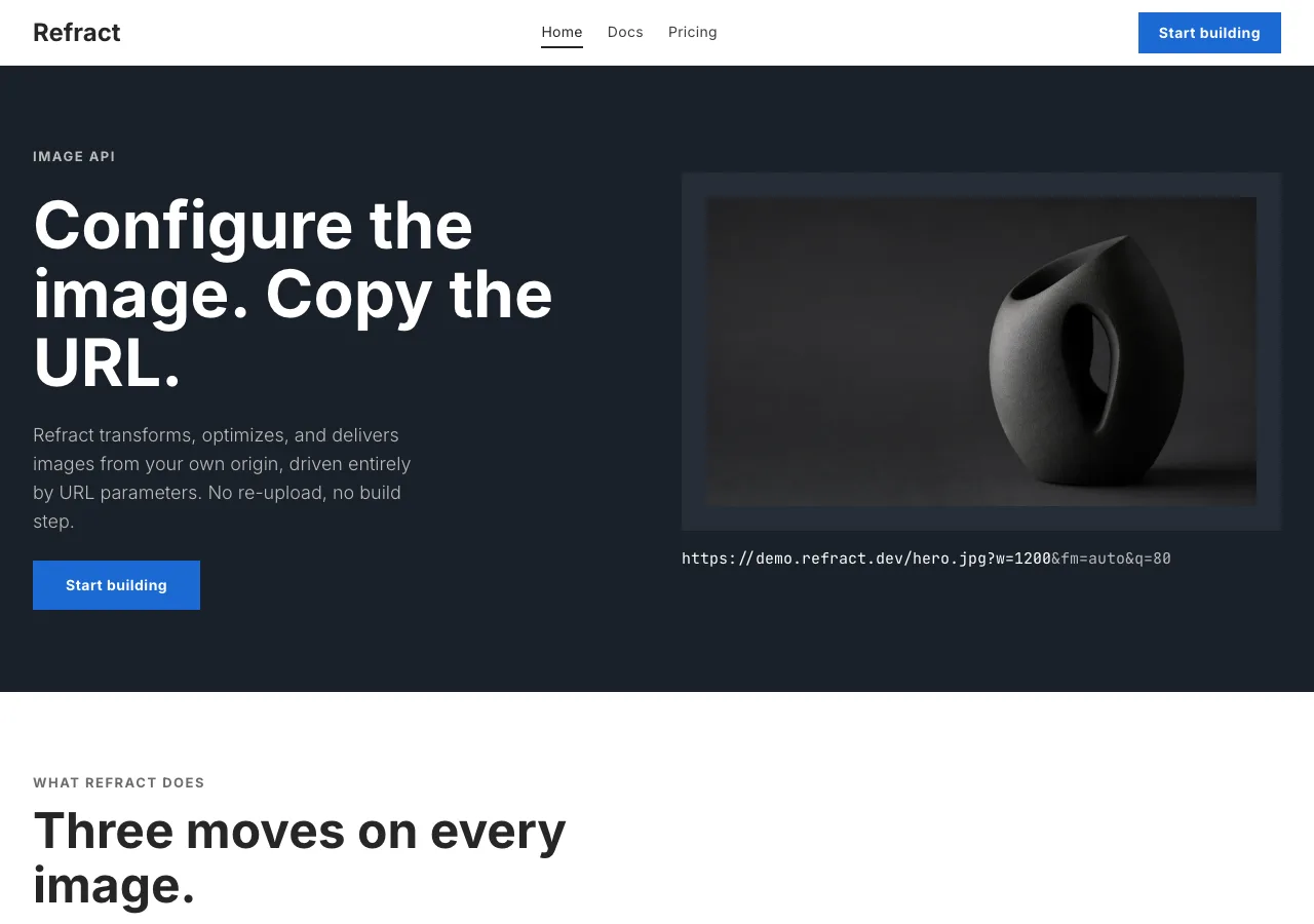
and a hero that is not a slogan but an **instrument**: a rack of option-tiles you
click to set `w` `h` `fit` `crop` `rot` `blur` `bg`, with the picture and the URL
answering in the same frame. You do not read this page; you configure it.

Spec starts from the calmest, most engineered marketing surface a mass-market
manufacturer ships — a corporate-automotive site that has decided, deliberately,
not to shout. Its whole hierarchy runs on two type weights: a heavy display cut
for every headline, button, and label, and a thin body cut for every paragraph,
with the middleweight (500) simply left out of the system. It spends exactly one
brand color, a single flat blue, on every primary action and nothing else. Its
surfaces are rectangles with hard 0px corners, never a pill and never a soft
radius. It carries no drop shadow anywhere; depth comes from one dark-navy band
per page dropped into an otherwise white sequence, and from studio photography of
the product itself. And its most literal object is a **configurator** — the panel
where a buyer picks paint, wheels, and trim from tiles, watches a render update,
and reads the resulting spec back as a column of big numbers over small uppercase
labels.

Point that language at a URL-driven image API and it fits almost without
alteration, because **an image transform is a configuration**. The ten
parameters are the options. The query string is the build sheet. The rendered
plate is the car on the turntable. The reference already knew how to let a buyer
assemble a product from tiles and read its specification back as numbers; this
design changes the nouns and keeps the machine. What transfers, intact: the white
canvas, the one flat blue (`#1c69d4`) as the only thing that converts, the 0px
rectangle on every button and card and input and tile, the 700-against-300 weight
contrast as the entire editorial voice, the one dark-navy band per page, the
required light → dark → light rotation, the total absence of shadow, the
UPPERCASE letter-spaced inline link (the reference's "LEARN MORE ›" becomes
"OPEN ›" and "COPY URL ›"), the option-tile, the spec-cell, and the model-card
photo-plate grid. The reference's licensed face (BMW Type Next Latin) is
substituted, exactly as its own analysis directs, by **Inter** at 700/300. That
lineage is named in this document and **nowhere else**: the built page carries
only the product's own name, **Refract**, in English.

One thing is **cut**, and cutting it is a palette decision, not a timid one. The
reference reserves a tricolor stripe — blue, blue, red — for its motorsport
sub-brand, and keeps it out of the corporate flow entirely. Spec drops it
**completely**, and does not even keep it as a rare divider, for two reasons that
are the same reason: it carries a second and a third hue (a lighter blue and a
signal red), and admitting any of that stripe — even one 4px rule — would break
the single discipline this whole design is built to hold, which is that **there
is one blue and there is no other brand hue anywhere.** Refract has no motorsport
context to earn the stripe. It stays off the page.

The eight designs under this brief take these same ten parameters to eight
different places, and Spec's two nearest neighbors are the other two light ones —
so the line gets drawn hard against both. **`aperture`** (from Airbnb) is the
other light-and-photographic design, and it is the soft one: every corner is
rounded, its hero is a single 9999px **pill** URL-builder bar, its one voltage is
a **red**, and it permits itself **one shadow tier**. Spec is its exact opposite
on each of those axes — every corner is a hard **0px rectangle**, its hero is a
**rack of option-tiles** not a pill, its one voltage is a corporate **blue**, and
it carries **no shadow at all**. Where aperture is soft, warm, and quiet, Spec is
hard, cool, and engineered. **`prism`** (from Vercel) is the other light-and-
technical design, and it is the one Spec is most often confused with — both are
near-white pages with a mono voice for the URL and a blue in the palette. The
divergence is total once you look: prism's blue is a **link** and nothing
converts on it (its CTA is a black **100px pill**); Spec's blue is the **only**
action color and every CTA is a blue **0px rectangle**. Prism's one piece of
color is a **multi-hue refraction gradient**; Spec has **no gradient** and one
flat blue. Prism's depth is a **stacked soft shadow** and a polarity-flipped dark
band; Spec has **no shadow** and a dark band that is navy, not black. Prism caps
its display weight at **600 and forbids bold**; Spec's entire signature is a
**heavy 700** headline. Prism tracks its display **aggressively negative**; Spec
tracks display at **exactly 0**, because the reference's face is wide and
tightening it reads as a different, borrowed brand. If prism is the platform that
stays calm, Spec is the machine that stays precise.

Two further siblings brush against Spec and must be held off. **`cutaway`** (from
Dyson) also sets big specification numbers, and if Spec's spec-cells drifted dark
they would start to converge — so the divider is stated: cutaway is a **dark
graphite** page with **magenta-and-cyan** voltage and exploded-photo diagram
planes, its readouts at **88px**; Spec is a **light corporate** page with **one
blue**, its spec-cells on white with hairline dividers, its numbers sized to a
spec sheet and not an instrument cluster. **`folio`** (from Wired) is the other
square-cornered design, and 0px corners alone could read as shared — but folio is
a **serif print magazine** with display at **weight 400**, an exposed column
grid, and hairline rules used as ornament; Spec is a **sans configurator** with
display at **weight 700**, a blue action color, and hairlines that carry no
meaning at all. Square corners are common vocabulary; everything built on them
diverges.

Where the reference has no answer, the answer is the browser. The brief promises
a live before/after transform, and this page delivers one honestly — the
option-tiles are wired to the plate through `object-fit`, `object-position`,
`transform`, `filter`, and a background color, so the seven parameters a browser
can genuinely apply (`w` `h` `fit` `crop` `rot` `blur` `bg`) mutate the picture in
the same frame as the click and rewrite the URL beneath it. The three that a
browser cannot apply — `fm`, `q`, `dpr`, which are format negotiation and
server-side re-encoding — ride the URL string, each tagged, and the demo names
them without pretending to run them. **No byte count is invented, no file-size
counter animates, no latency the brief did not supply is printed.** The tiles are
wired, not drawn; a tile that moves and changes nothing on the plate is a tile
that has been faked.

## Palette

White canvas, near-black ink, one dark navy for the band, and **one blue**. The
reference spends exactly one brand color and reserves its tricolor stripe for a
sub-brand; Spec spends the one blue and drops the stripe, so the entire page is
white, ink, navy, and blue — no second hue exists.

| Token                 | Hex       | Role                                                                             |
| --------------------- | --------- | -------------------------------------------------------------------------------- |
| `--canvas`            | `#FFFFFF` | Pure white — the page floor, every card and plate surface, the nav, the input.   |
| `--surface-soft`      | `#F7F7F7` | The one tonal step — the demo band, the overage band, the footer, code fills.     |
| `--surface-card`      | `#FAFAFA` | The soft-grey plate behind a photo in a model-card and a variant plate.           |
| `--surface-strong`    | `#EBEBEB` | A heavier grey — a section divider fill, the disabled option-tile surface.        |
| `--navy`              | `#1A2129` | Dark navy — the one dark band per page (hero + closing CTA). Not black; warm.     |
| `--navy-elevated`     | `#262E38` | One step up from navy — a nested plate resting on the dark band.                  |
| `--ink`               | `#262626` | All display and primary text. Near-black, never pure black.                       |
| `--body`              | `#3C3C3C` | Default running copy in the thin body cut.                                        |
| `--body-strong`       | `#1A1A1A` | Lead paragraphs and emphasized body.                                             |
| `--muted`             | `#6B6B6B` | Captions, breadcrumbs, table meta, footer links.                                 |
| `--muted-soft`        | `#9A9A9A` | **Disabled text and fine-print legal only — fails AA, see rules.**                |
| `--hairline`          | `#E6E6E6` | The 1px rule: tile outline at rest, table separator, card divider.               |
| `--hairline-strong`   | `#CCCCCC` | The stronger 1px outline: secondary-button border, input outline, emphasized rule.|
| `--blue`              | `#1C69D4` | **The single action color.** Primary button fill, selected-tile 2px border, "OPEN ›" link, focus ring. |
| `--blue-press`        | `#0653B6` | The press state of `--blue`. Fill only.                                          |
| `--on-blue`           | `#FFFFFF` | White label on a blue fill.                                                       |
| `--on-navy`           | `#FFFFFF` | White text on the navy band.                                                      |
| `--on-navy-soft`      | `#BBBBBB` | Secondary white on the navy band — sub-headlines, meta.                          |

Rules:

- **One hue, and it is blue. A second brand hue is not a variant — it is a
  defect.** There is no green success, no amber warning, no error red, no purple,
  no second blue-stop pretending to be an accent. The reference ships a semantic
  green / amber / red set and a motorsport red; **none of them exists here.** A
  validation message — a malformed hex typed into the `bg` field, which is the one
  place in the configurator that takes free text — is set in **`--ink`** with the
  field's outline going to **`--blue`** on focus and to a heavier `--ink` rule
  when the value is rejected; it does **not** introduce an error red, because a
  fifth color that means "wrong" is exactly the flattening this palette refuses.
  Links are `--blue`; disabled things are `--muted-soft`; nothing is any other
  color.
- **Contrast (measured, WCAG 2.1, computed from the sRGB relative-luminance
  formula).** On `--canvas` (`#FFFFFF`): `--ink` **15.1:1**, `--body-strong`
  **17.4:1**, `--body` **11.0:1**, `--muted` **5.3:1**, `--blue` **5.2:1**. On
  `--surface-soft` (`#F7F7F7`): `--ink` **14.1:1**, `--muted` **5.0:1**, `--blue`
  **4.9:1**. On the `--navy` band (`#1A2129`): `--on-navy` white **16.2:1**,
  `--on-navy-soft` (`#BBBBBB`) **8.5:1**, and white on `--navy-elevated`
  (`#262E38`) **13.7:1**. Everything named here clears AA body text (4.5:1) with
  margin.
- **White on the blue button clears AA — measured, not assumed.** `--on-blue`
  white on `--blue` (`#1C69D4`) measures **5.22:1**, above the 4.5:1 AA body
  threshold, so the primary button's 14px/700 label passes on the resting fill
  with a real margin. It sits below the 7:1 AAA line — and the **press** state
  `--blue-press` (`#0653B6`) measures **7.19:1**, clearing AAA, so the button only
  gets more legible when touched. **No deeper text-bearing blue is needed**: the
  reference's own corporate blue holds AA for white type as shipped, which is why
  this design can spend a single blue on both the fill and the label without the
  two-stop split aperture needs for its red. `--blue` is also the "OPEN ›" link
  color, and as text it measures **5.2:1 on white** and **4.9:1 on
  `--surface-soft`** — both above AA body — so an inline blue link is legible on
  either light surface at its 13px/700 size.
- **Blue is fill-only on the navy band.** `--blue` on `--navy` measures **3.1:1** —
  it clears the 3:1 non-text and large-text bars but **fails AA body (4.5:1)**, so
  on the dark band blue appears only as a **button fill carrying a white label**
  (white-on-blue 5.2:1 inside the button) or as a large non-text mark, and **never
  as blue body text on navy.** Any run of blue text small enough to read as a
  paragraph on the dark band is a defect; that text is `--on-navy` white or
  `--on-navy-soft`.
- **`--muted-soft` (`#9A9A9A`) does NOT hold AA, does not even hold the 3:1 bar,
  and is disabled-only.** It measures **2.8:1 on `--canvas`** and **2.6:1 on
  `--surface-soft`** — below every threshold. It sets **disabled tile labels and
  fine-print legal and nothing else** — never a paragraph, a parameter value, a
  price, a stat, a caption a visitor must read, or the accepted-values column of
  the table, all of which step up to `--muted` (5.3:1) or `--ink`. Per WCAG 1.4.3,
  disabled controls are exempt from the contrast minimum, which is the only reason
  this token is allowed to exist at its value.
- **The hairlines are decorative and carry no meaning.** `--hairline` measures
  **1.3:1** on white and `--hairline-strong` **1.6:1** — both far below the 3:1
  non-text bar. Therefore **no control's identity and no control's state may rest
  on a hairline alone.** An option-tile is identified by its persistent `--ink`
  label, not by its outline; a **selected** tile is marked by three changes at
  once — a **2px `--blue` border** (5.2:1, a real mark well above the 3:1 bar),
  its label stepping from the **300 body cut to the 700 display cut**, and its
  value rendering in full `--ink` — so state is never carried by a hairline or by
  color alone. Focus is a **2px `--blue` ring** on light surfaces (5.2:1) and a
  **2px `--on-navy` white ring** on the dark band (16.2:1), never a hairline.
- **No gradient anywhere, and therefore no scrim.** Every surface is flat color —
  the reference has no gradient in its corporate language and neither does this.
  This has a consequence worth stating: because a scrim is a gradient, **type
  never sits on top of a photograph in this system.** The dark-navy hero holds its
  headline on the flat navy beside the render, not over it; captions and titles
  sit beneath their plates.
- **No shadow anywhere.** There is no drop shadow, no glow, no inset, no ambient
  band shadow, on any card, tile, plate, input, or button, in any state. Depth is
  produced by exactly two things: the **color-block contrast** of the one navy
  band against the white sequence, and the **studio photography**. This is the
  single hardest line to hold and the fastest tell that the design has drifted —
  the moment a card lifts on a shadow, it has become `aperture` or `prism`.

## Typography

Two voices, cleanly split, **both self-hosted as woff2 under `assets/fonts/`** via
`@font-face` — no font CDN, no Google Fonts `<link>`.

**Interface — Inter.** The substitute the reference's own Font Substitutes section
names for its licensed face, run in exactly two weights: **700** for every display
line, button, nav item, and uppercase label, and **300 (Light)** for every
paragraph and descriptive line. It carries display, body, navigation, labels,
buttons, captions, and every figure. There is no second sans and no serif in this
system.

**Code — JetBrains Mono.** The one voice the transplant has to *add*, because the
reference has no monospace at all — a car configurator has no code, and a URL-
driven API is nothing but code. It is confined, absolutely, to **the request URL
string, the SDK snippet, and the ten parameter names** wherever they appear. It
never sets a heading, a label, a paragraph, a price, or a stat.

| Role        | Face           | Size / Leading | Tracking | Features | Use                                                    |
| ----------- | -------------- | -------------- | -------- | -------- | ------------------------------------------------------ |
| Display XL  | Inter 700      | 64px / 1.05    | 0        | —        | Index hero headline on the navy band — the largest type |
| Display L   | Inter 700      | 48px / 1.1     | 0        | —        | Section heads, page openers                            |
| Display M   | Inter 700      | 32px / 1.15    | 0        | —        | Sub-section heads, CTA-band line, tier names           |
| Display S   | Inter 700      | 24px / 1.25    | 0        | —        | Model-card titles, FAQ questions                       |
| Spec value  | Inter 700      | 56px / 1.05    | 0        | **tnum** | The four stats figures and the three tier prices       |
| Title       | Inter 700      | 18px / 1.4     | 0        | —        | Card group titles, table heads, intro lead             |
| Title S     | Inter 700      | 16px / 1.4     | 0        | —        | Option-tile label when selected, list label            |
| Body        | Inter 300      | 16px / 1.55    | 0        | —        | Default running copy — the thin Light cut              |
| Body S      | Inter 300      | 14px / 1.55    | 0        | —        | Footer body, table cells, fine print                   |
| Caption     | Inter 400      | 12px / 1.4     | 0.5px    | —        | Photo captions, meta lines                             |
| Label       | Inter 700      | 13px / 1.3     | 1.5px    | —        | UPPERCASE spec-cell labels, "OPEN ›" links, tabs       |
| Button      | Inter 700      | 14px / 1.0     | 0.5px    | —        | Primary and secondary button labels                    |
| Nav link    | Inter 400      | 14px / 1.4     | 0.3px    | —        | Top-nav menu items                                      |
| URL string  | JetBrains Mono | 15px / 1.5     | 0        | **zero** | The live request URL under the configurator            |
| Param       | JetBrains Mono | 14px / 1.6     | 0        | **zero** | The ten parameter names, tags, inline tokens           |
| Code        | JetBrains Mono | 14px / 1.6     | 0        | **zero** | The SDK snippet in the code block                       |

Principles:

- **The 700/300 contrast is the entire editorial voice.** A heavy display cut
  standing next to a thin body cut is the signature — a headline reads as machined
  and a paragraph reads as spoken, and the gap between them is the design's tension.
  Every headline, every button, every uppercase label is 700; every paragraph is
  300. **Weight 500 is absent from the system.** It never appears — not on a lead,
  not on emphasis, not on a price. Weight **400 lives in exactly two neutral utility
  roles**, caption and nav-link, and nowhere else. Reaching for 500 or 600 to
  "settle" a headline is how this design turns into `prism`, whose ceiling is 600;
  reaching below 700 for display is how it turns into `folio`, whose display is 400.
- **No negative tracking, ever.** The reference's face is wide by design and holds
  its display at **0 letter-spacing**; Inter is set the same way. There is no
  Apple-style or Vercel-style tightening at large sizes — display XL at 64px tracks
  at 0, not at −2px. This is a load-bearing divergence from both light siblings
  (aperture tightens its display, prism tightens it aggressively), and reverting to
  negative tracking reads as a looser, borrowed brand. The **only** non-zero
  tracking in the system is the deliberately *wide* +1.5px on the UPPERCASE Label
  role and +0.5px on the small Button and Caption roles — spacing letters apart, the
  "machined precision" gesture, never together.
- **UPPERCASE letter-spaced inline links.** The reference's "LEARN MORE ›" — 13px /
  700 / 1.5px tracking, terminated by a `›` chevron — is reused verbatim as
  **"OPEN ›"** on every model-card and variant plate and as **"COPY URL ›"** beside
  the live URL. It is the only inline-link idiom in the system.
- **Tabular figures where figures must align.** The Spec value role sets
  `font-feature-settings: "tnum"`. **Inter genuinely ships `tnum`** (verified in its
  GSUB feature list), so the stats band's `62%` / `21 ms` / `98.6%` / `99.95%` lock
  to one column width across four spec-cells, and the three tier prices
  (`$0` / `$29` / `$249`) line up down their cards. This is the one OpenType feature
  declared on Inter, and it is declared only on the roles that set aligned figures.
- **The slashed zero is functional, not decorative.** The URL string, the Param
  role, and the Code block set `font-feature-settings: "zero"`, which **JetBrains
  Mono genuinely ships**. In a system whose entire subject is a URL a developer will
  copy and retype, a `0` that cannot be mistaken for an `O` is a requirement:
  `?w=1200&q=80` must be unambiguous at 14–15px.
- **Two features are declared and no others: `tnum` (Inter) and `zero` (JetBrains
  Mono), both verified present in the real faces.** Three are *deliberately absent*
  and must not be added by a later hand:
  - **`onum` is never declared.** Inter ships **no** old-style figures at all — its
    digits are lining, always. Declaring `onum` on Inter is a silent no-op that
    looks like a decision, and the spec-cell numbers must be lining regardless.
  - **`liga` is never declared.** Neither Inter nor JetBrains Mono ships a `liga`
    feature; both route their contextual behavior through `calt`, which is on by
    default. Declaring `liga` does nothing.
  - **`tnum` is never declared on JetBrains Mono.** A monospace is already one width
    per glyph, so the URL and code align by construction; declaring `tnum` there
    would be harmless and dishonest, which is worse than harmless.
- **The mono never leaks.** A parameter is mono because it is a literal API token —
  `w`, `fit`, `fm=auto`. Prose *about* a parameter is Inter; the parameter itself is
  JetBrains Mono. A price is not mono. A stat is not mono. A tier name is not mono. A
  spec-cell label is Inter 700 uppercase, not mono.

## Spacing & layout

The reference is denser than a marketing page and looser than a spec table — open
at the bands, tight in the grids. That survives the transplant: the hero and the
dark bands get air, the tile rack and the parameter table do not.

- **8px base unit** (with a 4px micro-step). Tokens: 4 · 8 · 12 · 16 · 24 · 32 · 48
  · 80.
- **Section rhythm: 80px** top and bottom between every major band — the reference's
  exact corporate rhythm, tighter than a motorsport page's 96px, because the page is
  utility-driven and wants the next band sooner.
- **Card interior padding: 24px** for model-cards, feature cards, and tier cards;
  **16px** for the denser option-tile and inventory-style rows. Content centers in a
  **1440px** container; the docs page caps at **1080px**, because a ten-row parameter
  table and a code block stop being readable stretched wider.
- **Radius rule — 0px on everything, a circle only for a rare icon button.** Every
  button, card, plate, input, option-tile, tab, spec-cell, and the code block is a
  hard **0px rectangle**. The **only** curved shape permitted is a `9999px` circle on
  a rare icon-only button (a stepper's `+` / `−`, a disclosure chevron). There is no
  4px, no 8px, no "just slightly rounded" anywhere — a soft corner is not a variant,
  it is a defect, and it is the fastest way to turn this design into `aperture`. A
  square corner is the brand.
- **Elevation — no shadow, ever. Depth is color-block plus photograph.** The
  elevation model has exactly two idioms and neither is a shadow:

  | Level        | Treatment                                        | Use                                  |
  | ------------ | ------------------------------------------------ | ------------------------------------ |
  | Flat         | No shadow, no border                             | Body, nav, footer, the navy band     |
  | Hairline     | 1px `--hairline` / `--hairline-strong` border    | Option-tile at rest, table rule, input |
  | Selected     | 2px `--blue` border (no shadow)                  | Selected option-tile, focused input  |
  | Color-block  | The `--navy` band against the white sequence     | The hero and the closing CTA         |
  | Photographic | Edge-to-edge studio photo on a `--surface-card` plate | Renders, sample images, variants |

  There is no hover-lift, no floating card, no stacked drop. A card is separated from
  the page by its photograph and a 1px hairline; the important band is separated by
  going navy. **If a band feels flat, the fix is a larger photo or the navy block —
  never a shadow and never a gradient.**

Breakpoints (the reference's own, unchanged):

| Width                 | Behavior                                                                                                                                   |
| --------------------- | ------------------------------------------------------------------------------------------------------------------------------------------ |
| Mobile <768px         | Hamburger nav; hero display 64→40px; model-card and variant grids 1-up; **the option-tile rack scrolls horizontally in a single row** above the stacked before/after plates; spec-cells stack 2-up; footer 4-col → 1-col |
| Tablet 768–1024px     | Top nav narrows, secondary items fold under "More"; model-card and variant grids 2-up; the tile rack wraps to two rows; spec-cells 2-up     |
| Desktop 1024–1440px   | Full top-nav; capability trio 3-up; variant grid 4-up; the full option-tile rack in one block beside the before/after plates; spec-cells 4-up |
| Wide >1440px          | Content caps at 1440px; the gutters absorb the rest. No band grows past the container.                                                      |

Band rhythm — `--canvas` dominates, `--surface-soft` is the one tonal step, and
**`--navy` appears exactly twice per page (the hero and the closing CTA), never
adjacent, and no two light bands of the same tone ever touch.** The required
rotation is light → dark → light throughout:

- **index** — nav (`--canvas`) → **hero (`--navy`, 80px:** a Display XL headline, a
  300-weight sub-line, one `--blue` primary button reading **"Start building" →
  `./docs.html`**, and the `hero-render` on a `--navy-elevated` plate beside the
  copy, with the request-form URL in the URL role beneath**)** → capability trio,
  three **model-cards** — Transform / Optimize / Deliver (`--canvas`, 80px) →
  **live-transform demo, the configurator** (`--surface-soft`, 80px: the option-tile
  rack driving the before/after plates, the live URL and "COPY URL ›" beneath, and a
  **4-up variant grid** of the same source at four fixed query strings underneath) →
  **stats band, four spec-cells** at 56px (`--canvas`, 80px) → **CTA band (`--navy`,
  80px:** one `--on-navy`-bordered secondary button, **"Start building" →
  `./docs.html`)** → footer (`--surface-soft`).
- **docs** — nav (`--canvas`) → **opener (`--navy`, 80px:** a Display L page title, a
  300-weight line, and the request-form URL in the URL role, with `docs-origin` on a
  `--navy-elevated` plate**)** → **quickstart, three numbered steps** with hairline
  dividers, the first pairing the "connect your origin" step to a small photo plate
  and the third carrying the **SDK code block** (`--canvas`, 80px) → **parameter
  reference, the ten-row table** (`--surface-soft`, 80px) → **caching & limits,**
  three spec-cells of figures (the 50 req/s limit, the 30-day cache window, purge by
  URL or tag) (`--canvas`, 80px) → **CTA band (`--navy`,** "Start building →
  `./pricing.html`") → footer (`--surface-soft`).
- **pricing** — nav (`--canvas`) → **opener (`--navy`, 80px:** a Display L page
  title and a 300-weight line, with `pricing-hero` on a `--navy-elevated` plate**)** →
  **tier cards, three of them** — Free / Pro / Scale, identical in weight
  (`--canvas`, 80px) → **overage & billing semantics** (`--surface-soft`, 80px) →
  **FAQ, four disclosure rows** with hairline dividers (`--canvas`, 80px) → **CTA
  band (`--navy`,** "Start building → `./docs.html`") → footer (`--surface-soft`).

## Signature

Five devices. Each is a direct translation of one of the reference's own.

### 1. The configurator option-tile — the reference's paint / wheel / trim selector

The reference's configuration flow is a rack of **selection tiles**: a buyer picks
a paint color, a wheel, an upholstery from tiles laid in a grid, each tile a 0px
rectangle with a 1px hairline at rest that takes a **2px blue border** when
selected, and the render updates to match. **Every part of that survives; only the
options change.** Here the tiles pick the transform parameters, and the plate is
the render.

The option-tile rack is the hero object of the demo band — a block of 0px-rectangle
tiles, grouped by parameter, driving the before/after plates directly. Each tile
carries its value in the body cut at rest and its label in `--ink`; a selected tile
takes a **2px `--blue` border**, steps its label from the 300 cut to the 700 cut,
and renders its value in full `--ink`. The rack drives the **seven browser-honest**
parameters — the ones a browser can genuinely apply, live, with no server and no
lying:

| Group  | Tiles / control                              | Honest browser mechanism            |
| ------ | -------------------------------------------- | ----------------------------------- |
| `w`    | Numeric stepper (circular `±` icon buttons)  | Rendered width of the plate          |
| `h`    | Numeric stepper (circular `±` icon buttons)  | Rendered height of the plate         |
| `fit`  | Four tiles: `cover` `contain` `fill` `crop`  | `object-fit` (and position for crop) |
| `crop` | Three tiles: `smart` `center` `edges`        | `object-position`                    |
| `rot`  | Three tiles: `90` `180` `270`                | `transform: rotate()`                |
| `blur` | Slider, 0–100                                | `filter: blur()`                     |
| `bg`   | Hex swatch tiles + hex field                 | The plate's `background-color`       |

**Selecting any tile mutates the preview immediately and rewrites the URL string
beneath it.** Three rules bound the rack, and each costs the design something:

- **`fm`, `q`, and `dpr` are in the URL string and are NOT in the rack.** They
  appear in the live URL set in `--muted` rather than `--ink`, each tagged
  **`NEGOTIATED`** in the Param role, and the docs table repeats the tag. The label
  is literal: `fm=auto` negotiates AVIF → WebP → JPEG from the request's `Accept`
  header, and a browser cannot demonstrate a re-encode. The tempting alternative is
  to stage one — run a byte counter down under the plate, animate a file shrinking —
  and that would put an invented number in the one place a developer is certain to
  check. **This system prints no figure the brief did not supply.** The tag is what
  the design says instead of the number.
- **An unset parameter is absent from the URL.** There is no `rot=0` and no `blur=0`
  in the string, because the brief defines `rot` as `90`/`180`/`270` and `blur` as
  `0–100`, and a tile at rest contributes nothing. A `blur` of 0 removes the
  parameter from the URL rather than printing a zero.
- **`bg` is inert unless `fit=contain`.** The brief scopes `bg` as the background
  fill *for `contain`*, so the `bg` tiles are disabled (`--surface-strong` surface,
  `--muted-soft` label, no swatch active) in every other fit mode and become live the
  moment `contain` is chosen. It is the one conditional in the rack, and it is not
  styling — it is the parameter's own scope, showing.

### 2. The spec-cell — the reference's model-detail specification readout

The reference's model-detail page reads a car's specification back as a row of
**spec-cells**: a big value in the heavy display cut on top, a small UPPERCASE
letter-spaced label beneath, separated from its neighbors by hairline dividers, no
box and no shadow. Spec uses this **twice**, for the two things that are literally
specifications on this site: the **stats band** and the **parameter values**.

On the index, the stats band is four spec-cells across a white band — the value in
the **Spec value** role (56px / 700 / `tnum`, `--ink`), the label in the 13px
UPPERCASE Label role (`--muted`) beneath, hairline dividers between:

```
62%             21 ms           98.6%           99.95%
AVERAGE         MEDIAN CACHED    CACHE HIT       UPTIME SLA
PAYLOAD CUT     RESPONSE         RATIO           (SCALE)
```

The same cell renders every current parameter value beneath the configurator (the
build sheet: `W 1200`, `FIT COVER`, `CROP SMART`) and every tier price on the
pricing page (the `$0` / `$29` / `$249` in the Spec value role with `tnum`). **The
figures are printed once, at rest — no count-up, no sparkline, no chart, no
animated meter.**

### 3. The model-card photo-plate variant grid — one source, four build sheets

The reference's homepage is a **4-up model-card grid**: each card is a white 0px
plate holding a model render on a soft-grey `--surface-card` panel, the model name
in the display cut beneath, a one-line tagline in the body cut, and a "LEARN MORE ›"
link. **Every part survives; the model name becomes a query string.**

The pattern appears twice. As the **capability trio**, it holds three cards —
**Transform**, **Optimize**, **Deliver** — each a photo plate, a Display S title, a
300-weight sentence carrying the brief's claim (Transform: ten chainable
parameters, smart crop; Optimize: `fm=auto`, 62% average payload cut; Deliver: 41
edge locations), and an **"OPEN ›"** link. As the **variant grid** beneath the
configurator, it holds **four cards built from one source photo** — the same
`demo-source` rendered at four fixed query strings, each card a genuine transform of
the file (via `object-fit` / `object-position` / `transform` / `filter`), its
**"model name" its query string** in the Param mono role, its **"OPEN ›" loading
that configuration back into the rack above**. A car buyer picks a trim from the
grid or configures their own; a developer picks a preset transform or builds their
own. That the four plates share one source file is the whole point: it is the same
picture, four build sheets.

### 4. The dark-navy hero band — the reference's one dark band per page

The reference drops **one dark-navy band** into an otherwise white page — the hero,
where the lead model sits — and uses the color-block contrast of that band against
the surrounding white as its primary depth cue, no shadow required. Spec inherits
it exactly: **one `--navy` (`#1A2129`) band per page**, holding the page's largest
headline in `--on-navy` white, the render on a `--navy-elevated` nested plate beside
it, and the request-form URL in mono beneath. The band is not black — it is a warm
navy — and it is the reason the page never needs a shadow to feel dimensional. A
matching `--navy` band closes each page as the CTA, so the dark color brackets the
white sequence top and bottom without the two dark bands ever touching.

### 5. The UPPERCASE letter-spaced "OPEN ›" link — the reference's "LEARN MORE ›"

The reference's inline call-to-action is an UPPERCASE letter-spaced text link — 13px
/ 700 / 1.5px tracking, terminated by a `›` chevron, reading "LEARN MORE ›". Spec
reuses it verbatim in two forms: **"OPEN ›"** on every model-card and variant plate,
and **"COPY URL ›"** beside the live request URL under the configurator (the honest
primary act for a product whose interface is a URL). It is the only inline-link idiom
in the system; there is no underlined-blue prose link and no button-styled text link
beside it.

## Components

- **Nav bar.** `--canvas`, **64px** tall, 1px `--hairline` beneath, sticky. The
  wordmark **Refract** sits flush left in the Display S role (24px / 700). Three page
  tabs sit center — **Home · Docs · Pricing** — in the Nav-link role (14px / 400); the
  active tab takes `aria-current="page"` and a **2px `--ink` underline** (never a blue
  one — blue is reserved for action, and a page tab is not an action). Flush right: a
  `button-primary` reading **"Start building"**. The nav never carries the navy fill.
- **`button-primary`.** `--blue` (`#1C69D4`) fill, `--on-blue` white label in the
  Button role (5.2:1), **0px corners**, **48px** tall, 14×32px padding. Press flips
  the fill to `--blue-press` (`#0653B6`, white label 7.2:1) — **no shadow change, no
  translate.** This is the site's only conversion mark and it reads **"Start
  building"**, carrying the brief's stated CTA intent and leading to the docs page. It
  appears at most twice per page.
- **`button-secondary`.** `--canvas` fill, `--ink` label, 1px `--hairline-strong`
  border, same 0px / 48px geometry. Used for "Copy," "View docs," and **all three tier
  CTAs alike** — no tier CTA is ever `button-primary`, because a blue fill on exactly
  one tier would single it out as recommended, which the content never claims.
- **`button-secondary-on-navy`.** Used on the dark band: transparent fill, `--on-navy`
  white label, 1px `--on-navy` white border, same rectangular geometry. The closing
  CTA band uses this so the dark band's action reads as white-outlined, not as a blue
  block dropped onto navy.
- **`button-text-link`.** The UPPERCASE "OPEN ›" / "COPY URL ›" inline link: no
  surface, no border, `--blue` text in the Label role (13px / 700 / 1.5px tracking),
  terminated by `›`. On the navy band it is `--on-navy` white, not blue (blue-on-navy
  fails AA body).
- **`option-tile` / `option-tile-selected`.** One cell of the configurator rack:
  `--canvas` fill, 0px corners, 16×24px padding, 1px `--hairline` border at rest with
  the value in the body cut. **Selected:** 2px `--blue` border, label stepped to the
  700 cut, value in full `--ink` — three cues, none of them a hairline or color alone.
  **Disabled** (`bg` outside `contain`): `--surface-strong` surface, `--muted-soft`
  label, `aria-disabled="true"`, no swatch active.
- **`stepper`.** The `w` / `h` numeric control: a 0px value field flanked by two
  **circular** icon-only buttons (`−` / `+`) on `--surface-card` — the one place a
  circle is permitted, because it is an icon button. Each press mutates the plate width
  or height and rewrites the URL in the same frame.
- **`spec-cell`.** Transparent fill, no box, hairline dividers between cells. The value
  in the Spec value role (56px / 700 / `tnum`) over a 13px UPPERCASE Label in `--muted`.
  Carries the four stats, the live parameter values under the configurator, and the
  three tier prices. **No icon, no delta, no trend arrow.**
- **`model-card`.** `--canvas`, **0px** corners, 24px padding, no shadow. A photo plate
  on `--surface-card` at the top (edge-to-edge, 0px), a Display S title beneath, a
  300-weight tagline, and an "OPEN ›" link. Separated from the page by its photograph
  and a 1px `--hairline` — nothing lifts on hover. The capability trio and the variant
  grid are built from these.
- **`text-input`.** `--canvas` fill, `--ink` value in the Body role, **0px corners**,
  14×16px padding, 48px tall, 1px `--hairline-strong` border. On focus the border goes
  to **2px `--blue`** (the reference's "thickens to ink" pattern, recolored to the
  action blue). The `bg` hex field is the one free-text input in the configurator; a
  rejected hex takes a heavier `--ink` border, not an error red.
- **Parameter table.** The ten-parameter reference, built as the reference builds its
  spec sheets: **hairline-divided full-width rows — no card, no shadow, no zebra, no
  border box.** Each row is 16px of vertical padding with a 1px `--hairline` between
  rows, the section closed by a 1px `--hairline-strong` above and below. Three columns:
  the **parameter name in JetBrains Mono `--ink`**, the accepted values in the Body S
  role, and the description in `--body`. The `fm`, `q`, and `dpr` rows each carry the
  `NEGOTIATED` tag; the stated default (`q` 75) is printed; defaults the brief does not
  give are not invented.
- **`negotiated-tag`.** An 11px UPPERCASE **0px rectangle** (not a pill) in the Param
  mono role, `--muted` on `--surface-strong`, 2×8px padding, reading `NEGOTIATED`. It
  marks the three server-side parameters in the URL string and the table, and is used
  for nothing else. **It is never blue and never red** — it is a statement of fact, not
  an alarm or an action.
- **Code block.** `--surface-soft` fill, **0px** corners, 24px padding, no border, no
  shadow. JetBrains Mono at 14px / 1.6 in `--ink` with `zero`, holding the SDK snippet
  (`import { refract } from "@refract/js"` …). A `button-secondary` "COPY URL ›"-style
  copy control sits at the top-right. **No syntax-highlight palette** — this system has
  one hue and will not spend it on a keyword; emphasis inside the block is the 700 cut
  in `--ink`.
- **`tier-card`.** The reference's model-card pattern turned to pricing: `--canvas`,
  **0px** corners, 24px padding, 1px `--hairline` border, **no shadow**. Inside, in
  order: the tier name (Display M, 700), the **price in the 56px Spec value role with
  `tnum`** (`$0` / `$29` / `$249` per month), a full-width `button-secondary` CTA, and a
  quota stack beneath in the Body S role — transforms, bandwidth, support, and the tier's
  extras. **No tier is marked "recommended," "popular," or "best value."** The three
  cards are identical in weight and geometry; only their content differs. A badge would
  be an opinion the content never expressed, set in type as though it had.
- **FAQ row.** A full-width disclosure row, 1px `--hairline` between rows: the question
  in the Display S role, a **circular** icon-only chevron button at the right (the one
  permitted circle), the answer in the Body role `--body` when open. **Nothing is drawn
  around it** — no card, no fill, no shadow, no accordion box. A hairline, a question, a
  chevron.
- **Footer.** `--surface-soft` (`#F7F7F7` — soft grey, the reference's footer tone, not
  pure white), `--body` text, 64px vertical padding. A 4-column link list — Product /
  Docs / Pricing / About — in the Body S role, closed by a copyright line in the Caption
  role at `--muted`. **The page never inverts to navy at the foot** — the dark band is
  the hero and the CTA, and the footer is the soft-grey close.

## Motion

**Restrained, and never decorative.** Motion has one job — to make a control feel
immediate — and, because there are no shadows in the system, it is not asked to lift,
float, or bounce anything.

- **The preview answers in the same frame as the tile that moved.** Nothing is inserted
  to make that feel expensive — no delay, no skeleton, no shimmer, no spinner standing in
  for a wait the browser is not having. The plate simply changes.
- **Selection is a border and weight swap, never a shadow.** A tile going selected
  changes its 1px hairline to a 2px `--blue` border and steps its label to the 700 cut in
  **120ms ease-out** — no scale, no lift, no glow. The primary button darkens to
  `--blue-press` on press with **no movement.** The reference documents only Default and
  Active/Pressed states, and so does this: hover is a border or fill swap only.
- **No count-up on the spec-cells.** The four stats and the three prices are set once, at
  rest. There is no charting, no sparkline, no animated meter anywhere in the system.
- **Focus is a 2px `--blue` ring** (5.2:1) with a 2px offset on every interactive element
  on a light surface, and a **2px `--on-navy` white ring** (16.2:1) on the dark band. It
  is never removed.
- Under **`prefers-reduced-motion: reduce`**, every transition is dropped and each element
  renders in its final state. **Turn all of it off and nothing is lost but the easing** —
  the tiles still build the URL, the plate still shows the result, and the spec-cells were
  never moving in the first place.

## Image treatment

**Every photograph in this bundle looks as though it came from the same studio.** The
reference shoots its product on a clean studio sweep and in controlled environment light —
a configurator render, not a lifestyle scene — and Spec holds that register across all
three pages: a **single object on a plain seamless background, soft even studio light, no
props, off-center.** There is **no illustration, no vector art, no icon set, no diagram, no
chart, and no "flat" anything** — the capability cards are carried by a photograph and a
sentence, exactly as the reference's model-cards are.

The studio runs in **two lighting keys, and only two.** The `hero-render` sits on a **deep
neutral studio sweep** so it reads inside the dark `--navy` band, dramatically side-lit,
the subject emerging from shadow — the configurator-turntable look against a dark stage.
Every other image sits on a **pale seamless background** (near-white to light grey) so it
reads on the white bands and, critically, so `bg`, `crop`, and `blur` have somewhere to
show: a sample on a busy backdrop cannot demonstrate a background fill.

**How every generated image in this system is prompted.** These are binding rules; a still
that breaks one is regenerated, not accepted and cropped around.

1. **Nothing in frame carries language.** Every prompt states, explicitly and in its own
   clause, that the image contains **no text, no lettering, no numerals, no labels, no
   logos, no brand markings, no signage, and no packaging print** — not on the object, not
   on the sweep, not anywhere. A generated still invents lettering if left alone, and
   invented lettering inside a plate this page is about to enlarge, crop, and blur is a
   counterfeit brand printed at size, in the one thing the design asked the visitor to look
   at. (This is the image provider's single most common failure; the clause is the guard.)
2. **No people. No hands.** Not one, not in the background, not out of focus. Two reasons.
   The model fuses fingers into a knuckleless mass, and the way past that is to stage the
   shot without hands rather than roll the prompt again and hope. The better reason is what
   these pictures are for: each is a **sample input** the API is about to resize and blur in
   front of a developer, not an advertisement. A person turns the sample into a lifestyle
   shot and takes the frame away from the demo.
3. **The frame is quiet and survives the crop.** No props beyond the single subject each
   prompt names, no scattered incidental objects, no busy studio clutter. Every photograph
   must still read deliberately after being cropped to `1:1` and blurred to 100, because the
   configurator will do exactly that, live, in front of the visitor. A fussy corner becomes
   a fussy corner enlarged.
4. **The subject sits off-center, always.** The brief promises smart crop keeps subjects in
   frame, and the demo makes good on it by cropping these photographs where the visitor can
   watch. A subject parked in the middle survives any crop — `smart` and `center` land on the
   same pixels and the visitor learns nothing. Push the object to one side and the strategies
   visibly disagree, which is the only way the claim gets tested.

Constant tone words on every prompt: **studio product photography, single object, plain
seamless background, soft even light, calm, precise, generous negative space, no people, no
text.** No image ever has type set on top of it (there is no scrim in this system to make
that legible), no image is full-bleed, and every plate is a hard 0px rectangle on a
`--surface-card` panel.

Needed images (referenced `./assets/<id>.webp`):

- `hero-render` (16:9) — A single sculptural matte object of undefined purpose resting on a
  deep neutral studio sweep, lit dramatically from one side so it emerges from shadow, placed
  well off-center to the right, cool controlled studio light, no text, no lettering, no
  numerals, no labels, no logos, no brand markings, no signage, no packaging print, no
  people, no hands, quiet and uncluttered.
- `capability-transform` (16:10) — A single smooth geometric object on a pale seamless
  studio background, pushed hard to the left of the frame, soft even light, generous empty
  space to the right, no text, no lettering, no numerals, no labels, no logos, no brand
  markings, no signage, no packaging print, no people, no hands.
- `capability-optimize` (16:10) — A single object with long smooth tonal gradients across its
  matte surface on a pale seamless background, placed off-center, soft raking studio light, no
  text, no lettering, no numerals, no labels, no logos, no brand markings, no signage, no
  packaging print, no people, no hands.
- `capability-deliver` (16:10) — An overhead studio view of a single smooth curved form on a
  pale seamless surface, the form entering from one corner, cool even light, large negative
  space, no text, no lettering, no numerals, no labels, no logos, no brand markings, no
  signage, no packaging print, no people, no hands.
- `demo-source` (4:3) — A single clean ceramic object on a pale seamless studio background,
  placed well off-center to the right with clear open space to the left, soft even daylight,
  plain uncluttered background, no text, no lettering, no numerals, no labels, no logos, no
  brand markings, no signage, no packaging print, no people, no hands. (This is the
  configurator source and the variant grid's one source — it will be cropped, rotated,
  blurred, and background-filled live, so it must survive all four.)
- `docs-origin` (16:9) — A single plain object resting on a pale seamless studio surface in
  soft even light, placed off-center, calm and precise, no text, no lettering, no numerals, no
  labels, no logos, no brand markings, no signage, no packaging print, no people, no hands.
- `pricing-hero` (3:4) — A single tall slender object standing on a pale seamless studio
  surface, lit softly and evenly, placed off-center in a portrait frame, generous negative
  space, no text, no lettering, no numerals, no labels, no logos, no brand markings, no
  signage, no packaging print, no people, no hands.

## Do / Don't

Do:

- Keep the canvas pure white (`--canvas` `#FFFFFF`) and the ink near-black (`--ink`
  `#262626`); reserve `--navy` (`#1A2129`) for exactly two bands per page (the hero and the
  closing CTA), and keep the footer soft grey (`--surface-soft`).
- Spend one blue and only blue. `--blue` (`#1C69D4`) is the primary button fill (white label,
  5.2:1 AA), the selected-tile 2px border, the "OPEN ›" link on light surfaces, and the focus
  ring — and nothing else on the page is any hue but blue, ink, navy, or grey.
- Make every corner a hard 0px rectangle — buttons, cards, plates, inputs, tiles, tabs,
  spec-cells, the code block. Permit a circle only for a rare icon-only button (a stepper, a
  chevron).
- Set display in the 700 cut and body in the 300 cut, at 0 tracking. Keep weight 500 out of
  the system entirely and weight 400 confined to caption and nav-link.
- Build the demo as the configurator: a rack of option-tiles wired to the before/after plates,
  the seven browser-honest parameters (`w` `h` `fit` `crop` `rot` `blur` `bg`) truly mutating
  the picture and rewriting the URL, and `fm` `q` `dpr` in the URL string tagged `NEGOTIATED`.
- Set the four stats and the three prices in the 56px Spec value role with `tnum`, over
  UPPERCASE letter-spaced labels, in spec-cells divided by hairlines.
- Show one source photo at four query strings in the variant grid, each plate a real
  browser-drawn transform whose "model name" is its query string.
- Produce depth from the navy color-block and the studio photography, and from nothing else.

Don't:

- **No second hue.** No green success, no amber warning, no error red, no purple, no lighter-
  blue accent — and **no tricolor stripe**: the reference's motorsport stripe carries a second
  blue and a red, and it is dropped completely, not kept as a divider. A validation message is
  `--ink`, not a new color.
- **No shadow, anywhere, in any state.** No drop, no glow, no inset, no hover-lift, no ambient
  band shadow. The moment a card floats, the design has become `aperture` or `prism`.
- **No gradient, and therefore no scrim and no type on a photograph.** Every surface is flat
  color; the headline sits on the flat navy beside the render, never over it.
- **No 0px corner exceptions and no soft corners.** No pill, no rounded card, no 4px "just a
  little" radius. A soft corner is `aperture`'s language and the fastest way to converge.
- **No display weight below 700 and no middleweight.** Weight 500 is absent; dropping display to
  600 is `prism`, dropping it to a serif 400 is `folio`. The heavy-700-against-thin-300 contrast
  is non-negotiable.
- **No negative tracking.** Display tracks at 0; the only non-zero tracking is the deliberately
  *wide* +1.5px on uppercase labels. Tightening display reads as a borrowed brand.
- **Never put blue body text on the navy band** (3.1:1, fails AA body). On navy, blue is a
  button fill with a white label or a large non-text mark only; text is white or `--on-navy-soft`.
- **`--muted-soft` (`#9A9A9A`) is disabled-and-legal only** (2.8:1) — never a paragraph, a
  value, a price, a stat, or the accepted-values column.
- **No monospace outside the URL, the SDK snippet, and the parameter names.** No mono headings,
  no mono prices, no mono spec-cell labels.
- **No invented facts and no invented numbers.** No byte count beside the preview, no file-size
  animation, no latency, uptime, or edge count the brief did not supply, no "most popular" tier,
  no badge. **Every figure on this site traces to `content.md`** — the stats (62%, 21 ms, 98.6%,
  99.95%), the 41 edge locations and the cold-transform p50/p99 (89 ms / 340 ms), the 50 req/s
  limit and the 30-day cache window, the prices, quotas, overage rates ($2 per 1,000 transforms,
  $0.08/GB), parameter ranges, and the default `q` of 75.
- **No count-up on the spec-cells, no chart, no sparkline.** Four numbers, set once, at rest.
- No emoji anywhere, and **no naming of the source reference in the built page** — the reference
  is named in this document's prose only. The site carries the product's own name, **Refract**,
  in English, and nothing else.