DESIGN.md
# Reel — Design System

## Concept

**An image API where the photographs _are_ the interface.** A pure-black cinematic
canvas, full-bleed stills running edge to edge as the page itself, and a chrome that
retreats until almost nothing survives except a film-slate layer of uppercase,
letter-spaced metadata. The images are not mood-board decoration standing in for an
idea — they are the literal input and output of the product, the files the API is
about to resize, crop, rotate, and blur while the visitor watches.

Reel starts from a page built like a reel of film. A creative-tools brand makes its
entire marketing surface out of one move: it deletes the interface. No icon
illustrations doing the explaining, no diagrams, no colored chrome, no shadows —
just full-viewport cinematic photography and video, one typeface handling everything
from a 48px film-title headline down to an 11px uppercase tag, and a cool-slate gray
for the few words that are allowed to be small. Every section is a frame; depth comes
from lighting and focus, the way it does in cinema, never from a drop shadow. Point
that page at a URL-driven image API and, unlike most transplants, almost nothing has
to be invented — because **an image API is a product whose entire output is a
photograph**, and this is the one design language on earth that already believes the
photograph should be the whole page.

So the borrowed austerity is not a costume. When the reference fills a viewport with
a cinematic still, it is showing what its model can _make_. When reel fills a viewport
with a still, it is showing the API its _payload_ — the exact `hero.jpg` about to
become `hero.jpg?w=1200&fm=auto&q=80`. The image has already earned the screen; the
type never has to argue for a pixel of it. Everything downstream follows from that
one fact: the display weight is **400, not bold** (the lightest of any design under
this brief); the palette has **no hue at all**; the elevation model has **zero
shadow**; and when a band feels thin the fix is a bigger, better-lit frame, never a
heavier headline.

A **reel** is a strip of frames run one after another — which is exactly the shape of
this system's structure: full-bleed cinematic **frames**, cut against bands of pure
black **void**, annotated by a **slate** layer of uppercase metadata the way a
clapperboard annotates a shot. The load-bearing device is the **cinematic frame that
is the interface** — the demo, the hero, and the three capabilities are all
full-bleed frames whose controls live _on_ the image as slate labels — plus the
**letterbox slate bar**, a solid-black cinematic bar laid across a frame that carries
the fine uppercase type where a raw photograph could never hold it legibly.

The source language is **Runway's**: pure black (`#000000`) as the page floor and
maximum-emphasis surface; a single typeface for every role, size and weight doing all
the hierarchy; cool-slate neutrals (`#767d88`, `#7d848e`) for secondary text — cool,
never warm; tight display at line-height 1.0 with negative tracking (−0.9px to
−1.2px); uppercase labels carrying _positive_ letter-spacing (~0.35px) as the one
structural signpost; weight **450** for micro labels, the reference's own precision
detail; small radius (4–8px), never a pill; and **zero shadows anywhere**. Its
licensed face (abcNormal) is substituted here by **Inter**, the substitute its own
reference notes name — chosen over the reference's other suggestion, DM Sans, because
Inter's real `tnum` and `zero` features let it set the stats figures and the request
URL honestly without a second typeface (see _Typography_). That lineage is named in
this document and **nowhere else**: the built page carries only the product's own
name, **Refract**, in English.

Two habits of the reference are taken intact — **the full-bleed cinematic frame** and
**the single-typeface commitment**. Two are cut, and the sections below show the
working. The reference _alternates dark and light sections_ as its depth cue; reel
**stays in the dark and finds its rhythm in photograph versus void instead** — the
"light section" is a lit frame, not a white background, and the page never inverts to
paper. And the reference's _hand-illustrated product icons and its logo trust-bar_
are both cut, because illustration is banned here (see _Image treatment_) and a
trust-bar of brand marks is exactly the invented-lettering failure this design is
built to prevent.

Set the eight designs of this brief side by side and reel's nearest neighbors are the
two other photo-forward ones, so the lines are drawn hard against both. **`cutaway`**
is the other dark, image-led design, and it is the one reel is most confused with —
so: cutaway **dissects** the photograph, blowing one still into annotated diagram
planes tilted apart in 3D, on a graphite floor (`#141618`, not true black), with two
voltages of magenta-and-cyan light and 88px instrument readouts at weight 800, nothing
above 4px and not one curve in the system. Reel does the opposite on every axis: it
keeps **every photograph whole and cinematic**, on a **pure-black** floor with **no
hue whatsoever**, **zero shadow**, small 4–8px radii, and a display weight of **400** —
where cutaway takes the image apart to show the machine, reel leaves the image intact
because the image _is_ the machine's answer. **`aperture`** is the other photo-forward
one, but it is light: a white canvas, soft pill corners everywhere, one Rausch red, a
pill URL-builder bar for a hero, and type that never touches a photograph. Reel is its
tonal inverse — pure-black, full-bleed, colorless — and it is the one design under this
brief where **type is allowed on the image** (white only, over a scrim or a letterbox
bar). And **`prism`** — near-white paper, a refraction-spectrum gradient as its only
chrome, pill CTAs, stacked soft shadows, photographs allowed only _inset_ in rounded
panes — is reel read in a mirror: reel is pure-black, its photographs are **full-bleed
and never inset**, it has **no gradient and no shadow at all**, and its corners are
small rectangles, not pills. The remaining four (`carton` cream anti-design, `folio`
print serif, `spec` automotive blue, `node` rounded mechanic-coded) share nothing with
reel but the ten parameters and the product name.

It is the only one of the eight that hands the entire page to **cinematic
photography** with the interface deleted. Take the frames out and what remains is
black, white, two cool slates, and one barely-visible hairline — no gradient, no
shadow, no second hue, no type above 48px, and no weight above 600. Every color on the
site lives inside a photograph; so does every gradient; so does everything that reads
as light. That is what lets the chrome around the frames stay pure black — and it is
why, if a band ever looks weak, the fix is a better-lit frame and never a louder line
of type.

## Palette

Black, white, two cool slates, and a single near-invisible hairline. **There is no
hue anywhere in the chrome** — not a link color, not a status dot, not an accent, not
a gradient. The only color on the entire site lives inside the photographs, which is
the whole thesis. The reference is absolute about this ("the only color comes from
photography… the interface itself is intentionally colorless"), and reel inherits the
absolute unchanged: **a colored control on this page is a defect.**

| Token           | Hex       | Role                                                                                    |
| --------------- | --------- | --------------------------------------------------------------------------------------- |
| `--void`        | `#000000` | Pure black — the page floor, every text band, the maximum-contrast surface.             |
| `--void-deep`   | `#030303` | A near-imperceptible step off black — alternating text bands, tier panels, the FAQ band.|
| `--surface`     | `#1a1a1a` | The one elevated dark surface — the code block, and it carries **white text only** (see rules). |
| `--light`       | `#FFFFFF` | Every heading, every figure, and all reading-critical text on the dark floor.           |
| `--slate`       | `#767d88` | Cool-slate secondary text — descriptions, captions, the slate label layer. **On `--void` / `--void-deep` only.** |
| `--slate-mid`   | `#7d848e` | Cool-slate tertiary text and metadata — the AA-safe slate that also clears `--surface`. |
| `--hairline`    | `#27272a` | The single 1px rule: frame edges, table row dividers, panel borders. **Decorative only.**|

Rules:

- **No hue. Ever. Adding one is not a variant — it is a defect.** The reference ships a
  large gray ramp and a set of tempting neutrals (a dark link `#0c0c0c`, a footer gray
  `#999999`, a muted `#a7a7a7`); reel keeps the palette to seven colorless tokens and
  never reaches for a blue link, a green success, an amber warning, a red alarm, or a
  syntax-highlight keyword color. A link is white with an underline; a validation
  message — a malformed hex typed into the one free-text control, `bg` — is set in
  `--light` with the field's hairline going to `--light` on focus. Introducing a color
  to say "wrong" is exactly the thing this palette forbids. The only color on the page
  is a wavelength inside a photograph.
- **Contrast (measured, WCAG 2.1, computed from the sRGB relative-luminance formula).**
  On `--void` (`#000000`): `--light` **21.0:1**, `--slate` **5.06:1**, `--slate-mid`
  **5.56:1**. On `--void-deep` (`#030303`): `--light` **20.6:1**, `--slate` **4.97:1**,
  `--slate-mid` **5.46:1**. On `--surface` (`#1a1a1a`): `--light` **17.4:1**,
  `--slate-mid` **4.61:1**. Everything a visitor must read clears AA body (4.5:1) with
  margin — white by a wide one, slate by a real one.
- **`--slate` (`#767d88`) clears AA on the two blacks and FAILS it on `--surface`.** It
  measures **5.06:1** on `--void` and **4.97:1** on `--void-deep` — comfortably past the
  4.5:1 body threshold — but only **4.19:1** on `--surface` (`#1a1a1a`), which is
  _below_ AA. This is the palette's one sharp edge and it is handled by rule, not by
  hope: **`--slate` is confined to the two black surfaces**, where it is the cool-slate
  secondary voice the reference is known for. The moment secondary text needs to sit on
  `--surface`, it steps up to `--slate-mid` (**4.61:1**, clears AA) or to `--light`. In
  practice this rarely fires, because `--surface` exists almost entirely for the code
  block, and the code block carries `--light` text.
- **`--surface` (`#1a1a1a`) carries white text only.** It is the single elevated dark
  panel — the SDK code block — and its body is `--light` (17.4:1). This keeps the one
  place `--slate` would fail (4.19:1) a place `--slate` never appears. Any surface that
  must carry slate-gray secondary text is `--void` or `--void-deep`, by rule.
- **The hairline carries no meaning.** `--hairline` (`#27272a`) measures **1.41:1** on
  `--void` and **1.38:1** on `--void-deep` — far below the 3:1 non-text bar. Therefore
  **no control's identity and no control's state may rest on a hairline alone.** A
  parameter row is a row because of its label and its spacing, not its divider; a tier
  panel is a panel because of its `--void-deep` surface step off the `--void` page, not
  its border; the active nav tab is marked by a **2px `--light` underline** plus
  `aria-current="page"`, never by a hairline; focus is a **2px `--light` ring**
  (21.0:1), never a hairline. The hairline is a whisper of containment and nothing more.
- **Type on photography is white, and only white.** Reel is the one design under this
  brief that sets type on the image — but a cool slate gray fails badly over a bright
  still (over a heavy scrim on a white-bright photo it falls near 1.3:1), so the slate
  label layer **never** sits on a raw photograph. Two mechanisms carry type over
  imagery, and both are stated as rules:
  1. **A display headline may ride a scrim** — a black-to-transparent overlay gradient —
     but only in `--light`, and only where the scrim reaches **≥85% black** beneath the
     glyphs. At 85% the composite background sits at or below 0.15 relative luminance
     even over the brightest possible photo, so white holds **≥5.25:1**; the hero and
     capability scrims run to ~90% under text, where white holds ~7:1. A scrim is a
     legibility overlay, not decoration — it is the _only_ gradient permitted anywhere
     in this system, and it never carries color.
  2. **The slate label layer rides a letterbox bar** — a solid `--void` bar laid across
     the frame (the cinematic device, see _Signature_) — so its uppercase `--slate`
     metadata sits on pure black at the full 5.06:1, exactly as it would in a text band.
     Fine slate type never touches the photograph itself.
- **No paper, ever.** There is no white section, no light band, no light footer, and no
  inversion to a bright canvas anywhere. The reference alternates dark and light; reel
  keeps the theatre dark and alternates **frame against void** instead. The footer is
  `--void`, the same black as the page. **The page never turns on the lights.**

## Typography

**One typeface, doing everything — and no second face is added.** This is the single
sharpest divergence from reel's technical siblings: `aperture` and `prism` both break
the reference's single-typeface law by adding JetBrains Mono, on the argument that "a
URL-driven API is nothing but code." Reel refuses. The reference commits to _one_ face
for display, body, labels, and code alike, and reel keeps that commitment absolute:
**Inter sets the 48px hero line, the body copy, the slate labels, the request URL, and
the SDK snippet — all of it.** Hierarchy is built from size, weight, case, and tracking,
never from a font-family switch. It is self-hosted as woff2 under `assets/fonts/` via
`@font-face` — no font CDN, no Google Fonts `<link>`.

**Interface & everything — Inter.** The substitute the reference's own Font Substitutes
note names for abcNormal (alongside DM Sans, which reel declines for the reason given
below). Weights run **400 / 450 / 500 / 600 and no heavier** — the reference's ceiling
is 600 and reel holds it, with **450 as the precision weight** for micro labels and
**400 for all display**, so the largest type in the system is also among the lightest.

| Role         | Face       | Size / Leading | Tracking | Features        | Use                                                        |
| ------------ | ---------- | -------------- | -------- | --------------- | ---------------------------------------------------------- |
| Display XL   | Inter 400  | 48px / 1.0     | −1.2px   | —               | Index hero line, capability frame titles — the largest type |
| Display L    | Inter 400  | 40px / 1.02    | −1.0px   | —               | Section heads, the mission-statement close                 |
| Display M    | Inter 400  | 32px / 1.05    | −0.9px   | —               | Docs & pricing page openers                                |
| Title        | Inter 500  | 20px / 1.1     | −0.2px   | —               | Tier names, FAQ questions, small heads                     |
| Readout      | Inter 400  | 48px / 1.0     | −1.2px   | **tnum**        | The four stats figures and the three tier prices           |
| Body         | Inter 400  | 16px / 1.5     | −0.16px  | —               | Default running copy                                       |
| Body S       | Inter 400  | 14px / 1.45    | −0.16px  | —               | Table cells, captions, meta, footnotes                     |
| Nav / Button | Inter 600  | 14–16px / 1.25 | −0.16px  | —               | Nav links (16px), button labels (14px/600)                 |
| Slate label  | Inter 450  | 11–13px / 1.3  | +0.35px  | **case**        | Uppercase eyebrows, param labels, table heads, the `NEGOTIATED` tag |
| URL / Code   | Inter 450  | 14–15px / 1.6  | 0        | **tnum, zero**  | The live request URL, the SDK snippet, the ten param names |

Principles:

- **Display is light and tight.** Every display size is weight **400** at line-height
  **1.0–1.05** with negative tracking (−0.9px to −1.2px), so a headline reads as a
  compressed film title rather than a marketing shout. The reference caps display at
  ~48px and never goes bold; reel obeys both. There is no 72px hero and no 88px number
  — the 88px instrument readout is `cutaway`'s language, and reaching for it is the
  fastest way to converge the two dark designs. **The photograph is the scale; the type
  is not.** If a band feels weak, enlarge and re-light the frame, never the headline.
- **Weight is barely an emphasis, and it stops at 600.** The full range is 400 / 450 /
  500 / 600. Display and the Readout are 400; the slate label layer is 450; titles and
  figures-in-prose are 500; nav and buttons are 600. There is no 700, no 800, no black,
  no italic-for-emphasis, and no letter-spaced display. Emphasis is size and case, not
  a heavier cut.
- **Uppercase is the only structural signpost.** The slate label layer — eyebrows, the
  ten parameter labels on the demo slate, the table column heads, the `NEGOTIATED` tag —
  is **uppercase at 11–13px, weight 450, `--slate`, letter-spacing +0.35px**. This is
  the reference's exact micro-craft: positive tracking on uppercase labels against the
  negatively-tracked lowercase display, and the unusual intermediate weight 450 that
  reads as precision rather than accident. It is the one place the interface is allowed
  to speak, and it speaks in the voice of a clapperboard.
- **The single-typeface law is absolute, and it costs something.** Because reel adds no
  monospace, the request URL and the SDK snippet are set in **Inter, not a mono** — an
  unusual choice made honestly. It pays a real price: code loses the per-glyph column
  alignment a monospace gives for free. Reel mitigates rather than pretends, with three
  moves and no fourth: **`tnum`** locks the digits to one width so `?w=1200&q=80` still
  aligns; **`zero`** slashes the zero so a developer copying `q=80` can never read it as
  an `O`; and the code sits on `--surface` at 14–15px / 1.6 with generous leading. That
  is the whole mitigation, and naming its cost is the point.
- **Tabular figures where figures must align.** The Readout and the URL/Code roles set
  `font-feature-settings: "tnum"`. **Inter genuinely ships `tnum`** (verified in its
  GSUB feature list), so the stats band's `62%` / `21 ms` / `98.6%` / `99.95%` lock to
  one column width and the three tier prices line up down their panels.
- **The slashed zero is functional, not a flourish.** The URL and code roles set
  `font-feature-settings: "zero"`. **Inter genuinely ships a `zero` (slashed-zero)
  feature** — this is the specific reason Inter was chosen over DM Sans, whose
  slashed-zero support reel would not vouch for: in a system whose subject is a URL a
  developer will copy and retype, an unambiguous `0` is a requirement, and reel gets it
  from its one typeface rather than importing a second one.
- **Three features are declared and no others: `tnum`, `zero`, `case` — all real in
  Inter's GSUB.** `case` shifts punctuation to cap height inside the all-caps slate
  labels. Two more are _deliberately absent_ and must not be added by a later hand:
  - **`liga` is never declared.** Inter ships no `liga` feature; its contextual behavior
    routes through `calt` (on by default). Declaring `liga` is a silent no-op that looks
    like a decision and does nothing.
  - **`onum` is never declared.** Inter ships no old-style figures at all — its digits
    are lining, always. The stats and prices are lining tabular figures, which is what a
    credits-roll of numbers on black should be.

## Spacing & layout

The reference reads as cinema: full-viewport frames edge to edge, then generous black
between the text bands, "large vertical gaps that feel like watching scenes change."
Reel keeps both registers — frames bleed to every edge with zero gutter; text bands
breathe wide.

- **8px base unit** (the reference's own). Tokens: 4 · 8 · 12 · 16 · 24 · 32 · 48 · 64 ·
  96 · 128.
- **Section rhythm: 96px** top and bottom on text bands (`--void` / `--void-deep`),
  stretching to **128px** around the hero. **Full-bleed frames take zero vertical
  padding** — they run edge to edge at a fixed cinematic height (a 16:9 or wider band,
  ~72–88vh on the hero and demo) and butt directly against the black bands above and
  below. The rhythm of the page is _frame → void → frame_, not padding between cards.
- **Content column: text inside a band caps at a 720px measure, centered**; the frames
  themselves are edge-to-edge within a **1600px cinema-wide container**, the gutters
  absorbing anything past it. The docs page caps its table and code column at **960px**
  so a ten-row reference and a code block stay readable and never stretch.
- **Radius rule — small, never a pill, and never a bare sharp corner as ornament.**
  Buttons **6px**; the code block, tier panels, and inset image cards **8px**; the
  letterbox slate bars and full-bleed frames are edge-to-edge and show **no corner at
  all**. There is no 9999px pill anywhere — a pill is `aperture`'s and `prism`'s
  language, and reaching for one blurs reel toward them. Equally there is no deliberate
  0px-square-corner _as a design statement_ — the crisp 0px rectangle is `cutaway`'s and
  `spec`'s and `folio`'s language; reel's contained elements are softly cut at 6–8px,
  the reference's own "subtly rounded, not circular."
- **Elevation: zero shadows, by law.** There is no `box-shadow` anywhere in this system
  — not on a card, not on a button, not on the code block, not on a frame. This is a
  film-production decision inherited whole: in cinema depth comes from light, focus, and
  composition, not from a drop shadow. Reel's depth is built from four things and no
  shadow:
  1. **Frame against void** — a full-bleed, dramatically-lit photograph set against a
     band of pure `--void`. This is reel's primary "alternation": not dark chrome versus
     light chrome, but _image_ versus _darkness_. The lit frame is the light section;
     the black band is the dark one.
  2. **Photographic depth-of-field** — a shallow focus plane inside each frame does the
     separating a shadow would otherwise do.
  3. **Scrim and letterbox transparency** — a black overlay lifts type off the image
     (see _Palette_), and a solid letterbox bar sits _in front of_ the frame.
  4. **Tonal surface steps** — `--void` → `--void-deep` → `--surface`, separated by 1px
     `--hairline`, distinguish the rare solid panels (a tier card, the code block) from
     the page. The step is a color, never a shadow.

Breakpoints (adapting the reference's own, which cap at a 1600px cinema container):

| Width               | Behavior                                                                                                                                                   |
| ------------------- | ---------------------------------------------------------------------------------------------------------------------------------------------------------- |
| Mobile <640px       | Display steps to **32px**; nav collapses to wordmark + menu; full-bleed frames are maintained and stack single-file; the capability grid goes 1-up; the demo's edge slate controls become a bottom sheet; letterbox bars thin but stay solid; tier panels 1-up |
| Tablet 640–1024px   | Display **40px**; the capability grid holds its asymmetric 2-up (one lead frame + a stacked pair); the demo stays full-bleed; tier panels begin 3-up        |
| Desktop 1024–1440px | Display **48px**; the full asymmetric capability grid; the demo runs full-bleed with the slate along its bottom edge; tier panels 3-up                       |
| Wide >1440px        | Frames run edge-to-edge to a **1600px** cap; the gutters absorb the rest; text columns hold their 720px measure so a line never over-runs                    |

Band rhythm — `--void` dominates, `--void-deep` is the tonal step, the full-bleed frame
is the "light," and **no band is ever paper**:

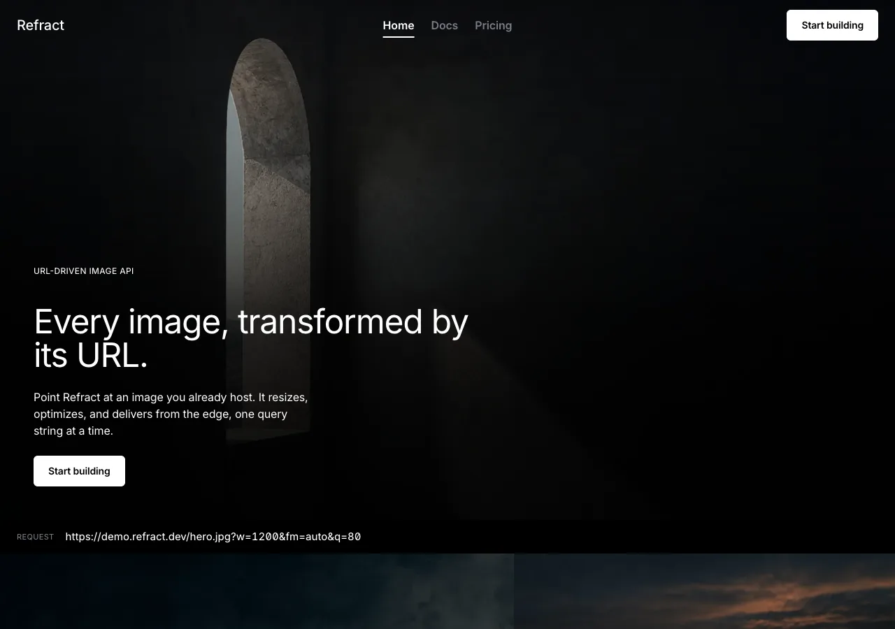
- **index** — **hero** (full-bleed `hero` frame, ~88vh, with a bottom-left scrim
  carrying the eyebrow slate, one 48px `--light` line, a one-line sub, a **"Start
  building"** CTA, and the request-form URL on a letterbox slate bar) → **capability
  trio**, three full-bleed frames in an asymmetric editorial grid — **Transform /
  Optimize / Deliver** — each with a title and one sentence on a scrim and one factual
  detail on its slate bar (`--void` between them) → **live-transform demo**, one
  full-bleed cinematic frame that is the browser-drawn result, with the ten-parameter
  slate along its bottom edge and the live URL beneath (`--void-deep`, framed) → **stats
  band**, the four figures at 48px like a credits roll, `--light` on `--void`, 96px →
  **CTA band**, the mission-statement close — a full-bleed frame, one 40px `--light`
  line, one `--light` **"Start building" → `./docs.html`** button.
- **docs** — page opener (`--void`, 32px line) → **quickstart**, three numbered steps in
  a slate-labeled `01 / 02 / 03` stack with the `docs-origin` frame set beside step 1,
  the third step holding the SDK snippet in the `--surface` code block (`--void`) →
  **parameter reference**, the ten-row table set as a slate — hairline-divided rows, no
  card, no zebra (`--void`) → **caching & limits**, three hairline rows of figures
  (`--void-deep`, 96px).
- **pricing** — page opener over the `pricing-hero` full-bleed band (32px line on a
  scrim) → **tier panels**, three of them, `--void-deep` solid cards with a `--hairline`
  edge, price in the 48px Readout with `tnum` (`--void`, 96px) → **overage & billing
  semantics**, hairline rows (`--void`, 96px) → **FAQ**, four hairline-divided
  disclosure rows (`--void-deep`, 96px).

## Signature

Five devices. Each is a direct translation of one of the reference's own.

### 1. The cinematic frame that is the interface — the full-viewport hero, extended

The reference's signature is a **full-viewport cinematic image** with a restrained text
overlay: a film-grade still filling the screen, a 48px headline in white on the dark
imagery, the interface reduced to almost nothing. Reel takes that from a hero treatment
and makes it the **operating principle of the whole page**. The hero, the three
capabilities, and the live demo are all **full-bleed frames**, and the demo's controls
do not sit in a separate panel — they live **on the image**, as an uppercase slate along
its bottom edge. Editing a slate value mutates the frame live and rewrites the URL; the
image is not illustrating the control, the image _is_ the control's surface.

The **before/after is a cut, never a wipe.** The demo frame defaults to the RESULT — the
source `demo-source` photograph redrawn by the parameters currently set — and a slate
toggle **cuts** it to the SOURCE, the way an editor A/Bs an ungraded and a graded plate.
There is no drag-handle bisecting the image: a wipe handle takes half of every frame
back, and this design handed the whole frame to the photograph on purpose.

The seven controls on the slate are exactly the seven **browser-honest** parameters —
the ones a browser can truly apply to the frame, live, with no server and no lying:

| Slate control | Honest browser mechanism                     |
| ------------- | -------------------------------------------- |
| `w`           | Rendered width of the frame                   |
| `h`           | Rendered height of the frame                  |
| `fit`         | `object-fit` (`cover` `contain` `fill` `crop`) |
| `crop`        | `object-position` (`smart` `center` `edges`)  |
| `rot`         | `transform: rotate()` (`90` `180` `270`)      |
| `blur`        | `filter: blur()` (0–100)                      |
| `bg`          | The frame's background fill (hex)             |

**Manipulating any control mutates the frame in the same repaint and rewrites the URL.**
A control that moves and changes nothing on the image is a control that has been faked.
Two rules bound the demo, each costing the design something:

- **`fm`, `q`, and `dpr` are in the URL string and are NOT on the slate.** They ride the
  live URL, each carrying a `NEGOTIATED` tag in the 11px slate-label role, because
  `fm=auto` negotiates AVIF → WebP → JPEG from the request's `Accept` header and a
  browser cannot perform a re-encode. The tempting move is to stage one — run a
  file-size counter down, print a byte count under the frame. **That would put an
  invented number in the one place a developer is certain to check, and this design
  prints no figure the brief did not supply.** The tag is what reel says instead of the
  number.
- **`bg` is live only when `fit=contain`.** The brief scopes `bg` as the fill _for
  `contain`_, so the control is inert in every other fit mode and wakes the moment
  `contain` is chosen. It is the one conditional on the slate, and it is the parameter's
  own scope showing, not styling.

### 2. The letterbox slate — the uppercase label layer, made cinematic

The reference's structural device is its **uppercase, letter-spaced label layer** —
14px and 11px labels, weight 450, positive tracking, cool slate — that signposts the
page against the tight lowercase display. Reel keeps every part of it and gives it a
surface: a **letterbox slate bar**, a solid `--void` bar laid across a frame like the
black bar of a 2.39:1 letterbox or the strip of a clapperboard, carrying the uppercase
metadata in `--slate` at the full 5.06:1. This is the device that makes type-on-image
_honest_ in this system: the fine slate type never risks a bright photograph, because it
sits on solid black laid in front of the photograph. Every frame's factual line — the
request URL under the hero, `41 EDGE LOCATIONS` under Deliver, the live parameters under
the demo — is set on a letterbox slate. **The ten-row parameter table on the docs page
is the same device unrolled**: a slate of uppercase column heads over hairline-divided
rows, the whole reference table read as one long clapperboard.

### 3. The editorial frame grid — the mixed-size magazine layout

The reference lays its cinematic stills in an **asymmetric, mixed-size grid** — a large
feature frame paired with smaller supporting ones, "editorial magazine rhythm." Reel
spends this on the **capability trio**: at desktop the three frames are not a tidy 3-up
of equal tiles but an editorial arrangement — one tall lead frame beside a stacked pair
— so **Transform / Optimize / Deliver** read as a magazine spread, not a feature table.
Each frame carries a Display-XL title and one sentence on its scrim, and one figure from
the brief on its slate: Transform names its ten chainable parameters and smart crop;
Optimize names `fm=auto` and the **62%** average payload reduction; Deliver names the
**41 edge locations** and the **21 ms** cached p50. The reference's hand-illustrated
product icons do **not** survive — illustration is banned here — so each capability is
carried by _a photograph and a sentence_, which is the entire thesis of the design.

### 4. The credits-roll stats — the one loud typographic moment on black

The reference allows itself one place where type gets large. Reel spends it on the
**stats band** and stages it as a **credits roll**: the four figures — **62%**, **21
ms**, **98.6%**, **99.95%** — set in `--light` at 48px in the Readout role with `tnum`,
four across on pure `--void`, each figure over a `--slate` label, exactly the way end
credits print white on black. Tabular figures are the whole point: the four numbers sit
in one row and their digits line up. **No icons, no sparklines, no charts, no count-up
animation** — the figures are printed once and hold still. The band carries nothing
else; the black around them is the theatre going dark for the credits.

### 5. The mission-statement close — the emotional last frame

The reference ends on a **mission statement**: white text on a dark ground, generous
vertical air, the artistic and philosophical close after all the frames have run. Reel
keeps it as the **CTA band** — a final full-bleed frame with a single 40px `--light`
line in the Display-L role and one `--light` **"Start building"** button leading to the
docs, carrying the brief's stated CTA intent. It is the last frame of the reel: the page
does not end on a form or a footer-first sell, it ends on one cinematic line and one
quiet action, then the black footer beneath it.

## Components

- **Nav bar.** Transparent over the hero frame, ~72px tall, no border and no fill at
  rest. The wordmark **Refract** sits flush left in `--light` at the Title role; three
  page tabs sit center — **Home · Docs · Pricing** — in the Nav role (16px / 600), the
  active tab taking `aria-current="page"` and a **2px `--light` underline** (never a
  hairline, never a hue). Flush right: a `button-primary` reading **"Start building."**
  On scroll the nav gains a solid `--void` fill and a 1px `--hairline` beneath, so it
  never competes with the frame it floats over. **The tabs are type only** — the
  reference's illustrated nav icons and its "NEW" badges both fail to survive: the icons
  because illustration is banned, the badges because the brief hands this product nothing
  to announce.
- **`button-primary`.** `--light` fill, `--void` label at the Nav/Button role
  (14px / 600, **21.0:1**), **6px** radius, ~44px tall, 12×20px padding. Inverted and
  colorless — the highest-contrast mark on the page precisely because it spends no hue.
  Press drops the fill to ~88% white; **no transform, no shadow** (there are no shadows
  to change). This is the site's primary action — **"Start building" → `./docs.html`** —
  and it appears at most twice per page.
- **`button-ghost`.** Transparent fill, `--light` label, a 1px `--hairline` outline that
  brightens to `--slate-mid` on hover, **6px** radius, same height. Used for all three
  **tier CTAs alike** and for "Copy" actions. No tier CTA is ever `button-primary`: the
  three tiers are identical in weight, and a filled white button on exactly one of them
  would single it out as recommended — the one thing the content never claims.
- **`button-text`.** Plain `--light` text, no surface, no border, underlined on hover.
  Used for "Show more" and the FAQ disclosure rows.
- **`frame`.** The load-bearing element: a full-bleed photograph, edge-to-edge, zero
  radius, zero shadow, `object-fit: cover`. It may carry (a) a **scrim** — a
  black-to-transparent gradient reaching ≥85% under any `--light` display type — and/or
  (b) a **letterbox slate bar** — a solid `--void` strip across an edge carrying
  uppercase `--slate` metadata. A frame never carries slate type on the raw image and
  never carries a second hue.
- **`slate-bar`.** The letterbox device: a solid `--void` bar, ~40px tall, laid across a
  frame's bottom (or top) edge, holding the slate label layer (Inter 450, 11–13px,
  uppercase, +0.35px, `--slate`) and — on the demo — the seven interactive controls and
  the live URL. It is the one place the interface is visible on an image.
- **`demo-slate`.** The interactive slate under the live-transform frame: seven inline
  controls for `w` `h` `fit` `crop` `rot` `blur` `bg`, each an uppercase `--slate` label
  over its current value in `--light`. `w` / `h` are numeric (steppers + drag); `fit` /
  `crop` / `rot` are option groups; `blur` is a slider; `bg` is a hex field, **live only
  when `fit=contain`**. Each control mutates the frame and rewrites the URL in the same
  frame. A `SOURCE / RESULT` toggle cuts the frame between the original and the
  transform. Focus is the 2px `--light` ring. **This is the only playground in the
  design** — the hero and the demo read from one state; there is not a second slate.
- **The live URL.** Set in the URL/Code role (Inter 450, 14–15px, `tnum` + `zero`),
  `--light` on the slate bar, with `fm` / `q` / `dpr` appended and each carrying a
  `negotiated-tag`. Unset parameters are absent from the string — there is no `rot=0`
  and no `blur=0`, because the brief defines no such values and the design invents none.
- **`negotiated-tag`.** An 11px uppercase slate label (`--slate`, +0.35px, no fill, no
  radius), reading `NEGOTIATED`. It marks the three server-side parameters in the URL
  string and repeats on their rows in the docs table. It is a statement of fact, never
  an alarm, and — the palette having no hue — it is never colored.
- **Parameter table.** The ten-parameter reference, built as one long slate: **full-width
  hairline-divided rows on `--void`, no card, no shadow, no zebra, no border box.** A
  slate-label header row (`PARAMETER · VALUES · DESCRIPTION`, uppercase, +0.35px,
  `--slate`) sits above rows of ~16px vertical padding divided by 1px `--hairline`. Three
  columns: the **parameter name in the URL/Code role, `--light`, weight 500** (the
  single-typeface stand-in for a mono token); the accepted values in Body S `--slate`;
  the description in Body S `--slate`. The `fm`, `q`, `dpr` rows each carry the
  `NEGOTIATED` tag; the stated default (`q` 75) is printed; defaults the brief does not
  give are not invented. White-on-black at 21:1 and slate-on-black at 5.06:1 make it fully
  legible in the dark — the table does not need a light section to be read.
- **Code block.** `--surface` (`#1a1a1a`) fill, **8px** radius, 24px padding, no border,
  no shadow. Inter at the URL/Code role (14–15px / 1.6) in `--light` (17.4:1) with `tnum`
  + `zero`. A `button-ghost` "Copy" sits at its top-right. **No syntax-highlight palette**
  — this system has no hue to spend on a keyword; emphasis inside the block is weight 500
  `--light`, and nothing else. It carries `--light` text only, which is exactly why
  `--surface` is the one panel where `--slate` (4.19:1 here) never appears.
- **`tier-panel`.** The pricing card: `--void-deep` (`#030303`) surface — a tonal step
  off the `--void` page, not a shadow — with a 1px `--hairline` edge, **8px** radius,
  32px padding. Inside, in order: the tier name (Title role, `--light`), the **price in
  the 48px Readout role with `tnum`** ($0 / $29 / $249 per month), a full-width
  `button-ghost` CTA, and a quota stack beneath in Body S — transforms, bandwidth,
  support, and the tier's extras, labels in `--slate` (5.06:1 on `--void-deep`), figures
  in `--light`. **No tier is marked "recommended," "popular," or "best value"** — the
  three panels are identical in weight and only their content differs. The panels sit on
  `--void-deep` rather than `--surface` precisely so `--slate` clears AA on them.
- **FAQ row.** A full-width disclosure on the `--void-deep` band, 1px `--hairline`
  between rows: the question in the Title role (`--light`), a `button-text` chevron at the
  right, and the answer in Body `--slate` when open. **Nothing is drawn around it** — no
  card, no fill, no shadow. A hairline, a question, and a chevron.
- **Footer.** `--void` — **black, exactly like the page.** The reference has no contrast
  footer and neither does this. Three columns of Body S `--slate` links, 24px gutters,
  closed by a `--hairline` legal band in the Body S role at `--slate-mid`. **There is no
  light slab, and no dark slab that differs from the page — the reel simply runs out.**

## Motion

**Restrained, and cinematic where it moves at all.** Motion has one job — to make a
control feel immediate — plus one permitted ambient gesture, and it is asked for nothing
else.

- **The frame answers in the same repaint as the control that moved.** Nothing is
  inserted to make that feel expensive — no delay, no skeleton, no shimmer, no spinner
  standing in for a wait the browser is not having. The frame simply changes, the way a
  viewfinder does.
- **The before/after is a cut or a slow dissolve — never a wipe.** Toggling
  `SOURCE / RESULT` either hard-cuts (instant) or cross-dissolves over ~200ms, the two
  cinematic transitions; it never drags a handle across the frame.
- **One ambient gesture is permitted: a slow Ken-Burns drift on the hero frame** — an
  imperceptible scale/position creep over 20s+ that must never be noticeable at a glance.
  It is the system's only ambient motion, the analogue of a held cinematic shot, and it
  is **fully disabled under reduced motion.** No other frame drifts.
- **Hover and focus are opacity and brightness swaps only** — a nav link brightens to
  full `--light`, a ghost button's hairline lifts to `--slate-mid`, a frame lightens its
  scrim slightly. No scale, no translate, no bounce, no spring, no parallax, no
  scroll-jacking, no reveal-on-scroll, and **no count-up on the stats band** — the four
  figures are printed, not performed.
- **Focus is a 2px `--light` ring** (21.0:1) with a 2px offset on every interactive
  element, and it is never removed. In a colorless system the focus ring is white, the
  brightest mark available.
- Under **`prefers-reduced-motion: reduce`**, the Ken-Burns drift and every transition
  are dropped and each element renders in its final state; the cut replaces the dissolve.
  **Turn all of it off and nothing is lost but the easing** — the slate still builds the
  URL, the frame still shows the result, and the photograph was never moving in the first
  place.

## Image treatment

**Every photograph in this bundle is a film-grade still from the same production.** One
register, held across all three pages: a **real photograph**, dramatically and
directionally lit, deep shadow, shallow depth of field, a cinematic color grade, quiet
and composed. **There is no illustration, no vector art, no icon set, no diagram, no
chart, no 3D render, and no "flat" anything** — the reference's hand-illustrated product
icons are the one part of its language reel deliberately drops, and dropping them is what
forces the photographs to carry the page, which is the entire design. The dramatic
lighting is what earns the pure-black canvas: a still lit against darkness sits on
`--void` as if the void were its own negative space.

**How every generated image in this system is prompted.** These are binding rules, and a
generated image that breaks one is rejected and re-generated, never accepted and cropped
around.

1. **Nothing in frame carries language.** Every prompt must state, explicitly and in its
   own clause, that the image contains **no text, no lettering, no numerals, no labels,
   no logos, no brand markings, no signage, and no packaging print** — not on a wall, a
   sign, a screen, a spine, a crate, or anything else. A generated still left to itself
   invents lettering, and invented lettering on a frame this page runs full-bleed is a
   counterfeit brand printed at cinema scale inside the one thing the design asked the
   visitor to watch. (This is the image provider's most common failure; the clause is
   the guard.)
2. **No people. No hands.** Not one, not in the background, not out of focus. Two reasons
   to hold the line. The model cannot draw fingers; it fuses them into a knuckleless
   mass, and the way past that is to **stage the shot without hands**, not to roll the
   prompt again and hope. The better reason is what these pictures are _for_: each is a
   file the API is about to crop and blur in front of a developer — **a sample input, not
   a lifestyle photograph.** Put a person in the frame and the still stops offering itself
   to the demo and starts selling a mood.
3. **The frame is quiet and survives the crop.** No props beyond the subject each
   description names, no scattered incidental objects, no busy lived-in scenes. Every
   photograph must survive being cropped to `1:1` and blurred to 100 and still look
   deliberate, because **the demo will do exactly that to them, live, in front of the
   visitor.** A still with a fussy corner becomes a fussy corner enlarged.
4. **The subject sits off-center, always.** The brief promises that smart crop keeps
   subjects in frame, and the demo makes good on it by cropping these photographs where
   the visitor can watch. A subject parked in the middle survives any crop — `smart` and
   `center` land on the same pixels and the visitor learns nothing. Push the subject to
   one side and the strategies visibly disagree, which is the only way the claim gets
   tested.

Beyond those, every prompt carries the constant tone words: **cinematic film still,
dramatic directional light, deep shadow, shallow depth of field, moody, high-end
editorial, calm, real place or object, off-center subject, no people, no hands, no
text.** Type is set on a frame only in `--light` and only over a scrim or a letterbox
bar (see _Palette_); the fine slate labels never touch the raw photograph.

Needed images (referenced `./assets/<id>.webp`):

- `hero` (16:9) — A single architectural archway or window opening set well off-center to
  the left, a shaft of hard directional light falling through it across a dark plaster
  wall, deep shadow filling the rest of the frame, cinematic film still, shallow depth of
  field, moody, no text, no lettering, no numerals, no labels, no logos, no brand
  markings, no signage, no packaging print, no people, no hands, quiet and uncluttered.
- `capability-transform` (16:9) — A tall empty chair beside a window pushed hard to the
  right of the frame, a single blade of low sun raking across a bare dark floor, deep
  shadow on the left, cinematic film still, shallow depth of field, no text, no lettering,
  no numerals, no labels, no logos, no brand markings, no signage, no packaging print, no
  people, no hands, generous dark negative space on the left.
- `capability-optimize` (16:9) — A coastal horizon at last light with long smooth tonal
  gradients from deep shadow to a single bright band on the water, one dark headland low
  and to the left, cinematic film still, moody, no text, no lettering, no numerals, no
  labels, no logos, no brand markings, no signage, no packaging print, no people, no
  hands, no boats.
- `capability-deliver` (16:9) — A high aerial of a lone road curving between dark cliffs
  and open sea, hard low afternoon light picking out the road against shadowed terrain,
  cinematic film still, shot from far above, no text, no lettering, no numerals, no
  labels, no logos, no brand markings, no signage, no packaging print, no people, no
  hands, no vehicles, the road entering from one corner.
- `demo-source` (4:3) — A single smooth ceramic vessel on a dark surface beside a hard
  window light, placed off-center to the right, deep shadow across the left of the frame,
  cinematic film still, shallow depth of field, plain dark background, no text, no
  lettering, no numerals, no labels, no logos, no brand markings, no signage, no packaging
  print, no people, no hands.
- `docs-origin` (16:9) — A stack of blank unlabeled photographic prints on a dark table in
  a single shaft of side light, the top print completely empty, deep shadow around them,
  placed off-center, cinematic film still, no text, no lettering, no numerals, no labels,
  no logos, no brand markings, no signage, no packaging print, no images printed on them,
  no people, no hands.
- `pricing-hero` (16:9) — A dark stone stairwell climbing off-center toward a single hard
  shaft of light from above, deep shadow filling the lower frame, plain plastered walls,
  cinematic film still, moody, no text, no lettering, no numerals, no labels, no logos, no
  brand markings, no signage, no packaging print, no people, no hands.

## Do / Don't

Do:

- Keep the canvas pure black (`--void` `#000000`), the type white (`--light`), the
  secondary voice cool slate (`--slate` `#767d88`) on the two blacks only, and keep the
  footer the same black as the page.
- Make the full-bleed cinematic frame the interface — hero, capability trio, and demo are
  all frames, and the demo's controls live on the image as a slate bar.
- Keep the seven browser-honest parameters (`w` `h` `fit` `crop` `rot` `blur` `bg`)
  interactive and truly wired to the frame, and keep `fm` / `q` / `dpr` in the URL string
  with the `NEGOTIATED` tag — no invented byte counts, no file-size animation.
- Set all display at weight **400**, line-height 1.0–1.05, negative tracking, capped at
  48px; set the slate label layer at weight **450**, uppercase, +0.35px; keep the weight
  ceiling at 600.
- Set the four stats and the three prices in the 48px Readout role with `tnum`; set the
  URL and code in Inter with `tnum` + `zero`, no second typeface.
- Carry type over a photograph in `--light` only, over a scrim (≥85% black under text) or
  on a solid letterbox bar; keep fine slate labels off the raw image.
- Use zero shadows and let the frame-against-void alternation, the depth of field, and the
  tonal surface steps be the depth.
- Give contained elements a small radius (6px buttons, 8px panels and the code block); use
  no pill and no bare 0px statement corner.

Don't:

- **No paper anywhere** — no white section, no light band, no light footer, no inversion
  to a bright canvas. The page never turns on the lights.
- **No hue.** No accent, no link color, no green success, no amber warning, no red alarm,
  no syntax-highlight palette, no colored tag, no gradient as chrome. The only color on
  the site is inside a photograph. A colored control is a defect.
- **No shadow.** Not on a card, a button, the code block, a frame, or a nav — depth is
  photographic and tonal, never a `box-shadow`.
- **`--slate` (`#767d88`) never sits on `--surface`** (4.19:1, fails AA) and never on a
  raw photograph — it is confined to `--void` / `--void-deep`. On `--surface`, text is
  `--light`; if slate is ever needed there, it is `--slate-mid` (4.61:1).
- **No pill and no display-statement square corner.** Pills are `aperture`/`prism`; the
  crisp 0px rectangle is `cutaway`/`spec`/`folio`. Reel's corners are softly cut at 6–8px.
- **No display weight above 600, no bold headline, no 88px number.** The light 400 display
  is the voice; the 88px instrument readout is `cutaway`'s and reaching for it converges
  the two dark designs.
- **No second typeface.** No monospace for the URL or the code — Inter sets everything,
  with `tnum` + `zero` doing the work a mono would. A mono heading, a mono price, or a
  mono URL is a defect.
- **No wipe-slider, no drag handle** on the before/after — it is a cut or a dissolve. And
  **no count-up, no charts, no sparklines** on the stats band; four figures, set once.
- **No illustration, no vector art, no icon set, no diagram, no chart, no 3D render.**
  Every image is a photograph. The reference's product icons are cut on purpose.
- **No people and no hands in any generated image**, and **no text, lettering, numerals,
  labels, logos, or brand markings** in frame — the still is a sample input, not an ad,
  and invented lettering full-bleed is a counterfeit brand at cinema scale.
- **No invented facts, and no invented numbers.** No byte count beside the frame, no
  file-size animation, no latency, uptime, or edge count the brief did not supply, no
  "most popular" tier, no "NEW" badge. **Every figure on this site traces to
  `content.md`** — the stats (62%, 21 ms, 98.6%, 99.95%), the 41 edge locations and the
  cold-transform p50/p99 (89 ms / 340 ms), the 50 req/s limit and the 30-day cache window,
  the prices, quotas, overage rates ($2 per 1,000 transforms, $0.08/GB), parameter ranges,
  and the default `q` of 75. A number that cannot be pointed back to that file does not get
  set.
- No emoji anywhere, and **no naming of the source reference in the built page** — the
  reference is named in this document's prose only. The site carries the product's own
  name, **Refract**, in English, and nothing else.