DESIGN.md
# Prism — Design System

## Concept

**An image API presented as an edge-delivery platform.** Near-white paper, ink-black
type, a mono voice for every technical mark, and a single decorative object doing
all the color work at hero scale: not a photograph and not a headline, but **a band
of refracted light** — white light entering one edge and leaving the other split
into its spectrum.

Prism starts from a page written for engineers who already know the syntax.
**Vercel**, a developer-platform brand, builds its whole marketing surface out of three
materials —
a stark black-and-ink duet on a near-white canvas, a monospaced label on every
technical thing, and one multi-stop mesh gradient that floats behind the hero and is
never allowed anywhere else. That page has no photographs in it; its hero is a
gradient and a code block. Point it at a URL-driven image API and almost everything
transfers untouched, because **an image API _is_ a deploy platform — it fetches an
origin, transforms at the edge, caches across a network, and answers in
milliseconds.** The brief's third capability, *Deliver — 41 edge locations, 21 ms
cached, 98.6% hit ratio*, is not a stretch for this language. It is the language's
home ground.

One thing has to change, and changing it is the whole design. The reference's mesh
gradient is the reference's brand, tuned to its own three-word story
(develop / preview / ship). Here the product is named **Refract**, and refraction is
the single most exact word in optics for *what a prism does to light*: it bends each
wavelength by a different angle and disperses white into a spectrum. So the mesh
gradient is **re-authored as a refraction spectrum** — the same six light-stops the
reference floats behind its hero, reordered into the wavelength sequence
red → amber → green → blue → violet, so the one decorative object on the page is
literally the thing the product is named after. This is an adaptation, stated plainly:
the reference's rule was "one gradient is the entire decoration, hero scale only,
never miniaturised, never one color," and Prism keeps that rule to the letter while
changing what the gradient _means_.

The governing principle is inherited whole and must not be softened: **the gradient
is the only chrome, and the type stays calm.** The reference's geometric sans never
climbs past weight 600 — no 700, no 800, no black — and that ceiling is what makes it
read as a settled system rather than a shouting one. Prism holds the ceiling. Display
is sentence-case, tracked aggressively negative, and terminated with a period, the
way the reference ends "Build and deploy on the AI Cloud." with a full stop that is
part of the voice. Everything technical — every section eyebrow, every one of the ten
parameters, the request URL, the SDK — is set in the monospace, because in this system
**mono is the sound the platform makes.** Its two proprietary faces (a geometric sans,
a matching mono) are substituted here by **Inter** and **JetBrains Mono**, the
open-source pair its own analysis names. That lineage is named in this document and
**nowhere else**: the built page carries only the product's own name, **Refract**, in
English.

The other designs under this brief take the same ten parameters somewhere Prism will
not follow. `spec` is the other light, technical, blue-tinged one, and it is the one
Prism is most often confused with — so the line is drawn hard: `spec` runs a single
flat automotive blue as its one action color, **0px rectangular corners on
everything**, **no shadow and no gradient at all**, and a heavy-700-against-thin-300
type contrast, building each transform like a car in a configurator. Prism does the
opposite on every axis: its blue is a _link_ and nothing converts on it, its CTA is a
**100px pill**, its depth is a **stacked soft shadow**, its type ceiling is **600**,
and its one piece of color is a full **multi-hue spectrum**, not one flat blue. `folio`
is the other restrained light page, but it is a serif print magazine with square
corners and an exposed column grid; Prism is a geometric-sans platform with rounded
pills, a gradient, and a dark band. `reel` shares nothing but the alphabet — it is
pure-black cinematic photography with the interface deleted. Prism is near-white, and
its photographs live only _inside_ preview panes, never full-bleed.

Where the reference has no answer, the answer is the browser. The brief promises a
live before/after transform, and this page shows one — a real photograph on the left,
the same file on the right redrawn by the parameters currently set, with the query
string printed in mono beneath. That demo stops exactly where an honest browser stops:
`fm`, `q`, and `dpr` are format negotiation and server-side re-encoding, which a
browser cannot perform and this design will not fake. They ride the URL, tagged, and
the demo names them without pretending to run them.

## Palette

Ink on near-white, a full gray ramp doing all the structural work, **one functional
blue** confined to links, and **a six-stop refraction spectrum** that appears only
inside the gradient. Nothing else carries color.

| Token               | Hex       | Role                                                                              |
| ------------------- | --------- | --------------------------------------------------------------------------------- |
| `--canvas`          | `#FFFFFF` | Pure white — card, nav, popover, and footer surfaces.                              |
| `--page`            | `#FAFAFA` | The default page body (98% white). Almost every band sits on this.                 |
| `--inset`           | `#F5F5F5` | A slightly deeper inset — code-block inner fill, the demo band, table header.      |
| `--ink`             | `#171717` | Every heading and body-strong mark on light; also the **dark-band fill**.          |
| `--body`            | `#4D4D4D` | Secondary running copy, card body, nav-link text at rest.                          |
| `--mute`            | `#888888` | Lowest-priority labels only — **fails AA body, never a paragraph (see rules).**    |
| `--hairline`        | `#EBEBEB` | The 1px rule: card borders, table rows, dividers, input outlines.                  |
| `--hairline-strong` | `#A1A1A1` | A stronger divider and the inset-ring color — **decorative, never text on light.** |
| `--link`            | `#0070F3` | The functional blue. Large-text links, focus ring, in-product accent only.        |
| `--link-deep`       | `#0761D1` | **Every blue that carries body-size text** — inline links inside prose.            |
| `--on-ink`          | `#FFFFFF` | Text on the `--ink` dark band and the polarity-flipped Pro card.                   |
| `--on-ink-soft`     | `#A1A1A1` | Secondary text and mono labels on the dark band.                                   |
| `--spectrum-red`    | `#FF4D4D` | Refraction stop 1. **Gradient only** — never a UI color, never miniaturised.       |
| `--spectrum-amber`  | `#F9CB28` | Refraction stop 2. Gradient only.                                                  |
| `--spectrum-green`  | `#50E3C2` | Refraction stop 3. Gradient only.                                                  |
| `--spectrum-blue`   | `#007CF0` | Refraction stop 4. Gradient only.                                                  |
| `--spectrum-violet` | `#7928CA` | Refraction stop 5. Gradient only.                                                  |

Rules:

- **The spectrum is decoration and only decoration.** Its five stops exist to be
  interpolated into one gradient — the hero refraction band, and the same band bled
  faintly into the top of the dark stats section. **No spectrum hue is ever a UI
  color:** not a button, not an icon, not a text color, not a border, not a status
  dot, not a chart series, not a selected-state marker. The reference is absolute
  that the gradient "lives at hero scale only, never miniaturised, never reduced to a
  single colour," and that absolute is inherited. A red control on this page is a
  defect; the only red permitted is a wavelength inside a band of light.
- **One functional color, and it is a link.** The blue `--link` / `--link-deep` is
  the whole of the design's chromatic UI vocabulary, and it does exactly one job —
  marking a link. Nothing _converts_ on blue: the primary CTA is **`--ink` black**,
  because in the reference the black ink pill _is_ the conversion target. There is no
  green success, no amber warning, no purple, no second accent. A validation
  message — a malformed hex typed into the one free-text field, `bg` — is set in
  **`--ink`**, with the field outline going to `--link` on focus; it does **not**
  introduce an error red, because introducing a sixth color to say "wrong" is exactly
  the flattening the reference forbids.
- **Contrast (measured, WCAG 2.1, sRGB relative-luminance formula).** On `--page`
  (`#FAFAFA`): `--ink` **16.6:1**, `--body` **8.2:1**, `--link-deep` **5.6:1**,
  `--mute` **3.4:1**. On `--canvas` (`#FFFFFF`): `--ink` **17.1:1**, `--body`
  **8.5:1**, `--link-deep` **5.8:1**, `--link` **4.5:1**. On the `--ink` dark band
  (`#171717`): `--on-ink` **17.1:1**, `--on-ink-soft` **6.6:1**. On the black `--ink`
  CTA fill: `--on-ink` white **17.1:1**. Everything a visitor must read clears AA body
  (4.5:1) with margin.
- **`--mute` (`#888888`) does NOT hold AA and is label-only.** It measures **3.4:1**
  on `--page` — below the 4.5:1 body threshold, above the 3:1 large-text and non-text
  bars. Use it for a mono eyebrow at 12px only where that eyebrow is decorative
  signposting, for placeholder text, and for disabled labels. **It never sets a
  paragraph, a parameter description, a price, a stat, or the accepted-values column
  of the table** — those are `--body` (8.2:1) or `--ink`. When a mono eyebrow is
  load-bearing (a parameter name in the table), it is `--ink`, not `--mute`.
- **`--link` (`#0070F3`) sits right on the AA line (4.5:1 on white) and below it on
  `--page` (4.4:1).** So body-size links inside prose use **`--link-deep`**
  (`#0761D1`, 5.6:1 on `--page`), and the bright `--link` is confined to large text
  (≥24px, where the 3:1 bar applies), the 2px focus ring (a non-text mark, 3:1 bar),
  and in-product accent marks. A 16px inline link in blue that is not `--link-deep`
  is a defect.
- **The hairlines carry no meaning.** `--hairline` measures **1.3:1** on `--page`,
  `--hairline-strong` **2.6:1** — both below the 3:1 non-text bar. **No control's
  identity or state may rest on a hairline alone.** A card is a card because of its
  surface step (`--canvas` on `--page`) and its stacked shadow, not its border; the
  selected pricing tier is marked by a **full polarity flip to the dark band**, not a
  colored edge; focus is a **2px `--link` ring**, never a hairline.
- **Depth is a stacked shadow, never a flat drop and never a hairline.** The one
  elevation idiom is the reference's: multiple small offsets layered at 4–12% black,
  plus an inset 1px ring, so a card "sits on the page" without floating. This is a
  color rule as much as a shadow rule — the ring is `rgba(0,0,0,0.06)`, the drops are
  black at single-digit alpha, and no shadow ever tints toward the spectrum.

## Typography

Two voices, cleanly split, **both self-hosted as woff2 under `assets/fonts/`** via
`@font-face` — no font CDN, no Google Fonts `<link>`.

**Interface — Inter.** The substitute the reference's own analysis names for its
proprietary geometric sans. It carries display, body, buttons, nav, and every figure,
at weights **400 / 500 / 600 and no heavier** — the reference's display ceiling is 600
and Inter holds it here. Display sizes take aggressive negative tracking; body stays
neutral.

**Technical — JetBrains Mono.** The reference's second face is a matching monospace
for "anything that wants to signal technical," and this product is nothing but
technical things: the request URL, the SDK snippet, the ten parameter names, and every
section eyebrow. It is confined to exactly those. **It never sets a heading, a
paragraph, a price, or a body label.**

| Role         | Face           | Size / Leading | Tracking | Features | Use                                              |
| ------------ | -------------- | -------------- | -------- | -------- | ------------------------------------------------ |
| Display XL   | Inter 600      | 48px / 1.0     | -2.4px   | —        | Index hero line — the largest type in the system  |
| Display L    | Inter 600      | 32px / 1.25    | -1.28px  | —        | Page openers, section heads                       |
| Display M    | Inter 600      | 24px / 1.3     | -0.96px  | —        | Card-cluster heads, tier names                    |
| Display S    | Inter 600      | 20px / 1.4     | -0.6px   | —        | Card titles, FAQ questions                        |
| Readout      | Inter 600      | 48px / 1.0     | -1.6px   | **tnum** | The four stats figures and the three tier prices  |
| Lead         | Inter 400      | 18px / 1.55    | 0        | —        | The lead paragraph under a section head           |
| Body         | Inter 400      | 16px / 1.5     | 0        | —        | Default running copy                              |
| Body S       | Inter 400      | 14px / 1.43    | -0.28px  | —        | Card meta, table cells, footnotes                 |
| Strong       | Inter 500      | 16px / 1.5     | 0        | —        | Emphasized inline body                            |
| Button       | Inter 500      | 16px / 1.25    | 0        | —        | Marketing pill button labels                      |
| Button S     | Inter 500      | 14px / 1.2     | -0.28px  | —        | Nav button labels                                 |
| Eyebrow      | JetBrains Mono | 12px / 1.33    | 0        | **zero** | Section eyebrows, the technical signpost layer    |
| Param        | JetBrains Mono | 14px / 1.6     | 0        | **zero** | The ten parameter names, tags, inline code tokens |
| URL          | JetBrains Mono | 15px / 1.5     | 0        | **zero** | The live request URL under the demo               |
| Code         | JetBrains Mono | 13px / 1.6     | 0        | **zero** | The SDK snippet inside the code mockup            |

Principles:

- **Weight 600 is the display ceiling and it is non-negotiable.** No headline, no
  price, no stat, no card title climbs to 700 or beyond. The reference reads calmer
  than its peers precisely because it refuses bold display, and that refusal is the
  single easiest thing to break and the fastest way to turn Prism into a generic SaaS
  page. Emphasis is size, tracking, and the polarity flip — never a heavier cut.
- **Sentence-case headlines, period-terminated.** Every display line is sentence
  case and ends with a full stop: "Point Refract at your images." That period is
  inherited from the reference's voice and is load-bearing punctuation, not a typo.
- **Negative tracking is part of the display voice.** −2.4px at 48px, −1.28px at
  32px, easing to zero by body size. Reverting display to default tracking reads as a
  different, looser brand.
- **Mono is the technical layer and never leaks into prose.** A parameter is mono
  because it is a literal API token — `w`, `fit`, `fm=auto`. Prose _about_ a
  parameter is Inter; the parameter itself is JetBrains Mono. A price is not mono. A
  stat is not mono. An eyebrow is mono because an eyebrow is a signpost in the
  platform's own machine voice.
- **Tabular figures where figures align.** The Readout role sets
  `font-feature-settings: "tnum"`. **Inter genuinely ships `tnum`** (verified in its
  GSUB feature list), so the stats band's `62%` / `21 ms` / `98.6%` / `99.95%` lock
  to one column width and the three tier prices line up down their cards.
- **The slashed zero is functional.** Every mono role sets
  `font-feature-settings: "zero"`, which **JetBrains Mono genuinely ships**. In a
  system whose subject is a URL a developer will copy and retype, `?w=1200&q=80` must
  be unambiguous — a `0` that cannot be read as an `O` is a requirement, not a
  flourish.
- **Two features are declared and no others: `tnum` (Inter), `zero` (JetBrains
  Mono).** Both were verified present in the real faces. Three are deliberately
  absent: **`liga`** is never declared (neither face ships it; both route contextual
  behavior through `calt`, on by default — declaring `liga` is a silent no-op that
  looks like a decision), **`onum`** is never declared (Inter ships no old-style
  figures; its digits are lining, always), and **`tnum` is never declared on JetBrains
  Mono** (a monospace is already one width per glyph; declaring it is dishonest even
  though harmless).

## Spacing & layout

The reference reads as engineered: large gaps between bands, tight stacks inside a
card. Prism keeps both — generous section rhythm, dense card interiors — and never the
other way around.

- **4px base unit.** Tokens: 4 · 8 · 12 · 16 · 24 · 32 · 40 · 64 · 96 · 128.
- **Section rhythm: 96px** top and bottom between major bands, stretching to **128px**
  around the hero so the refraction gradient has room to breathe. The dark stats band
  takes the full 96px and the gradient bleeds into its top edge.
- **Card padding: 24px** for marketing cards, **32px** for the large callout and the
  tier cards. Inside a card the head/body stack is tight (8px), then a wider gap
  (24px) before the CTA — the reference's "tight interior, wide exterior."
- Content centers in a **1200px container**; the docs page caps at **960px**, because
  a ten-row parameter table and a code block stop being readable stretched wider.
- **Radius scale — rounded, with two pill scales that coexist by design.** Inputs and
  nav buttons **6px** (the reference's base UI radius). Marketing cards and the code
  mockup **8px**. Large cards, tier cards, and popovers **12px**. The demo preview
  panes **12px**. **Marketing CTAs are a full 100px pill; nav-scale buttons are 6px
  squares** — the two shapes are deliberately different scales of the same system and
  must not be blurred into one. No element is 0px: a square corner here is `spec`'s
  language, and reaching for it is the fastest way to converge the two.
- **Elevation: one stacked-shadow token, plus the dark band.**
  `box-shadow: rgba(0,0,0,0.06) 0 0 0 1px, rgba(0,0,0,0.04) 0 2px 4px, rgba(0,0,0,0.04) 0 8px 16px -4px`
  — an inset ring over two soft drops, carried by every card, the code mockup, the
  demo panes, and the popover. There is no second tier and no single heavy drop. The
  **polarity-flipped `--ink` band is the design's other depth cue** — switching a
  section from `--page` to `--ink` is how Prism marks its most important band, exactly
  as the reference does.

Breakpoints:

| Width               | Behavior                                                                                                     |
| ------------------- | ------------------------------------------------------------------------------------------------------------ |
| Mobile <640px       | Display steps to **32px**; nav collapses to wordmark + menu; hero gradient stays centred behind a stacked headline; capability trio and pricing go 1-up; the demo panes stack source-over-result |
| Tablet 640–1024px   | Display **40px**; capability trio 3-up holds, pricing 3-up holds, demo panes stay side by side               |
| Desktop 1024–1200px | Display **48px**; full 3-up grids; the refraction gradient runs at full hero width                           |
| Wide >1200px        | Content caps at 1200px; bands stretch edge-to-edge in surface color but content holds the max-width; the gradient never grows past the hero container |

Band rhythm — `--page` dominates, `--canvas` and `--inset` are the tonal steps, and
**exactly one band per experience inverts to `--ink`**:

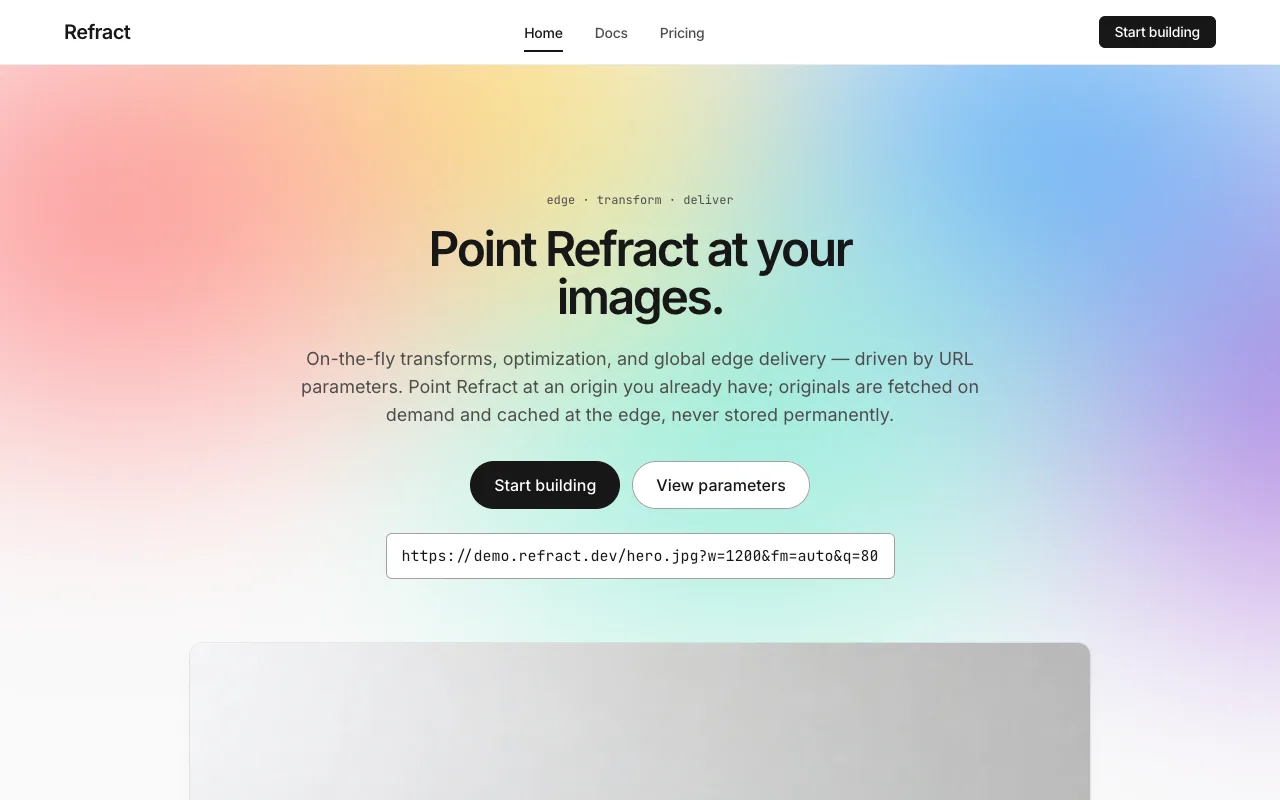
- **index** — hero (`--page`, 128px: mono eyebrow, one 48px period-terminated line,
  an 18px lead, the refraction gradient behind, a pill CTA, and the request URL in a
  mono badge beneath) → capability trio, three marketing cards, Transform / Optimize /
  Deliver (`--page`, 96px) → live-transform demo, the before/after panes with the mono
  URL (`--inset`, 96px) → **stats band, the four figures at 48px, polarity-flipped to
  `--ink`** with the spectrum bled faintly across its top (96px) → CTA band (`--page`,
  96px, one `--ink` pill: **"Start building" → `./docs.html`**).
- **docs** — page opener (`--page`, 32px line) → quickstart, three numbered steps, the
  third holding the SDK snippet in the dark code mockup (`--canvas`) → parameter
  reference, the ten-row table (`--page`) → caching & limits, three rows of figures
  (`--inset`, 96px).
- **pricing** — page opener (`--page`, 32px line) → tier cards, three of them with the
  **Pro card polarity-flipped to `--ink`** (`--page`, 96px) → overage & billing
  semantics (`--inset`, 96px) → FAQ, four disclosure rows (`--canvas`, 96px).

## Signature

Five devices. Each is a direct translation of one of the reference's own.

### 1. The refraction band — the mesh gradient, re-authored

The reference's signature is a **multi-stop mesh gradient** that floats behind the
hero as the entire decorative system: cyan / blue / violet / pink / amber, treated as
one object, never cropped to a single color, never miniaturised, used at hero scale
only. **Every constraint on it survives; only its meaning changes.**

The refraction band is a soft, wide gradient occupying the top two-thirds of the hero,
interpolating the five `--spectrum-*` stops in **wavelength order**
(red → amber → green → blue → violet) so that the page's one piece of color is a prism
dispersing white light — the exact optical event the product is named after. It is
rendered as a CSS/inline-SVG gradient, not a generated image; it scales fluidly with
the hero and never tiles. The same band bleeds faintly (≤20% opacity) across the top
edge of the dark `--ink` stats section, and **appears in exactly those two places and
nowhere else.**

Three rules bound it:

- **Hero scale only.** It is never shrunk into an icon, a bullet, a badge, a card
  accent, or a swatch. If a section feels flat, the fix is whitespace and a stronger
  headline, never a second gradient.
- **One object, never decomposed.** The stops are interpolated, never pulled apart
  into individual colored elements. There is no "red section" and no "violet card."
- **It carries no text and no meaning.** Nothing legible sits on the gradient; the
  headline sits above it on `--page`, not on top of it. The band says one thing —
  _refraction_ — and it says it wordlessly.

### 2. The mono technical layer — every eyebrow, every parameter

The reference sets every section eyebrow and small label in its monospace face, and
sets code in it too, so the page has a persistent second voice that means "this is the
machine talking." Prism inherits it exactly. **Every eyebrow above a section head is
JetBrains Mono at 12px with `zero`** (`transform: negotiate`, `edge: deliver`,
`quickstart: 3 steps`). **Every one of the ten parameters is mono wherever it
appears** — in the demo URL, in the parameter table's name column, in a capability
card's inline example. This is the layer that makes a near-white marketing page read
as a developer platform without a single dark IDE screenshot: the mono is doing the
work the screenshot would otherwise do.

### 3. The polarity-flipped dark band — the one inversion

The reference cycles its surfaces `canvas-soft → canvas → primary`, and the
polarity-flip to the deep ink is its chief depth cue — the dark band is where a
section announces it matters. Prism spends that inversion on the **Deliver / stats
band**, which is the brief's strongest trust claim and the reference's home ground: a
full-width `--ink` section, `--on-ink` white type, the four figures at 48px in the
Readout role with `tnum`, the refraction gradient bled faintly across its top. The
**Pro pricing card** takes the same flip — polarity-inverted to `--ink` against its
two white siblings — which is the reference's exact pricing pattern. **The inversion
is rationed to those two moments.** There is no dark hero, no dark footer, no dark nav;
the page is near-white and inverts once per experience, on purpose.

### 4. The code mockup and the preview panes

The reference's `code-editor-mockup` is a dark `--ink` rectangle with mono text inside,
treated as an image at the layout level — and it is where the SDK snippet lives:
`import { refract } from "@refract/js"`, set in Code role on `--ink`, with a
`button-secondary` "Copy" at its corner and no syntax-highlight palette (this system
will not spend color on a keyword; emphasis inside the block is weight 500 white).

The **before/after demo** is built from the same chrome turned to preview: two
12px-clipped **preview panes** side by side on the `--inset` band — the source
photograph on the left, the same file redrawn on the right by the parameters currently
set. Beneath the pair, the live request URL in the URL role. **The right pane is the
left pane under `object-fit`, `object-position`, `transform`, `filter`, and a
background color** — the seven browser-honest parameters (`w` `h` `fit` `crop` `rot`
`blur` `bg`), wired to a small control row, mutating the pane and rewriting the URL in
the same frame. There is no second image asset and no pre-rendered "optimized"
version.

`fm`, `q`, and `dpr` appear in the URL string but not in the controls, each carrying a
mono **`NEGOTIATED`** tag, because format negotiation and re-encoding happen at the
edge from the `Accept` header and a browser cannot demonstrate them. **The design
prints no byte count and runs no file-size animation** — that would put an invented
number in the one place a developer is certain to check. The tag is what the design
says instead of the number.

### 5. The ink pill — the single conversion mark

The reference's one conversion target is a **black-ink 100px pill**, and every Sign-Up
/ Start-Deploying action across its site is that pill. Prism keeps it: the primary CTA
is `--ink` fill, `--on-ink` white label, 100px radius, and it reads **"Start
building"** — carrying the brief's stated CTA intent, leading to the docs page. It
appears at most twice per page (nav + a band). Nothing converts on blue and nothing
converts on the spectrum; **conversion is black, always.** The secondary action is a
white pill with a hairline ring, same scale, same shape.

## Components

- **Nav bar.** `--canvas`, **64px** tall, 1px `--hairline` beneath, sticky. The
  wordmark **Refract** sits flush left in Display S; three page tabs sit center —
  **Home · Docs · Pricing** in Button S — the active tab taking `aria-current="page"`
  and a **2px `--ink` underline**. Flush right: a single small `button-primary` "Start
  building" at nav scale (6px radius, 32px tall) — the center tabs already carry `Docs`,
  so no redundant secondary button sits beside it. The nav never carries the spectrum.
- **`button-primary`.** `--ink` fill, `--on-ink` white label in Button role, **100px
  pill**, 48px tall at marketing scale / 32px at nav scale (6px radius at nav scale
  only). Press deepens the fill to pure `#000` and holds the stacked shadow — no
  translate. This is the site's conversion mark and it is always black.
- **`button-secondary`.** `--canvas` fill, `--ink` label, 1px `--hairline-strong`
  ring, same pill scale as primary. Used for "Copy," "View docs," and **all three tier
  CTAs alike** — no tier CTA is ever `button-primary`, because a black pill on exactly
  one tier would claim a recommendation the content never made. The Pro card's CTA,
  sitting on the dark flip, becomes a **white pill on black** (secondary, inverted).
- **`button-tertiary`.** Plain `--ink` text, no surface, underlined on hover in
  `--link-deep`. Used for "Show more" and FAQ disclosure toggles.
- **`eyebrow`.** JetBrains Mono 12px `zero`, `--body` (or `--on-ink-soft` on the dark
  band), sitting above a section head. The persistent technical signpost. Never
  `--mute` when it names a real token.
- **`marketing-card`.** `--canvas` on `--page`, **8px** radius, the one stacked-shadow
  token, 24px padding. A mono eyebrow, a Display S title, a Body paragraph, and — for
  the three capability cards — an inline mono example (`fm=auto`, `41 edge locations`).
  Lifts one step on hover (shadow only, no translate). The three capability cards
  (Transform / Optimize / Deliver) are these.
- **`preview-pane`.** `--canvas`, **12px** radius, the stacked-shadow token, a
  photograph clipped inside. Two of them make the before/after demo; the right one is
  the browser-drawn transform of the left. A mono caption beneath names the parameters
  that changed.
- **`control-row`.** The small row under the demo that drives the panes — steppers for
  `w` / `h`, an option group for `fit` / `crop` / `rot`, a slider for `blur`, and a
  hex field for `bg` (live only when `fit=contain`, the parameter's own scope showing).
  Each control mutates the right pane and rewrites the URL immediately. Focus is the
  2px `--link` ring. This is the only playground in the design; the demo band does not
  get a second one.
- **`code-mockup`.** `--ink` fill, **8px** radius, 24px padding, JetBrains Mono Code
  role in `--on-ink`, `zero`. Holds the SDK snippet. A `button-secondary` "Copy" at the
  top-right. **No syntax-highlight colors** — emphasis is weight 500 white.
- **Parameter table.** The ten-parameter reference, built as the reference builds its
  data tables: a **mono-caps header row** on `--inset` (Eyebrow role, uppercase), body
  rows in Body S, 1px `--hairline` between rows, no card and no zebra. Three columns —
  the **parameter name in the Param mono role, `--ink`**, the accepted values in Body
  S, the description in `--body`. The `fm`, `q`, `dpr` rows carry the `NEGOTIATED` tag;
  the stated default (`q` 75) is printed; defaults the brief does not give are not
  invented.
- **`negotiated-tag`.** An 11px mono uppercase pill, `--body` on `--inset`, 2×8px
  padding, reading `NEGOTIATED`. Marks the three server-side parameters in the URL and
  the table. **It is never a spectrum color and never red** — it is a statement of
  fact.
- **`tier-card`.** `--canvas`, **12px** radius, stacked shadow, 32px padding. Inside,
  in order: the tier name (Display M), the **price in the 48px Readout role with
  `tnum`** ($0 / $29 / $249 per month), a full-width `button-secondary` CTA, then a
  quota stack (Body S). The **Pro card is polarity-flipped to `--ink`** with
  `--on-ink` type and an inverted white-pill CTA — the reference's featured-tier
  pattern, and the only tier that inverts. No tier is labeled "recommended" or
  "popular"; the flip is a surface treatment, not a claim in words.
- **FAQ row.** A full-width disclosure, 1px `--hairline` between rows: the question in
  Display S, a `button-tertiary` chevron at the right, the answer in Body `--body`
  when open. No card, no fill, no shadow — a hairline, a question, a chevron.
- **Footer.** `--page` — the same near-white as the body; **the page never inverts at
  the foot.** 64×24px padding, three columns of Body S links, mono column eyebrows,
  closed by a `--hairline` legal band in Body S `--body`. No dark slab.

## Motion

**Calm and functional.** The reference is one of the quieter systems on the web, and
Prism's motion budget matches — motion exists to make a control feel immediate and to
do nothing else.

- **The preview answers in the same frame as the control that moved.** No skeleton, no
  shimmer, no spinner, no artificial latency — the pane redraws the way a viewport
  does.
- **The refraction gradient may drift, slowly or not at all.** A gentle position shift
  over 20s+ is permitted; it must be imperceptible at a glance and it is the only
  ambient motion in the system. It is **fully disabled** under reduced motion.
- **Cards and panes lift on hover** by shadow step only, in 120ms ease-out — no scale,
  no translate. **Pills** darken on press with no movement. **The dark band and the
  Pro flip do not animate** — they are printed states.
- **No count-up on the stats band.** The four figures are set once, at rest. No
  charts, no sparklines, no animated meters anywhere.
- **Focus is a 2px `--link` ring** with a 2px offset on every interactive element, and
  it is never removed.
- Under **`prefers-reduced-motion: reduce`**, every transition and the gradient drift
  are dropped and each element renders in its final state. Turn it all off and nothing
  is lost but the easing — the controls still build the URL and the pane still shows
  the result.

## Image treatment

Prism is a near-white platform, not a photo gallery, so photographs live in a **narrow,
deliberate role**: inside the preview panes of the demo and as the 16:9 thumbnails
capping the three capability cards, always **inset in rounded, stacked-shadow card
chrome** — never full-bleed, never behind type, never bleeding to an edge. The
refraction gradient and the dark code mockup are drawn in CSS, not generated; they are
not in this list. Everything the reference would show as a code screenshot, Prism shows
as real CSS chrome, and everything it would show as a template thumbnail, Prism shows
as one of these photographs.

**How every generated image in this system is prompted.** Binding rules; a still that
breaks one is regenerated, not cropped around.

1. **Nothing in frame carries language.** Every prompt states, in its own clause, that
   the image contains **no text, no lettering, no numerals, no labels, no logos, no
   brand markings, no signage, and no packaging print** — anywhere in the frame. A
   generated still invents lettering if allowed, and invented lettering inside a plate
   the demo is about to enlarge is a counterfeit brand printed at size. (This is the
   image provider's most common failure; the clause is the guard.)
2. **No people, no hands.** Not one, not out of focus, not in the background. The
   model fuses fingers into a mass, and — more to the point — each photograph is a
   _sample input_ the API is about to resize and blur in front of a developer, not a
   lifestyle shot. A person turns the sample into an advertisement.
3. **The frame is quiet and survives the crop.** No props beyond the named subject, no
   busy corners. Every photograph must still read deliberately after being cropped to
   `1:1` and blurred to 100, because the demo will do exactly that, live.
4. **The subject sits off-center.** Smart crop only visibly differs from center crop
   when the subject is not already centered, so every composition pushes its subject to
   one side, giving `crop=smart` and `crop=center` something to visibly disagree about.

Constant tone words on every prompt: **clean, calm, modern editorial photography,
soft even daylight, generous negative space, real place or object, no people, no
text.** The register is cooler and more product-like than a travel photograph — this
is a platform's sample library, not a holiday.

Needed images (referenced `./assets/<id>.webp`):

- `hero-preview` (16:9) — A single smooth ceramic vessel on a wide pale surface,
  placed well off-center to the right, cool soft daylight, large empty negative space
  to the left, no text, no lettering, no numerals, no labels, no logos, no brand
  markings, no signage, no packaging print, no people, no hands, quiet and uncluttered.
- `capability-transform` (16:9) — A folded length of plain matte fabric on a seamless
  light background, pushed to the left of the frame, soft even studio light, no text,
  no lettering, no numerals, no labels, no logos, no brand markings, no signage, no
  packaging print, no people, no hands, generous space to the right.
- `capability-optimize` (16:9) — A calm gradient sky at dusk over a flat horizon with
  long smooth tonal transitions, a single low dark form to the left, no text, no
  lettering, no numerals, no labels, no logos, no brand markings, no signage, no
  packaging print, no people, no hands, no buildings.
- `capability-deliver` (16:9) — An overhead view of a smooth curving road cutting
  across open terrain, shot from high above, cool afternoon light, the road entering
  from one corner, no text, no lettering, no numerals, no labels, no logos, no brand
  markings, no signage, no packaging print, no people, no hands, no vehicles.
- `demo-source` (4:3) — A single ripe piece of fruit on a plain pale tabletop beside a
  soft window light, placed off-center to the right, cool daylight, plain uncluttered
  background, no text, no lettering, no numerals, no labels, no logos, no brand
  markings, no signage, no packaging print, no people, no hands.

## Do / Don't

Do:

- Keep the canvas near-white (`--page` `#FAFAFA`, `--canvas` `#FFFFFF`) and the ink
  near-black (`--ink` `#171717`), and keep the footer the same near-white as the page.
- Make the refraction gradient the only chrome, at hero scale only, interpolating the
  five spectrum stops in wavelength order — plus its one faint bleed across the top of
  the dark stats band. Nowhere else, never miniaturised, never one color.
- Invert to `--ink` exactly once per experience — the stats band on index, the Pro
  card on pricing — and nowhere else.
- Set every eyebrow and every parameter in JetBrains Mono; keep the URL and SDK in
  mono with `zero`.
- Hold display type at weights 400–600, sentence case, period-terminated, negatively
  tracked — and cap it at **600**.
- Make conversion black: the `--ink` 100px pill is the only thing that converts.
- Keep the blue a link (`--link-deep` for body-size, `--link` for large text and the
  focus ring) and nothing more.
- Set the stats and prices in the 48px Readout role with `tnum`; use exactly one
  stacked-shadow tier for depth.
- Keep photographs inset in rounded panes and cards; keep the browser-honest seven
  parameters wired and `fm` / `q` / `dpr` tagged `NEGOTIATED`.

Don't:

- **Never spend a spectrum hue on UI.** No red button, no violet card, no blue-green
  icon, no gradient badge, no gradient miniaturised anywhere. The spectrum is light,
  not paint.
- **No 0px corners.** Not on a card, a table, the code mockup, or an input. Square
  corners are `spec`'s language and the fastest way to converge the two.
- **No display weight above 600**, no bold headline, no black price. The calm is the
  brand.
- **No second functional color.** No green success, no amber warning, no error red —
  a validation message is `--ink`, not a new hue.
- **No dark hero, no dark footer, no dark nav.** The page inverts once, on the stats
  band and the Pro card, and nowhere else.
- **No invented numbers.** No byte count beside the preview, no file-size animation,
  no latency, uptime, or edge count the brief did not supply, no "most popular" tier.
  **Every figure on this site traces to `content.md`** — the stats (62%, 21 ms, 98.6%,
  99.95%), the 41 edge locations and cold-transform p50/p99, the 50 req/s limit and
  30-day cache window, the prices, quotas, overage rates, parameter ranges, and the
  default `q` of 75.
- **No monospace outside the URL, SDK, parameter names, and eyebrows.** No mono
  headings, no mono prices.
- **No syntax-highlight palette** in the code mockup, **no count-up** on the stats,
  **no full-bleed photography** (that is `reel`), and **no type on top of a
  photograph** (there is no scrim in this system).
- No emoji anywhere, and **no naming of the source reference in the built page** — the
  reference is named in this document only. The site carries the product's own name,
  **Refract**, in English, and nothing else.