DESIGN.md
# Node — Design System

## Concept

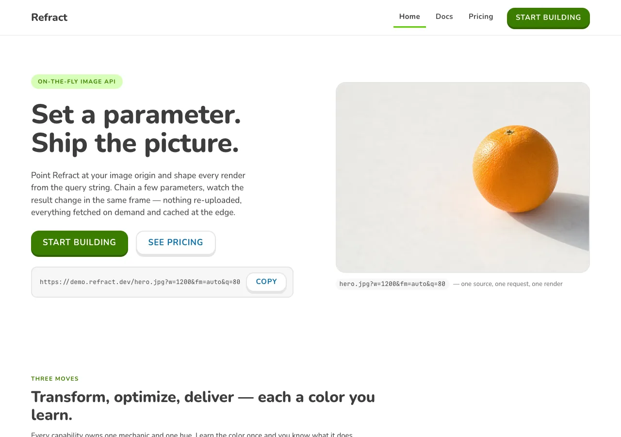
**An image API taught like a toy** — a URL-driven developer tool built entirely
out of the one design language on the web engineered to make you *want to poke it*:
solid tiles with a darker bottom "lip" that compress when you press them, a warm-dark
text that is never black, heavy rounded type, and a palette where every color means
something. The three-step quickstart is a **lesson path** of pressable circular
nodes; the stats are XP tiles; the ten parameters are collectible choice-tiles; the
demo is a before/after you build by tapping. Nothing in this system is flat, sharp,
or grey-on-grey. It is the brightest, roundest, most pressable page a developer
documentation site can honestly be.

Node starts from **Duolingo's** language, which is unusual among the eight references
under this brief in that it was never a page about a product at all — it is a game
loop. Its whole surface is tuned so a tap feels *physical*: the primary button has a
visible thickness you push down onto the page, lesson nodes bulge like plastic
bubbles along a winding path, a wrong answer costs a red heart, a streak burns
orange. Point that language at an image API and most of the game furniture maps onto
the product with almost no translation — because an image API, too, is a thing you
poke and watch respond. You set `w=1200`, and a picture changes. You chain a
parameter, and it changes again. **The URL is the toy, and the response is the
reward** — which is exactly the loop Duolingo built its entire visual system around.

What transfers is the *structure*, and only the structure. **The 3D push-button and
its lip** come across whole — a solid face over a darker bottom border that collapses
on press — and carry every call to action. The **rounded geometry** (16px buttons,
20px cards, fully-round path nodes, nothing square anywhere) comes across whole. The
**mechanic-coded palette** comes across whole: one green for the single primary
action per screen, and four saturated accents that each *mean* one thing and are
never spent decoratively. What is **cut** is everything that is Duolingo's
intellectual property and none of ours to ship: the owl mascot Duo, the World
Characters, the wordmark, the proprietary Feather Bold face, and — the load-bearing
cut — **illustration as the primary imagery**. Duolingo runs on custom vector
characters; this product's payload is *photographs*, and the design keeps the toy
*chrome* illustrated-feeling (built from CSS geometry, not from a drawn character)
while insetting the *real* transform-demo photographs in rounded frames. There is no
mascot in this build and none is invented (see *Image treatment*). The toy is made of
buttons and radii and color, not of a character.

The name **Node** is a deliberate pun, and it is the hinge between the metaphor and
the infrastructure. In Duolingo, a *node* is one circular bubble on the lesson path —
a step you press to advance. In this brief, a *node* is one of the product's **41
edge locations** — a delivery point on the network. The design puts the two on top of
each other on purpose: the three-step quickstart becomes a **lesson path of green
nodes**, and green is also the color of *Deliver*, the capability that owns those 41
edge nodes. So the pressable green bubbles a visitor taps to learn the API are the
same green as, and a visual rhyme for, the edge nodes that will actually serve their
images. The toy word and the real word are one word.

De-convergence — this brief carries **eight** designs off the same ten parameters,
and Node is the maximally distinct one, the only bright/rounded/pressable member of
the set:

- `aperture` (Airbnb): white, soft pills, one Rausch red, a photo marketplace with a
  pill URL-bar. Light and quiet.
- `carton` (Oatly): cream board, typewriter mono, anti-design, mixed type voices,
  hand-drawn wobbling boxes. Loud but *paper*.
- `cutaway` (Dyson): dark graphite, magenta+cyan voltage, an exploded-photo diagram,
  88px industrial readouts. Dark and technical.
- `folio` (Wired): white print magazine, serif display at weight 400, an exposed
  column grid, square 0px corners, page folios. Editorial.
- `prism` (Vercel): near-white, ink + mono, a refraction-spectrum gradient, pill
  CTAs, stacked soft shadows, a weight-600 ceiling. Calm platform.
- `reel` (Runway): pure-black cinematic, full-bleed photography as the interface,
  zero shadows, one sans. Dark and filmic.
- `spec` (BMW): white, one flat blue, rectangular 0px corners, heavy-700 vs Light-300
  type, a configurator of spec-cells. Precise and mechanical.
- **`node` (this one): the toy.** The only design that uses the **3D lip** (structural
  depth, not shadow), the only one with a **lesson path**, the only one that runs
  **five mechanic-coded accents**, the only one where **every corner is round and
  every control presses down**. Where the other seven are restrained-light, dark, or
  anti-design-cream, Node is bright, heavy, and springy. If a control on this page
  does not look like it wants to be pressed, it is off-brand.

The one thing this design refuses to let the toy tone do is **lie**. The gamified
voice is the *teaching metaphor* — it is how the page explains an image pipeline as a
sequence of small, winnable steps. It is not a license to invent. The parameter
reference, the pricing table, and the FAQ read as real, precise developer
documentation: every number on the built page traces to `content.md`, the demo shows
only what a browser can honestly do, and no figure is softened, rounded, or animated
into something the brief did not supply. The button springs; the facts do not.

## Palette

Bright toy fills on Snow-white paper, warm-dark **Eel** text that is never black, and
**five mechanic-coded accents**, each carrying exactly one meaning. This is the one
design under the brief that runs a full saturated palette — and running it honestly is
the hard part, because **the toy's brightest, most iconic fills cannot legibly carry a
white word.** That fact governs the whole system, and the palette is built around it
rather than pretending it away.

### Surfaces & text

| Token             | Hex       | Role                                                                          |
| ----------------- | --------- | ----------------------------------------------------------------------------- |
| `--snow`          | `#FFFFFF` | Pure white — page floor, every card and tile face, nav, footer.               |
| `--polar`         | `#F7F7F7` | Soft off-white — input fields, resting rows, alternating bands, code block.    |
| `--swan`          | `#E5E5E5` | The 2px resting border and divider; disabled fill; progress/slider track.     |
| `--hare`          | `#AFAFAF` | Placeholder and disabled labels **only** — never read (see rules).            |
| `--wolf`          | `#777777` | Muted metadata / captions — short labels only, flagged below.                 |
| `--eel`           | `#4B4B4B` | Default body and heading text. The brand's "black." Never `#000000`.          |
| `--eel-strong`    | `#3C3C3C` | Large display headlines only.                                                 |
| `--on-color`      | `#FFFFFF` | White label on the Meadow CTA and on deep-stop accent fills.                  |

### Mechanic-coded accents

Each hue is a **triad**: a **bright** stop (fills, chips, lips, keylines — *never a
word*), a **deep** stop (the only stop that carries body-size text), and a **lip**
(the structural darker bottom border). The **meaning** column is load-bearing — an
accent used outside its meaning is a defect.

| Mechanic        | Bright     | Deep (text-safe) | Lip        | Subdued tint | Means                                                    |
| --------------- | ---------- | ---------------- | ---------- | ------------ | -------------------------------------------------------- |
| **Meadow** (go) | `#58CC02`  | `#3A7D00`        | `#2E6200`  | `#D7FFB8`    | The single primary action; **Deliver**; the edge nodes; success. |
| **Macaw**       | `#1CB0F6`  | `#0E6FA8`        | `#0F86C4`  | `#DDF4FF`    | **Transform**; secondary actions; links; the selected choice-tile. |
| **Bee**         | `#FFC800`  | —  (Eel on Bee)  | `#E5A100`  | `#FFF4C8`    | **Optimize**; the payload-reduction stat; value/XP.       |
| **Fox**         | `#FF9600`  | `#C96A00`        | `#E58500`  | `#FFE7CC`    | The uptime SLA — the streak that never breaks; continuity. |
| **Cardinal**    | `#FF4B4B`  | `#C81E1E`        | `#EA2B2B`  | `#FFDFDF`    | Limits, caps, and errors — the "hearts" you can run out of. |
| **Beetle**      | `#CE82FF`  | `#8A44C7`        | `#A560E8`  | `#F1E1FF`    | The premium tier (Scale) — the "Super" accent.            |

Note the split: **Meadow's bright stop is `#58CC02` — the iconic Feather Green — but
its *text-bearing* stop is the deeper `#3A7D00`.** The bright green fills nothing that
holds a word. This is the palette's spine, and the next paragraph is why.

Rules:

- **Contrast (measured, WCAG 2.1, computed from the sRGB relative-luminance
  formula).** On `--snow` (`#FFFFFF`): `--eel` **8.72:1**, `--eel-strong` **11.03:1**,
  `--wolf` **4.48:1**, `--hare` **2.19:1**. On `--polar` (`#F7F7F7`): `--eel`
  **8.14:1**. On `--swan` (`#E5E5E5`): `--eel` **6.93:1**. On the Meadow-subdued tag
  (`#D7FFB8`): `--eel` **7.85:1**. Everything a visitor must actually read is Eel, and
  Eel clears AA body (4.5:1) with room to spare on every surface in the system.
- **The primary CTA is white on Meadow-deep `#3A7D00` — 5.11:1, and it passes AA.**
  This is the deliberate, load-bearing deviation from the reference. Duolingo's own
  primary button is a white label on bright Feather Green `#58CC02`, and **that
  combination measures 2.09:1 — it fails AA outright, and it fails even the 3:1
  large-text and non-text bars.** The reference ships that failure because its button
  labels are large and the brand predates the audit; transplanting it unchanged would
  ship the failure too. Node corrects it exactly the way `aperture` corrects Airbnb's
  white-on-Rausch and `prism` routes body links to a deeper blue: **every green that
  carries a word is the deep stop `#3A7D00`** (white label, 5.11:1), and the **bright
  Feather Green `#58CC02` is confined to non-text marks** — progress-bar fill, the
  correct-state flash, decorative node halos, and the pale-tag pairing where a *dark*
  Eel label sits on the pale-green subdued fill. The cost is real and worth naming:
  the CTA green is a notch deeper and less electric than the app's signature green.
  That is the price of an accessible primary action, and this design pays it rather
  than inherit a 2.09:1 button.
- **No bright accent ever carries a word, and most cannot even carry a white glyph.**
  White-on-bright measures: Macaw **2.44:1**, Fox **2.18:1**, Bee **1.55:1**, Beetle
  **2.54:1**, Feather Green **2.09:1** — all below the 3:1 non-text bar; only Cardinal
  (**3.30:1**) clears it. So: (a) any accent surface that holds text uses the **deep
  stop** — Macaw-deep `#0E6FA8` (5.44:1 white), Cardinal-deep `#C81E1E` (5.74:1),
  Beetle-deep `#8A44C7` (5.63:1), Fox-deep `#C96A00` (3.79:1, **large/bold text only**);
  and (b) any **icon or glyph** sitting on a bright accent is **Eel-dark**, not white —
  Eel on Bee **5.61:1**, Eel on Feather Green **4.18:1**, Eel on Fox **3.99:1**, Eel on
  Macaw **3.57:1** all clear the 3:1 non-text bar, where white would not. **Bee is the
  strict case: it never carries white anything** — its content is always Eel-dark
  (Eel-on-Bee 5.61:1), and Bee is never a text color on white (2.23:1). This is why
  the mechanic table gives Bee no deep-text stop: Bee is a fill and a keyline, never a
  letter.
- **The mechanic → color mapping is 1:1 and semantic, exactly as the reference's is.**
  In Duolingo green means *correct* and *is* the brand; red means *wrong* and *is*
  hearts. Node keeps that discipline: Meadow is go/Deliver/success/the-edge-nodes;
  Cardinal is limits/caps/errors (the rate-limit note, the Free-tier pause, the one
  destructive tone); Bee is Optimize/value; Macaw is Transform/secondary/links; Fox is
  uptime-as-streak; Beetle is the premium Scale tier. **A hue outside its meaning — a
  red used to decorate, a purple that marks nothing premium — is a defect, not a
  variant.** There is no sixth hue, and none of the five appears without its meaning.
- **`--wolf` (`#777777`) measures 4.48:1 on Snow — a hair under the 4.5 AA body line,
  and 4.18:1 on Polar.** It is therefore **label-only**: muted metadata, a caption
  that repeats information already given, a footer link. **It never sets a paragraph,
  a parameter description, a price, a stat, or anything a visitor must read to use the
  product** — those are Eel. Where the reference would run secondary body in Wolf, Node
  steps it up to Eel.
- **`--hare` (`#AFAFAF`) does NOT hold AA (2.19:1) and is placeholder/disabled only.**
  It sets the ghost text in an empty `bg` hex field and the label of a disabled
  control, and nothing else. It never carries a value, a figure, or a sentence.
- **The Swan border carries no meaning by itself.** `--swan` on Snow measures
  **1.3:1** — far below the 3:1 non-text bar — so **no control's identity or state
  rests on the border alone.** A resting card is a card because of its surface and its
  2px outline *together*; a pressable element is pressable because of its **lip**
  (structural thickness), not its border color; a selected choice-tile is marked by
  **three changes at once** — a pale Macaw-subdued fill, a Macaw-deep border-and-lip,
  and its label stepping 500 → 700 — so state never rests on color alone. Focus is a
  **3px Eel ring** (8.72:1), never an accent-only ring.
- **Depth is structural, not chromatic, and there is no dark canvas.** The page never
  inverts — no dark hero, no dark section, no dark footer. Elevation is the **lip**
  (below), not a tint and not a shadow; the one exception is a true overlay (modal,
  toast), which is allowed a soft real shadow. Every band is Snow or Polar; the toy is
  bright all the way down.

## Typography

**One rounded family does everything a human reads**, and **one monospace, tightly
quarantined, sets everything a machine reads.** Both are self-hosted as `woff2` under
`assets/fonts/` via `@font-face` — no font CDN, no Google Fonts `<link>`.

**Interface — Nunito.** The open-source substitute the reference's own Font
Substitutes section names for the proprietary Feather Bold: a rounded sans with
generous terminals and a large x-height, run **heavy** — 500 for body, 700 for
structure and buttons, 800 for display. (Baloo 2 is the reference's chunkier
alternate; Nunito is the safer default for the dense parameter table and is the single
face used here.) There is **no thin weight and no second sans**. Roundness is not a
decoration in this system — it *is* the brand, and a sharp grotesque (Helvetica, Arial,
Inter) would break the toy tone in one glance. Buttons and eyebrows render **uppercase
with 0.8–1.2px tracking**; display and body stay sentence-case.

**Code — JetBrains Mono.** The one voice the transplant must *add*, because Duolingo
has no code and an image API is nothing but code. It is the **machine's** voice, and it
is confined — absolutely — to **the request URL, the SDK snippet, and the ten parameter
names**. This is a deliberate, scoped exception to the single-family rounded law: a
developer will *copy and retype* the query string, and legibility of `?w=1200&q=80` at
small size outranks roundness inside that one machine zone. It never sets a heading, a
label, a price, a stat, a paragraph, or a node numeral. Everything a person reads as
language is Nunito; only the literal API tokens are mono.

| Role         | Face           | Size / Leading | Tracking          | Features | Use                                                     |
| ------------ | -------------- | -------------- | ----------------- | -------- | ------------------------------------------------------- |
| Display XXL  | Nunito 800     | 56px / 1.05    | -0.5px            | —        | Index hero headline — the largest type in the system     |
| Display XL   | Nunito 800     | 40px / 1.1     | -0.4px            | —        | Page openers on docs and pricing, section openers        |
| Display L    | Nunito 800     | 32px / 1.15    | -0.2px            | —        | Sub-section heads, big celebratory copy                  |
| Heading L    | Nunito 700     | 22px / 1.25    | 0                 | —        | Card titles, tier names, FAQ questions                   |
| Heading M    | Nunito 700     | 19px / 1.3     | 0                 | —        | List headings, capability-card titles, node labels       |
| Heading S    | Nunito 700     | 17px / 1.3     | 0                 | —        | Choice-tile labels, small headings                       |
| Body L       | Nunito 500     | 17px / 1.5     | 0                 | —        | Marketing lead paragraph                                 |
| Body         | Nunito 500     | 15px / 1.5     | 0                 | —        | Default UI and running copy                              |
| Body S       | Nunito 500     | 13px / 1.45    | 0                 | —        | Table cells, card meta, footer                           |
| Button L     | Nunito 700     | 17px / 1.0     | 0.8px (uppercase) | —        | Primary 3D push-button label                             |
| Button M     | Nunito 700     | 15px / 1.0     | 0.8px (uppercase) | —        | Compact buttons, nav items                               |
| Stat figure  | Nunito 800     | 40px / 1.0     | 0                 | —        | The four XP-style stat-tile numbers                      |
| Price figure | Nunito 800     | 40px / 1.0     | 0                 | —        | The three plan prices                                    |
| Caption      | Nunito 700     | 13px / 1.4     | 0                 | —        | Bold badge/meta labels                                   |
| Eyebrow      | Nunito 700     | 12px / 1.3     | 1.2px (uppercase) | —        | Section eyebrows                                         |
| Param        | JetBrains Mono | 14px / 1.6     | 0                 | **zero** | The ten parameter names, inline API tokens              |
| URL          | JetBrains Mono | 15px / 1.5     | 0                 | **zero** | The live request URL under the demo                     |
| Code         | JetBrains Mono | 13px / 1.6     | 0                 | **zero** | The SDK snippet in the code block                       |

Principles:

- **Bold is the baseline; there is no thin weight.** Body is 500, everything
  structural is 700, display is 800. The brand's warmth comes from weight and
  roundness, not delicacy — a Light cut anywhere reads as a different, colder system.
- **Uppercase + tracking is the "press me" voice.** Button labels and eyebrows are
  uppercase with 0.8–1.2px tracking. Display and body are sentence-case.
- **Text is Eel, never black.** Every headline and paragraph is `--eel` (`#4B4B4B`) or
  `--eel-strong` for the largest display; `#000000` appears nowhere.
- **Round everything, including the numerals.** The stat and price figures are Nunito
  800 — heavy and rounded — not a mono and not a condensed face. The toy counts in its
  own voice.

### Font-feature honesty

The reference's game counters (`number-xp`) declare `font-feature-settings: "tnum"`
so a ticking streak does not jitter. Node's substitute is **Nunito**, and this is
where the transplant has to be honest rather than aspirational:

- **This system declares `tnum` nowhere, because I have not dumped the self-hosted
  Nunito `woff2` to confirm it ships a `tnum` GSUB feature, and Nunito's default
  numerals are proportional.** Declaring a feature a face may not carry is a *silent
  no-op that looks like a decision* — the exact dishonesty the sibling specs call out
  for `liga`/`onum` — so the design does not do it. `liga` and `onum` are likewise
  never declared.
- **The XP-style stat tiles do not need it.** Each tile holds **one static figure**,
  set once at rest — there is no count-up animation anywhere in this system (see
  *Motion*), so the anti-jitter reason Duolingo needs `tnum` never arises. `62%`,
  `21 ms`, `98.6%`, and `99.95%` are printed, not performed, and each lives alone in
  its own tile.
- **The one place figures share a column is aligned structurally, not by a feature.**
  The three plan prices — `$0` / `$29` / `$249` — stack down the pricing cards, so they
  are set in a **fixed-width, right-aligned numeric cell**: they line up on their last
  digit by layout, guaranteed, whether or not the shipped Nunito carries tabular
  figures. The alignment is a box, not a font claim.
- **The mono is not asked to be tabular either.** JetBrains Mono is a monospace —
  every glyph is already one width — so the URL and the SDK align *by construction*;
  `tnum` is never declared on it (harmless but dishonest). What it **does** declare is
  `zero`, the slashed zero, which JetBrains Mono genuinely ships: in a system whose
  subject is a URL a developer will copy and retype, a `0` that cannot be misread as an
  `O` is a functional requirement at 14px, not a flourish. `zero` is the **only** font
  feature declared anywhere in this system.

## Spacing & layout

Generous at the bands, thumb-friendly in the controls. The reference is phone-first
and one-task-per-screen; Node keeps the roomy, single-focus rhythm and the big tap
targets, on a marketing-and-docs site rather than an app.

- **8px base unit**, with a 4px sub-token for fine work. Tokens: 4 · 8 · 12 · 16 · 24 ·
  32 · 48 · 80.
- **Section rhythm: 80px** top and bottom between major bands (the reference's `huge`),
  tightening to **48px** for dense stacks inside a section. The hero takes the full
  80px above and below.
- **Button padding `14px 24px`; min-height 50px** on the primary push-button — chunky
  and comfortably above the 44×44px WCAG target floor. Choice-tiles and steppers are
  large; path nodes are ~72–80px circles.
- Content centers in a **1200px container**; the docs page caps at **1040px**, because
  a ten-row parameter table and a code block stop being readable stretched wider.
- **The round-everything radius rule — nothing in this system is 0px.** Buttons,
  choice-tiles, and stat tiles **16px**; inputs and small chips **12px**; feature and
  plan cards and the inset photo frames **20px**; large celebratory containers and the
  demo shell **24px**; path nodes, progress bars, tags, and the stepper buttons are
  **fully round (9999px / circles)**. A square corner is not a variant — it is the
  fastest way to turn Node into `folio` or `spec`, and it appears nowhere.
- **Elevation is the lip, not a shadow.** Depth in this system is **structural
  thickness**: a pressable element sits on a darker bottom border ("lip") that reads as
  a physical edge you push down onto the page. There is no ambient drop-shadow on a
  card, a tile, or a band. **Real shadows are reserved for true overlays only** — a
  modal or a toast that genuinely floats above the page takes a soft
  `0 8px 24px rgba(75,75,75,0.15)`, and nothing else does. Swapping the lip for a
  shadow on a button is off-brand; adding a shadow to a resting card is off-brand.

### The lip elevation model

| Level | Treatment                                                                 | Use                                              |
| ----- | ------------------------------------------------------------------------- | ------------------------------------------------ |
| 0 flat | `--snow` / `--polar` fill, no border                                     | Page background, passive containers              |
| 1 outlined | 2px `--swan` all-around border                                       | Resting cards, stat tiles, inputs                |
| 2 liftable | 2px side/top border + **4px darker bottom lip**                     | Choice-tiles, ghost buttons — press to compress  |
| 3 solid 3D | Solid color face + **4px (buttons) / 6px (path nodes) darker lip**   | Primary push-buttons, active path nodes          |
| 4 overlay | Soft real shadow `0 8px 24px rgba(75,75,75,0.15)`                     | Modals and toasts **only**                       |

On press, a Level-2 or Level-3 element translates its face down by the lip height and
the lip collapses to 0 — the control visibly compresses flush onto the surface, then
springs back on release. **A disabled control has no lip (it is flat) — flatness is the
"not pressable" cue.** This is the single most important structural fact in the system.

### Breakpoints

| Name    | Width         | Key changes                                                                                                                   |
| ------- | ------------- | ----------------------------------------------------------------------------------------------------------------------------- |
| Mobile  | < 640px       | Single column; hero display steps 56 → 36px; capability trio and plan cards go 1-up; push-buttons go full-width; demo controls stack under the frames; nav collapses to wordmark + menu with the green CTA persisting. |
| Tablet  | 640–1024px    | Content caps ~720px; capability trio and plan cards 2-up; buttons size to content; the lesson path stays single-column.        |
| Desktop | 1024–1280px   | Bands center at 1200px (docs 1040px); trio and plan cards 3-up; top nav with inline links + green CTA; demo frames side-by-side.|
| Wide    | > 1280px      | Container caps at 1200px; gutters absorb the rest; type and nodes scale up but every band stays single-focus.                  |

The **lesson path never becomes a grid** at any width — it stays a single-column
serpentine of nodes and just narrows, exactly as the reference's path does.

### Band rhythm per page

`--snow` dominates; `--polar` is the only tonal step; **no band is dark.**

- **index** — hero (Snow, 80px: eyebrow, one 56px headline, a one-line lead, the
  primary green push-button **"Start building" → `./docs.html`**, and the live request
  URL in a mono badge) → **capability trio**, three mechanic-coded feature cards,
  **Transform (Macaw) / Optimize (Bee) / Deliver (Meadow)** (Snow, 80px) →
  **live-transform demo**, the before/after pair inside rounded frames with its
  choice-tile / stepper / slider control cluster and the live URL (Polar, 80px) →
  **stats band**, four XP-style stat tiles (Snow, 80px) → **CTA band**, one green
  push-button repeating "Start building" (Polar, 80px).
- **docs** — page opener (Snow, 40px line) → **quickstart as the lesson path**, three
  numbered green nodes on a serpentine connector — step 1 create-a-key-and-connect-an-
  origin, step 2 request-your-first-transform (the request-form URL), step 3 the SDK
  snippet in a code block beside the third node (Snow) → **parameter reference**, the
  ten-row table of choice-detail rows (Snow) → **caching & limits**, three stat-style
  rows (50 req/s per key, 30-day edge cache, instant purge by URL or tag) (Polar, 80px).
- **pricing** — page opener (Snow, 40px line) → **three plan cards**, Free / Pro /
  Scale (Snow, 80px) → **overage & billing semantics** (Polar, 80px) → **FAQ**, four
  disclosure rows (Snow, 80px).

## Signature

Five devices. Each is a direct translation of one of the reference's own game
components into the vocabulary of an image API.

### 1. The 3D push-button + lip — the load-bearing device

Duolingo's single most recognizable element: a solid-color face over a **darker bottom
border ("lip")** that gives the button visible physical thickness, and that
**collapses to 0 as the face translates down on press**, so every tap compresses the
button onto the page and springs back. Node carries this whole, and it carries *every*
call to action.

- The **primary push-button** is a `#3A7D00` Meadow face with a 4px `#2E6200` lip, a
  white Button-L label (uppercase, 5.11:1), 16px radius, 50px min-height. On `:active`
  the face `translateY(4px)` and the lip goes to 0. It is the **one primary action per
  screen** — the hero CTA, the CTA-band CTA, the nav CTA — and it is always Meadow.
- The **disabled** state removes the lip entirely and fills `--swan` with a `--hare`
  label. **The missing lip *is* the disabled cue** — a flat tile does not invite a
  press.
- The mechanic is not decoration; it is **the design's entire depth idiom**. There are
  no drop-shadows on buttons, cards, or bands — thickness comes from the lip, and real
  shadow is spent only on a true overlay. Ship a flat green fill and it reads as
  disabled; that is the fastest way to break this system.

### 2. The lesson path — the three-step quickstart, and the "node" pun made literal

Duolingo's learning journey is a **vertically scrolling serpentine of circular
pressable nodes** — soft green bubbles with a 6px lip, each a step you press to
advance. Node spends this on the **three-step quickstart**: three ~72px circular Meadow
nodes numbered 1 · 2 · 3, connected by a dashed serpentine, each pressing down like the
buttons (a 6px lip, collapsing on `:active`), each a white numeral on Meadow (5.11:1).
Pressing a node expands its step — the copy, the request-form URL, and on the third
node the SDK code block.

This is where the pun lands. The nodes are **Meadow green**, and Meadow is also the
color of **Deliver** and its **41 edge locations** — the brief's own "nodes." So the
pressable green bubbles a developer taps to *learn* the API are a deliberate visual
rhyme for the edge nodes that will *serve* their images. The lesson-path node and the
edge node are the same shape and the same green on purpose. The quickstart stays
single-column and serpentine at every breakpoint — it never becomes a grid.

### 3. The XP-style stat tile — the profile stat block

Duolingo's profile shows Day Streak / Total XP / League as **stat tiles**: a rounded
card, a big number, a small label, the number often colored to its mechanic. Node
spends this on the **four brief stats**, each in its own 16px-radius Snow tile with a
2px Swan outline:

```
62%                21 ms              98.6%              99.95%
average payload    median cached      cache hit ratio    uptime SLA
reduction          response
[Bee keyline]      [Macaw keyline]    [Meadow keyline]   [Fox keyline]
```

The mechanic coding lives in each tile's **keyline and icon-chip**, not in the number:
62% → **Bee** (Optimize), 21 ms → **Macaw** (Transform-speed / latency), 98.6% →
**Meadow** (Deliver / cache), 99.95% → **Fox** (uptime as the streak that never
breaks). **The big figure itself is Eel (8.72:1)**, not the mechanic hue — because a
40px number in bright Fox or Feather Green on white fails AA (2.09–3.30:1), and a stat a
visitor cannot read is not a stat. The color is the tile's *coding*; the figure is Eel.
The tiles are **printed once, at rest — no count-up**.

### 4. The choice-tile — a lesson answer becomes a parameter

Duolingo's exercise screen is built from **choice-tiles**: tappable answer cards with a
2px border and a 4px lip that fill a pale color and swap their border to Macaw when
selected. Node spends this on the **live-demo controls** — the browser-honest
parameters a visitor sets by tapping:

- `fit` (`cover` / `contain` / `fill` / `crop`), `crop` (`smart` / `center` / `edges`),
  and `rot` (`90` / `180` / `270`) are **choice-tiles**: press one and it fills
  Macaw-subdued (`#DDF4FF`), its border and lip go Macaw-deep, its label steps 500 → 700
  (three cues, never color alone), and the preview updates in the same frame.
- `w` and `h` are **steppers** — a value between two circular push-buttons.
- `blur` (0–100) is a **slider** on a fully-round Swan track with a Meadow fill.
- `bg` (hex) is a **swatch grid + hex field**, live **only when `fit=contain`** — the
  parameter's own scope, showing; inert (label `--hare`, no press) otherwise.

The ten parameters also appear as **detail rows** in the docs reference table — the same
choice-tile logic, read rather than pressed.

### 5. The mechanic-coded capability trio — each color means one thing

Duolingo's discipline is that **every color carries a mechanic** and none is spent
decoratively. Node's three capabilities *are* three mechanics, and each takes its color:
**Transform → Macaw**, **Optimize → Bee**, **Deliver → Meadow**. Each is a feature card
with a mechanic-colored icon-chip and top keyline, an Eel title and body, and one inline
mono example (`w=1200`, `fm=auto`, `41 edge locations`). No card carries a white word on
a bright fill; the color is the chip and the keyline, the text is Eel. This is the rule
that keeps a five-accent palette from reading as a circus: each hue shows up exactly
where its meaning is, and nowhere else.

## Components

- **Nav bar.** `--snow`, 72px tall, a 1px `--swan` divider beneath, sticky. The wordmark
  **Refract** sits flush left in Heading L. Three page tabs sit center — **Home · Docs ·
  Pricing** in Button M — the active tab taking `aria-current="page"` and a **3px Meadow
  underline**. Flush right: a `button-primary` "Start building" at nav scale (16px
  radius, 40px tall, its 4px lip intact). Below tablet the links collapse to a menu; the
  green CTA persists.
- **`button-primary`.** The signature 3D push-button: `#3A7D00` Meadow face, 4px
  `#2E6200` lip, white Button-L label (5.11:1), 16px radius, 50px min-height, `14px 24px`
  padding. `:active` translates the face down 4px and collapses the lip. **One per
  screen.** Disabled = `--swan` fill, no lip, `--hare` label.
- **`button-secondary` (ghost).** `--snow` face, 2px `--swan` border with a 4px `--swan`
  lip, a Macaw-deep (`#0E6FA8`, 5.44:1) or Eel label. Still compresses on press — even
  the quiet button is 3D. Used for the second action in a pair and for all "Copy"
  actions. Because it carries the lip, it reads as pressable without spending the
  primary green.
- **`button-danger`.** Cardinal-deep (`#C81E1E`) face, 4px `#EA2B2B` lip, white label
  (5.74:1). Reserved for the single destructive/limit tone if one is needed; never used
  decoratively.
- **Choice-tile.** `--snow` face, 2px `--swan` border + 4px `--swan` lip, Heading-S Eel
  label, 16px radius, 16px padding. **Selected:** Macaw-subdued (`#DDF4FF`) fill,
  Macaw-deep border + lip, label 500 → 700 — three simultaneous cues. Presses down on
  tap like every other pressable. The demo's `fit`/`crop`/`rot`/`bg`-swatch controls are
  these.
- **`stepper`.** A value flanked by two **circular** push-buttons (`−` / `+`), each a
  small Meadow or ghost 3D button with its own lip. Drives `w` and `h`. Holds a min/max;
  a value at the floor disables the `−` button (which then loses its lip).
- **`slider`.** A fully-round `--swan` track with a **Meadow fill** and a circular thumb;
  drives `blur` (0–100). The fill is a *non-text* green surface, so bright Feather Green
  `#58CC02` is legitimate here.
- **Feature card (capability).** `--snow`, 20px radius, 2px `--swan` outline, a
  mechanic-colored **icon-chip** (a rounded square, bright accent fill with an Eel
  glyph) and a **top keyline** in the same hue, an Eel Heading-M title, a Body paragraph,
  and one inline mono token. Lifts nothing on hover (no shadow); a subtle press-in is its
  only motion if it is interactive. The three capability cards are these.
- **Path node.** A ~72px **circle**, Meadow face with a 6px `#2E6200` lip, a white
  numeral (Heading-M, 5.11:1). Presses down on tap. Connected to its neighbours by a
  dashed `--swan` serpentine connector. The three quickstart steps are these.
- **Stat tile.** `--snow`, 16px radius, 2px `--swan` outline, a mechanic **keyline** and
  **icon-chip**, the figure in Stat-figure Eel (40px / 800), a Body-S label beneath. Four
  of them make the stats band. No count-up.
- **Text input / hex field.** `--polar` fill, 2px `--swan` border, Eel Body, 12px radius,
  `14px 16px` padding, `--hare` placeholder. **Focus:** fill lifts to `--snow`, border
  swaps to 2px Macaw-deep, plus the 3px Eel focus ring.
- **`pill-tag`.** A fully-round tag: a **subdued** mechanic fill (`#D7FFB8`, `#DDF4FF`,
  `#FFF4C8`, …) with an **Eel** or deep-stop label in Eyebrow role (uppercase). Re-tinted
  per mechanic; never a bright fill with white text. The `NEGOTIATED` tag (below) is the
  one neutral exception.
- **`negotiated-tag`.** A neutral pill — `--wolf` label on `--polar`, uppercase Eyebrow —
  reading `NEGOTIATED`, marking `fm` / `q` / `dpr` in the URL string and in the parameter
  table. **It is never an accent color** — it is a statement of fact, not an alarm, and a
  mechanic hue on it would misassign a meaning.
- **Parameter table.** The ten-parameter reference, as a stack of **detail rows** (not a
  card grid): each row a 1px `--swan` divider between, the **parameter name in the Param
  mono role, `--eel`**, the accepted values in Body S, and the description in Eel. The
  `fm`, `q`, and `dpr` rows carry the `NEGOTIATED` tag; the stated default (`q` 75) is
  printed; defaults the brief does not state are not invented. Precise, quiet, real
  documentation — the toy tone does not enter the table.
- **Code block.** `--polar` fill, 16px radius, 24px padding, **no shadow, no
  syntax-highlight palette** (this system will not spend a mechanic hue on a keyword;
  emphasis inside is weight 700 Eel). JetBrains Mono Code role with `zero`. A
  `button-secondary` "Copy" sits at the top-right. Holds the SDK snippet.
- **Plan card.** `--snow`, 20px radius, 2px `--swan` outline, 24px padding. In order: the
  tier name (Heading L), the **price in the 40px Price-figure role, right-aligned in a
  fixed-width numeric cell** (`$0` / `$29` / `$249` per month), a full-width
  `button-secondary` CTA, and a quota stack in Body. Each card carries a **mechanic
  keyline**: Free neutral (`--hare`), Pro Meadow, **Scale Beetle** (the premium accent).
  **No tier is labeled "recommended," "popular," or "best value,"** and all three CTAs are
  identical ghost buttons — the brief hands this product no featured tier, so the design
  claims none. Duolingo would highlight the middle tier; Node declines to, and keeps the
  single primary green CTA of the pricing page in the CTA-band, not on one card. (See
  *Design notes for the build* below.)
- **FAQ row.** A full-width disclosure, 1px `--swan` between rows: the question in Heading
  L, a **circular** `--polar` chevron push-button at the right (with its own small lip),
  the answer in Body Eel when open. No card, no fill, no shadow — a divider, a question, a
  chevron.
- **Footer.** `--polar` — the same soft off-white family as the page; **the page never
  inverts at the foot.** `48px 24px` padding, columns of Body-S links in Eel, a `--wolf`
  legal line. No dark slab.

## Motion

**Bouncy where you press, still where you read.** The reference's motion is springy and
over-eased — the press, the confetti, the progress-fill — and Node keeps the *press* and
drops the celebration theatre, because a documentation site is not a game and its numbers
must not perform.

- **The press is the motion.** On `:active`, a push-button, choice-tile, stepper, node,
  or chevron translates its face down by the lip height (lip → 0) and springs back on
  release with a short over-eased ease-out (~120ms down, ~180ms spring back). This is the
  brand's feel-good loop and the one place motion is deliberately *playful*.
- **The preview answers in the same frame as the control that moved.** No skeleton, no
  shimmer, no spinner, no artificial latency — a choice-tile, stepper, or slider mutates
  the demo frame and rewrites the URL immediately, the way a viewport redraws.
- **No count-up on the stats or prices.** The four figures and the three prices are set
  once, at rest. No charts, no sparklines, no animated meters, and — critically — **no
  file-size animation on the demo** (see *Image treatment*).
- **No confetti, no mascot animation, no hopping character.** The reference's celebration
  layer is IP and out of register for a dev-docs site; it is cut. What remains is the
  press.
- **Focus is a 3px Eel ring** (8.72:1) with a 2px offset on every interactive element, and
  it is never removed.
- Under **`prefers-reduced-motion: reduce`**, the press-spring becomes an instant
  state-swap (the lip still collapses, without the bounce), and every transition is
  dropped. **Turn all of it off and nothing is lost but the springiness** — the buttons
  still compress, the demo still updates, the facts were never moving.

## Image treatment

**The toy chrome is CSS; the photographs are real.** This is the resolution of the
brief's central tension with this reference. Duolingo bans stock photography *as primary
imagery* because it runs on **custom illustration and the Duo mascot** — but this
product's payload *is* photographs, and its mascot and illustration are IP that this
build must strip. So the split is drawn cleanly:

- **The "toy" is built entirely from geometry, not from a drawn character.** The 3D
  lips, the rounded radii, the mechanic-coded palette, the pill nodes — all of it is CSS.
  **There is no generated illustration, no vector character, no icon-as-illustration, and
  no mascot.** None is invented; inventing a character would be inventing brand IP the
  product does not have. Icons are simple rounded-geometric glyphs (thick strokes,
  rounded caps), drawn in CSS/SVG, never a cast of characters.
- **The only generated images are real photographs, inset in rounded (20px) frames** —
  which is precisely the one place the reference *does* allow photography (marketing
  testimonials sit inset in rounded containers). Every photograph is a **sample input the
  API actually transforms**: the demo crops it, rotates it, and blurs it live, in front of
  the visitor. It has earned its place the way a payload earns it — it is the file the
  product is about, not decoration standing in for an idea.

**How every generated image in this system is prompted.** These are binding rules; a
still that breaks one is regenerated, never accepted and cropped around.

1. **Nothing in frame carries language.** Every prompt states, in its own clause, that
   the image contains **no text, no lettering, no numerals, no labels, no logos, no brand
   markings, no signage, and no packaging print** — not on a wall, a sign, a box, a book, a
   screen, or anything else. A generated still invents lettering if left to itself, and
   invented lettering inside a frame the demo is about to enlarge is a counterfeit brand
   printed at size, inside the one object the design asked the visitor to look at. This is
   the image provider's most common failure mode, and the clause is the guard.
2. **No people, no hands.** Not one, not out of focus, not in the background. The model
   fuses fingers into a knuckleless mass, and — more to the point — each photograph is a
   *sample input* the API is about to resize and blur, not a lifestyle shot. A person turns
   the sample into an advertisement.
3. **The frame is quiet and survives the crop.** No props beyond the named subject, no
   busy corners, no lived-in clutter. Every photograph must still read deliberately after
   being cropped to `1:1` and blurred to 100, because the demo will do exactly that, live.
   A fussy corner becomes a fussy corner enlarged.
4. **The subject sits off-center, always.** The brief promises smart crop keeps subjects
   in frame, and the demo makes good on it by cropping these photographs where the visitor
   can watch. A subject parked dead-center survives any crop — `smart` and `center` land on
   the same pixels and the visitor learns nothing. Push the subject to one side and the
   strategies visibly disagree, which is the only way the claim gets tested.

Node's register is distinct from its siblings: where `aperture` shoots warm travel and
`prism` shoots cool product-library, Node is **bright, high-key, and friendly** — cheerful
daylight, clean simple subjects, playful color, generous space — the visual equivalent of
the toy tone, but still a *real photograph*, never an illustration. Constant tone words on
every prompt: **bright high-key daylight, clean and simple, single subject, cheerful,
generous negative space, real object or place, no people, no text.** No image is ever
full-bleed, none carries type on top of it, and every one is clipped to a 20px frame.

Needed images (referenced `./assets/<id>.webp`):

- `hero-preview` (4:3) — A single bright piece of citrus fruit on a clean pale surface in
  high-key daylight, placed well off-center to the right, generous empty space to the left,
  cheerful and simple, no text, no lettering, no numerals, no labels, no logos, no brand
  markings, no signage, no packaging print, no people, no hands, quiet and uncluttered.
- `capability-transform` (4:3) — A smooth colorful ceramic bowl on a seamless bright
  background, pushed hard to the left of the frame, soft even studio light, clean simple
  geometry, generous space to the right, no text, no lettering, no numerals, no labels, no
  logos, no brand markings, no signage, no packaging print, no people, no hands.
- `capability-optimize` (4:3) — A calm high-key gradient of sky at midday with long smooth
  tonal transitions and a single small bright cloud low to the left, clean and simple, no
  text, no lettering, no numerals, no labels, no logos, no brand markings, no signage, no
  packaging print, no people, no hands, no buildings, no aircraft.
- `capability-deliver` (4:3) — An overhead view of a smooth curving path crossing bright
  open ground, shot from directly above in cheerful afternoon light, the path entering from
  one corner, clean and simple, no text, no lettering, no numerals, no labels, no logos, no
  brand markings, no signage, no packaging print, no people, no hands, no vehicles.
- `demo-source` (4:3) — A single ripe apple on a plain pale tabletop beside soft window
  light, placed off-center to the right, bright high-key daylight, plain uncluttered
  background, no text, no lettering, no numerals, no labels, no logos, no brand markings, no
  signage, no packaging print, no people, no hands.
- `docs-origin` (1:1) — A neat stack of blank, unlabeled pale cards resting on a bright
  clean table in soft daylight, the top card completely empty, placed off-center, no text,
  no lettering, no numerals, no labels, no logos, no brand markings, no signage, no
  packaging print, nothing printed on the cards, no people, no hands.
- `pricing-hero` (4:3) — Three simple smooth rounded objects of graduated size on a clean
  pale surface in bright daylight, grouped off-center to one side, cheerful and minimal,
  generous negative space, no text, no lettering, no numerals, no labels, no logos, no
  brand markings, no signage, no packaging print, no people, no hands.

## Do / Don't

Do:

- Give **every** pressable element the 3D lip — buttons, choice-tiles, steppers, path
  nodes, chevrons — a darker bottom border that collapses on press. Structural thickness
  is the depth idiom; the disabled state is the *only* flat one.
- Reserve the primary **Meadow** green for the single primary action per screen; let the
  four accents carry their mechanics (Macaw = Transform/secondary, Bee = Optimize, Fox =
  uptime, Cardinal = limits/errors, Beetle = the Scale tier). Every color means one thing.
- Set text-bearing green in **Meadow-deep `#3A7D00`** (white 5.11:1) and confine bright
  Feather Green `#58CC02` to non-text marks (progress fill, keylines, node halos, subdued
  tags with Eel text).
- Keep every stat, price, and node numeral, and every accent surface's glyph, in **Eel**
  where a bright fill would fail — the color codes the tile, Eel carries the value.
- Keep text in Eel (`#4B4B4B`), never `#000000`; render buttons and eyebrows uppercase
  with 0.8–1.2px tracking; use the rounded substitute (Nunito) at heavy weight.
- Round everything: 16px buttons and tiles, 20px cards and photo frames, 24px shells,
  fully-round nodes and pills. Nothing is 0px.
- Keep the seven browser-honest parameters (`w` `h` `fit` `crop` `rot` `blur` `bg`) wired
  to the preview via choice-tiles, steppers, and a slider; keep `fm` `q` `dpr` in the URL
  string with the neutral `NEGOTIATED` tag.
- Build the quickstart *as* the lesson path — three pressable green nodes on a serpentine —
  and let the node/edge-node pun stand.
- Keep the parameter table, pricing, and FAQ precise and real; every figure traces to
  `content.md`.

Don't:

- **Don't ship a flat button.** A green fill with no lip reads as disabled — the lip is
  what makes it pressable, and it is the whole depth model.
- **Don't put white text on any bright accent.** White-on-Feather-Green (2.09:1),
  -Macaw (2.44:1), -Fox (2.18:1), -Bee (1.55:1), -Beetle (2.54:1) all fail. Text-bearing
  fills use the deep stop; glyphs on bright fills are Eel; Bee never carries white anything.
- **Don't use pure black** for text, and don't introduce a sixth hue or spend an accent
  outside its meaning — a decorative red or an unmapped purple breaks the "every color
  means something" logic that lets five accents coexist.
- **Don't use a sharp grotesque** (Helvetica, Arial, Inter) for the interface — roundness
  is the brand; Nunito is mandatory. Don't let the mono (JetBrains Mono) leak past the URL,
  the SDK, and the parameter names.
- **Don't declare a font feature the face may not ship.** No `tnum` on Nunito (unverified,
  and unneeded — the stats are static and the prices align in a fixed-width cell), no `liga`
  or `onum` anywhere; `zero` on JetBrains Mono is the only declared feature.
- **Don't use a 0px corner** anywhere — that is `folio`'s and `spec`'s language, and the
  fastest way to converge.
- **Don't swap the lip for a drop-shadow** on a button, tile, or card, and don't add an
  ambient shadow to a band. Real shadow is for true overlays (modal, toast) only.
- **Don't invert the page** — no dark hero, no dark section, no dark footer. That is
  `cutaway` and `reel`, and different designs.
- **Don't invent facts or numbers.** No byte count beside the preview, no file-size
  animation, no count-up on the stats, no latency/uptime/edge count the brief did not
  supply, no "most popular" tier, no mascot, no celebration confetti. **Every figure traces
  to `content.md`** — the stats (62%, 21 ms, 98.6%, 99.95%), the 41 edge locations and the
  cold-transform p50 89 ms / p99 340 ms, the 50 req/s limit and 30-day cache, the prices,
  quotas, overage rates ($2 / 1,000 transforms, $0.08/GB), parameter ranges, and the
  default `q` of 75.
- No emoji anywhere, and **no naming of the source reference in the built page** — Duolingo
  is named in this document's prose only, to explain lineage and font substitution. The
  site carries only the product's own name, **Refract**, in English.

### Design notes for the build

- **The featured pricing tier is deliberately not featured.** Duolingo's pricing pattern
  highlights the middle tier, but the brief supplies no "recommended"/"popular" claim, and
  the house style (both exemplars) refuses to invent one. Resolution: three identical ghost
  CTAs, tiers differentiated only by a mechanic keyline (Free neutral, Pro Meadow, Scale
  Beetle), and the pricing page's one primary green CTA kept in the CTA-band. A
  Duolingo-faithful featured-Pro treatment, if ever wanted, should be a *surface*
  echo only (e.g. a raised card with a full lip), never a worded claim.
- **The Meadow-deep primary green is a knowing departure from the iconic Feather Green.**
  The bright `#58CC02` primary button fails AA at 2.09:1; the CTA green is deepened to
  `#3A7D00` (5.11:1) to pass, at the cost of some electricity. Flagged because it is the one
  place the build visibly differs from the reference's most recognizable component.
- **`tnum` is declared nowhere.** Confirmed a deliberate choice, not an oversight — the
  self-hosted Nunito `woff2` was not dumped to verify the feature, the stats are static, and
  the prices align structurally. If the build wants belt-and-suspenders, it may add
  `font-variant-numeric: tabular-nums` as a no-harm progressive enhancement, but the layout
  must not depend on it.