DESIGN.md
# Frost — Design System

## Concept

**An image API whose entire chrome is built from its own `blur` parameter.** A
full-bleed photograph carries every color; the interface is a stack of translucent
frosted panes floating above it; and the depth is real — stacked translucency, a
specular edge, and soft ambient light, never a flat card. Set a value in the
floating control and the picture behind the frost changes. The chrome is not
decorated to look like the product; **the chrome _is_ the product, running.**

This design is drawn free-form from a single product truth, and it names no company
as its source. The truth is in the parameter list: one of Refract's ten transform
parameters is **`blur` — gaussian, 0–100**. Frosted glass is not _like_ gaussian
blur; frosted glass **is** gaussian blur — a translucent sheet that samples the
image behind it and softens it. So the genre this page borrows is not a brand's
look but a material: **the language of layered glass**, the family of translucent,
backdrop-blurred surfaces the whole industry now calls frosted or liquid glass. The
entire interface is built out of one CSS declaration — `backdrop-filter: blur()` —
which is the exact operation `blur` performs at the edge. Every panel on the page is
a live instance of the feature the product sells.

That is the argument, and it is honest because it is **checkable in the browser**.
The most persuasive thing an image API can do on a marketing page is not describe a
transform — it is **run one, in front of you, and let you see it is not faked**. Of
the ten parameters, seven are things a browser can genuinely apply to a picture
(`w` `h` `fit` `crop` `rot` `blur` `bg`), and three are server-side and are not
(`fm` `q` `dpr`, which negotiate format and re-encode at the edge). Frost draws the
line exactly there, like its siblings do — but it has one parameter the others do
not get to brag about. **`blur` is the one transform a browser reproduces with total
fidelity, because the API's gaussian blur and CSS's `blur()` are the same math.**
So the demo's blur slider does not simulate the feature; it invokes the identical
operation, on a real pane, over a real image. When a visitor drags that slider and
watches the pane frost, the page is not showing a picture of the product working —
it is the product working, and the interface it is embedded in is made of the same
stuff. **That is why the frost is allowed to be the whole chrome: it is the one
decorative language that is simultaneously a functional demonstration.**

The load-bearing device is **the frosted pane** — a single translucent, blurred
panel with a 1px specular top edge and a soft ambient shadow. Every surface on the
site is one: the nav, the hero's URL builder, the capability cards, the stat tiles,
the docs table, the code block, the tier cards, the FAQ. There is no other card
idiom. Depth is produced by stacking these panes at different blur radii and
opacities so they read as sheets of glass at different distances from the
photograph — never by a drop shadow standing in for elevation. Take the panes away
and what is left is a photograph and a paper margin; the interface lives entirely in
the translucency between them.

Two siblings under this brief sit close enough to be confused with Frost, and the
line gets drawn hard against both. **`spec`** is the other design with an action
blue, and it is Frost's exact opposite on the axis that matters. `spec` runs a
single **flat corporate blue** (`#1C69D4`) as the only thing that converts, on
**hard 0px rectangles**, with **no shadow and no gradient anywhere** — its depth is
color-block contrast, and its whole discipline is that a surface is a flat opaque
plane. Frost inverts every one of those: its blue is **luminous, not flat**, a
blue-violet (`#4D6BFF`) that appears **only on glass** and reads as light passing
_through_ a surface rather than paint sitting _on_ one; its corners are **soft**;
and **depth is the entire point** — the thing `spec` refuses. Where `spec` is a
configurator of opaque tiles, Frost is a stack of transparent sheets. **`prism`** is
the other "one decorative object" design — a single refraction gradient on
near-white paper — and it draws its own line first: prism's rules state, in as many
words, **no glassmorphism, no glow, no scrim, one stacked _soft_ shadow and nothing
translucent.** Frost is the design prism defines itself against. Prism's one object
is a **flat gradient** that carries no image and no depth; Frost's one object is a
**sheet of translucency** that carries the image _through_ it and is nothing but
depth. Prism keeps photographs inset in opaque panes and forbids type on a
photograph; Frost floats type on frosted glass over a full-bleed photograph as its
central move. They share an alphabet and a near-neutral base and nothing else.

Every other design under this brief refuses translucent depth on purpose. `aperture`
hands its weight to photography but keeps the interface flat white; `reel` deletes
the interface and goes full-bleed black; `folio`, `carton`, and `tty` are paper and
text. **Frost is the only one that puts the interface _on_ the photograph and makes
the glass between them the whole design.** That the glass is the API's own `blur`
is what keeps it from being decoration.

## Palette

Color is not in the palette — **color is in the photograph**, and the chrome is
neutral translucent glass that tints itself from whatever image sits behind it. The
named tokens are therefore mostly _glass_: a small family of white-tinted
translucent fills at graded opacities, one ink, one dark glass for code, and **one
luminous blue-violet accent that lives only on glass and reads as transmitted
light.** There is no second hue, and the accent is never paint on an opaque surface.

| Token             | Value                          | Role                                                                                     |
| ----------------- | ------------------------------ | ---------------------------------------------------------------------------------------- |
| `--paper`         | `#EEF0F3`                      | The soft-neutral page floor behind the imagery — visible margins, the tone under panes where no photo runs. |
| `--paper-deep`    | `#E4E7EC`                      | A half-step deeper paper — the dimmed base beneath the docs and pricing glass.            |
| `--ink`           | `#181A1F`                      | Primary text on glass. Near-black; the darkness is load-bearing (see the contrast floor). |
| `--ink-soft`      | `#3D424A`                      | Secondary text — **`--glass-strong` only** (fails the floor on lighter glass, see rules). |
| `--ink-faint`     | `#6B7078`                      | Decorative micro-labels only — **fails AA, never a paragraph, value, price, or stat.**    |
| `--glass-thin`    | `rgba(255,255,255,0.45)`       | Ambient / decorative panes. Carries **no reading text** — large display (≥24px) only.     |
| `--glass`         | `rgba(255,255,255,0.62)`       | The standard reading pane. Carries primary `--ink` body and labels.                       |
| `--glass-strong`  | `rgba(255,255,255,0.72)`       | The dense reading pane — long body, the parameter table. The only home of `--ink-soft`.   |
| `--glass-ink`     | `rgba(24,26,31,0.82)`          | Dark frosted pane — the code block and the URL badge. Carries light text.                 |
| `--glass-edge`    | `rgba(255,255,255,0.85)`       | The 1px specular top edge inset into every pane.                                          |
| `--glass-shadow`  | `rgba(18,22,38,0.20)`          | The soft ambient shadow cast beneath a pane.                                              |
| `--hairline`      | `rgba(24,26,31,0.10)`          | Interior 1px rules _inside_ a pane — table rows, dividers. Decorative; carries no meaning.  |
| `--accent`        | `#4D6BFF`                      | The luminous blue-violet. **Non-text marks and light only** — the slider fill, the selected pane's edge glow, focus. |
| `--accent-deep`   | `#3B53E0`                      | Every accent fill that carries white text — the CTA — and large accent figures. (See rule.) |
| `--accent-glow`   | `rgba(77,107,255,0.35)`        | The accent as light through glass — radial blooms, tile backlights, the tint on a lit pane. |
| `--on-glass`      | `#FFFFFF`                      | White text on `--glass-ink` (the code block, dark panes).                                 |
| `--on-glass-soft` | `#C3C8D4`                      | Secondary light text on `--glass-ink` — comments, meta.                                   |
| `--on-accent`     | `#FFFFFF`                      | White label on the `--accent-deep` fill.                                                  |

Rules:

- **The photograph is the only source of color, and the glass drinks it.** Every
  pane sets `backdrop-filter: blur(...) saturate(1.2)` — the `saturate` pulls the
  hue of the image behind it up through the white tint, so a pane over a blue sea
  reads cool and a pane over warm light reads warm. This is the entire color
  strategy: **the UI has no palette of its own; it borrows the photograph's.** No
  token below `--accent` is a hue. There is no green success, no amber warning, no
  error red, no second blue. A validation message — a malformed hex typed into the
  one free-text field, `bg` — is set in **`--ink`** with the field's frosted edge
  going to `--accent` on focus and a heavier `--ink` inner rule when rejected; it
  does **not** introduce an error color, because a second hue is exactly the
  flattening this palette refuses.
- **The accent is light, not paint, and it lives only on glass.** `--accent`
  (`#4D6BFF`) never fills an opaque surface, never sets body text, and never appears
  off a translucent pane. Its jobs are all _luminous_: the fill of the demo's blur
  slider, the specular top edge of a selected or focused pane going from white to
  accent, and the soft `--accent-glow` bloom that reads as a pane lit from behind.
  This is the exact split from `spec`, whose blue is a **flat opaque fill on a hard
  rectangle**; here the same family of blue is **transmitted through a surface**, and
  if it ever reads as a flat blue chip the design has become `spec`.
- **Contrast on glass is computed against the _worst_ backdrop, and the number is a
  floor.** A white-tinted pane at opacity α, composited over a backdrop, is lightest
  over white and **darkest over pure black**, where it renders as a flat grey of
  value `255·α`. Every ratio below is measured at that black-backdrop minimum —
  meaning **the photograph and the blur can only make the pane lighter, never
  darker, so each figure is a guaranteed floor, not an average.** (A real photograph
  is almost never uniformly black under a whole block of text; the blur averages the
  region toward mid-tone; the floor is deliberately pessimistic.) Ratios use the
  WCAG 2.1 sRGB relative-luminance formula.
- **Primary ink holds on both reading glasses, because the ink is near-black.**
  `--ink` (`#181A1F`, L≈0.010) over the worst-case pane measures **6.5:1 on
  `--glass`** (0.62 → grey `#9E9E9E` floor) and **8.8:1 on `--glass-strong`** (0.72 →
  `#B8B8B8` floor) — both clear AA body (4.5:1) with margin, over black. On
  `--glass-thin` (0.45 → `#737373` floor) it measures **3.7:1**, which clears the
  3:1 large-text bar but **not** AA body — so **`--glass-thin` carries only display
  type ≥24px in `--ink`, or nothing readable at all.** The choice of a near-black
  ink rather than a soft grey is what buys these floors; a `#444` ink would fail over
  a dark photo.
- **Secondary ink is confined to the dense pane.** `--ink-soft` (`#3D424A`, L≈0.054)
  measures **5.1:1 on `--glass-strong`** (over black) — AA body — but only **3.8:1 on
  `--glass`**. Therefore **`--ink-soft` appears only on `--glass-strong` panes**
  (docs body, table meta, captions inside dense panes). On a standard `--glass` pane,
  everything a visitor must read is full `--ink`. `--ink-faint` (`#6B7078`) holds no
  reading role anywhere; it is a decorative eyebrow/label token and is called out
  as such, exactly like the siblings' faint tokens.
- **Code and the URL sit on _dark_ glass, which inverts the problem into a
  guarantee.** `--glass-ink` (`rgba(24,26,31,0.82)`) is frosted glass tinted with the
  ink, and it is _lightest_ over a white backdrop (worst case for its white text),
  where it composites to `#414347`. White `--on-glass` there measures **9.9:1** and
  `--on-glass-soft` (`#C3C8D4`) **5.9:1** — both AA, over the worst case. So the two
  surfaces a developer will actually read character-by-character (the request URL,
  the SDK snippet) are the two that hold contrast regardless of the photo, because
  their glass is dark, not white.
- **The accent's bright stop fails white-text AA — so it never carries text.**
  White on `--accent` (`#4D6BFF`, L≈0.193) measures **4.32:1** — _below_ AA body —
  which is precisely why `--accent` is a non-text mark only. Every accent fill that
  carries a white label steps to **`--accent-deep`** (`#3B53E0`, L≈0.125), where
  white measures **6.0:1**. This is the same two-stop honesty the siblings use for
  their reds and blues: the luminous hue survives where it carries no word (the
  slider, the edge, the glow), and the deeper stop carries every label. A large
  accent figure (the stat readout, ≥40px) may use `--accent-deep` on `--glass-strong`
  at **3.0:1**, which clears the 3:1 large-text bar — but the stat figures'
  _preferred_ treatment is `--ink` with an accent backlight (see Signature 4), which
  reads at 8.8:1 and still glows.
- **The hairlines carry no meaning.** `--hairline` (`rgba(24,26,31,0.10)`) is a faint
  interior rule between table rows and list items _inside_ a pane; it never bounds a
  control's identity or state. A pane is a pane because of its translucency, its
  specular edge, and its ambient shadow — not a border. Focus is a ring, not a
  hairline (see Motion).
- **Transparency degrades to solid, on request and on old browsers.** Under
  `@supports not (backdrop-filter: blur(1px))`, every glass token falls back to an
  **opaque** fill (`--glass` → `#F4F5F7`, `--glass-strong` → `#F8F9FB`, `--glass-ink`
  → `#1C1E24`) so text never rests on raw photograph. Under
  `prefers-reduced-transparency: reduce`, the same opaque fallbacks apply on purpose,
  the `saturate` boost is dropped, and the accent glow is removed — the page becomes
  a set of solid neutral cards over a still photograph, and **nothing readable is
  lost, only the translucency.** This is the answer to the unreadable-glass cliché:
  the glass is a floor-guaranteed enhancement, never the only thing holding the text.

## Typography

Two voices, cleanly split, **both open-source Google Fonts, self-hosted as woff2
under `assets/fonts/`** via `@font-face` — no font CDN, no runtime Google Fonts
`<link>`. Neither face is proprietary, so the built page carries no licensed font.

**Interface — Figtree.** A humanist geometric sans with open apertures, a tall
x-height, and a genuinely usable **Light (300)**, chosen for one reason above all:
**it stays legible after the glass softens it.** Frosted panes blur and lower the
contrast of everything set on them by a hair, and a tightly-drawn grotesque or a
high-contrast display face loses its joints under that treatment. Figtree's even
stroke and open counters survive the softening — a `300`-weight headline reads as
_airy_, not as _thin and broken_, which is exactly the register this design wants:
calm, light type that gets out of the way and lets the glass and the image carry the
page. It runs at weights **300 / 400 / 500 and no heavier** — there is no bold in
this system, because bold display fights the softness of the glass and turns a
luminous surface into a loud one. Figtree carries display, body, navigation, labels,
buttons, and every figure.

**Technical — JetBrains Mono.** The one voice the interface must add, because a
URL-driven API is nothing but code and Figtree is not a monospace. It is confined,
absolutely, to **the request URL, the SDK snippet, and the ten parameter names**
wherever they appear. It never sets a heading, a paragraph, a price, or a label. Its
slashed zero is functional: the whole subject of the page is a query string a
developer will copy and retype, and `?w=1200&q=80` must be unambiguous.

| Role        | Face            | Size / Leading | Tracking | Features   | Use                                                     |
| ----------- | --------------- | -------------- | -------- | ---------- | ------------------------------------------------------- |
| Display XL  | Figtree 300     | 60px / 1.1     | -1.5px   | —          | Index hero line, floating on glass over the photo        |
| Display L   | Figtree 400     | 40px / 1.15    | -0.8px   | —          | Page openers, section heads                              |
| Display M   | Figtree 400     | 28px / 1.25    | -0.4px   | —          | Card and tier names, sub-heads                           |
| Display S   | Figtree 500     | 20px / 1.35    | -0.2px   | —          | Card titles, FAQ questions                               |
| Readout     | Figtree 300     | 56px / 1.05    | -1.0px   | **tnum\*** | The four stats figures and the three tier prices         |
| Lead        | Figtree 400     | 19px / 1.6     | 0        | —          | The lead line under a section head                       |
| Body        | Figtree 400     | 17px / 1.7     | 0        | —          | Default running copy — generous leading, airy            |
| Body S      | Figtree 400     | 14px / 1.6     | 0        | —          | Table cells, card meta, captions                         |
| Label       | Figtree 500     | 13px / 1.3     | 0.6px    | **case**   | Uppercase micro-labels above a stat or a group            |
| Button      | Figtree 500     | 16px / 1.2     | 0        | —          | Button and CTA labels                                    |
| Nav link    | Figtree 400     | 15px / 1.4     | 0        | —          | Top-nav menu items                                       |
| URL string  | JetBrains Mono  | 15px / 1.5     | 0        | **zero**   | The live request URL in the floating control and badges  |
| Param       | JetBrains Mono  | 14px / 1.6     | 0        | **zero**   | The ten parameter names, the `NEGOTIATED` tag, tokens    |
| Code        | JetBrains Mono  | 14px / 1.6     | 0        | **zero**   | The SDK snippet inside the dark glass code pane          |

Principles:

- **Light is the display voice, and it is deliberate.** Figtree 300 sets the hero and
  the big readouts; 400 sets section heads and body; 500 is the ceiling, reserved for
  card titles, labels, and buttons where a little more presence is needed. **There is
  no 600, no 700, no bold anywhere.** Emphasis is size, generous whitespace, and the
  luminous accent — never a heavier cut. A bold headline on a frosted pane reads as a
  smudge; the calm is the point, and holding the weight ceiling is the fastest way to
  keep the glass looking like glass rather than like a heavy plastic card.
- **Generous leading is part of the material.** Body runs at **1.7** and Lead at
  **1.6** — looser than a dense SaaS page — because text on a softly-blurred surface
  wants air around each line to stay crisp. Tightening the leading to 1.4 to fit more
  copy is a defect; it makes the glass feel cramped and the type feel heavy.
- **Negative tracking on display only, easing to zero by body.** −1.5px at 60px,
  −0.8px at 40px, relaxing to 0 by 17px body. This keeps the light display from
  feeling loose without ever tightening the reading sizes.
- **The mono never leaks.** A parameter is mono because it is a literal API token —
  `w`, `fit`, `fm=auto`, `blur`. Prose _about_ a parameter is Figtree; the parameter
  itself is JetBrains Mono. A price is not mono. A stat is not mono. A tier name is
  not mono.
- **Tabular, aligned figures — declared, and structurally guaranteed.** The Readout
  role declares `font-feature-settings: "tnum"` so the stats and prices lock to one
  column width. **\*** Figtree's tabular-figures feature must be confirmed present at
  build time; **whether or not it is, the four stat figures and the three prices are
  additionally laid out in fixed-width flex cells**, so column alignment never depends
  on the OpenType feature alone. This is the honest version of the siblings'
  verified-`tnum` claim: the alignment is guaranteed by layout, and the feature is a
  refinement on top.
- **The slashed zero is functional.** The URL, Param, and Code roles set
  `font-feature-settings: "zero"`, which **JetBrains Mono genuinely ships**. In a
  system whose subject is a URL that gets copied and retyped, a `0` that cannot be
  read as an `O` is a requirement, not a flourish.
- **`case` is declared on the uppercase Label role** (JetBrains Mono is not involved
  there) so punctuation in a rare uppercased label centers to the caps. `liga` is
  never declared on either face (both route contextual behavior through `calt`, on by
  default); `onum` is never declared (the figures are lining, always); `tnum` is
  never declared on JetBrains Mono, which is already monospaced by construction.

## Spacing & layout

The rhythm is open and slow — a glass interface wants room between its sheets so the
stacking reads, and wants the photograph to breathe at the edges. Bands are generous;
the interiors of a pane are calm rather than dense.

- **8px base unit** (with a 4px micro-step). Tokens: 4 · 8 · 12 · 16 · 24 · 32 · 48 ·
  64 · 96 · 128.
- **Section rhythm: 96px** top and bottom between major bands, stretching to **128px**
  around the index hero so the floating control has open photograph around it. The
  page is airier than its utility siblings on purpose: the space _is_ the depth cue,
  the room in which the glass floats.
- **Pane padding: 24px** for standard panes, **32px** for the large hero control, the
  tier cards, and the code pane. Inside a pane the head/body stack is calm (12px), a
  wider gap (24px) before an action.
- Content centers in a **1200px container**; the docs page caps at **960px**, because
  a ten-row parameter table and a code block stop being readable stretched wider. The
  full-bleed photograph always runs edge-to-edge behind the container; only the glass
  and the type respect the max-width.
- **Radius — soft, and never square.** Standard panes **20px**; large panes (hero
  control, tier cards, code pane) **28px**; small controls, chips, and the slider
  track **12px**; the CTA button **14px**; the nav pill and tags **9999px**. **No
  element is 0px** — a hard corner is `spec`'s language and the single fastest way to
  make a translucent sheet read as an opaque tile. Soft corners are how glass catches
  light on its edge.
- **Elevation is stacked translucency, not a drop shadow.** The one elevation model
  is the frosted-pane recipe (Signature 1): a translucent fill, a `backdrop-filter`
  blur, a 1px specular top edge, and a soft low ambient shadow. **Depth between panes
  is produced by varying the blur radius and the opacity, not by piling on shadow** —
  a nearer pane blurs harder (`blur(30px)`), sits at higher opacity, and casts a
  wider ambient shadow; a farther pane blurs softer (`blur(14px)`), sits more
  transparent, and casts a tighter one. The ambient shadow is always soft and low
  (`0 12–24px 40px -12px var(--glass-shadow)`); there is no hard 2px drop and no
  border-as-elevation. If two panes need to read as separate, the fix is a blur-radius
  and opacity step, never a heavier shadow.

Breakpoints:

| Width               | Behavior                                                                                                                                                     |
| ------------------- | ------------------------------------------------------------------------------------------------------------------------------------------------------------ |
| Mobile <640px       | Display steps to **36px**; nav collapses to the wordmark + a frosted menu sheet; the hero's floating control becomes a single full-width pane with the URL and one primary action; the capability trio and the tiers stack 1-up (the depth fan flattens to a vertical stack); the before/after panes stack source-over-frost |
| Tablet 640–1024px   | Display **40px**; the floating control holds its full control row; the capability trio holds 3-up but the z-stagger compresses; the before/after panes stay side by side                                                        |
| Desktop 1024–1200px | Display **60px**; the full staggered fans; the floating control sits offset over the photograph                                                              |
| Wide >1200px        | Content caps at 1200px; the photograph bleeds edge-to-edge behind it; the glass never grows past the container                                              |

Band rhythm — the photograph is the constant, the paper is the calm floor beneath it,
and the glass is everything the visitor reads:

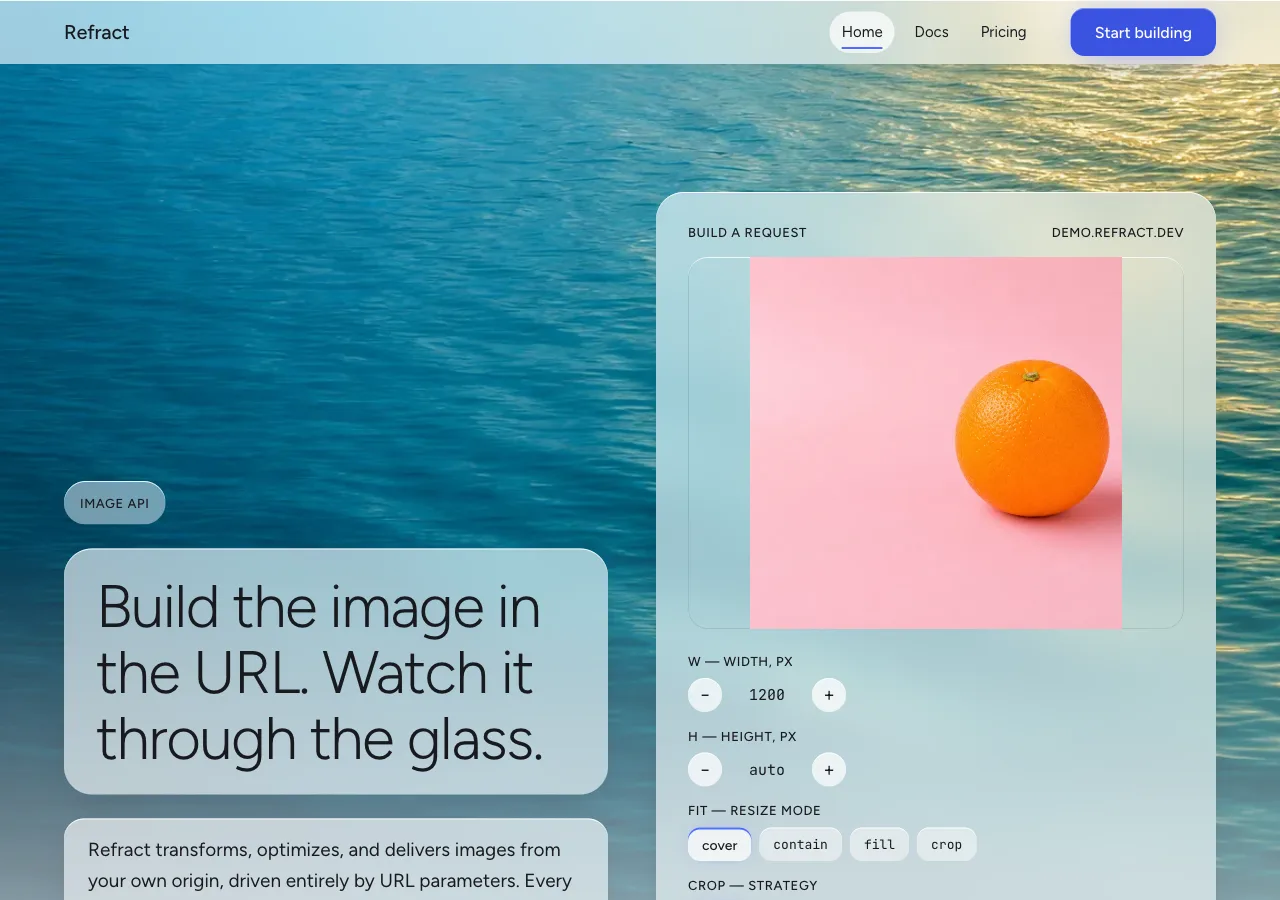
- **index** — a **full-bleed photograph** runs behind the whole page. Nav (frosted,
  sticky) → **hero (128px:** an eyebrow, one 60px Display XL line, a Lead sub-line, the
  **floating control** building the request URL, and one `--accent-deep` CTA reading
  **"Start building" → `./docs.html`**, all on frosted panes over the photo**)** →
  capability trio, three glass cards at staggered depth — Transform / Optimize /
  Deliver (96px) → **live-transform demo**, the before/after behind glass with the
  blur-as-chrome slider (96px) → **stats band**, the four figures as luminous stat
  glass (96px) → CTA band, one frosted pane over the photo (96px) → footer (a
  `--glass-strong` strip over `--paper-deep`).
- **docs** — a **dimmed photograph** (darkened to ~55% and desaturated a touch)
  behind a calmer, denser stack of `--glass-strong` panes. Nav → page opener (a 40px
  Display L line on glass) → **quickstart, three depth-layered glass steps**, the
  third holding the SDK snippet in the dark `--glass-ink` code pane → **parameter
  reference, the ten-row table** in one `--glass-strong` panel → **caching & limits**
  (the origin model, 50 req/s, 30-day edge cache, purge by URL or tag) on a
  `--glass-strong` panel → closing CTA ("See pricing" → `./pricing.html`) → footer.
- **pricing** — a **dimmed photograph** behind three glass tier cards. Nav → page
  opener → **tier cards, three of them at staggered depth** — Free / Pro / Scale
  (96px) → **overage & billing semantics** on a frosted pane (96px) → **FAQ, four
  frosted accordion panes** (96px) → closing CTA ("Start building" → `./docs.html`) →
  footer.

## Signature

Five devices. Each is a direct expression of the product's own `blur` — the material
of the whole interface — tied to a specific fact in the brief.

### 1. The frosted pane — the atom every surface is built from

The load-bearing device. **Every surface on the site is one frosted pane**, and it is
a single recipe:

```css
.pane {
  background: var(--glass);                              /* rgba(255,255,255,0.62) */
  backdrop-filter: blur(24px) saturate(1.2);            /* the API's blur, live */
  -webkit-backdrop-filter: blur(24px) saturate(1.2);
  border-radius: 20px;
  box-shadow:
    inset 0 1px 0 0 var(--glass-edge),                  /* the 1px specular top edge */
    0 16px 40px -12px var(--glass-shadow);              /* the soft ambient shadow */
}
```

Three parts, all load-bearing. The **translucent blurred fill** is the API's `blur`
feature applied to the page's own content — a literal instance of the transform,
running as chrome. The **1px specular top edge** (`inset 0 1px 0 0 var(--glass-edge)`)
is the highlight a real sheet of glass catches along its top rim where light grazes
it; it is what makes a pane read as a physical sheet rather than a flat translucent
rectangle, and it is present on every pane without exception. The **soft ambient
shadow** is low, wide, and cool — the glass floating a few millimetres above the
photograph, not a hard drop. The blur radius and the fill opacity are the two knobs
that set a pane's apparent _depth_: nearer panes blur harder and sit more opaque,
farther panes blur softer and sit more transparent. This is the only card in the
system; there is no opaque card, no flat card, and no bordered card, and every other
device below is this pane specialised.

### 2. The floating control — the hero's URL builder, on the photograph

The hero is not a headline; it is a **frosted control floating on a full-bleed
photograph**, and the act of floating there **frosts the picture behind it** — the
hero is the first and largest demonstration of the feature. The control is a 28px-
radius `--glass` pane, offset over the image, holding the parameter builder that
assembles the brief's exact request:

```
https://demo.refract.dev/hero.jpg?w=1200&fm=auto&q=80
```

The URL is set live in the mono URL role inside a `--glass-ink` badge at the foot of
the control, and it updates as the builder's controls move. The builder drives the
**seven browser-honest parameters** — the ones a browser can genuinely apply to the
plate behind the glass, with no server and no lying:

| Control        | Parameter | Honest browser mechanism                    |
| -------------- | --------- | ------------------------------------------- |
| Width stepper  | `w`       | Rendered width of the plate                  |
| Height stepper | `h`       | Rendered height of the plate                 |
| Fit options    | `fit`     | `object-fit` (`cover` `contain` `fill` `crop`) |
| Crop options   | `crop`    | `object-position` (`smart` `center` `edges`) |
| Rotate options | `rot`     | `transform: rotate()` (`90` `180` `270`)     |
| Blur slider    | `blur`    | `filter: blur()` — the identical gaussian    |
| Background     | `bg`      | The plate's `background-color`, hex          |

**Manipulating any control mutates the plate behind the glass immediately and
rewrites the URL.** Three rules bound it, exactly as the siblings bound theirs:
`fm`, `q`, and `dpr` ride the URL string, each carrying a mono **`NEGOTIATED`** tag,
and are **not** in the builder, because format negotiation and server-side re-encode
cannot be demonstrated in a browser and this design will not fake a byte count to
pretend otherwise; an unset parameter is **absent** from the URL (no `rot=0`, no
`blur=0`); and **`bg` is inert unless `fit=contain`**, the parameter's own scope
showing. The floating control is the only builder in the design — the demo band reads
from the same state and does not get a second one.

### 3. Staggered depth — the capability trio as three sheets of glass

The three capabilities — **Transform**, **Optimize**, **Deliver** — are **three
frosted panes at three different depths**, fanned so they read as sheets of glass at
increasing distance from the photograph. Depth is the message: each card blurs the
image behind it by a different radius and sits at a different opacity, so the trio is
a small physical demonstration that stacked translucency produces depth without a
single drop shadow.

| Card       | Depth | Recipe                                                        | Brief's claim carried                                                          |
| ---------- | ----- | ------------------------------------------------------------ | ------------------------------------------------------------------------------ |
| Transform  | front | `--glass` 0.62, `blur(30px)`, wide ambient shadow            | Ten chainable URL parameters; **smart crop keeps subjects in frame.**           |
| Optimize   | mid   | `--glass` 0.58, `blur(22px)`, medium shadow                  | `fm=auto` negotiates AVIF → WebP → JPEG from the `Accept` header; **62%** average payload reduction. |
| Deliver    | back  | `--glass-thin` 0.45→display-only, `blur(14px)`, tight shadow | **41 edge locations**; cached response p50 **21 ms**; **98.6%** cache hit ratio. |

Because the back (Deliver) card runs at `--glass-thin`, its **body copy sits on a
nested inner `--glass-strong` chip** — the card is a thin sheet, but the sentence a
visitor reads rests on a denser inset that holds the contrast floor. This is the
pattern wherever a decorative-thin pane must carry text: the pane is thin, the text
sits on a strong inset. Each card carries its capability name in Display M, a
Figtree-400 sentence with the brief's figure, and an inline mono token
(`fm=auto`, `41 edge locations`) where the claim names one.

### 4. Luminous stat glass — the numbers lit from behind

The brief's four trust figures — **62% · 21 ms · 98.6% · 99.95%** — are four frosted
tiles, and each tile is **lit from behind by the accent**: a soft `--accent-glow`
radial bloom sits under the figure, so the number reads as glass with light passing
through it. The figure itself is set in the **Readout role (56px, Figtree 300) in
`--ink`** — near-black, at **8.8:1** on the `--glass-strong` tile — so the number is
always legible; the _glow_ is the accent, not the ink, which keeps the luminous
effect off the contrast path entirely (the bloom is a non-text mark). A designer who
wants the numeral itself tinted may set it in `--accent-deep` at this size (3.0:1,
above the 3:1 large-text bar), but the default is lit ink.

```
62%            21 ms          98.6%          99.95%
AVERAGE        MEDIAN         CACHE HIT      UPTIME SLA
PAYLOAD CUT    CACHED         RATIO          (SCALE)
```

The labels beneath are the uppercase Label role in `--ink-soft` on the strong tile.
**The figures are set once, at rest — no count-up, no sparkline, no chart, no
animated meter.** The tiles sit in a shallow depth fan (the `62%` tile nearest, the
`99.95%` tile furthest) so the band itself demonstrates the stacking. Every figure
traces to `content.md`; the accent glow is the only thing on the band that is not a
number or a label.

### 5. The blur-as-chrome demo — the slider that frosts a pane

The live-transform demo is where the thesis is proven in public. Two plates sit side
by side on frosted panes: the **source photograph** on the left behind a **clear
pane** (`blur` 0 — glass with the blur turned off, so the image reads sharp), and the
**same photograph** on the right behind a **pane whose `backdrop-filter: blur()` is
wired directly to the demo's `blur` slider**. Drag the slider from 0 to 100 and the
right pane frosts in real time — **and this is not a simulation of the `blur`
parameter; it is the parameter.** The API's gaussian `blur` and the CSS `blur()`
driving the pane are the same operation, so the demo is the one place on any of this
brief's sites where the interface chrome and the product feature are provably
identical. Beneath the pair, the live URL rewrites, and the `blur=NN` token in it
tracks the slider exactly.

The other six browser-honest parameters drive the right plate through the same
control row as the hero (`w` `h` `fit` `crop` `rot` `bg`), each mutating the plate and
the URL in the same frame. `fm`, `q`, and `dpr` carry the `NEGOTIATED` tag and are
named without being run. **The demo prints no byte count and animates no file
shrinking** — that would put an invented number in the one place a developer checks.
What the demo says instead of a fake number is the frost itself, live: the one
transform it can prove, it proves completely.

## Components

- **Nav bar.** A **frosted sticky pane** — `--glass` at 0.62, `backdrop-filter:
  blur(24px)`, **64px** tall, a 1px specular top edge, spanning full width. Because it
  is glass, **the page content scrolls _under_ it and is blurred as it passes** — the
  nav is itself a running instance of `blur`, the first thing a visitor sees the
  feature do. The wordmark **Refract** sits flush left in Display S; three page tabs
  sit center — **Home · Docs · Pricing** in the Nav-link role — the active tab taking
  `aria-current="page"` and a **2px `--accent` underline** on its own frosted chip.
  Flush right: one `--accent-deep` glass CTA, **"Start building."** The nav never
  carries an opaque fill.
- **`button-primary` (the CTA).** `--accent-deep` (`#3B53E0`) frosted fill with a 1px
  specular top edge, `--on-accent` white label in the Button role (6.0:1), **14px**
  radius, 48px tall. It is glass, not a flat chip: a faint `--accent-glow` sits under
  it so it reads as a lit pane. Press deepens the fill and brightens the edge — no
  translate. This is the only thing on the site that converts, and it reads **"Start
  building,"** carrying the brief's CTA intent to the docs page.
- **`button-secondary`.** A `--glass` pane, `--ink` label, the standard specular edge,
  same 14px/48px geometry. Used for "Copy," "See pricing," and **all three tier CTAs
  alike** — no tier CTA is ever `button-primary`, because an accent CTA on exactly one
  tier would claim a recommendation the content never made.
- **`pane` (the frosted card).** The Signature-1 recipe. Standard content cards are
  `--glass` at 20px radius; large cards (hero control, tier cards, code pane) are 28px.
  A card lifts on hover by a **blur-radius and opacity step** (it comes forward through
  the glass), never by a shadow jump. The capability trio, the stat tiles, and the FAQ
  panes are all this.
- **`pane-strong`.** The dense reading pane — `--glass-strong` at 0.72 — used wherever
  long body or a table lives (the whole docs stack, the overage panel). It is the only
  surface that carries `--ink-soft` secondary text. Over the docs page's dimmed
  photograph it reads as a calm, near-solid frost.
- **The floating control.** Signature 2 — a 28px `--glass` pane holding the parameter
  builder, the `--glass-ink` URL badge, and the CTA, floating offset over the hero
  photograph. Its controls are the seven browser-honest parameters; `fm` `q` `dpr` are
  tagged in the URL.
- **`slider` (the blur control).** A 12px-radius frosted track with an `--accent`
  fill from 0 to the current value and a circular glass thumb with an accent-lit edge.
  It is the one control that visibly changes the chrome as well as the plate — moving
  it frosts the demo's right pane (Signature 5). The `--accent` fill is a non-text
  mark (the value is printed in the URL), so the bright stop is honest here.
- **`stepper`.** The `w` / `h` control — a mono value flanked by two circular glass
  `−` / `+` buttons. Each press mutates the plate dimension and rewrites the URL.
- **`option-group`.** The `fit` / `crop` / `rot` control — a row of small frosted
  chips; the selected chip takes a **2px `--accent` specular edge** (its top rim
  glows accent instead of white) and its label steps to Figtree 500. State is carried
  by the glowing edge plus the weight step, never by a hairline or color alone.
- **`url-badge`.** A `--glass-ink` pane (dark frosted glass) holding the live request
  URL in the mono URL role, `--on-glass` white with `zero` (9.9:1). A glass "Copy"
  button sits at its right. The dark glass is deliberate: the URL is the one string a
  developer reads character-by-character, and dark frost holds its contrast over any
  photograph.
- **Parameter table.** The ten-parameter reference, built inside one `--glass-strong`
  panel over the dimmed docs photograph: a header row in the uppercase Label role, body
  rows in Body S, 1px `--hairline` between rows, no nested cards and no zebra. Three
  columns — the **parameter name in the mono Param role, `--ink`**; the accepted
  values in Body S `--ink-soft`; the description in `--ink-soft`. The **`blur` row is
  the one highlighted**: it takes a faint `--accent-glow` wash across the row and a
  short note — _the transform this whole page is built from_ — because it is. The
  `fm`, `q`, and `dpr` rows carry the `NEGOTIATED` tag; the stated default (`q` 75) and
  ranges (`dpr` 1–3, `blur` 0–100, `q` 1–100) are printed; defaults the brief does not
  give are not invented.
- **`negotiated-tag`.** A 9999px mono chip, `--ink-soft` on a faint `--glass-thin`
  fill, reading `NEGOTIATED`. Marks the three server-side parameters in the URL and the
  table. **It is never the accent and never red** — a statement of fact, not an alarm.
- **Code pane.** Signature-adjacent: a 28px `--glass-ink` pane (dark frosted glass),
  32px padding, JetBrains Mono Code role in `--on-glass` with `zero`, holding the SDK
  snippet (`import { refract } from "@refract/js"` …). A glass "Copy" sits top-right.
  **No syntax-highlight palette** — this system spends no color on a keyword; emphasis
  is `--on-glass` at full white against `--on-glass-soft` comments (5.9:1).
- **`tier-card`.** Signature-1 panes at staggered depth — `--glass-strong` at 28px
  radius, 32px padding. Inside, in order: the tier name (Display M), the **price in the
  56px Readout role** (`$0` / `$29` / `$249` per month), a full-width
  `button-secondary` CTA, and a quota stack in Body S. The three cards fan in depth
  (Free nearest, Scale furthest) as a **compositional arrangement only** — **no tier is
  marked "recommended," "popular," or "best value,"** none takes the accent edge, and
  the depth order carries no ranking. The cards are equal in content weight.
- **FAQ pane.** Each of the four entries is a `--glass` accordion pane: the question in
  Display S, a glass chevron button at the right, the answer in Body `--ink` when open.
  Opening a pane brings it forward through the glass (a blur/opacity step), never a
  shadow jump.
- **Footer.** A `--glass-strong` strip over `--paper-deep` — **the page never inverts
  to a dark slab.** Three columns of Body S links, uppercase Label column heads in
  `--ink-soft`, closed by a legal line in Body S. The footer is glass over calm paper,
  the one place the photograph does not run, so the page settles onto its neutral floor.

## Motion

**Calm, and mostly about light.** Motion has two jobs — to make a control feel
immediate, and to let the glass catch light as it moves — and it is not asked to do
anything else. There is no bounce, no parallax scroll-jacking, no reveal-on-scroll.

- **The plate answers in the same frame as the control that moved.** No skeleton, no
  shimmer, no spinner, no artificial latency — the plate behind the glass redraws the
  way a viewport does. The blur slider frosts its pane continuously as it drags
  (Signature 5); that is the one motion the design is _about_.
- **Panes come forward, they do not lift.** A card on hover, an FAQ pane on open, and
  the nav-docked state all animate by a **blur-radius and opacity step over 160ms
  ease-out** — the pane moves _through_ the glass toward the viewer, not up off a
  shadow. No scale, no translate.
- **The accent is light, and light may breathe.** The `--accent-glow` blooms under the
  stat tiles and the CTA may pulse extremely slowly (a 12s+ opacity drift between two
  near-identical low values), imperceptible at a glance — the sense of a lit pane, not
  a blinking one. It is the only ambient motion in the system and is **fully disabled
  under reduced motion.**
- **The photograph may drift behind the fixed glass.** On the index, a very slow
  parallax (the photo shifting a few pixels slower than the scroll) reinforces that
  the glass floats above it. It is subtle, never a full parallax stage, and it is
  **disabled under reduced motion**, where the photo is fixed.
- **Focus is a haloed accent ring, built for glass.** Because a single ring can vanish
  against either a light pane or a dark photograph, focus is a **2px `--accent` ring
  with a 1px `--on-glass` white inner separator** and a 2px offset — one of the two
  rings always contrasts, whichever way the backdrop goes. It is never removed. The
  slider thumb, steppers, chips, and every button take it.
- **No count-up on the stats.** The four figures are set once, at rest. No charts, no
  sparklines, no meters.
- Under **`prefers-reduced-motion: reduce`**, every transition, the accent breath, and
  the photo parallax are dropped; each element renders in its final state; the blur
  slider still frosts its pane on release. Under **`prefers-reduced-transparency:
  reduce`**, the glass goes to its opaque fallbacks (Palette) — the page becomes solid
  neutral cards over a still photograph, and **nothing readable is lost, only the
  translucency.** Turn all of it off and the controls still build the URL and the
  plate still shows the result.

## Image treatment

The photograph is not decoration in this design — **it is the palette and the
payload.** It is the only source of color (the glass tints itself from it), and it is
the file the API is about to resize, crop, rotate, and blur while the visitor watches
through the frost. So the photography is chosen to two ends at once: **rich, saturated
natural color** so the glass has something to drink, and a **quiet, single subject that
survives the crop and the blur** so the demo can operate on it in public. There is no
illustration, no vector art, no icon set, no diagram, no chart, and no 3D render —
every image is a photograph, and the glass is drawn in CSS over it.

Unlike its calm-neutral siblings, **Frost wants color in the frame** — a cool sea, a
warm gradient sky, saturated petals — because a frosted pane over a grey photograph is
a grey pane, and the whole point is that the chrome takes its hue from the image. But
color is the _only_ way this photography runs hotter than the siblings'; every other
rule is the same, and two are stricter because a frosted pane sits _on_ the picture:

**How every generated image in this system is prompted.** Binding rules; a still that
breaks one is regenerated, not cropped around.

1. **Nothing in frame carries language.** Every prompt states, in its own clause, that
   the image contains **no text, no lettering, no numerals, no labels, no logos, no
   brand markings, no signage, and no packaging print** — anywhere in the frame. A
   generated still invents lettering if allowed, and invented lettering inside a plate
   the demo is about to enlarge and blur is a counterfeit brand printed at size. This
   is the image provider's single most common failure; the clause is the guard.
2. **No people, no hands.** Not one, not out of focus, not in the background. The model
   fuses fingers into a mass, and — more to the point — each photograph is a _sample
   input_ the API is about to blur in front of a developer, not a lifestyle shot.
3. **The frame is quiet and survives the crop _and the frost_.** No props beyond the
   named subject, no busy corners. Every photograph must still read deliberately after
   being cropped to `1:1`, rotated, and **blurred to 100**, because the demo will do
   exactly that, live — and because a frosted pane will sit over a large part of it and
   soften it further. A fussy corner becomes a fussy corner blurred twice.
4. **The subject sits off-center, and off the glass.** Smart crop only visibly differs
   from center crop when the subject is not already centered, so every composition
   pushes its subject to one side — giving `crop=smart` and `crop=center` something to
   disagree about. On the index hero, the subject sits on the side **opposite** the
   floating control, so the frosted pane sits over the quieter region of the frame and
   the subject stays legible beside it.
5. **Color is rich but light is soft.** Saturated, natural color; strong but diffuse
   light; smooth tonal fields the glass can average cleanly. No harsh specular blowouts
   (they read as artefacts under blur), no muddy low-contrast scenes (the glass has
   nothing to take hue from).

Constant tone words on every prompt: **rich natural color, soft diffuse light, smooth
tonal fields, a single calm subject, generous negative space, real place or object, no
people, no text.** The register is a saturated, tranquil sample library — a page whose
color comes entirely from these frames.

The dimmed backdrops (docs, pricing) are the same photographs treated darker and a
touch desaturated in CSS (`brightness(0.55) saturate(0.9)`), so the dense
`--glass-strong` reading panes sit calmly over them and the docs read like a quiet
room rather than a lightbox. **Type never sits on raw photograph** — it always sits on
a pane whose contrast floor is guaranteed (Palette), and on the docs and pricing pages
the backdrop is dimmed besides.

Needed images (referenced `./assets/<id>.webp`):

- `hero-backdrop` (16:9, full-bleed) — A sunlit rippling water surface in rich teal and
  blue with warm gold highlights toward the upper right, smooth tonal gradients across
  the frame, the brightest reflections off-center to the right, soft diffuse light, no
  text, no lettering, no numerals, no labels, no logos, no brand markings, no signage,
  no packaging print, no people, no hands, quiet and uncluttered, generous calm area to
  the left for the floating control.
- `capability-transform` (16:9) — A single smooth folded length of richly colored
  fabric — deep coral into magenta — on a soft seamless background, pushed to the left
  of the frame, soft even light, smooth tonal transitions, no text, no lettering, no
  numerals, no labels, no logos, no brand markings, no signage, no packaging print, no
  people, no hands, generous space to the right.
- `capability-optimize` (16:9) — A calm gradient sky at dusk in saturated violet, amber,
  and rose over a low flat horizon, long smooth tonal transitions, a single low dark
  form to the left, no text, no lettering, no numerals, no labels, no logos, no brand
  markings, no signage, no packaging print, no people, no hands, no buildings.
- `capability-deliver` (16:9) — An overhead view of a smooth curving road cutting across
  richly colored open terrain — deep green and warm earth — shot from high above, soft
  afternoon light, the road entering from one corner, no text, no lettering, no
  numerals, no labels, no logos, no brand markings, no signage, no packaging print, no
  people, no hands, no vehicles.
- `demo-source` (4:3) — A single ripe piece of vividly colored fruit on a soft-toned
  seamless surface, placed off-center to the right with clear open space to the left,
  soft even daylight, plain uncluttered background, rich saturated color, no text, no
  lettering, no numerals, no labels, no logos, no brand markings, no signage, no
  packaging print, no people, no hands. (This is the demo source and the one plate the
  blur slider frosts live — it will be cropped to `1:1`, rotated, blurred to 100, and
  background-filled, so it must survive all four.)
- `docs-backdrop` (16:9) — A field of softly out-of-focus wildflowers in saturated
  blues and warm pinks with smooth tonal fields, no sharp subject, soft diffuse light,
  no text, no lettering, no numerals, no labels, no logos, no brand markings, no
  signage, no packaging print, no people, no hands. (Runs dimmed and slightly
  desaturated behind the docs glass.)
- `pricing-backdrop` (16:9) — A smooth gradient of colored light across a calm surface —
  deep indigo into teal into warm amber — with long even tonal transitions and no hard
  subject, soft light, no text, no lettering, no numerals, no labels, no logos, no brand
  markings, no signage, no packaging print, no people, no hands. (Runs dimmed behind the
  pricing glass.)

## Do / Don't

Do:

- Build **every surface from the frosted pane** — a translucent `backdrop-filter` fill,
  a 1px specular top edge, and a soft ambient shadow — and produce depth between panes
  by stepping the **blur radius and opacity**, never by stacking heavier shadows.
- Let the **photograph carry all the color** and let the glass tint itself from it with
  `saturate(1.2)`; keep the chrome neutral translucent white and the base `--paper`
  (`#EEF0F3`).
- Keep the accent **luminous and glass-bound**: `--accent` (`#4D6BFF`) only as light —
  the slider fill, a selected pane's edge glow, the stat backlight — and `--accent-deep`
  (`#3B53E0`) for any accent fill that carries white text (6.0:1). Nothing on the page
  is any other hue.
- Hold text to the **contrast floors**: primary `--ink` on `--glass` (6.5:1) or
  `--glass-strong` (8.8:1); `--ink-soft` on `--glass-strong` only (5.1:1); code and the
  URL on dark `--glass-ink` (9.9:1). Treat every ratio as a black-backdrop floor the
  photograph can only improve.
- Make the **blur slider frost a real pane** in the demo — the API's `blur` and CSS
  `blur()` are the same operation, so the demo is not a simulation.
- Keep the **seven browser-honest parameters** (`w` `h` `fit` `crop` `rot` `blur` `bg`)
  truly wired to the plate and the URL, and tag `fm` `q` `dpr` `NEGOTIATED`.
- Set display in **Figtree 300–500**, airy, with generous 1.7 body leading; set the
  stats and prices in the 56px Readout role with aligned figures.
- Give the docs and pricing pages a **dimmed** backdrop and dense `--glass-strong`
  panes; keep the footer glass over `--paper-deep`, never a dark slab.
- Provide the **opaque fallbacks** under `@supports not (backdrop-filter)` and
  `prefers-reduced-transparency`, so text is never left on raw photograph.

Don't:

- **No opaque flat card, no 0px corner, no border-as-elevation.** A hard-cornered
  opaque tile is `spec`'s language and the fastest way to make glass read as plastic.
- **No flat accent chip.** The blue is transmitted light on glass, never paint on an
  opaque surface. White text on the bright `--accent` (4.32:1) is a defect; text-bearing
  accent is `--accent-deep`.
- **No text on a lighter glass than its floor allows.** Never `--ink-soft` on `--glass`
  or `--glass-thin`; never body on `--glass-thin`; never any reading text on raw
  photograph.
- **No second hue, no gradient-as-decoration, no dark inversion band.** No green success,
  no amber warning, no error red — a validation message is `--ink`. (The one gradient in
  the system is the accent _glow_, which is light, not a decorative mesh — that is
  `prism`'s device, and this is not `prism`.)
- **No bold, ever.** Figtree stops at 500; a 600/700 headline on frosted glass reads as
  a smudge and turns a luminous surface into a loud one.
- **No heavy drop shadow standing in for depth.** Depth is stacked translucency and the
  specular edge; a hard 2px drop is the tell that the glass has stopped being glass.
- **No invented numbers.** No byte count beside the demo, no file-size animation, no
  latency, uptime, or edge count the brief did not supply, no "most popular" tier.
  **Every figure on this site traces to `content.md`** — the stats (62%, 21 ms, 98.6%,
  99.95%), the 41 edge locations and the cold-transform p50/p99 (89 ms / 340 ms), the
  50 req/s limit and the 30-day edge-cache window, the prices, quotas, overage rates
  ($2 per 1,000 transforms, $0.08/GB), the parameter ranges, and the default `q` of 75.
- **No monospace outside the URL, the SDK snippet, and the parameter names.** No mono
  headings, no mono prices.
- **No count-up on the stats, no chart, no sparkline.** Four numbers, set once, lit from
  behind.
- **No tier singled out** by an accent edge, a badge, or a "recommended" word — the
  staggered depth of the tier cards is a compositional fan, not a ranking.
- No emoji anywhere. This design **names no source brand** — it is drawn free-form from
  the product's own `blur` parameter and the genre of layered glass. The built page
  carries only the product's own name, **Refract**, in English, and nothing else.