DESIGN.md
# Carton — Design System

## Concept

**An image API printed on the back of a carton.** Cream board, flat black ink, a
typewriter that will not shut up, and a page that talks to you the entire way down —
apologising, digressing, explaining the billing model twice, and putting the boring
parts in a box with a hand-drawn border because it knows they are boring. Sit a food
package down next to a developer platform and the two of them have absolutely nothing to
say to one another, which is precisely why this page cannot stop talking: **the friction
between them is not a problem this design is solving. It is the thing this design is
selling.**

Take the name literally, because it is carrying the structure and not the mood. A
**carton** is a piece of design that has been printed on every face it owns, and it is
the only object in the world holding a licence to nag. It has an ingredient panel. It
has small print nobody requested. It has a sticker somebody slapped on crooked. It has
a whole paragraph on the back written at a person who is holding it at arm's length in
a supermarket aisle and has already decided not to read it — and it prints the paragraph
regardless. **So does this site.** The ten-parameter reference is the ingredient list.
The billing semantics are the small print. The playground is a proof sheet somebody has
scrawled corrections all over. Nothing here is *documented*. It is *printed*, by a
package that is genuinely anxious you will put it back on the shelf unread.

The governing principle is inherited whole from the reference and must not be softened:
**the verbose copy IS the design, and it refuses to look slick.** You do not have to take
that on trust, and you are not going to be asked to: what follows is a list, and a list is
the one thing a package genuinely knows how to print. No gradient. No glass. No blurred
shadow. No tidy single-family type system. No 12-column grid with even gutters. No
whitespace-as-luxury. No smooth radius scale. What is left when all of that is removed is
**paper, ink, and words** — a great many words — and the words turn out to be the product,
because the product is a URL and a URL is a sentence.

The source language is **Oatly's** — uncoated cream paper (`#F3EEE7`) carrying a flat
warm near-black ink, one loud spot colour per surface, and type that is *deliberately
mixed*: a distressed typewriter mono running the rambling self-aware body copy, a bold
condensed grotesque shouting billboard headlines, a friendly rounded grotesque, and
freehand lettering clashing on top. Four voices in one headline is the house style, not
a mistake. Its shapes are hand-drawn wobbly boxes and circular stickers rather than
geometric radii; its layout is crowded on purpose; its imagery is low-fi halftone rather
than glossy product photography. All four of its faces are proprietary, and the four
named in its own Font Substitutes section are the four used here: the typewriter becomes
**Courier Prime**, the condensed billboard face becomes **Anton**, the rounded grotesque
becomes **Fredoka**, and the hand-lettering becomes **Caveat**. That lineage is named in
this paragraph and **nowhere else**: the built page carries only the product's own name,
**Refract**, in English.

Here is the argument for the whole transplant, and you are invited to check it rather
than take it on faith. **A food package and an API reference are both obliged to declare
exactly what is inside them, and only one of the two has ever looked like it enjoyed the
job.** A carton lists every ingredient, states the quantity, prints the storage
instructions, and admits in small type what happens if you leave it out of the fridge.
An API reference is handed the identical assignment — ten parameters, their accepted
values, the single default anybody actually stated, a rate limit, a cache window, a
billing rule — and it answers by setting all of it in a grey table under a hero gradient,
in the evident hope that you will take its word for the rest. **The package is not a
costume this design borrowed off a neighbouring industry. It is the form that has spent a
century getting good at one sentence — "here is precisely what is in this, and precisely
what it will cost you"** — and a page about an image API either says that sentence or
says nothing worth reading. The brief asks for trust. A carton buys trust by telling you
more than you asked for, the unflattering parts included. That purchase is the move being
transplanted, and everything below this line is that move being made.

**You are going to see the other three, so here are the distances, told plainly before
anybody has to squint at them.** `aperture` is white, soft, and photography-led — a 64px
hairline-segmented pill at 9999px radius, popovers, a circular red orb, generous air,
corners that are never square. Carton owns no pill, no popover, no red, and no air.
`cutaway` is the dark one — graphite, magenta-and-cyan voltage, an 88px industrial
readout, a photograph exploded into 3D planes. Carton goes dark exactly once, for one
black ribbon; it never takes a photograph apart; and it runs no voltage at all, only a
spot colour, which is a term from printing and not from electricity.

**And this is not `folio`, which is the comparison that will actually get made.** `folio`
is paper too, and ink too, and at a distance a careless eye could merge the two of us.
The merge does not survive contact, and the split runs through every layer. **`folio` is
a refined print grid**: a display serif held at weight 400, a serif longform body, a sans
confined to metadata — three voices, never four — multi-column text, hairline rules, a
drop cap, running heads, radius 0, every rule ruled straight because a press does not
wobble, and **no monospace anywhere in the system**. **Carton is anti-design scrawl**: a
typewriter monospace body, **four** type voices mixed on purpose, hand-drawn wobbly
boxes, circular sticker badges slapped on at an angle, options circled by hand with a
pen, and copy that will not shut up. **Carton never uses a refined serif display — there
is no serif of any kind in this system. Carton never lays out a print column grid. Carton
has no drop cap and no running head.** `folio` is quiet because it wants you to read.
**Carton is loud because it is worried that you won't.** `folio` keeps the printed form
and plays it completely straight; carton takes the one printed form nobody has ever
respected — the back of a package — and plays *that* straight instead.

## Palette

Cream board, warm near-black ink, **one blue and one mustard**. There is no third
accent, no semantic palette, and **no hue in this system that the reference did not put
there.**

| Token            | Hex       | Role                                                                                                 |
| ---------------- | --------- | ---------------------------------------------------------------------------------------------------- |
| `--paper`        | `#F3EEE7` | Uncoated cream board — the page floor, the nav, most bands. **Never pure white.**                      |
| `--paper-bright` | `#F7F3EC` | The lighter cream. Input wells, and nothing else.                                                      |
| `--kraft`        | `#E7DECF` | Recycled board — the back-of-pack panels, the ingredient list, the alternating bands.                  |
| `--paper-shadow` | `#DCD2C1` | The **hard offset** under a hand-drawn box. A second impression of the same shape, never a blur.       |
| `--ink`          | `#1A1815` | Warm near-black. All type, every rule, every hand-drawn line, the focus ring. **Never pure `#000`.**   |
| `--ink-soft`     | `#4A4640` | Secondary copy, unset values, the fine print inside a kraft panel.                                     |
| `--ink-faint`    | `#6B655B` | Captions, meta. **Body-legal on paper — but never on `--kraft`.** See the ration below.                |
| `--on-ink`       | `#F3EEE7` | Cream reversed out of the black ribbon and the footer. The same cream as the paper.                    |
| `--blue`         | `#0E63F0` | The spot blue. **Non-text marks, display ≥24px, and the flood band only.** See the ration below.       |
| `--blue-ink`     | `#0A48AD` | The same hue, one stop down. **Every blue that carries text below 24px** — plus the flat duotone backing beneath a halftoned plate. |
| `--on-blue`      | `#FFFFFF` | The white reversed out of a `--blue` flood — **the only pure white in this system's own chrome**, and it is earned. |
| `--mustard`      | `#D2A02C` | The 1970s ochre. **A fill under `--ink` type, or type on the black ribbon. Never on paper as text.**   |

Rules:

- **Contrast (measured, WCAG 2.1, computed from the sRGB relative-luminance formula).**
  On `--paper` (`#F3EEE7`): `--ink` **15.35:1**, `--ink-soft` **8.12:1**, `--ink-faint`
  **5.00:1**, `--blue-ink` **7.15:1**. On `--kraft` (`#E7DECF`): `--ink` **13.28:1**,
  `--ink-soft` **7.03:1**, `--blue-ink` **6.19:1**. On `--paper-bright` (`#F7F3EC`):
  `--ink` **16.02:1**, `--ink-soft` **8.47:1**, `--ink-faint` **5.22:1**. On the `--ink`
  ribbon: `--on-ink` **15.35:1**, `--mustard` **7.43:1**. On a `--mustard` fill: `--ink`
  **7.43:1**. On a `--blue` flood: `--on-blue` **5.17:1**. Every ratio in this paragraph
  clears AA body text (4.5:1).

- **`--ink-faint` (`#6B655B`) holds AA on paper and FAILS on kraft, and the kraft is
  where the fine print lives.** It measures **5.00:1 on `--paper`** and **5.22:1 on
  `--paper-bright`** — body-legal on both — but **4.33:1 on `--kraft`**, below the 4.5:1
  bar. This is exactly the near-miss that ships broken if nobody computes it, because the
  ingredient panel and the small print are *both* kraft and both are exactly where a
  designer reaches for the faintest ink they own. **So `--ink-faint` never appears on
  `--kraft` at all**: every word inside a kraft panel steps **up** to `--ink-soft`
  (7.03:1) or `--ink` (13.28:1), including the fine print, the captions, the unset
  values, and the placeholder inside an input that sits on a kraft panel. Nothing on the
  back of this pack is set in ink you cannot read, which is the whole joke about the
  backs of packs, and this design refuses to make it.

- **The spot blue misses AA body text by two hundredths, and we are going to say so out
  loud rather than round it away.** `--blue` (`#0E63F0`) measures **4.48:1 on `--paper`** —
  it *fails* the 4.5:1 body bar, by 0.02. And the ratio is **symmetric**: cream *on*
  `#0E63F0` is the same **4.48:1**, so the reference's own move — cream body copy reversed
  out of a spot-blue flood — carries the identical failure, and transplanting it unchanged
  would ship it. On `--kraft` the same blue falls to **3.88:1**. So the blue runs at two
  depths of the one hue, and the depths are fixed:
  1. **`--blue` (`#0E63F0`)** — **non-text marks, display type at 24px and above, and the
     flood band.** As a mark it faces the 3:1 bar and 4.48:1 clears it with room; as
     display type at 24px+ it faces the 3:1 large-text bar and clears that too. Its
     licensed uses are a **closed list of four**, and it appears nowhere else on the site:
     the **hand-drawn ellipse circling a selected option**, the **hand-drawn underline
     beneath the active nav link**, **one word of the hero's mixed-type headline** (Anton
     at 72px, or Fredoka at 44px — both far above the 24px floor), and **the one flood band
     per page**. It sets no paragraph, no label, no value, no caption, no table cell, no
     button text, and nothing at all below 24px. **It never appears on `--kraft`**
     (3.88:1).
  2. **`--blue-ink` (`#0A48AD`)** — the same hue one stop down (H 217.2° / S 89.1%
     against the spot blue's H 217.4° / S 89.0%; **only the lightness moves, 49.8% →
     35.9%**). **Every blue that carries text below 24px**: an inline link, its
     underline, and an out-of-range validation message. **7.15:1 on paper, 6.19:1 on
     kraft** — it holds AA on both grounds, which is the entire reason it exists.
     **Nothing new was mixed to fix this.** The second stop is the same ink run heavier,
     the way a printer would have solved it, and opening a fresh tin of colour instead
     would have been a defect. The
     reference does already ship a darker stop in this exact hue — `primary-deep`
     (`#041C44`, H 217.5°) — but at L 14% it reads as ink, not blue, which is precisely
     why the reference spends it on flood backgrounds and reversed-out mono copy rather
     than on a link; `--blue-ink` sits at L 35.9%, the shallowest step down from the spot
     blue that still reads as blue and clears AA, which is why it is minted rather than
     borrowed. It also backs one non-text surface — the flat duotone fill beneath a
     halftoned plate (see *Signature 4*) — where it carries no contrast obligation of
     its own, because it carries no text.
  3. **`--on-blue` (`#FFFFFF`)** — the type reversed out of a `--blue` flood, at
     **5.17:1**. This is **the only pure white in this system's own chrome**, and it is
     here because the reference's own reversed cream (`#F7F3EC`) measures **4.67:1** on
     that blue — a 0.17 margin — and a design that sets its four trust figures on a
     seventeen-hundredths margin has not actually decided anything. The page floor is
     cream; the type on a blue flood is white; there is no third case. (The one other
     white that can reach the screen is a `bg` **swatch preview** — but that is the
     visitor's data, not the system's chrome, and the rule below says so.)

- **The mustard fails everything on paper — including the non-text bar — and the palette
  is built around that fact rather than pretending otherwise.** `--mustard` (`#D2A02C`)
  measures **2.07:1 on `--paper`** and **1.79:1 on `--kraft`**. That is below the 4.5:1
  body bar, below the 3:1 large-text bar, and **below the 3:1 non-text bar as well** — so
  on paper the mustard may not be text, may not be a rule, may not be a border, may not
  be an outline, and may not be a boundary of any kind. What it *can* be is what a
  1970s spot ochre always was on a package: **a solid fill with black printed on top of
  it.** `--ink` on `--mustard` measures **7.43:1**, and the ratio is symmetric, so the
  same 7.43:1 licenses **mustard type on the black ribbon**. The mustard's uses are a
  **closed list of three**:
  1. **The sticker fill** — a mustard circle carrying `--ink` hand type (7.43:1), ringed
     by a hand-drawn **`--ink`** circle, so the sticker's boundary is ink and never
     mustard.
  2. **The highlighter swipe** — a mustard block sitting behind `--ink` mono type inside
     the rambling block (7.43:1). It **carries no state, no boundary, and no meaning**:
     deleting it entirely would cost the page nothing but a joke, which is the test a
     decorative colour has to pass.
  3. **Type and marks on the `--ink` ribbon** — the accent word in the marquee and the
     one scrawl in the footer, both at 7.43:1.

  And nowhere else. **There is no mustard rule, no mustard border, no mustard hairline,
  no mustard focus ring, no mustard link, and no mustard text on paper, ever. Not one
  mark in the playground is mustard**, and that is not an oversight to be tidied up
  later: at 2.07:1 the mustard cannot be seen reliably enough to carry a control's
  state, so it is kept away from every control this design owns.

- **The two accents never meet, and the contrast maths is what put them apart.** The
  blue works on paper and dies on the ribbon (`--blue` on `--ink` is **3.43:1**). The
  mustard works on the ribbon and dies on the paper (**2.07:1**). So **the paper's spot
  is the blue and the ribbon's spot is the mustard**, and no surface in this system ever
  carries both. That is the reference's own "one loud spot per surface" rule — and this
  design did not adopt it as a style, it **arrived at it by measuring**, which is the
  best reason to keep a rule there is.

- **The hairlines and the kraft carry no meaning.** `--paper-shadow` measures **1.30:1**
  on paper and `--kraft` **1.16:1** — far below the 3:1 non-text bar. Therefore **no
  control's identity and no control's state may rest on a tone step or an offset.** Every
  callout in the playground is identified by a persistent `--ink` key (15.35:1), written
  out in full, never by its position on the sheet; focus is a **2px `--ink` ring**
  (15.35:1), never a coloured one; and a selected option is marked by **three changes at
  once** — the hand-drawn `--blue` ellipse around it, its label stepping 400 → 700, and
  `aria-checked="true"` — so state is never carried by colour alone.

- **No gradients anywhere, and therefore no scrim.** Every surface is one flat colour —
  and a scrim, being a gradient, is not available to this design at any price. So **type
  never sits directly on a photograph in this system.** The two marks that
  overlap a photograph both bring their own opaque ground with them — the sticker's type sits
  on the sticker's fill, and a key balloon's type sits on the balloon's cream fill — and
  neither ever touches the image surface. The caption goes underneath, scrawled, where a
  caption belongs.

- **On a `--blue` flood, every word is `--on-blue` and the only button is `button-ink`.**
  This is not a preference — it is the arithmetic. `--ink` type on `--blue` measures
  **3.43:1** and fails AA body, so a `button-drawn` (a transparent fill with an `--ink`
  label) placed on the flood would ship a failing label. `button-ink` is safe there
  because its label reads against **its own `--ink` fill** at 15.35:1, and the button's
  edge against the flood clears the 3:1 non-text bar at 3.43:1. **No ink type ever touches
  the blue, and no cream type ever touches it either** (4.48:1). The flood carries white
  and nothing else.

- **`--ink` fills exactly three surfaces on this site — the marquee ribbon, the footer,
  and `button-ink` — and a button is not a band.** There is no dark hero, no dark section,
  and no dark theme; everywhere else the ink touches the page it is type, a drawn stroke,
  or a mark. **Each page carries exactly one flood band**, and it is blue. **A dark canvas
  is `cutaway`, and it is a different design.**

## Typography

**Four voices, mixed on purpose, and the mixing is the signature.** A single-family
system is not a tidier version of this design — it is a failure of it. All four are
self-hosted as woff2 under `assets/fonts/` via `@font-face` — no font CDN, no Google
Fonts `<link>`. All four are the substitutes the reference's own Font Substitutes section
names.

**Body — Courier Prime.** The typewriter. It is the workhorse and it carries **every
paragraph on this site**, plus every caption, every eyebrow, every label, every table
cell, the ten parameter names, the URL string, the SDK listing, the ingredient panel,
and **every figure that has to line up in a column**. If a visitor is reading a sentence
or checking a number, they are reading Courier Prime. The typewriter texture is
load-bearing: it is what makes the copy read as hand-banged-out rather than
art-directed, and swapping the body to a clean geometric sans would delete the design.

**Billboard — Anton.** The bold condensed grotesque. Uppercase, tight, and loud: the
hero shout, the huge figures, the section heads, the marquee ribbon, and the button
labels. **It never sets a paragraph and it never sets a sentence.** It sets words.

**Rounded — Fredoka.** The friendly one. Capability titles, tier names, FAQ questions —
the places where the page is being nice to you rather than shouting at you. **It never
sets a paragraph and it never sets a figure.**

**Hand — Caveat.** The scrawl. Stickers, marginal asides, pull-quotes, the arrows'
labels, the "P.S." at the foot of the rambling block. And it is fenced hard, for a
reason that is not stylistic: **a handwriting face is the least legible thing on this
page, so no functional text is ever set in it.** Caveat never sets a parameter name, a
value, a price, a quota, a table cell, a button label, a nav link, a form label, an error
message, or anything a visitor must read in order to use the product. **Caveat carries
jokes and nothing else.** If the whole face failed to load, the site would still be
completely usable, and that is the test it has to pass.

| Role          | Face              | Size / Leading | Tracking | Features         | Use                                                                    |
| ------------- | ----------------- | -------------- | -------- | ---------------- | ---------------------------------------------------------------------- |
| Billboard     | Anton 400         | 72px / 0.95    | -1px     | **case**         | The index hero shout, uppercase                                        |
| Shout         | Anton 400         | 54px / 0.98    | -0.8px   | **case**         | Page openers on docs and pricing, uppercase                            |
| Figure huge   | Anton 400         | 96px / 0.90    | -2px     | **case**         | The four stats figures and the three tier prices                      |
| Section head  | Anton 400         | 28px / 1.05    | -0.3px   | **case**         | Section heads and the marquee ribbon, uppercase                        |
| Button        | Anton 400         | 16px / 1.0     | 0.3px    | **case**         | Button labels, uppercase                                               |
| Rounded XL    | Fredoka 600       | 44px / 1.02    | -0.4px   | —                | The friendly counter-headline in a mixed-type line                     |
| Rounded title | Fredoka 600       | 22px / 1.1     | 0        | —                | Capability titles, tier names, FAQ questions                           |
| Scrawl XL     | Caveat 700        | 40px / 1.0     | 0        | —                | Sticker badges                                                          |
| Scrawl        | Caveat 400        | 32px / 1.1     | 0        | —                | Pull-quotes, marginal asides, arrow labels, the P.S.                    |
| Lead          | Courier Prime 400 | 18px / 1.55    | 0.1px    | —                | The lead paragraph of the rambling block                               |
| Body          | Courier Prime 400 | 16px / 1.6     | 0.1px    | —                | Default running copy — every paragraph on the site                     |
| Body S        | Courier Prime 400 | 14px / 1.6     | 0.1px    | —                | Dense copy, table cells, FAQ answers, the fine print                   |
| Data          | Courier Prime 400 | 15px / 1.5     | 0.1px    | —                | Every figure that stacks in a column: values, quotas, ledgers          |
| URL           | Courier Prime 400 | 17px / 1.5     | 0.2px    | —                | The live URL string. **Never set below 17px.**                          |
| Listing       | Courier Prime 400 | 15px / 1.7     | 0.1px    | —                | The SDK listing                                                        |
| Key           | Courier Prime 700 | 14px / 1.4     | 0        | —                | The ten parameter names — `w`, `fit`, `fm` — wherever they appear      |
| Caption       | Courier Prime 400 | 13px / 1.5     | 0.2px    | —                | Photo captions, fine notes                                             |
| Eyebrow       | Courier Prime 700 | 12px / 1.4     | 1.5px    | —                | Uppercase eyebrow and nav label                                        |
| Label         | Courier Prime 400 | 11px / 1.4     | 1px      | —                | Uppercase micro-label on a tag                                         |

Principles:

- **Mono is the body voice, and that is the sharpest line between this design and
  `folio`.** Every paragraph on this site is a typewriter paragraph at a loose 1.55–1.6
  leading. `folio` has **no monospace anywhere** and reaches the same content through a
  reading serif. Neither of us is allowed to drift: a serif paragraph here would be as
  wrong as a mono paragraph there.

- **There is no serif in this system at all** — not a display serif, not a text serif,
  not a slab. Four faces: a typewriter mono, a condensed grotesque, a rounded grotesque,
  and a hand. A refined serif display is `folio`'s single most identifiable object and
  reaching for one here is the fastest way to destroy this design.

- **Mix families in one line, on purpose.** The hero headline is built by **clashing
  three or four voices in a single line** — an Anton shout word, a Fredoka word, a
  Caveat word, at different sizes and a fractional rotation each. This is the house
  signature. Consistency-of-family is not a goal, and tidying a headline into one face is
  a defect, not a cleanup. (On mobile the line simplifies to **two** clashing voices
  rather than four — never to one.)

- **Every figure that must align in a column is Courier Prime, and it aligns by
  construction.** This is the whole numeric argument of the design and it is the exact
  inverse of every sibling's:
  - **No `tnum` is declared anywhere in this system, on any face, in any role**, because
    **none of the four faces ships it** — verified absent from the real GSUB feature list
    of Courier Prime, Anton, Fredoka, and Caveat alike. Declaring it would be a pure void
    in all four.
  - It costs nothing, because **Courier Prime is a true monospace** (`post.isFixedPitch =
    1`, verified in the font binary): every glyph is already one width, so the ten-row
    ingredient panel's value column, the tier quotas, and the overage ledger lock into a
    column *by construction*. **What `tnum` was for, the typewriter already does.** So
    any figure that has to stack goes in the Data role, and no figure that has to stack is
    ever set in Anton — which has no tabular figures to offer, and could not be made to.
  - The four stats figures and the three tier prices **are** set in Anton at 96px — and
    they are allowed to be, precisely because **each one stands alone in its own cell and
    no figure has to align with the figure beside it.** Four numbers in four hand-drawn
    boxes align by their boxes, not by their digits. If a later hand ever wants a numeric
    column in the billboard face, the answer is that the column belongs in the typewriter,
    not that the feature belongs in the font.

- **Exactly one OpenType feature is declared in this system — `case`, on Anton — and it
  was verified present in the face's real GSUB table.** Everything else is deliberately
  absent, and the absences are not oversights:
  - **`case` on Anton, and it does real work — in the one place that has the glyphs for
    it.** Verified in Anton's GSUB: the feature performs 50 substitutions and, critically,
    it **maps `hyphen`, `slash`, `periodcentered`, `parenleft`, `parenright`, `endash`,
    `emdash`, and `bullet` onto their `.case` variants**. Every Anton role in this system
    is uppercase, and the **marquee ribbon** is built on exactly those glyphs —
    `TRANSFORM / OPTIMIZE / DELIVER · NO RE-UPLOAD · 41 EDGE LOCATIONS ·` — where `case`
    lifts the slash, the hyphen, and the middot from lowercase height to cap height, which
    is precisely where an all-caps ribbon needs them. **It is declared at role level on all
    five Anton roles, and on a string with none of those glyphs it substitutes nothing** —
    `START BUILDING` gets no benefit from it, and this document says so rather than
    implying the feature is working everywhere it is written. It is declared for
    consistency of the role and it fires where the glyphs are: the ribbon, and any
    uppercase Anton line carrying a hyphen, a slash, a middot, or a parenthesis.
  - **`case` is never declared on Courier Prime, and this is the trap.** The face *does*
    ship a `case` feature — 14 substitutions — but **every one of them maps an accent**
    (`grave → grave.case`, `dieresis → dieresis.case`, and so on). **It does not touch
    the hyphen, the slash, the parenthesis, or the middot** (verified). This site's copy
    is English and its uppercase eyebrows are ASCII, so `case` on Courier Prime would
    perform **zero substitutions on a single character this site actually sets**. It would
    look like a decision and do nothing. So it is not declared, and the uppercase Eyebrow
    and Label roles are **true uppercase with tracking**, which is all they ever needed.
  - **`zero` is never declared anywhere in this system, on any of its four faces.** Anton's
    GSUB does carry `zero → zero.zero` — a verified slashed zero, and Anton is the only one
    of the four that ships the feature at all — but it is never called: no carton price has
    ever needed to disambiguate a `0` from an `O`, and declaring a feature no figure is
    actually confused without would be engineering furniture.
    **Courier Prime ships no `zero` at all** (verified absent from its GSUB, as it is from
    Fredoka's and Caveat's), and this design is going to say out loud how backwards that
    is rather than move quietly past it. The one place on this site where a `0` and an `O`
    stand close enough together to be confused for one another is the URL string — the one
    line a visitor is going to select, copy, and paste into a terminal — and the URL string
    is set in the face that has no slashed zero to give it. The face that *does* own one
    spends it on a 96px price that nobody has ever squinted at. Borrowing the billboard's
    glyph into a typewritten URL would not be a fix, it would be a costume. So the URL role
    buys the missing feature back with size: a **17px floor**, **0.2px** of tracking to
    push the characters off each other, and no instance of the URL anywhere on this site
    set smaller than that. The line you are most likely to have to retype is the largest
    and loosest typewriter line on the page, which is where it should have been anyway.
  - **`liga` and `calt` are never declared.** **Courier Prime ships neither** (both
    verified absent — it has no `GPOS` table at all, and therefore no `kern`, which is
    exactly what a fixed-pitch face should look like). Anton, Fredoka, and Caveat all ship
    `liga`, and Caveat also ships `calt` — and both are **on by default in every browser**,
    which is what gives Caveat its natural handwritten variation for free. Declaring either
    would be this document taking the credit for something the browser had already done by
    itself, and this document has quite enough to take credit for.
  - **`onum`, `lnum`, and `pnum` are never declared. None of the four faces ships any of
    them** (verified absent from all four GSUB tables). There is no old-style figure in
    this system and no way to get one; the figures are whatever each face draws by
    default, and this document does not pretend to a choice it does not have.
  - **`smcp` is never declared, though Anton ships it** (244 substitutions, verified
    present). True small caps in a 96px condensed billboard face is a contradiction, and
    small caps are `folio`'s manner, not this one's. **`ss01` and `salt` are never
    declared, though Caveat ships both** (117 alternate letterforms each). Reaching into
    an alternate set to make a handwriting face *look more handwritten* is exactly the
    kind of fussing this design exists to refuse.

## Spacing & layout

**Density is the aesthetic.** This design inverts the whitespace default that the other
three run on: it does not breathe, it crowds. Whitespace here is not a luxury signal, it
is a lack of something to say — and this page always has something to say. **When a
layout feels off, the fix is almost never more air; it is a better arrangement of the
crowding.**

- **4px base unit.** Tokens: 4 · 8 · 12 · 16 · 24 · 40 · 64 · 96.
- **Section rhythm: 64px** top and bottom between bands. The hero takes **96px** — and
  that is the *only* place this system spends 96px, because the hero is the one band that
  isolates a single shout and a single sticker. Inside a band, blocks pack at **12–16px**
  gaps. **A 40px gap inside a copy block is a defect.**
- Content centres in a **1120px container**. **The copy measure caps at 660px** — a narrow
  typewritten column, the width of a printed panel, and it never widens. The measure is
  narrow for the same reason a package's is: the text is long and it has to stay readable
  in a column somebody is scanning.
- **There is no column grid, and that is the second-sharpest line against `folio`.**
  Blocks are placed like a paste-up: they sit slightly off-baseline, they rotate a
  fraction of a degree, they overlap. Nothing is ruled into a shared multi-column text
  grid, there are no column rules, no running heads, no folios, and **no drop cap.**
  Those are `folio`'s furniture and they are its whole identity.
- **The rotation ration.** Every hand-drawn element carries a rotation between **-1.2°
  and +1.2°**, and **no two adjacent elements rotate the same way.** The number is small
  on purpose: at 3° the page reads as a themed template, at 1° it reads as a page that was
  printed slightly crooked. **Nothing on this site is rotated past 1.2° except two named
  objects**: the **sticker badges** (-8° to +8°, because a sticker really is slapped on)
  and the **drawn ellipse circling a selected option** (2–4°, because a pen circling a
  word does not land square). Those two, and nothing else.
- **Radius rule.** Geometric radius is **0px** on bands, ribbons, panels, tables, plates,
  and inputs, and **2px** on buttons and tags — near-sharp, exactly as the reference's own
  scale is. **The real corners in this system are drawn, not radiused:** a hand-drawn box
  is a single asymmetric `border-radius` shorthand,

  ```css
  border-radius: 255px 15px 225px 15px / 15px 225px 15px 255px;
  ```

  which bends each corner by a different amount and reads as a pen line rather than a
  radius token. **There is no pill anywhere in this system** — a 9999px radius is
  `aperture`'s language — and **the only `border-radius: 50%` in this system belongs to the
  sticker badge**, which is a deliberate, recognisable object rather than a corner. The two
  other round-looking things on the site — the `--blue` ellipse a pen leaves around a chosen
  option, and the cream **key balloon** that pins a callout to the photograph when the sheet
  is too narrow to scatter into — are **SVG ellipses, not radii**, and an ellipse drawn with
  a pen is not a corner that somebody rounded.
- **Elevation: there is exactly one, and it is a printing artefact.** Depth is a **hard
  offset**: a second impression of the same shape in `--paper-shadow`, 4px down and 4px
  right, with the same drawn radius, and **a blur radius of exactly `0`.**

  ```css
  box-shadow: 4px 4px 0 0 var(--paper-shadow);   /* the ONLY shadow in this system */
  ```

  **Every `box-shadow` in this system has a blur radius of `0` and a spread of `0`,
  without exception.** A non-zero blur is not a variant — it is a defect, and it is the
  fastest way to turn a printed page into a floating web card. There is no elevation tier,
  no ambient shadow, no glow, no inset, and no shadow on hover. This is not a drop shadow;
  it is mis-registration, and the difference is the whole design.

Breakpoints:

| Width               | Behavior                                                                                                                                                                                                                                                                             |
| ------------------- | ------------------------------------------------------------------------------------------------------------------------------------------------------------------------------------------------------------------------------------------------------------------------------------ |
| Mobile <640px       | Billboard steps **72 → 38px**; the huge figure steps **96 → 54px**; the mixed-type headline drops from four clashing voices to **two — never to one**; the copy column goes single and stays crowded; **the marquee keeps running**; stickers shrink but keep their rotation and their overlap; **the proof stage drops to *balloon key* mode** — the seven arrows are withdrawn, each parameter's key is balloonned onto the region of the photograph it governs, and the seven callouts stack loose and crooked beneath the plate (see *Signature 1*); the untouched before print sits above the after plate; **body mono stays 16px** |
| Tablet 640–1024px   | Billboard **54px**; figure **64px**; the capability trio goes 2-up then 1-up; **the proof stage runs in *rail* mode** — no side margin survives at this width, so the callouts fall into the margins **above and below** the plate, three above and four below, their arrows running vertically into the image; the untouched before print pins into the top margin beside the callouts, reduced                                                                    |
| Desktop 1024–1120px | Billboard **72px**; figure **96px**; **the proof stage runs in full *scatter*** — the after plate anchored top-left inside its own fixed well at the centre of the sheet, seven callouts in the margins all around it, arrows into the photograph, the untouched before print pinned in the sheet's top-left margin, and the URL slug line across the foot; the capability trio runs 3-up                                                                                                                 |
| Wide >1120px        | Content caps at 1120px; the margins absorb the rest. **Ribbons and flood bands run full-bleed edge-to-edge. The copy measure never exceeds 660px at any width.**                                                                                                                       |

Band rhythm — cream dominates, kraft is the alternating board, **one black ribbon and one
blue flood per page, and no dark theme anywhere**:

- **index** — nav (paper) → **marquee ribbon** (ink, Anton uppercase, one mustard word) →
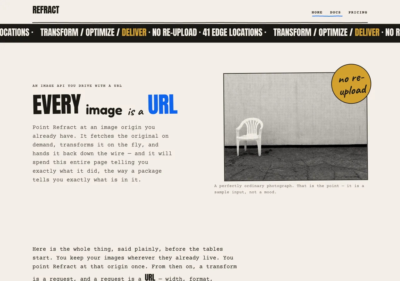
  **hero** (paper, 96px: an eyebrow, the four-voice mixed headline — an Anton shout word, a
  Fredoka word, a Caveat word, and **one 72px Anton word in `--blue`**, each at its own
  fractional rotation — the halftoned hero photograph, and one sticker badge slapped over
  its corner at -6°) → **the rambling
  block** (paper, 660px measure: the lead and three typewritten paragraphs saying what
  Refract actually is — you point it at an image origin you already have, there is no
  re-upload, the originals are fetched on demand and cached at the edge and never stored
  permanently — with one mustard highlighter swipe and a Caveat P.S.) → **capability
  trio** (kraft, 64px: three hand-drawn boxes — **Transform**, **Optimize**, **Deliver**) →
  **the marked-up proof** (paper, 64px: the after plate in its well at the centre of the
  sheet, seven hand-drawn callouts scattered through the margin around it with drawn arrows
  running into the photograph, the untouched before print pinned in the top-left margin,
  the URL slug line across the foot, and the kraft boring-bit box hanging off its asterisk)
  → **stats band** (**the one blue flood**, 64px: the
  four figures at 96px in `--on-blue`) → **CTA band** (paper, 64px, in a hand-drawn box:
  one ink button, **"Start building" → `./docs.html`**) → footer (ink).
- **docs** — nav → marquee ribbon → page opener (paper, 54px Shout) → the lead (paper,
  660px measure, typewritten) → **quickstart** (paper, 64px: three hand-drawn boxes,
  hand-numbered `1` `2` `3` in Caveat in the margin, the third carrying the **SDK
  listing** on kraft) → **the ingredient panel** (kraft, 64px: the ten-parameter reference
  set as a back-of-pack ingredient list) → **the small print** (kraft, 64px: caching and
  limits — 50 requests/second per key on every tier, variants cached at the edge for 30
  days, instant purge by URL or tag) → **CTA band** (**the one blue flood**, 64px) →
  footer.
- **pricing** — nav → marquee ribbon → page opener (paper, 54px Shout) → the lead → **the
  three tiers** (paper, 64px: three hand-drawn boxes, prices at 96px) → **the small
  print** (kraft, 64px: overage and billing semantics as a second ingredient panel) →
  **FAQ** (paper, 64px, 660px measure: four typewritten disclosure rows) → **CTA band**
  (**the one blue flood**, 64px) → footer.

## Signature

Four devices. The first three are lifted straight out of the reference's own world of printed
matter — the proof sheet, the copy that will not stop, the ribbon and the sticker; the fourth is
the shape system all three of them are drawn with.

### 1. The marked-up proof — the parameter playground's control surface

**Nobody in the history of the world has changed a photograph by filling in a form.** They
put the print on the table, picked up a pen, and wrote on it — an arrow into the thing that
was wrong, a ring round the option they wanted, a number scrawled against the edge that had
to move. That sheet is a real object in this design's own trade: the proof comes back from
the printer clean, and it goes back to the printer covered in handwriting. **The playground
is that sheet.** The controls are not collected anywhere. They are **scattered through the
margin around the photograph, each one tied by a drawn arrow to the part of the image it
governs**, and the marginalia *is* the interface. It is the only place on this site where a
visitor can change what the product does.

**There is no panel, and there is never going to be one.** No row list. No key-here /
control-there / value-hard-right column. No rules ruled between the controls, no box drawn
around the lot of them, no heading over the top of it. This has to be said out loud and
early, because a stacked console of labelled rows is what a tidy hand reaches for at two in
the morning, it would look perfectly respectable, and it would be somebody else's furniture
painted in carton's ink. **Not one of the other three designs in this brief writes on the
photograph.** Whatever they keep their controls in — a segmented pill, an instrument
console, a column of their own prose — the controls stand *beside* the image and address it
politely from across the room. **Carton's are on top of it, in pen.**

**The sheet is `--paper`, and the arithmetic chose that, not the styling.** The pen that
circles a chosen option is `--blue`, and `--blue` may never touch `--kraft` (3.88:1). A
kraft proof would have meant either a blue mark on a ground it is barred from, or the
quiet deletion of the best idea in the design. So the proof is a cream sheet, the kraft
stays where kraft belongs — the ingredient panel, the small print, the boring-bit box — and
this paragraph exists so that nobody later "restores" the kraft and takes the pen out with
it.

Six objects live on the sheet:

1. **The after plate — the proof itself.** The live photograph, anchored **top-left inside
   a fixed well** at the centre of the sheet, square-cornered, framed by a drawn 2px `--ink`
   rule, rotated a fraction of a degree, running clean and full-colour. It reads the state of
   the seven callouts and repaints the instant one of them moves. Captioned `After` beneath,
   in the 13px Caption role.
2. **The before print.** The same source photograph, printed small and plain in the sheet's
   **top-left margin**, captioned `Before`. It is a fixed reference and it never moves. **No
   callout, no arrow, and no balloon ever touches it** — it is the copy nobody wrote on, and
   that is the whole of its job. Both plates run clean: neither is halftoned, because a
   halftone is decoration and this pair is evidence.
3. **Seven callouts** — `w`, `h`, `fit`, `crop`, `rot`, `blur`, `bg` — in the margin.
4. **Eight arrows**: seven running from the callouts into the photograph (two of them ending in
   a dimension line rather than an arrowhead), and an eighth running from the asterisk in the
   slug line down to the boring-bit box. That is the sheet's inventory, not its census: **seven
   of the eight are always drawn, and `bg`'s is drawn only under `contain`**, because outside
   `contain` there is no letterbox band for it to land in.
5. **The slug line** — the live URL across the foot of the sheet, on its own drawn rule,
   where a printer's proof carries its job line.
6. **The boring-bit box** — a kraft wobbly box hanging off the slug line's asterisk on the end
   of the eighth arrow, holding the paragraph about the three parameters a browser cannot
   perform.

**A callout at rest.** One **wobbly box** (*Signature 4*, primitive 1) — 12px of padding, a
rotation somewhere in the ±1.2° ration, no two adjacent ones leaning the same way, carrying
the hard 4px `--paper-shadow` offset like everything else drawn on this site. Inside it: the
**key**, written out in the 14px Key role in `--ink` (15.35:1) at the box's top-left, never
abbreviated and never replaced by an icon; the **control**; and the **live value** in the
15px Data role. The seven values **do not line up in a column**, because there is no column
— they are scattered across the sheet, which is the point of the whole exercise. The
typewriter still earns its keep here, just for a different reason than in a table: a number
that is *changing while you drag it* would make a proportional face breathe, the digits
swelling and shrinking inside the box a dozen times a second. Courier Prime is a true
monospace, so the numeral counts without the box moving at all.

**Hover** thickens the callout's arrow from 2px to 3px, and does nothing else — the box does
not lift, does not glow, does not re-rotate, and grows no shadow, because there is no blurred
shadow in this system to grow. **Focus** puts the 2px `--ink` ring (15.35:1) on the control
itself, and `:focus-within` thickens that callout's arrow to 3px as well, so that the line
running from the thing in your hand into the photograph is visibly the line you are holding.
The thickening is ink weight, never colour, and it is a courtesy on top of the ring, never
the only cue. **While a control is being changed**, the after plate repaints within the frame,
the value counts in the callout, and **the matching token in the slug line steps 400 → 700**
for as long as that control holds focus — so the URL shows you which of its own words you have
your hand on. A weight step, not a colour.

**An unset parameter still gets a callout.** It prints `not set` in `--ink-soft` (8.12:1 on
paper) where its value goes, and it contributes nothing to the URL. Its key stays. Its arrow
stays. **A package does not hide the field it left blank; it prints the field and leaves it
empty**, and a visitor can see at a glance that there are seven things here and that they have
touched two of them.

**How a number gets into a scrawl — the contradiction, and the way out of it.** A slider is a
piece of chrome from somebody else's century: a ruled track, a manufactured thumb, a fill that
means something. Dropping one inside a box that was drawn crooked on purpose would be the most
embarrassing object on the site. **So this design has no slider — there is no track and no thumb
anywhere in it, and a drawn one is not a loophole.** The three numeric parameters are **written**,
the way a number goes onto a proof:

- **The written field.** The callout carries the number as a native `<input type="number">`
  with the browser's spinner suppressed, set in the 15px Data role and sitting on a **drawn ink
  rule** — a numeral written on a ruled line, which is exactly what a filled-in form on a
  package looks like. You type into it; **Up and Down step it** natively; it is a real input,
  it is the control of record, and everything below is decoration on top of a control that is
  already complete.
- **The scrub.** A pointer dragging horizontally across the written field runs the number up
  and down. It is an enhancement, it is unnecessary, and if it failed entirely nothing would be
  lost — which is the test any pointer-only affordance in this design has to pass.
- **The dimension line, for `w` and `h` only.** Their two strokes do not end in an arrowhead.
  They end in a **dimension line laid along the edge they govern** — a 2px `--ink` stroke with a
  stop-tick at each end, which is precisely the mark a proof uses to say *this edge, this far* —
  and **the far tick drags**: pull the plate's right edge to set `w`, pull its bottom edge to set
  `h`. **The two far ticks are the only drawn geometry on this sheet that is a control rather than
  a mark, and they have to be built as the exception they are.** The line, the near tick, and every arrow
  on the sheet are inert: they live in an `<svg>` overlay set to `pointer-events: none` (below),
  which is what stops a drawn stroke from eating a click meant for the paper underneath it. **So
  the far tick puts `pointer-events: auto` back on itself** — the two elements that do so are the
  only things in that overlay a pointer can touch, and *Components* (`arrow`) states the split
  again so a builder reading only that section cannot ship a dead affordance. A 2px pen line is
  not a target, so the tick's real target is a **transparent 44 × 44px `<rect>` centred on it**,
  carrying `touch-action: none` so a drag on the tick is a drag and not a page scroll, and a
  resize cursor on the axis it moves. The tick is `aria-hidden` and **outside the tab order**,
  because it is a second hand on the same value and not a second control — the written field is
  the control of record and it is where the keyboard goes. Giving one number two tab stops is how
  a scattered interface turns into a maze. Below 640px the arrows are withdrawn into *balloon key*
  mode and the ticks go with them; the written field is untouched, which is the whole reason it is
  the control of record and the tick is a courtesy on top of it.

**And here is the unflattering part, printed rather than buried.** `blur` runs 0–100 because the
brief says 0–100. `w` and `h` are pixels and **the brief states no maximum, so this design does
not invent one**: whatever positive integer you write goes into the URL exactly as you wrote it.
What the *sheet* can print is a different question — the well is only so wide — so when you ask
for a plate larger than the sheet can hold, **the plate renders at the sheet's limit and the
callout says so, in Body S, in `--ink`.** It does not silently clamp. It does not quietly rewrite
your number down and hope you were not watching. A page whose entire pitch is *we will tell you
what is in it* cannot cheat in the one place where a visitor is standing over its shoulder.

**The circled option, out in the margin where it always belonged.** The pen ringing the chosen
word is the best idea in this design and it survives the move completely intact — it simply
happens next to the photograph now, rather than inside the row of a panel that no longer exists.
`fit`, `crop`, and `rot` each set their options **inline on one line at 14px, weight 400** (the
Body S role), plainly, the way a printed list sets them. Choosing one **draws an ellipse around it
in `--blue`** — an SVG `<ellipse>`, 2px stroke, a `stroke-dasharray` tuned so the ring does not
quite close, rotated 2–4°, exactly as if a hand had circled the word and overshot. The chosen
option **also** steps 400 → 700 — the Key role's own weight, borrowed for emphasis — and **also**
carries `aria-checked="true"`. **Three signals, one of which is colour**, which is not
generosity: `--blue` is a non-text mark here (4.48:1 against the 3:1 bar), and state in this
system may never rest on colour alone. **Not a pill, not a chip, not a segmented control, and it
never rounds.** Each option run is a `role="radiogroup"` of `role="radio"` children with a roving
tabindex — the ordinary contract, unmodified, because there is nothing clever to be gained by
breaking it.

**`bg`, and the palette this design refuses to invent.** The brief gives `bg` exactly one
specification: a hex colour, used as the background fill for `contain`. **It does not hand this
design a set of presets, so this design does not print one.** A tidy row of five tasteful greys
would be five colours nobody ever specified, sitting on the one page that has spent two thousand
words promising you it does not make things up — and it would be making things up about its own
demo, which is worse, not better, than making them up about the product. So the `bg` callout
carries a **hex field** — a `text-input`, placeholder `#RRGGBB`, which is the *form* of a value
and not a value — and **one wobbly swatch beside it that previews exactly what is in the field
and nothing else**. The swatch is `aria-hidden`: it is a preview, and the field is the control.
An empty or malformed field leaves the swatch an empty drawn square with one ink stroke across
it, the value reads `not set`, and `bg` stays out of the URL entirely.

**`bg` is inert unless `fit=contain`, and it says so by being crossed out.** The brief scopes
`bg` as the fill *for* `contain`, so in every other fit mode the callout is **struck through** —
one drawn `--ink` stroke straight across the box, its key stepped to `--ink-soft`, its field
non-editable, its value `not set`, `aria-disabled="true"`, its balloon crossed out with the same
stroke, and **its arrow withdrawn from the sheet entirely.** That last one is not tidiness, it is
the same refusal the rest of this page is built on: the arrow's whole job is to say *this
parameter acts here*, the letterbox band it pointed into does not exist under `cover`, `fill` or
`crop`, and **an arrow drawn to a place that is not there is a mark telling a lie about the
picture.** A struck-through callout is a field printed and left empty, which a package does; an
arrow into nothing is a claim, which a package does not get to make. **A strike-through is a
shape, not a tone**, which is exactly why it is used: at 1.30:1 a `--paper-shadow` wash could not
carry that state and neither could any grey in this palette. The instant `contain` is circled,
the stroke lifts, the arrow is drawn back in to the band that has just opened, and the callout
wakes up.

**The arrows, and how they are authored.** Every one of them is CSS and SVG, and **not one of
them is generated** — the image model on this project is asked for photographs and for nothing
else, and that includes arrows (*Signature 4*).

- One `<svg>` overlays the sheet with `pointer-events: none`, its `viewBox` set to the stage's
  design box with `preserveAspectRatio="none"`, and **every path carries
  `vector-effect: non-scaling-stroke`**, so a 2px pen line stays a 2px pen line when the sheet
  stretches under it. The overlay is inert so that a stroke crossing the paper never eats a click
  meant for the paper. **The two far ticks are the single exception, and they re-enable
  `pointer-events: auto` on themselves** (above): a mark is inert, a control is not, and this
  sheet has exactly two pieces of drawn geometry that are controls.
- Each stroke is a `<path>` in 2px `--ink` with `stroke-linecap: round` and a spine that wanders
  ±1px along its length, so it reads as a person's line and not as a leader from a CAD program.
- **Five of the seven end in a hand-drawn arrowhead — two short strokes meeting at the point,
  and never a filled `marker` triangle**, because a filled triangle is a drafting program's arrow
  and this sheet was marked up by a person.
- **Two of the seven — `w` and `h` — end in a dimension line** along the edge they set, as above.
- **Where a parameter has a place, its callout sits at that place, and that is the entire
  placement rule.** `w` sits above the top edge and its dimension line runs along it. `h` sits
  against the right edge and its line runs down it. `fit`'s arrow lands on the plate's **drawn
  frame**, because `fit` is a question about the box and not about the picture. `crop`'s arrow
  runs **into the subject** — which the image manifest deliberately places well off-centre —
  because `crop` is a question about what survives the frame. `rot` sits at the **top-right
  corner** and its stroke curves into it, the way a proof marks a turn. `blur`'s arrow lands in
  the **middle of the image**. `bg`'s arrow lands in the **letterbox band** that `contain` opens
  up, which is the only place a `bg` value can ever be seen.
- **Every head is written from the plate's live box, and that is the rule that keeps this sheet
  from being a drawing of itself.** The plate grows and shrinks inside its fixed well, so a point
  that was *the middle of the image* at load is not the middle of it at `w=300`, and a target that
  was *the subject* at load is somewhere else entirely at `rot=90`. **So no arrow head is a fixed
  point in the sheet's design space.** Each one is expressed in the plate's own rendered
  coordinates and rewritten in the same frame the plate repaints. The **tails do not move** — they
  are pinned to the callouts, and the callouts are placed against the well (below) — so an arrow
  answers a change by swinging, never by dragging its box across the paper. The seven heads, and
  what each is anchored to:
  - **`w` and `h`** — the far tick of each dimension line, sitting on the edge that value sets,
    written from the same number that sizes the plate.
  - **`fit`** the plate's drawn frame, **`rot`** the frame's top-right corner, **`blur`** the
    centre of the box. These three are constant *in the box's own coordinates* and move only
    because the box moves.
  - **`crop`** — **the subject**, whose position is a function of the live transform. Its point is
    carried through the same `object-fit`, `object-position` and `rotate` the plate itself is
    under, so it lands on the cone wherever the transform has put the cone.
  - **`bg`** — the centre of the letterbox band, which exists under `contain` and under no other
    fit, and which has its own rule below.
- **Every computed head is clamped to the plate's rendered box, and that single clamp is the whole
  of the answer to *what if the thing it points at is gone*.** Set `rot=90`, or a narrow `w`, or
  `crop=edges`, and the subject can leave the frame. The arrow does not follow it out onto bare
  paper and it does not keep pointing at ground where the subject used to be: **it lands on the
  frame, at the edge the subject went out through** — which is not a degradation of the mark, it
  is the mark saying the true thing, *this is where the crop took it out.* **No arrow on this
  sheet can land on empty ground, in any state, ever.** A builder who ships one has shipped a
  drawing.
- **`bg`'s arrow is the one that is not always on the sheet, because its target is not always on
  the plate.** The letterbox band exists under `contain` and under no other fit. So **`bg`'s arrow
  is drawn while `fit=contain` and withdrawn in every other fit**, along with the callout it
  leaves — a struck-through callout does not point at anything, because there is nothing left for
  it to point at (see the strike-through rule below). Under `contain` its head is the centre of
  the band the fit actually opened, read off the plate's live box; and in the one case where
  `contain` opens no band at all — the box happening to match the source's own aspect — the head
  clamps to the frame on the axis the band would have opened along, exactly like every other
  computed head here.
- A live head is still an authored path — *Signature 4* forbids asking a model for a drawing, not
  doing arithmetic on one you drew yourself.
- **No arrow is labelled.** The key is written in the callout, in the typewriter. A Caveat scrawl
  in the margin may be funny *about* a control and may carry its own little pointing arrow while
  it does so — but **a Caveat scrawl is never a control's label**, because the hand face carries
  jokes and nothing else, and a control whose name is a joke is not a control.

**The plate never reflows the sheet.** It is anchored top-left inside a **fixed well**, and it
grows down and right within it; the callouts, the arrows and the slug line are all placed against
the *well* and not against the plate, so **changing `w` never moves a single callout.** An
interface whose controls jump about while you use them is unusable; a *scattered* interface whose
controls jump about is a punishment.

**Keyboard, and the focus order through a thing that is deliberately not in a line.** This is
where a design like this is usually caught pretending, so it is specified rather than hoped for.

- **The scatter is CSS. The sequence is DOM.** The callouts are authored in the DOM in the
  brief's own parameter order — `w`, `h`, `fit`, `crop`, `rot`, `blur`, `bg` — the same order the
  ingredient panel lists them in and the same order they appear in the URL, and they are *placed*
  on the sheet by named CSS grid areas. **There is no positive `tabindex` anywhere in this
  system.** So the tab order is the parameter order, it is the order the visitor has already been
  taught twice, and the fact that the eye is being thrown around the sheet has no effect on it
  whatsoever.
- **Eight tab stops on this sheet, and that is the complete list**: the `w` field, the `h` field,
  the `fit` group, the `crop` group, the `rot` group, the `blur` field, the `bg` hex field, and
  the `COPY IT` button. The edge ticks, the preview swatch, the key balloons, and all eight arrows
  are `aria-hidden` and unfocusable, so **no object on this sheet owns two stops.**
- Inside an option group, **arrow keys move and choose** and `Home`/`End` go to the ends. Inside a
  written field, **Up and Down step the number** and typing sets it.
- Each callout is a `role="group"` labelled by its key, so a screen reader says `w` before it says
  the number, no matter where on the sheet the eye happens to have landed.
- The slug line is an `<output>` — implicitly a polite live region — and it **repaints every frame
  while a value moves but announces only on commit**, so a visitor dragging an edge tick is not
  read a hundred consecutive URLs.
- **Focus is visible in two places at once**: the 2px `--ink` ring on the control, and the
  thickened arrow running from that callout into the photograph — so a keyboard visitor can see,
  out on the image, which part of the picture the control they are holding actually governs. The
  ring is the guarantee. The arrow is the courtesy.

Seven callouts, seven honest mechanisms, and every one of them genuinely mutates the after plate:

| Callout | What is in it                                                          | Honest browser mechanism      |
| ------- | ---------------------------------------------------------------------- | ----------------------------- |
| `w`     | **Written field** + a **dimension line** along the top edge, whose far tick drags   | Rendered width of the plate   |
| `h`     | **Written field** + a **dimension line** down the right edge, whose far tick drags  | Rendered height of the plate  |
| `fit`   | **Circled options**: `cover` `contain` `fill` `crop`                    | `object-fit`                  |
| `crop`  | **Circled options**: `smart` `center` `edges`                           | `object-position`             |
| `rot`   | **Circled options**: `90` `180` `270`                                   | `transform: rotate()`         |
| `blur`  | **Written field**, 0–100                                                | `filter: blur()`              |
| `bg`    | A **hex field** + one preview swatch                                    | The plate's background colour |

**Moving anything in the margin mutates the after plate immediately and rewrites the slug line.**
The before print never moves — that is the entire point of a before. Nothing on this sheet is a
mock-up: if a callout changes and the photograph does not, the design has failed and the build is
wrong.

**When the sheet is too narrow to scatter into.** The scatter needs margin on four sides and it does
not always get it, so it degrades in two named steps rather than collapsing into a list. Between
640px and 1024px the sheet runs in **rail** mode: there is no usable side margin at that width, so
the callouts fall into the margins **above and below** the plate — three above, four below — their
arrows running vertically into the image, and everything else about them unchanged.

Below 640px there is no margin left to write in at all, and the honest answer is the one the trade
itself uses when a sheet runs out of edge: **you balloon the mark onto the image and key the
instruction to it.** This is **balloon key** mode. The seven arrows are withdrawn. Each
parameter's **key is balloonned onto the region of the photograph it governs** — the key itself, in
the 14px Key role, on an **opaque `--paper` SVG ellipse ringed in 2px `--ink`**, sitting over the
picture exactly where its arrow used to land. (Ink on cream is 15.35:1 wherever the balloon lands,
which is why the balloon is opaque: a bare ink ring on an unknown photograph is a contrast claim
nobody can make. And it is an **SVG ellipse**, not a CSS radius — **the only `border-radius: 50%` in
this system is still the sticker badge**.) Beneath the plate, the seven callouts **stack**, each one
headed by the same key, still crooked, still at their own rotations, still overlapping. **They stack;
they do not tabulate.** No shared value column, no rules between them, no panel around them, no
alignment of any kind — if they ever congeal into a tidy list of rows, the redesign has been undone
and the fix is to un-tidy them. DOM order does not change, so **the tab order at 360px is the tab
order at 1440px**, which is the quiet dividend of having put the sequence in the DOM in the first
place.

Three rules govern this sheet, and they are the ones this design would deserve to be caught
by if it ever broke them:

- **`fm`, `q`, and `dpr` are not controls — they are the small print, and the small print is where a
  package tells the truth.** They have no callout, because a callout is a thing you can change and
  these are not. They appear **in the slug line only**, each carrying an **asterisk (`*`)**, and a
  drawn stroke runs from the asterisk down to a kraft **wobbly box** headed `* THE BORING BIT`,
  where the explanation sits in typewritten Body S:

  > `*` Three of these ten do not happen in your browser, and we are not going to stand here and
  > mime them for you — not on a page whose whole pitch is that we tell you what is in the box.
  > `fm=auto` negotiates AVIF → WebP → JPEG off the Accept header your request already sent. `q` is
  > applied when the image is re-encoded, and a browser cannot re-encode anything, so there is no
  > animation here of a payload getting smaller: we would have had to invent the number, and we
  > would rather lose the demo than invent the number. `dpr` is the honest one — your browser knows
  > its own device pixel ratio, we asked it, and what is printed up there is what it said, clamped
  > to the 1–3 the reference documents. That is the entire boring bit. Thank you for reading the
  > boring bit. Almost nobody does.

  **A package settled this problem a century ago and did not need a component library to do it: an
  asterisk, and a paragraph on the back that nobody was ever supposed to read, printed in full
  anyway.** So there is no badge here, and the absence is deliberate. `aperture` pills these three
  with a `NEGOTIATED` tag; `cutaway` marks them with a bordered `SERVER-SIDE` tag; both are perfectly
  good and neither is available to a carton, because **a carton does not own a badge.** It owns small
  print — and small print is *longer* than the thing it annotates, which is the joke, and is also the
  only honest answer, because "server-side" is a two-word claim and the truth takes a paragraph. The
  asterisk costs one glyph of `--ink`. The paragraph costs a paragraph, and the paragraph is the
  point. The same asterisk marks the same three rows in the docs ingredient panel, and the same box
  sits under it.

  The refusal underneath all of this is the load-bearing part. **We could have faked it.** A little
  counter under the photograph, running a payload down from one number to a smaller number — it would
  have looked terrific, it would have taken an afternoon, and every digit in it would have been made
  up on the spot. **Every number on this site comes from the brief or it does not get printed at
  all.** A page whose single argument is *we will tell you exactly what is in this* does not get to
  invent a file size to liven up its own demo. That is lying in the first place a developer would
  check, on the page that had just finished promising it would not.

- **An unset parameter is absent from the URL.** There is no `rot=0` and no `blur=0` in the string,
  because the brief defines `rot` as `90` / `180` / `270` and this design does not quietly mint a
  fourth value to keep a string tidy. An untouched callout reads `not set` and adds nothing.
- **`bg` belongs to whoever typed it, and it never gets printed on the pack.** The hex goes into the
  letterbox inside the after plate and it stops there: no button, no ribbon, no band, no sticker, and
  no focus ring has ever taken its colour from a stranger. The preview swatch wears the same drawn
  `--ink` border every other drawn object here wears, **so the swatch's frame is system ink no matter
  what is inside it, and no swatch ever takes a mustard ring or a blue one.** **A `bg` value can never
  be read as licensing a third accent in this interface.**

The **slug line** runs across the foot of the sheet in the 17px Courier Prime URL role, on its own
drawn rule. It opens at the brief's own request form —
`https://demo.refract.dev/hero.jpg?w=1200&fm=auto&q=80` — and the seven callouts rewrite it live.
**The moment the page loads, `dpr` writes itself into the string**: `&dpr=` and then the visitor's own
`window.devicePixelRatio`, clamped to the brief's 1–3. Nobody typed that number and nobody had to —
your browser has been carrying its own pixel ratio around this whole time and will hand it to any page
that asks, so this page asks, prints what it is given, and takes no credit for it. It is the one figure
on this sheet that came from your machine instead of from the brief, and it is why `dpr` never reads
`not set` the way an untouched `rot` does: there is no such thing as a browser without one. **The three
asterisked parameters are set in `--ink-soft` (8.12:1 on paper) rather than `--ink`** — so the string
is telling you, at a glance and without being asked, which half of itself your browser is actually
performing and which half is being done somewhere you cannot watch. It would have been easy to set them
in the same ink as everything else and hope you did not look. An ink **`COPY IT`** button sits beneath
the line. **There is no orb and no pill anywhere near any of it.**

> **Before a later hand helpfully "fixes" this:** the brief hands over two different numbers for `q`,
> and this design prints both, on purpose, in different places. The stated default is **75** — so the
> ingredient panel's Default column prints 75, because that is what a default is. The brief's own
> request-form URL is written with **`q=80`** — so the slug line opens with 80, because that is the URL
> the brief actually writes. Neither figure was invented here, neither is a typo, and the two are not
> in conflict: a default and a request are simply different things, which is the kind of distinction a
> package would rather spell out for you than let you trip over.

### 2. The rambling block — the copy is the design

**The brand's single most identifiable component, and the reason this transplant is worth
doing at all.** A block of 16px typewriter body in a 660px measure that rambles, digresses,
explains itself, and openly acknowledges that it is a package talking to a developer. **No
card, no fill, no box — just crowded mono copy on paper**, with the occasional word swapped
into an Anton shout or a Caveat scrawl mid-sentence, one **mustard highlighter swipe**
behind the phrase that actually matters, and a Caveat **P.S.** hanging off the bottom at
-1°.

It appears on all three pages, and it is where the brief's facts get *said* rather than
tabulated: that you point Refract at an image origin you already have and there is no
re-upload; that the originals are fetched on demand and cached at the edge and **never
stored permanently**, which is a sentence the page is happy to repeat because it is the
one a developer actually cares about; that `fm=auto` reads your Accept header and hands
back AVIF, then WebP, then JPEG, and that the average result is **62% smaller than the
source JPEG**; that there are **41 edge locations**, that a cached response comes back in
a median of **21 ms**, that **98.6%** of requests are cache hits, and that when it *is* a
cold transform it is **89 ms** at the median and **340 ms** at the 99th, which the page
prints because a number you hide is a number somebody assumes is worse.

**The register is verbose. The facts are not negotiable.** Wordiness is a permitted voice
in this design and invention is not: **not one figure, price, latency, byte count, or
quality claim on this site exists that the brief did not fix.** The block is allowed to be
funny about a number. It is never allowed to make one up.

### 3. The marquee ribbon and the sticker

The two objects a visitor cannot un-see, and the two that make the page read as printed
matter rather than as a website.

- **The marquee ribbon.** A full-bleed **`--ink`** band, 12px of vertical padding, running
  its text horizontally in the 28px uppercase Anton Section-head role in `--on-ink`
  (15.35:1), with **one word per pass set in `--mustard`** (7.43:1 on ink — and the only
  ground the mustard is ever type on). It runs a repeated line built from the brief and
  nothing else — `TRANSFORM / OPTIMIZE / DELIVER · NO RE-UPLOAD · 41 EDGE LOCATIONS ·` —
  and it sits directly beneath the nav on every page. This is the ribbon `case` was
  declared for: the slashes and the middot ride at cap height.
- **The sticker badge.** A **true circle** — `border-radius: 50%`, the only one in this
  system — filled `--mustard`, ringed by a hand-drawn 2px `--ink` circle, carrying two or
  three words of 40px Caveat in `--ink` (7.43:1), slapped over a corner of the hero
  photograph at **-6°** so it overlaps the plate the way a real sticker overlaps a package.
  **There is at most one sticker per page and never two**, it is always at a rotation, and
  it always overlaps something. A sticker that sits neatly in its own whitespace is not a
  sticker; it is a badge, and a badge is what this design is refusing.

### 4. The drawn shape system — and none of it is generated

Every hand-drawn thing on this site is **authored in CSS and SVG**. **No image model is
ever asked for a wobbly box, a sticker, an arrow, a circle, an underline, an ellipse, a
scrawl, an illustration, or a vector of any kind** — the model is asked for photographs and
nothing else, and a generated drawing is rejected on sight. That prohibition is not
squeamishness; it is what keeps the drawn marks *sharp at every size and live under every
state*, which a raster can never be.

The vocabulary is **five primitives**, and every other drawn mark on this site — an arrow, an
arrowhead, a dimension line, an underline, the strike-out across a disabled callout, the FAQ's
plus — is **primitive 2 by another name**: a 2px `--ink` SVG stroke with a wandering baseline.
There is no sixth primitive:

1. **The wobbly box.** A one-line CSS primitive, and the most-used object on the site:

   ```css
   .box {
     border: 2px solid var(--ink);
     border-radius: 255px 15px 225px 15px / 15px 225px 15px 255px;
     transform: rotate(-0.6deg);
     box-shadow: 4px 4px 0 0 var(--paper-shadow);  /* blur 0. always. */
   }
   ```

   Each instance varies its four corner pairs and flips the sign of its rotation, so no two
   boxes on a page are the same shape — which is the difference between a hand-drawn box and
   a themed one. It carries the capability trio, the quickstart steps, the tier blocks, **the
   seven callouts on the proof sheet**, the boring-bit box, and the CTA band.
2. **The drawn rule.** An inline SVG `<path>` with a 2px `--ink` stroke, `stroke-linecap:
   round`, and a baseline that wanders ±1px across its length. Every horizontal division on
   this site is one of these, and so is **every arrow on the proof sheet** — the arrow is this
   stroke with two more short strokes meeting at its point, never a filled `marker` triangle.
   **There is no `border-bottom` divider anywhere in this system.**
3. **The drawn ellipse.** An SVG `<ellipse>` with a 2px stroke. It has **two uses and two inks,
   and no third**: in `--blue`, with a `stroke-dasharray` that leaves the ring slightly open and
   a rotation of **2–4°** (one of the two objects licensed to break the ±1.2° ration), it is the
   pen circling a chosen option; in `--ink`, closed, over an opaque `--paper` fill, and rotated
   **within the ordinary ±1.2° ration**, it is the **key balloon** that pins a callout to the
   photograph when the sheet is too narrow to scatter into (*Signature 1*). The fill is what makes
   the second one legal: a bare ink ring on an unknown photograph is a contrast claim nobody can
   make, and ink on its own cream is 15.35:1 wherever the balloon lands.
4. **The sticker circle.** A CSS `border-radius: 50%` element with a 2px `--ink` ring and a
   `--mustard` fill, carrying Caveat type. Described above.
5. **The halftone plate.** Every photograph on this site is put through a **photocopier, in
   CSS**:

   ```css
   .plate img {
     filter: grayscale(1) contrast(1.55) brightness(1.06);
     mix-blend-mode: multiply;          /* the cream paper prints through the whites */
   }
   ```

   optionally masked by an **SVG tile of solid ink circles** (`mask-image`) for a coarse dot
   screen. **The dot screen is a tile of solid circles and never a `radial-gradient`**,
   because there are no gradients in this system and a halftone built from one would be the
   first. A duotone is the same multiplied grayscale plate over a flat `--paper` or a flat
   `--blue-ink` backing — **two flat colours, never a blend.** The plate itself is
   square-cornered, framed by a drawn `--ink` rule, and rotated a fraction of a degree.

   **The two plates that are never halftoned are the before/after demo pair**, because they
   are the thing the API is transforming in front of you and a filter stacked on top of
   either would make the demonstration a lie. Both run clean, at full colour, framed and
   rotated like the others.

## Components

- **Nav bar.** `--paper`, 16 × 24px padding, closed by a **drawn rule**. The wordmark
  **Refract** sits flush left in the 28px Anton Section-head role. Three page links — **Home
  · Docs · Pricing** — in the 12px uppercase Eyebrow role in `--ink`; the active link takes
  `aria-current="page"` and a **hand-drawn `--blue` underline** (a drawn rule in blue, a
  non-text mark at 4.48:1) plus a step to weight 700, so its state never rests on colour
  alone. **The links are three words and nothing else** — no icon beside them, and no little
  tag hanging off one of them announcing that something is new. Nothing in the brief tells
  this design that any capability is newer than any other, and a page that will not invent a
  byte count is certainly not going to invent an excitement. The **marquee ribbon** runs
  directly beneath it on every page.
- **`button-ink`.** The primary. **`--ink` fill, `--on-ink` cream label** at the 16px
  uppercase Anton Button role (15.35:1), **2px** radius, 48px tall, 14 × 28px padding, with
  the 4px `--paper-shadow` offset. Press removes the offset and translates the button 4px
  down and right, so it looks **pressed into the paper** — no fade, no lift, no glow. This is
  the site's primary action — **"Start building" → `./docs.html`** — and the `COPY IT` button
  under the URL string.
- **`button-drawn`.** The secondary. Transparent fill, `--ink` label, a **drawn 2px `--ink`
  border** — a wobbly box, not a crisp rectangle — 2px radius, 48px tall. Used for **all
  three tier CTAs — Free, Pro, and Scale alike.** **No tier CTA is ever `button-ink`:** the
  three blocks are drawn identically, and inking one of them in would be this pack quietly
  picking a favourite — which is exactly the manoeuvre it spends the rest of its surface
  promising you it will not pull.
- **`link`.** `--blue-ink` (`#0A48AD`, **7.15:1** on paper, **6.19:1** on kraft) with a 1px
  underline in the same colour, inside typewritten copy only. **Go and count the coloured
  words on this site that are set below 24px: you will get to two.** This link, and the
  validation message on `text-input` below. Both are `--blue-ink`; if you find a third, it is
  a mistake and not a flourish. (Every other coloured word here is large: the mustard in the
  ribbon at 28px and in the footer's Caveat scrawl at 32px, and one 72px blue word in the
  hero.)
- **`text-input`.** `--paper-bright` fill (`--kraft` never fills an input), `--ink` text in
  the Data role, a **drawn 2px `--ink` border**, 2px radius, 12 × 14px padding, 48px tall.
  Placeholder in `--ink-soft` (8.47:1) — **not `--ink-faint`**, which is body-legal on paper
  but fails on kraft (4.33:1) and is therefore kept off every surface a panel might move onto.
  Focus draws the **2px `--ink` ring at a 2px offset** — the ink thickens, it does not glow.
  A value the field cannot accept — a `blur` outside the brief's 0–100, or a `bg` that is not a
  hex colour — keeps the ring and prints a message in `--blue-ink` — **the same blue, not a
  semantic second colour**, because this system has no error red and will not grow one. (`q` is
  never validated here, because `q` is never typed here: it is one of the three asterisked
  parameters and it has no control at all.)
- **`callout`.** The playground's whole vocabulary, and **the only place this design puts a
  control of record** — the two draggable edge ticks are not a counter-example, because each is a
  second hand on a number a callout already owns (`aria-hidden`, no tab stop, see `arrow`). A
  **wobbly box** in the margin around the proof, 12px padding, rotated within the
  ±1.2° ration, carrying its hard offset: the **key** in the 14px Key role at its top-left, the
  control under it, the live value in the Data role, and **one drawn arrow leaving it for the
  photograph**. Seven of them, as set out in *Signature 1*. `role="group"`, labelled by its key.
  **It is never a row, it never shares a column with another callout, and no rule is ever ruled
  between two of them.**
- **`written-field`.** The numeric control of record, and there is no second kind of numeric
  control in this system: a native `<input type="number">` with its spinner suppressed, set in the
  Data role on a **drawn ink rule** — a number written on a ruled line. Typing sets it, Up and
  Down step it, and a pointer may scrub it horizontally. For `w` and `h`, the **far tick of the
  dimension line** on the plate's own edge is a *second hand* on the same value: it drags, it is
  `aria-hidden`, it is outside the tab order, and it is the one piece of drawn geometry on the
  sheet that takes a pointer (see `arrow`). It never becomes a stop of its own, and it never
  becomes the control of record. **No track, no thumb, no fill, no gloss, and no slider — a drawn
  slider is still a slider.**
- **`option-line`.** The inline run of options at 14px, weight 400 (the Body S role), inside a
  callout, the chosen one circled by a drawn `--blue` ellipse, stepped to weight 700 — the Key
  role's own weight, borrowed for emphasis — and carrying `aria-checked="true"`. A
  `role="radiogroup"` with a roving tabindex. **Not a pill, not a chip, not a segmented control,
  and never rounded.**
- **`swatch`.** A **24px wobbly square** — asymmetric drawn radius, 2px `--ink` border, rotated
  ±1° — filled with whatever hex is currently written in the `bg` field, and **there is exactly
  one of them on the site.** It is `aria-hidden`: it previews the visitor's value and the field
  beside it is the control. **There is no preset palette anywhere in this design**, because the
  brief never gave it one. An empty or malformed field leaves the square empty with a single ink
  stroke through it.
- **`arrow`.** A 2px `--ink` SVG `<path>` with a wandering spine, leaving a callout and landing on
  the region of the photograph its parameter governs — ending in **two short strokes meeting at a
  point** (five of them) or in a **dimension line** along an edge (`w` and `h`). `aria-hidden`,
  `vector-effect: non-scaling-stroke`. **Authored, never generated.** **Its head is written from
  the plate's live box and clamped to it, never from a fixed point on the sheet** (*Signature 1*),
  and `bg`'s is drawn only under `contain`.

  **Which of this geometry is a mark and which is a control, because the answer is not the same
  for all of it.** The overlay `<svg>` is `pointer-events: none` and so is every stroke in it: a
  mark on a proof is ink, and ink does not take a click. **The two exceptions are the far ticks of
  the `w` and `h` dimension lines, which are controls** — each one sets `pointer-events: auto`
  back on itself and carries a **transparent 44 × 44px hit `<rect>`**, because a 2px pen line is a
  mark you can see and not a target you can hit. They keep `touch-action: none`, they take a
  resize cursor, and they stay `aria-hidden` and outside the tab order — the written field is the
  control of record (*Signature 1*, Keyboard). **Everything else in the overlay — all five
  arrowheads, both dimension-line strokes, both near ticks, and the eighth arrow to the boring-bit
  box — is inert decoration.** A build that leaves `pointer-events: none` on the far tick has
  shipped a dead affordance; a build that lifts it anywhere else has shipped a stroke that eats
  clicks meant for the paper.
- **`balloon`.** A closed 2px `--ink` SVG ellipse over an opaque `--paper` fill, carrying a
  parameter's key in the Key role (15.35:1 on its own cream), sitting on the photograph where that
  parameter's arrow would have landed. **It exists only below 640px**, where the arrows are
  withdrawn, and it is `aria-hidden` — it is a printed mark, not a control.
- **`plate`.** A photograph: square-cornered, framed by a drawn 2px `--ink` rule, rotated a
  fraction of a degree, halftoned (except the demo pair, which runs clean). **No radius on the
  image itself, no blurred shadow, no overlay, no scrim, and type never sits directly on it** —
  the sticker's type sits on its own fill, which may overlap the photograph, never on the image
  surface itself, and so does the balloon's key. Its caption sits **beneath** it in the 13px
  Caption role, and a Caveat aside may hang off it at an angle. **The demo pair is two `plate`
  instances sharing one photograph**: the before print is static, untouched, and nothing is ever
  drawn on it; the after plate is the proof, and it is the one the seven callouts reach into.
  Neither ever ships alone.
- **`capability-box`.** One of three **wobbly boxes** on the kraft band, 24px padding: a
  halftoned plate, a title in the 22px Fredoka Rounded-title role, and a typewritten paragraph
  in Body. **Transform**, **Optimize**, **Deliver**. The three are the capability trio, and
  they are boxes rather than cards because a card has a shadow and this system has none.
- **The ingredient panel.** The ten-parameter reference, and the place the whole transplant
  pays off. **It is a back-of-pack ingredient list, not a documentation table.** A kraft board,
  headed `WHAT'S IN IT · ALL TEN` in the Eyebrow role, closed above and below by a **drawn
  rule**, with a drawn rule between each of the ten rows — and **those horizontal strokes are the
  only strokes in it.** Nothing is striped, nothing is boxed, nothing is filled, nothing floats,
  and **no rule is ever drawn down the panel between two columns**, because a column does not need
  help: the eye falls down a column on its own, and the only place it can lose its footing is on
  the long walk across a row. Every rule in this panel is therefore paying for a real difficulty,
  and a panel where every stroke is paying for something is a panel with very few strokes in it.
  Four columns: the **parameter** in the 14px Key role (`--ink`), the **accepted values** in the
  Data role (`--ink`), the **default** in the Data role (`--ink-soft`), and the **description** in
  Body S (`--ink-soft`, 7.03:1).

  About that Default column, because somebody is going to look at it and think it is broken:
  **nine of the ten rows print an em dash, and the tenth prints 75.** The brief states exactly one
  default in the whole reference — `q` = 75 — and this design is not going to fill in the other
  nine out of a sense of tidiness. It would be so easy. Nobody would notice. That is precisely the
  problem: the shopper who catches one invented figure on the back of a pack does not write off
  that one figure, they stop believing the entire label, and the developer reading this panel is
  that shopper with a terminal open. A real ingredient list leaves a field blank sooner than guess
  at it. Nine em dashes, and no apologies for them. The `fm`, `q`, and `dpr` rows carry the
  **asterisk**; the `THE BORING BIT` box sits beneath.
- **The small print.** The same kraft panel form at a smaller scale, headed `THE SMALL PRINT`,
  carrying **caching and limits** on docs (50 requests/second per key on every tier · variants
  cached at the edge for 30 days · instant purge by URL or tag) and **overage and billing
  semantics** on pricing ($2 per additional 1,000 transforms · $0.08/GB of bandwidth · Free
  pauses transforms at the cap and the originals keep serving · a transform is one unique
  source-and-parameter combination per billing month, and cached hits are free). Drawn rules
  between rows, the label hung at the left in the Key role, the figure at the right in the Data
  role — locked into a column by the typewriter, not by a font feature.
- **`tier-box`.** Three **wobbly boxes** on paper, 24px padding, no shadow but the hard offset.
  In order: the tier name in the 22px Fredoka Rounded-title role, **the price in the 96px Anton
  Figure-huge role with `case`** (`$0` / `$29` / `$249`) with `/mo` stepping down to
  the Data role, a full-width `button-drawn` CTA, and the quota beneath in the Data role —
  transforms, bandwidth, support, and the tier's extras — hung against their labels so the
  figures fall into a column. **No tier is marked "recommended," "popular," or "best value,"
  and no tier gets a sticker.** The brief does not say one is preferable, and a mustard stamp on
  exactly one of three blocks would invent a preference, which is an invented fact wearing a
  costume.
- **The stats band.** The **one blue flood** on index: full-bleed `--blue`, the four figures at
  96px Anton in `--on-blue` (5.17:1) — `62%` · `21 ms` · `98.6%` · `99.95%` — each over a 12px
  uppercase Eyebrow label in `--on-blue`, four across, each standing alone in its own cell.
  **No icons, no sparklines, no charts, no count-up.** These four came off the brief, and they
  are printed the way everything else on this pack is printed: once, in full, without a drum
  roll.
- **FAQ row.** A full-width disclosure row in the 660px measure, divided by **drawn rules**: the
  question in the 22px Fredoka Rounded-title role, the answer in Body S. The marker at the right
  is **two crossed pen strokes**, and opening the row **rubs one of them out** — the plus becomes
  the minus, which is what a plus was always going to become and what a hand would actually do to
  it. It is the same 2px `--ink` stroke as every other line on this site (*Signature 4*,
  primitive 2), so it is drawn from the vocabulary the page already owns rather than fetched in
  from an icon set that would arrive carrying somebody else's drawing style, somebody else's
  stroke weight, and a chevron that has never been near a pen. **No card, no fill, no shadow, no
  accordion box, and nothing spins.** Four rows, and they are the brief's four:
  what counts as a transform, what happens when you exceed your quota, whether you can use your
  own domain, and whether the originals are stored. The answers ramble. The facts do not move.
- **`sticker-badge`.** As set out in *Signature 3*. At most one per page.
- **Footer.** An **`--ink`** slab, 64 × 24px padding, cream `--on-ink` links in the 14px Body S
  role, closed by a drawn `--on-ink` rule and a 13px Caption legal line. It carries **one last
  scrawl in Caveat in `--mustard`** (7.43:1 on ink) — the page's last joke, and the second of
  the only two places the mustard is ever *type* rather than a fill (the other is the marquee's
  accent word; **`--ink` is the only ground the mustard may sit on as type**). The site's copy
  ends the way a carton's does: still talking.

## Motion

**Almost none, and never decorative.** Print does not move. The only two things motion is spent
on are making a control feel immediate and letting the ribbon run.

- **The photograph responds instantly.** A callout changes and the after plate repaints within the
  frame. Dragging an edge tick tracks the pointer with nothing between the two. There is no
  artificial delay, no skeleton, no shimmer, and **nothing that spins to imply this page is off
  somewhere doing work.** It is not doing any work. It is a browser, changing a picture, at the
  speed a browser changes a picture — and a spinner here would be a small lie told to make the
  demo feel expensive, on a page that has already promised, in writing, twice, that it does not
  tell those.
- **The marquee ribbon runs**, horizontally, at a constant speed, and it is the only continuously
  moving thing on the site. It is a scrolling ribbon by nature and it loops.
- **No scroll animation, no reveal-on-scroll, no parallax, no scroll-jacking, no hover-zoom on a
  photograph, no wobble-on-hover, and no count-up on the stats band.** A number that counts itself
  up in front of you is a number performing a little dance to hold your attention off what it
  actually says, and this page has nothing it needs to hold your attention off. **Nothing in this
  system rotates on hover** — the rotations are printed in, not animated on, and that includes
  every callout on the proof sheet.
- Hover and focus are **ink swaps, weight steps, and the offset only**, at ~120ms ease-out. A nav
  link gains its drawn underline; `button-ink` **loses its 4px offset and translates 4px down and
  right**, so it reads as pressed into the board; an FAQ question steps to weight 700; a callout's
  **arrow thickens from 2px to 3px** on hover and on `:focus-within`, and its token in the slug
  line steps 400 → 700 while it holds focus. All of it is ink getting heavier. **No scale, no lift,
  no bounce, no spring, no re-rotation, and no blurred shadow appearing on hover** — there is no
  blurred shadow in this system to appear.
- **Focus is a 2px `--ink` ring** (15.35:1) at a 2px offset, on every interactive element, and it
  is never removed. It is never blue and never mustard.
- Under **`prefers-reduced-motion: reduce`**, every transition is dropped, every element renders in
  its final state, and **the marquee ribbon stops and prints its line statically.** Switch all of it
  off and the page loses a ribbon that was running and keeps every word that was in it, standing
  still, where you can read it. **Nothing here has to move in order to be read** — a carton never
  could.

## Image treatment

**Every photograph on this site was taken the same way, and there is no second way.** Each one is a
**real photograph**, and it is deliberately a **plain, slightly awkward, unglamorous snapshot** —
flat overcast daylight, a straight-on deadpan frame, an ordinary object photographed without
ceremony, nothing styled and nothing arranged. It is the photograph a package puts on its back
because it has to show you something, not the photograph a brand puts on its front because it wants
you to want something. On the page it is then run through the CSS photocopier (*Signature 4*), and
the halftone is what welds it to the paper.

**The image model is asked for photographs and nothing else, and that prohibition is absolute.**
There is **no illustration, no vector art, no "flat vector" render, no icon set, no diagram, no
schematic, no chart, and no 3D render** anywhere in this bundle. **Every hand-drawn thing on this
site — the wobbly boxes, the sticker circles, the drawn rules, the circled options, the arrows, the
plus — is authored in CSS and SVG** (*Signature 4*), and asking a model to generate one is a defect
even if the result looks charming. This rule has already cost this project once: a sibling design in
another brief asked an image model for flat vector illustrations and the output was rejected on
sight. **Photograph it, or draw it in CSS. If it can be neither, it is not going on the pack** — and
that has been the rule since the first line of this document, as you may by now have gathered.

**How every image in this system is prompted.** These are binding rules, and a generated image that
breaks one is rejected and re-generated rather than accepted and cropped around.

1. **Nothing in frame carries language.** Every prompt states, explicitly and in its own clause,
   that the image contains **no text, no lettering, no numerals, no labels, no logos, no brand
   markings, no signage, no packaging print, and no stamped or printed marks of any kind** — not on
   the object, not on a wall, not in the background, not anywhere. Invented lettering is the single
   most common failure in a generated still, it reads as counterfeit branding, and **ordinary
   everyday objects are the exact subject matter that tempts a model into printing a label onto
   something.** Every object in these frames is **blank and unmarked**.
2. **No people and no hands.** Not one, not in the background, not out of focus. There are two
   reasons and the second one is the real one. The practical reason is that an image model will
   weld a set of fingers into a knuckleless mass and hand it back to you with confidence, and
   **you do not solve that by rolling the prompt again until you get lucky — you solve it by
   taking the hands out of the staging.** The reason that actually matters is what a person in the
   frame *says*: **the photographs on this site are sample inputs to an API — they are the thing
   being processed, not a mood being sold** — and the moment somebody's hand appears, holding
   something, the page has quietly started advertising a lifestyle instead of demonstrating a
   `crop` parameter, and nobody signed off on that.
3. **The frame is plain and uncluttered.** No props beyond the subject each description names, no
   scattered incidental objects, no busy lived-in scenes, no styling, no arrangement. **Unglamorous
   is a direction, not an accident** — flat overcast light, a straight-on angle, an ordinary object,
   and nothing done to flatter it.
4. **`demo-photo` has to survive being pulled apart in public, and it has one more job than the
   others.** The single asset prints twice on the proof sheet: as the untouched before print, and
   as the after plate, where a visitor will crop it to a square, blur it to 100, turn it 270°, and
   letterbox it against whatever hex they felt like typing — live, in front of them, while they
   watch. It has to look deliberate through every one of those, including the ugly combinations,
   and there are ugly combinations. **And its subject has to sit well off-centre.** This is not a
   composition preference, it is the entire load-bearing requirement of the demo: the brief makes a
   claim — *smart crop keeps subjects in frame* — and a `crop` callout is where this page either
   proves that claim or is quietly caught not proving it. **Put the subject in the middle and
   `smart` and `center` return the same picture, and the visitor has circled two different options
   with a pen and watched nothing happen.** A demo that cannot fail cannot demonstrate anything
   either, and this one is being watched by somebody who was told, at length, that they would be
   shown the truth.

Beyond those, each prompt carries the constant tone words: **flat overcast daylight, straight-on
deadpan snapshot, ordinary and unglamorous, nothing styled, nothing arranged, no people, no text.**
Crops hold identical framing across breakpoints — this design never art-directs a still into a
dramatic mobile crop — **no image is ever full-bleed**, every plate is square-cornered inside its
drawn ink frame, and **type never sits directly on a photograph in this system**: the sticker's
type sits on its own opaque fill, and so does the key inside a balloon, and either may overlap a
photograph. The caption sits beneath.

Needed images (referenced `./assets/<id>.webp`):

- `hero-photo` (4:3) — A single plain white plastic garden chair standing alone on a cracked
  concrete forecourt, pushed well off-centre to the left of the frame, a blank rendered wall behind
  it, flat overcast daylight, straight-on deadpan snapshot, ordinary and unglamorous, nothing styled,
  nothing arranged, no text, no lettering, no numerals, no labels, no logos, no brand markings, no
  signage, no packaging print, no stamped or printed marks, no people, no hands.
- `demo-photo` (4:3) — A single orange traffic cone standing on wet grey tarmac, set well off-centre
  to the right of the frame, a plain empty road surface filling the rest, flat overcast daylight,
  straight-on deadpan snapshot, ordinary and unglamorous, nothing styled, nothing arranged, no text,
  no lettering, no numerals, no labels, no logos, no brand markings, no signage, no packaging print,
  no stamped or printed marks, no people, no hands.
- `capability-transform` (4:3) — A stack of plain blank cardboard sheets lying slightly askew on a
  bare workbench, flat overcast daylight from a window, straight-on deadpan snapshot, ordinary and
  unglamorous, nothing else in frame, no text, no lettering, no numerals, no labels, no logos, no
  brand markings, no signage, no packaging print, no stamped or printed marks, no people, no hands.
- `capability-optimize` (4:3) — A folded blank paper bag resting flat on a plain formica table, its
  creases catching the light, flat overcast daylight, straight-on deadpan snapshot, ordinary and
  unglamorous, nothing else in frame, no text, no lettering, no numerals, no labels, no logos, no
  brand markings, no signage, no packaging print, no stamped or printed marks, no people, no hands.
- `capability-deliver` (4:3) — A plain grey utility cabinet standing against a blank pebbledash wall
  on an ordinary pavement, flat overcast daylight, straight-on deadpan snapshot, ordinary and
  unglamorous, nothing else in frame, no text, no lettering, no numerals, no labels, no logos, no
  brand markings, no signage, no packaging print, no stamped or printed marks, no people, no hands.
- `docs-photo` (1:1) — A blank unlabelled paper carton standing upright on a plain kitchen counter,
  photographed straight on, flat overcast daylight, ordinary and unglamorous, completely blank on
  every face, nothing else in frame, no text, no lettering, no numerals, no labels, no logos, no
  brand markings, no signage, no packaging print, no stamped or printed marks, no people, no hands.
- `pricing-photo` (3:4) — A tall plain supermarket shelf holding a row of identical blank unlabelled
  cartons, flat overcast fluorescent daylight, straight-on deadpan snapshot, ordinary and
  unglamorous, tall portrait, no text, no lettering, no numerals, no labels, no logos, no brand
  markings, no signage, no packaging print, no stamped or printed marks, no people, no hands.

## Do / Don't

Do:

- Keep the board cream (`--paper` `#F3EEE7`) and the ink warm near-black (`--ink` `#1A1815`) — never
  pure white, never pure `#000`. The one pure white on this site is `--on-blue`, reversed out of the
  flood band, and it is there because it measures 5.17:1 and the reference's own cream measures 4.67:1.
- **Mix four type voices on purpose**: Courier Prime for every paragraph and every figure that stacks,
  Anton for the shout and the huge numbers, Fredoka for the friendly titles, Caveat for the jokes. A
  single-family system is a failure of this design, not a tidier one.
- **Keep every functional word out of Caveat.** No parameter, value, price, quota, table cell, button,
  nav link, or error message is ever set in the hand. If the hand face failed to load, the site would
  still be completely usable.
- Set every figure that has to line up in a column in **Courier Prime**, which is a true monospace and
  aligns by construction. **Declare `tnum` nowhere** — none of the four faces ships it.
- Declare **exactly one OpenType feature: `case`, on Anton**, verified in its real GSUB. It lifts the
  slash and the middot in the all-caps ribbon. Anton's GSUB also ships a slashed zero — the only
  `zero` feature among the four faces — but no carton price has ever needed one, so `zero` is
  declared nowhere in this system, on any of its four faces.
- Draw the shapes: **wobbly boxes** (asymmetric `border-radius` + a fractional rotation), **drawn
  rules** (SVG paths with a wandering baseline, which is also every arrow on the proof sheet),
  **circled options** (an open `--blue` SVG ellipse), **sticker circles**, and **halftone plates** (a
  CSS `grayscale`/`contrast` filter with `mix-blend-mode: multiply`). All of it in CSS and SVG, none
  of it generated — an arrow least of all.
- **Scatter the playground's seven controls into the margin around the photograph, one hand-drawn
  callout each, every one tied to the image by a drawn arrow.** `w` and `h` against the edges they
  set, `crop` pointing into the subject, `rot` at the corner, `blur` into the middle, `bg` into the
  letterbox. Keep the seven browser-honest parameters (`w` `h` `fit` `crop` `rot` `blur` `bg`)
  interactive and genuinely wired to the after plate — the before print never moves — and mark `fm`
  `q` `dpr` with an **asterisk and the boring-bit box**, in the playground and in the ingredient
  panel alike. Print `dpr` from the visitor's real `window.devicePixelRatio`, clamped to the brief's
  1–3.
- **Put the scatter in CSS and the sequence in the DOM.** Callouts are authored in parameter order —
  `w` `h` `fit` `crop` `rot` `blur` `bg` — and placed by grid area. **No positive `tabindex`, and no
  object on the sheet with two tab stops.** Eight stops: seven callouts and `COPY IT`.
- **Ship the demo as a before/after pair, never a single plate.** One photograph, two `plate`
  instances on the proof sheet: the untouched before print in the margin, and the live after plate
  that the seven callouts actually reach into. A single demo plate is an incomplete build, not a
  simplification.
- Print an em dash for every default the brief does not state. Nine of the ten ingredient rows carry
  one, and the tenth carries 75.
- Crowd the page. Pack blocks at 12–16px, cap the copy measure at 660px, and spend 96px of air in
  exactly one place: the hero.
- Give every hand-drawn element a rotation between **-1.2° and +1.2°** (the **sticker badges** may
  go to ±8° and the **drawn ellipse circling a selected option** may go to 2–4° — those two, and only
  those two), and never let two adjacent elements rotate the same way.
- Keep `--ink-soft` (8.12:1 on paper, 7.03:1 on kraft) for anything a visitor must read inside a kraft
  panel, and keep `--ink-faint` (5.00:1 on paper) **off the kraft entirely** (4.33:1 — it fails there).

Don't:

- **Never set a paragraph in anything but the typewriter.** Anton sets words, Fredoka sets titles,
  Caveat sets jokes. **And never reach for a serif** — there is no serif of any kind in this system.
  **A refined serif display and a printed column grid are `folio`'s language** — the other paper
  design in this brief — and reaching for either is the first step toward becoming it.
- **No drop cap, no running head, no folio, no column rule, and no multi-column text grid.** That is
  `folio`'s furniture, it is its entire identity, and the split between the two of us is the one that
  has to stay legible: **`folio` is a refined print grid; carton is anti-design scrawl.**
- **No blurred shadow anywhere.** Every `box-shadow` in this system has a blur radius of `0` and a
  spread of `0` — a hard offset in `--paper-shadow`, which is a printing mis-registration and not an
  elevation. A non-zero blur is a defect. **No gradients, no glass, no glow, no elevation tier.**
- **Never rebuild the playground as a panel.** No stacked rows, no key-and-value column, no rules
  ruled between the controls, no box drawn round the lot of them, and no slider — **not even a
  hand-drawn slider, which is still a slider with a wobble on it.** The controls are scrawled in the
  margin and tied to the photograph by drawn arrows; the numbers are *written*, not dragged along a
  track. **A vertical console of labelled rows belongs to `cutaway`**, where an instrument panel is
  native and earned. Here it is the single most respectable, most tempting, most fatal thing this
  design could grow, and if it ever grows one, the design is over.
- **Never let the mobile fallback congeal into a table.** Below 640px the callouts stack, keyed to
  balloons on the photograph — they stack *crooked*, at their own rotations, with no shared column,
  no rules between them, and no panel around them. A tidy list of rows at 360px is the same defect as
  a tidy list of rows at 1440px, arrived at by the back door.
- **No pill and no orb.** A 9999px radius is `aperture`'s language. **The only `border-radius: 50%` in
  this system is the sticker badge**; the ellipse circling an option and the key balloon on the
  photograph are SVG ellipses drawn with a pen, not radii.
- **No dark canvas.** `--ink` fills exactly three surfaces — the marquee ribbon, the footer, and
  `button-ink` — and a button is not a band; there is no dark hero, no dark section, and no dark
  theme. Each page carries exactly one flood band, and it is blue. A graphite page is `cutaway`,
  and it is a different design.
- **No third accent.** One blue (two stops of one hue) and one mustard. No green success, no amber
  warning, no separate error red, no syntax-highlight palette. A validation message is `--blue-ink`,
  which is the same blue, not a semantic second colour.
- **`--blue` (`#0E63F0`) is never text below 24px** — **4.48:1 on paper fails AA body by 0.02**, and
  the ratio is symmetric, so cream reversed out of a blue flood carries the identical failure. Blue
  that carries small text is **`--blue-ink`** (`#0A48AD`, 7.15:1 / 6.19:1). Blue that floods carries
  **`--on-blue`** white (5.17:1). And `--blue` never touches `--kraft` (3.88:1).
- **`--mustard` (`#D2A02C`) is never text on paper, never a rule, never a border, never an outline,
  and never a focus ring** — **2.07:1 on paper fails even the 3:1 non-text bar.** It is a fill under
  `--ink` type (7.43:1) or it is type on the black ribbon (7.43:1), and it is nothing else. **No
  mustard sticker on one tier and not the others** — that invents a preference the brief never states.
- **`--ink-faint` (`#6B655B`) never appears on `--kraft`** — 4.33:1 fails AA there, and the kraft is
  exactly where the fine print lives. Inside a kraft panel, everything steps up to `--ink-soft`.
- **Never ask an image model for a drawing.** No illustration, no vector art, no "flat vector" render,
  no icon set, no diagram, no chart. Every generated asset is a photograph; every drawn mark is CSS or
  SVG. A generated sticker, a generated arrow, or a generated wobbly box is a defect.
- **No people and no hands in any generated image.**
- **Never build a halftone from a gradient.** The dot screen is an SVG tile of solid circles; a duotone
  is two flat colours. There are no gradients in this system and a halftone would be the first.
- **No type directly on a photograph.** There is no scrim in this system to make it legible, and a
  scrawled caption beneath the plate is the right place for the words anyway. **Two marks overlap a
  photograph, and neither is an exception to the rule** — the **sticker**, on every page, and the
  **key balloon** that pins a callout to the plate below 640px. Each brings its own opaque fill
  with it: the sticker's Caveat sits on mustard (7.43:1) and the balloon's key sits on cream
  (15.35:1), so in neither case does type ever touch the image surface. **If a third mark ever
  wants to overlap a plate, it needs a ground of its own before it is allowed to.**
- **Wordiness is a permitted register; invention is not.** The copy may ramble, digress, and be funny
  about a number. It may never make one up. Every figure on this site — 62%, 21 ms, 98.6%, 99.95%,
  41 edge locations, 89 ms / 340 ms cold, 50 requests per second, 30 days, $0 / $29 / $249,
  1,000 / 50,000 / 1,000,000 transforms, 5 GB / 250 GB / 5 TB, $2 per additional 1,000, $0.08/GB,
  `q` default 75, `q` 1–100, `dpr` 1–3, `blur` 0–100, `rot` 90/180/270 — comes from the brief, and
  nothing else does. **No byte count beside the photograph. No payload figure shrinking in an
  animation. No latency the brief did not supply. No "most popular" tier. No "NEW" badge.**
- **No count-up animation, no charts, no sparklines, no scroll parallax, no reveal-on-scroll, and no
  wobble-on-hover.** The rotations are printed in, not animated on.
- **No emoji anywhere.** The playful register in this design is bought entirely with type and with
  drawing, and never with an emoji — not in a sticker, not in a callout, not in the footer's last
  joke. And **no naming of the source reference in the built page**: the reference is named in this
  document's Concept and nowhere else. The site carries the product's own name, **Refract**, in
  English, and nothing else.