DESIGN.md
# Bevel — Design System

## Concept

**An image API rendered as a mid-90s professional imaging workstation.** Putty-beige
chrome, hard square corners, a navy title bar carrying the request URL, a toolbar of the
ten parameters, a before/after canvas sunk into a grey well, and a status bar reading the
live metrics along the bottom edge — a tool that has clearly been running, unchanged and
uncomplaining, since 1996. Every surface on the page is either **raised** (a light
top-left edge, a dark bottom-right edge) or **sunken** (the same edges inverted), and
every button physically presses *in* when you click it. There is no gradient, no soft
radius, no drop shadow, and no blur. Depth is the **bevel** — a two-tone geometric edge —
and nothing else.

The thesis is a claim about what an image API *is*. It is not a brand, not a campaign, not
a lifestyle; it is a **utility** — a machine that takes a file and a query string and
hands back a smaller, resized, re-encoded file, forty-one times out of forty-one, in
twenty-one milliseconds. And the software a working professional trusted most in the era
this design borrows from never looked like marketing. It looked like an **industrial
imaging application**: beige panels, beveled controls, a menu bar, a manual, a status bar
counting off what the machine was doing. That chrome made no argument and told no story.
It simply declared, in the flat authority of grey plastic and square windows, *this is a
tool, it works, and it will keep working.* Point that language at Refract and almost
nothing has to be invented, because the era's imaging application and the modern image API
are the **same product** thirty years apart: a bounded set of operations on a picture,
driven by a small vocabulary of parameters, with the result shown back to you and the
performance shown beneath it.

The transplant is honest because the bevel is not an illusion — it is a **geometric
fact**, and a checkable one. A modern card floats on a blurred drop-shadow that implies a
light source and a height the page does not actually have; the softness is a simulation.
A bevel implies nothing. A raised surface is raised because its top-left edge is literally
one pixel of white and its bottom-right edge is literally one pixel of charcoal — a hard,
countable, unambiguous statement, no ambient lighting model required. Press a beveled
button and it does not *pretend* to move; the edges **invert**, white becomes charcoal,
and the label sinks a pixel down and a pixel right, so the depth you saw was real enough to
reverse. This is the trust the whole design is built to earn: the same trust industrial
software earned by refusing to be soft. Nothing here is smoothed to look premium; the
authority comes from the tool being exactly what it says it is, down to the pixel — and,
as with every design under this brief, **every number on the built page traces to
`content.md`** and nothing is softened, rounded, or animated into a figure the brief did
not supply.

One rule keeps the era's chrome from becoming costume. In a real workstation, *everything*
was beveled — so the temptation is to bevel decoratively, to raise a panel because raised
looks period-correct. This design refuses that, and the refusal is checkable: **the bevel
encodes state, and only state.** A surface is **raised** if and only if it is a thing you
act on — a button, a tool, a tab, a whole window. A surface is **sunken** if and only if
it *receives* something — a text field receives typing, the canvas well receives an image,
the code well receives a snippet you copy, the status cells receive readouts. Nothing is
raised for looks and nothing is sunk for looks. A raised div that does nothing when
pressed is a lie the whole design is organized to prevent, and it is the fastest tell that
bevel has drifted into nostalgia. The bevel is not decoration; it is the interface telling
you, truthfully, what you can and cannot touch.

Two siblings under this brief also live in the developer's own past, and the lines between
them and bevel are drawn hard, because a careless glance could blur them.

**`node`** shares the single most similar mechanic — a **pressable "3D" button** — and is
the sibling bevel must separate from most deliberately. But node is the language engineered
to make you *want to poke it*: soft, saturated, and **rounded** — 16px radii everywhere,
fully-round path nodes, five candy accents each meaning one thing, a darker bottom "lip"
that the button squishes down onto with an over-eased **bounce**, then springs back. Node
is a **toy**; its depth is a colored lip on a rounded plastic bubble, and its motion is
play. Bevel is the opposite object on every axis. Its depth is a **two-tone hard edge**
(white/charcoal), not a colored lip; its corners are **0px squares**, never a radius; its
palette is **beige plus one navy plus one rationed maroon**, never a saturated accent set;
and its press is a **mechanical invert** — instant, flat, no bounce, no spring — a button
snapping *in* the way a real physical key does, not a bubble squishing down for delight.
Node presses because pressing feels good; bevel presses because a tool's controls actually
move. If a control on node's page does not look like it wants to be pressed, it is
off-brand; if a control on *this* page bounces, springs, rounds a corner, or wears a
saturated color, it is off-brand. One is a game loop; the other is an industrial tool.

**`tty`** is the other artifact of the developer's past, and it renders the *same era* —
but the **terminal** side of it. tty is flat cream paper carrying one monospaced face from
the hero headline to the footer legal line, ASCII `[+]` / `[-]` brackets where other
systems put icons, and one dark object doing all the work: a `$` prompt where the request
is typed and the response prints back. tty is **text** — a `man` page, a command line, no
chrome and no windows. Bevel is the **GUI** of that identical era: not a command line but
an **application window**, not flat text but **beveled panels**, not a `$` prompt but a
**toolbar and a canvas and a status bar**. Where tty's docs page is a shell transcript,
bevel's docs page is a **help file** with a sidebar tree. Where tty's code lives in a
**black terminal**, bevel's code lives in a **sunken white document well** — a field, not
a console — precisely so the two never converge on the same dark rectangle. Where tty draws
its bullets with `[+]` characters in running text, bevel draws its tree with a **graphical
widget** — indented rows, a small square node with a `+` inside a 9px box, dotted guide
lines. tty is the command line of 1996; bevel is the windowed application of 1996. Same
year, opposite surface.

The rest of the brief's designs share only the alphabet: `aperture` is a warm soft photo
marketplace, `carton` a printed-carton voice, `cutaway` a dark industrial diagram, `folio`
a serif print magazine, `prism` a calm near-white platform, `reel` a black cinematic
canvas, `spec` a white corporate configurator, and the two other batch designs run a live
telemetry console and a frosted-glass depth. Bevel is the only member built from **window
chrome** — the only one that is beige, square, beveled, and pressable-because-mechanical.
The load-bearing device is the **bevel**, and it is stated once more so it cannot be
missed: every surface is raised or sunken, depth is the two-tone edge alone, and there is
no shadow anywhere on the page.

The last discipline is the one the retro tone most tempts a builder to break. **The chrome
is period, the copy is not a joke.** A workstation aesthetic invites ironic, winking,
untrustworthy voice — the "haha, remember old software" register — and that register would
destroy the exact thing the design exists to build. The whole point is that industrial
software was *trusted*, and it was trusted because it was serious. So the parameter
reference, the pricing, the FAQ, and every line of copy read as real, precise, authoritative
developer documentation — the manual for a tool a professional depends on — never as a
period gag. The bevel is dead earnest. The facts do not wink.

## Palette

Putty beige, near-black ink, a white-and-two-greys bevel ladder that does every bit of the
depth work, **one system navy** on the title bars and the active state, and **one system
maroon** held in reserve for the single place a real machine would genuinely warn. That is
the entire palette. There is no gradient, no second brand hue, and no accent spent for
decoration — the page is beige, ink, and bevel, and it converts and warns on exactly two
colors that both come straight out of the era's own sixteen-color system swatch.

| Token           | Hex        | Role                                                                                  |
| --------------- | ---------- | ------------------------------------------------------------------------------------- |
| `--face`        | `#D4D0C8`  | Putty beige — the face of every window, panel, button, and toolbar; the page floor.   |
| `--hilite`      | `#FFFFFF`  | White — the light bevel edge (raised top-left / sunken bottom-right); field interiors. |
| `--shadow`      | `#808080`  | Grey — the inner dark bevel edge; the etched-text shadow; the disabled-glyph fill.    |
| `--dark`        | `#404040`  | Charcoal — the outer dark bevel edge, the deepest line; the 1px hard window outline.   |
| `--ink`         | `#1A1A1A`  | Near-black — all body, heading, table, label, and code text, on beige and on white.   |
| `--navy`        | `#000080`  | System navy — the active title bar, the current/selected state, the pressed-tab fill. |
| `--on-navy`     | `#FFFFFF`  | White — text and the request URL on a navy title bar or navy selection.               |
| `--alert`       | `#800000`  | System maroon — the ONE warning tone: the over-quota / Free-cap notice, nowhere else. |
| `--matte`       | `#A0A0A0`  | Neutral grey — the interior of the sunken image **canvas well** behind a photograph.  |
| `--title-idle`  | `#808080`  | Grey — an **inactive** title bar (the era's convention); reuses `--shadow`.           |

Rules:

- **Depth is the bevel, and the bevel is four values: white, face, grey, charcoal.** No
  color outside this ladder participates in elevation. There is **no drop shadow, no glow,
  no inset shadow-blur, and no gradient** on any surface, in any state — the reference
  hardware had none, and neither does this. A card that lifts on a soft shadow has become
  `aperture` or `prism`; a panel with a gradient fill has left the era entirely. The only
  thing that reads as "above" the page is a **raised** bevel; the only thing that reads as
  "below" it is a **sunken** one.
- **One navy, one maroon, and neither is decorative.** `--navy` (`#000080`) fills the
  active title bar, the selected navigation tab, and the highlight behind a chosen radio
  tile or a selected menu row — the era's "this is the active thing" color, and nothing
  else. `--alert` (`#800000`) appears **only** where the product genuinely warns: the
  over-quota strip and the Free-tier cap notice (the brief: Free *pauses* transforms at the
  cap). It is never a decorative red, never a "look here," never on a healthy state. A
  third hue is not a variant — it is a defect.
- **Contrast (measured, WCAG 2.1, computed from the sRGB relative-luminance formula).** On
  `--face` beige (`#D4D0C8`): `--ink` **11.3:1**, `--alert` maroon **7.1:1**, `--navy` as
  text **10.4:1**, `--shadow` grey **2.6:1**. On a `--hilite` white well (`#FFFFFF`):
  `--ink` **17.4:1**, `--shadow` grey **3.9:1**. On the `--navy` title bar (`#000080`):
  `--on-navy` white **16.0:1**. On the `--alert` maroon strip (`#800000`): white **10.9:1**.
  Everything a visitor must read — body, table, prices, quotas, the URL, the warning — is
  `--ink`, `--on-navy` white, or `--alert` maroon, and every one of those clears AA body
  (4.5:1) with real margin.
- **`--shadow` grey (`#808080`) fails AA and is bevel-edge-or-disabled only.** It measures
  **2.6:1** on beige and **3.9:1** on white — below the 4.5:1 body line on both. It is
  therefore never a text color a visitor must read. It does exactly three jobs: it is the
  inner dark line of a bevel, it fills the **etched/embossed disabled label** (grey glyph
  with a 1px `--hilite` white bottom-right offset — the era's engraved "not available"
  text), and it fills the **inactive** title bar. Disabled controls are exempt from the
  contrast minimum under WCAG 1.4.3, which is the only reason the etched label is allowed to
  sit at this value; nothing enabled and readable is ever grey.
- **Navy is reserved even though it would pass as text.** `--navy` measures a legible
  10.4:1 on beige, but it is **not** spent as a body or link color — it is the *active-state*
  color, and letting it set prose would dilute the one signal it carries. Links in body
  prose are `--ink` with an underline, exactly as a help file renders a cross-reference; the
  page does not convert or navigate on a colored word.
- **The title bar is flat navy, never a gradient.** A later era introduced the blue-to-cyan
  gradient title bar; this design predates it and refuses it. The active title bar is a flat
  `#000080` rectangle with white pixel text, and the inactive one is flat `#808080` grey —
  color-block, not blend.
- **The canvas matte is neutral so the parameters can show.** The sunken image well is
  `--matte` grey (`#A0A0A0`), not white and not beige, for a functional reason: `bg` fills a
  `contain` letterbox with a hex color, and `crop` and `blur` reframe the image inside the
  well — all of which need a neutral surround to read against. A white or beige well would
  swallow a pale `bg` fill; the mid-grey matte lets every browser-honest parameter show its
  work.

## Typography

Three faces, each fixing one job, all real Google Fonts self-hosted as `woff2` under
`assets/fonts/` via `@font-face` — no font CDN, no `<link>`. A **crisp bitmap/pixel display
face** dates the chrome; a **workmanlike system sans** carries everything a person reads; a
**monospace** carries everything a machine reads.

**Chrome — Silkscreen.** A crisp bitmap/pixel face, run at 400 (Regular) and 700 (Bold),
on the **title bars, the wordmark, and the panel/section headings**. It is the single
strongest era signal in the system: a title-bar caption in pixel type reads as *system
software* the instant it renders, before a single word is understood. It is chosen over the
alternative pixel face **DotGothic16** for one reason — Silkscreen's glyphs sit on a tight
8px design grid and stay razor-sharp at integer multiples of that grid, which is exactly
how a bitmapped system font behaved and exactly what the chrome needs to look mechanical
rather than merely "retro." DotGothic16 is the fallback if a builder needs CJK coverage or
a heavier body; Silkscreen is the default and the only pixel face used here.

**Interface — IBM Plex Sans.** The believable stand-in for the era's system sans (the
Tahoma / MS-Sans-Serif family that set every menu, dialog, and label of the period): an
open, workmanlike, faintly humanist sans with no personality to impose, run at **400**
(body), **500** (labels and controls), and **600** (emphasis, table parameter names,
prices). It carries the menu bar, every button label, the parameter descriptions, the
pricing quotas, the FAQ, the footer — every word a person reads as language. There is no
second sans and no serif anywhere in the system.

**Code — JetBrains Mono.** The machine's voice, confined absolutely to the **request URL,
the ten parameter names, the SDK snippet, and the status-bar metric readouts**. It is used
at 400 and 500, and it declares one OpenType feature — **`zero`**, the slashed zero, which
JetBrains Mono genuinely ships — because the entire subject of this product is a URL a
developer will copy and retype, and `?w=1200&q=80` must be unambiguous: a `0` that cannot
be mistaken for an `O` is a requirement at 13–14px, not a flourish. It never sets a heading,
a label, a paragraph, a price, or a tier name.

| Role          | Face             | Size / Leading | Tracking | Features | Use                                                        |
| ------------- | ---------------- | -------------- | -------- | -------- | ---------------------------------------------------------- |
| Title bar     | Silkscreen 400   | 16px / 1.0     | 0        | —        | The window/document caption on the navy bar; the wordmark  |
| Heading XL    | Silkscreen 400   | 24px / 1.1     | 0        | —        | Page/window openers (docs manual title, dialog title)      |
| Heading       | Silkscreen 400   | 16px / 1.2     | 0        | —        | Panel and group-box captions, section titles — short only  |
| Body          | IBM Plex Sans 400| 14px / 1.5     | 0        | —        | Default running copy, descriptions, list rows, FAQ answers |
| Body Strong   | IBM Plex Sans 600| 14px / 1.5     | 0        | —        | Inline emphasis, active labels, quickstart lead lines      |
| Label         | IBM Plex Sans 500| 13px / 1.3     | 0        | —        | Control labels, button labels, tier feature rows           |
| Menu          | IBM Plex Sans 400| 13px / 1.2     | 0        | —        | Menu-bar items and menu rows, with mnemonic underline      |
| Caption       | IBM Plex Sans 400| 12px / 1.4     | 0        | —        | Fine print, overage terms, status hints, `Fig N.` captions |
| Price         | IBM Plex Sans 600| 28px / 1.1     | 0        | —        | The three tier prices, right-aligned in a fixed cell       |
| URL           | JetBrains Mono 400| 14px / 1.5    | 0        | **zero** | The request URL — title-bar location and demo echo         |
| Param         | JetBrains Mono 400| 13px / 1.6    | 0        | **zero** | The ten parameter names, inline tokens, the NEGOTIATED tag |
| Metric        | JetBrains Mono 500| 13px / 1.2    | 0        | **zero** | The status-bar stat readouts (`21 ms`, `98.6%`, `41`)      |
| Code          | JetBrains Mono 400| 13px / 1.6    | 0        | **zero** | The SDK snippet in the sunken code well                    |

Principles:

- **Pixel type is chrome-only, and the legibility rule is strict.** Silkscreen is beautiful
  as a title bar and illegible as a paragraph — it is a **bitmap grid**, and a bitmap grid
  in a long run is a wall of noise. So it is confined to **short strings** — a window
  caption, a wordmark, a panel title, a page opener of a few words — and it renders **only
  at integer multiples of its 8px design grid** (16px and 24px, and 32px for the one largest
  opener), never at a fractional size, never scaled to an arbitrary px value, never
  sub-pixel-positioned, and **never below 16px on screen**. The moment a string is longer
  than a caption, or smaller than 16px, it is IBM Plex Sans. There is no exception: a
  parameter description in pixel type, a price in pixel type, a URL in pixel type — each is a
  defect, not a variant.
- **Hierarchy is face and size, held flat.** The chrome (Silkscreen) is one visual world;
  the prose (Plex Sans) is another; the machine tokens (JetBrains Mono) are a third. Within
  each, only size and weight separate roles. There is **no negative tracking anywhere** —
  the near-white siblings tighten their display to −2px, and reaching for that here would
  fight the fixed grids both the pixel face and the mono are built on. Every role sits at
  `letter-spacing: 0`.
- **Menu and button labels carry a mnemonic underline, and it is not a link.** The era
  underlined the access-key letter of a menu or button — `File`, `Register` — and this
  design keeps that as period-correct chrome. It is decorative-functional (a keyboard hint),
  rendered as a single-character underline, and it must never be confused with the underline
  on a body cross-reference link; the two never appear on the same surface.
- **Text is `--ink`, never pure black.** Every heading, label, table cell, and paragraph is
  `#1A1A1A`; `#000000` appears nowhere, not even in the code well — the near-black keeps the
  page warm against the beige rather than punching a hole in it.

### Font-feature honesty

- **`zero` is the only OpenType feature declared, and only on JetBrains Mono**, which
  genuinely ships it. It is set on the URL, Param, Metric, and Code roles — every surface
  where the slashed zero disambiguates a token a developer copies.
- **`tnum` is declared nowhere.** JetBrains Mono is a monospace — every glyph is already one
  advance — so the URL, the params, and the status metrics align *by construction*;
  declaring tabular figures on a monospace is a dishonest no-op. And the one place Plex Sans
  figures must line up — the three tier prices `$0` / `$29` / `$249` down the license
  dialog — is aligned **structurally**, in a fixed-width right-aligned cell, so the last
  digits lock regardless of whether the shipped Plex Sans carries `tnum`. The alignment is a
  box, not a font claim.
- **`onum` and `liga` are never declared.** The prices and stats must be lining figures, and
  neither declared feature would do anything honest here — the exact silent no-op the sibling
  specs call out and refuse.

## Spacing & layout

The reference is dense chrome around open work areas — tight menus and toolbars framing a
generous canvas — and that survives the transplant: the window furniture is compact and
grid-locked, the client area and the manual body breathe.

- **8px base unit, with 2px and 4px sub-steps** for the bevel edges and tight chrome. Tokens:
  2 · 4 · 8 · 12 · 16 · 24 · 32 · 48. Section padding inside the client area is 24px; window
  furniture (title bar, menu bar, status bar) is measured in the smaller steps.
- **The bevel atom is a 2px composite edge, and it is buildable as one box-shadow.** A
  **raised** (outset) surface — a button, a panel, a tab, a window — carries a light
  top-left and a dark bottom-right, two lines deep:

  ```css
  /* RAISED */
  box-shadow:
    inset  1px  1px 0 #FFFFFF,   /* outer top-left: white highlight */
    inset -1px -1px 0 #404040,   /* outer bottom-right: charcoal    */
    inset  2px  2px 0 #D4D0C8,   /* inner top-left: face            */
    inset -2px -2px 0 #808080;   /* inner bottom-right: grey        */
  ```

  A **sunken** (inset) surface — a field, the canvas well, the code well, a status cell —
  inverts the two axes so the light falls into the bottom-right:

  ```css
  /* SUNKEN */
  box-shadow:
    inset  1px  1px 0 #808080,   /* outer top-left: grey    */
    inset -1px -1px 0 #FFFFFF,   /* outer bottom-right: white */
    inset  2px  2px 0 #404040,   /* inner top-left: charcoal */
    inset -2px -2px 0 #D4D0C8;   /* inner bottom-right: face  */
  ```

  These two recipes, plus their inverse-on-press, are the entire depth system. No
  `box-shadow` with a blur radius appears anywhere — every shadow value above is a hard,
  zero-blur inset line.
- **Radius is 0px, everywhere, always.** Every window, panel, button, tab, field, tile,
  table, and well is a hard square rectangle. There is no 4px, no 8px, no "just slightly
  rounded" — a soft corner is **`node`'s** language and the single fastest way to converge
  the two designs, and it appears nowhere. The square corner is the brand.
- **Elevation has exactly four states and none is a shadow:**

  | State      | Bevel                                                | Use                                            |
  | ---------- | ---------------------------------------------------- | ---------------------------------------------- |
  | Raised     | Light top-left, dark bottom-right (recipe above)     | Buttons, panels, group boxes, tabs, the window |
  | Sunken     | Dark top-left, light bottom-right (inverted recipe)  | Fields, canvas well, code well, status cells   |
  | Pressed    | Raised → **inverted to sunken**, content nudges +1/+1 | A button on `:active`                          |
  | Flat/etched| A 1px `--shadow` groove or a 1px `--dark` outline    | Disabled controls, dividers, group-box frames  |

  A disabled button loses its raised bevel and goes **flat** with an etched label — flatness
  is the "not pressable" cue, the same way it is in `node`, but reached by *removing the
  bevel* rather than removing a lip.
- **The application window fills the viewport; the dialog does not.** The index and docs are
  **maximized** application windows — the beige client area runs edge to edge, framed by the
  title bar, menu bar, toolbar/sidebar, and status bar — so the desktop behind is never seen.
  The pricing page is a **centered dialog window** (~560px fixed) sitting on the beige field
  with a margin of desktop showing around it; it is separated from the field by its raised
  bevel and a 1px `--dark` outer line, **not** by a scrim or a shadow (the era used neither).
  The content column inside a maximized window caps at **1180px**; the docs help window's
  manual body caps at **1040px**, because a ten-row property table and a code well stop being
  readable stretched wider.

Breakpoints:

| Width               | Behavior                                                                                                                                              |
| ------------------- | --------------------------------------------------------------------------------------------------------------------------------------------------- |
| Mobile <640px       | The title bar truncates the long URL with a middle ellipsis (the copy control still yields the full string); the toolbar param buttons wrap to two rows; the before/after canvas stacks source-over-result; the docs sidebar tree collapses into a beveled dropdown above the manual; the pricing radio tiles stack 1-up; the status bar keeps two metric cells and hides the rest behind a `…` cell. |
| Tablet 640–1024px   | The toolbar holds in one row; capability panels go 2-up then wrap; the docs sidebar narrows but stays a tree beside the manual; before/after stays side by side; the license dialog holds its fixed width, centered. |
| Desktop 1024px+     | Full layout — the maximized window at 1180px, the docs manual at 1040px beside the sidebar tree, the capability trio 3-up, before/after side by side in the canvas well, and the four stat cells across the status bar. |

Band rhythm per page — each page is a **window**, and its "bands" are beveled panels
stacked down the client area on the beige floor; no band is a different color, because
depth is the bevel, not a tonal fill:

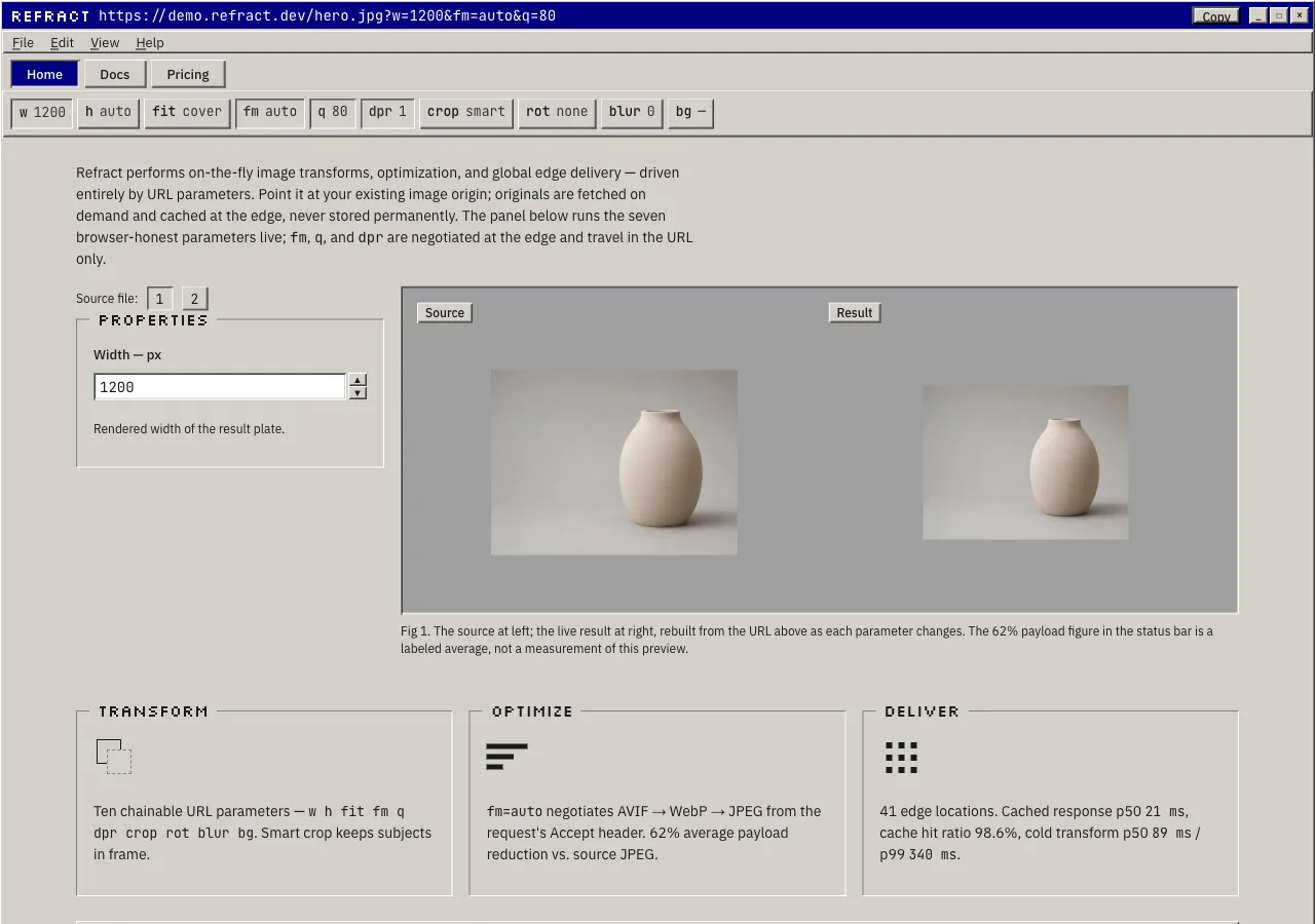
- **index** — the **application window**: a navy **title bar** carrying the request URL and
  the pixel wordmark → a **menu bar** (`File  Edit  View  Help`) → a **toolbar** of the ten
  parameter buttons and the Home / Docs / Pricing tab group (the active tab pressed navy) →
  the **hero work area**: a beveled **properties** group box driving a sunken **canvas well**
  of before/after → the **capability trio**, three raised group boxes Transform / Optimize /
  Deliver → a raised **CTA panel** with the default button **"Start building" → `./docs.html`**
  → the **status bar** of sunken metric cells (`62%` · `21 ms` · `98.6%` · `99.95%`) and a
  bottom-right resize grip.
- **docs** — the **help window**: title bar (`Refract — Reference`) → menu bar → a two-pane
  body: a sunken **sidebar tree** at left (Quickstart · Parameters · Optimize · Deliver ·
  Caching & limits · SDK) and the **manual body** at right — a `NAME`-style opener, the
  request-form URL in a sunken location field, the **quickstart** as three numbered steps
  with the SDK snippet in a sunken **code well** on step 3, the ten parameters as a beveled
  **property table**, and a **caching & limits** panel — → status bar.
- **pricing** — the **License Registration dialog**: a navy title bar (`Register Refract`) →
  a dialog body holding **three radio tiles** Free / Pro / Scale (one selectable at a time,
  the chosen tile highlighted navy) → the **overage & billing** terms as fine print → a
  **default "Register" button** and a secondary "Cancel" → below the dialog, a collapsible
  **help section** carrying the four FAQ entries as expandable rows.

## Signature

Five devices. Each is a direct translation of one part of an industrial imaging
application, and each is tied to a fact the brief supplies.

### 1. The bevel — the raised/sunken edge, and the whole depth model

The reference's every surface was drawn with a two-tone edge: a light line up the top and
left, a dark line down the bottom and right, so a button *rose* out of the panel and a text
field *sank* into it, with no shadow and no gradient anywhere on the screen. **This is the
atom of the entire system, and everything else is built from it.** A raised bevel and a
sunken bevel are the same two lines with their axes swapped, and the swap carries meaning:
**raised means actionable, sunken means receptive.**

Concretely, the bevel is a 2px composite edge (the two `box-shadow` recipes in *Spacing &
layout*): raised is white-then-face on the top-left and charcoal-then-grey on the
bottom-right; sunken is the exact inverse. Every button, panel, group box, tab, and window
frame is **raised**. Every text field, the image **canvas well**, the SDK **code well**, and
each **status cell** is **sunken** — because each of those receives content rather than
being pressed. The rule is checkable and load-bearing: **if a beveled surface is raised, it
must do something when you act on it; if it is sunken, it must hold something.** A raised
element that is inert, or a sunken element that is empty chrome, is the one defect this
whole design is organized to prevent. Depth here is not a lighting effect to be tuned — it
is a hard, countable geometric statement of what the interface will and will not let you
touch.

### 2. The application-window hero — the URL, the ten parameters, and the metrics, as chrome

The reference's central object is the **application window** itself: a title bar naming the
open document, a menu bar, a toolbar of the tools, a work canvas, and a status bar counting
the machine's state. Refract's hero is exactly this window, and every part of the chrome is
one of the brief's own facts, shown at 1:1.

- **The title bar is the request.** The active navy bar carries the pixel wordmark at the
  left and the request URL —
  `https://demo.refract.dev/hero.jpg?w=1200&fm=auto&q=80` — as its document caption, set in
  white **mono** rather than pixel type for the reason the legibility rule demands: the URL
  is long and a developer will copy it, and pixel type cannot carry a long string legibly,
  while mono can and disambiguates its zero. A small raised "copy" button sits at the bar's
  right edge. The URL *is* the document the window is showing.
- **The toolbar is the ten parameters.** A row of raised toggle buttons, one per parameter —
  `w  h  fit  fm  q  dpr  crop  rot  blur  bg` — each showing its name in the Param mono role
  and its current value. Selecting a parameter presses its button in (sunken) and reveals its
  control in the properties group box beneath; the seven browser-honest parameters
  (`w h fit crop rot blur bg`) mutate the canvas live, and the three server-side parameters
  (`fm q dpr`) show as sunken, **NEGOTIATED**-tagged, inert buttons — present in the URL,
  never faked (see device 3's mechanism table).
- **The canvas is before/after.** A sunken `--matte` grey well holds the source image on the
  left and the live transformed result on the right, each a real photograph the demo actually
  resizes, crops, rotates, and blurs in front of the visitor.
- **The status bar is the metrics.** Along the bottom, a row of sunken cells reads the brief's
  Deliver and headline figures in the mono Metric role — `62%` payload reduction, `21 ms`
  median cached, `98.6%` hit ratio, `99.95%` uptime SLA — with a first cell showing the
  machine state (`Ready`, then `Done`) and a resize grip in the corner. **No byte count is
  printed beside the live transform**: the `62%` is a labeled *average*, stated in the status
  cell, not a per-file measurement invented under the picture.

### 3. Press-in buttons — the bevel inverts, mechanically

The reference's every control moved when you clicked it, and it moved by the only means the
bevel allows: **on press, the raised edge inverts to a sunken one** — the white top-left
becomes charcoal, the charcoal bottom-right becomes white — and the label nudges one pixel
down and one pixel right, so the whole face reads as pushed *in*. On release it snaps back.
This is the honest core of the design: the depth you saw was real enough to reverse, and the
reversal is instant, flat, and mechanical.

The distinction from `node` lives entirely here, and it is worth stating as a mechanism.
Node's button has a **colored lip** — a darker bottom border — and on press the face
**translates down** onto that lip and springs back with an over-eased bounce; it is a soft
plastic bubble squishing, tuned for delight. Bevel's button has a **two-tone edge** and on
press that edge **inverts**; there is no translate-down, no lip, no bounce, no spring, and
no easing curve — the state swaps in a single frame, the way a physical key bottoms out.
Node presses to feel good; bevel presses because a tool's controls genuinely actuate. The
**default** button (the one that fires on Enter — "Start building" on index, "Register" on
pricing) carries an extra 1px `--dark` outline, the era's "this is the default action"
convention; **disabled** buttons drop the bevel to flat and etch their label grey.

The browser-honest mechanism, stated so the build cannot fake it:

| Parameter | Control                                   | Honest browser mechanism            |
| --------- | ----------------------------------------- | ----------------------------------- |
| `w`       | Spin control (raised `▲`/`▼` buttons)     | Rendered width of the result plate  |
| `h`       | Spin control (raised `▲`/`▼` buttons)     | Rendered height of the result plate |
| `fit`     | Dropdown: `cover` `contain` `fill` `crop` | `object-fit` (and position for crop)|
| `crop`    | Dropdown: `smart` `center` `edges`        | `object-position`                   |
| `rot`     | Dropdown: `90` `180` `270`                | `transform: rotate()`               |
| `blur`    | Trackbar slider, 0–100                    | `filter: blur()`                    |
| `bg`      | Hex field + swatch, live only on `contain`| The well's `background-color`       |
| `fm`      | **NEGOTIATED** — inert, tagged in the URL | Format is negotiated at the edge    |
| `q`       | **NEGOTIATED** — inert, tagged in the URL | Re-encode quality is server-side    |
| `dpr`     | **NEGOTIATED** — inert, tagged in the URL | Pixel-ratio selection is server-side|

`bg` is inert unless `fit=contain`, because the brief scopes it as the background fill *for
contain* — so its field is disabled (flat, etched) in every other fit mode and comes live
the moment `contain` is chosen. That conditional is not styling; it is the parameter's own
scope, showing.

### 4. The help-file docs — a sidebar tree and a manual body

The reference's documentation was not a web page; it was a **help file** — a two-pane window
with a navigable tree at the left and the manual text at the right. The docs page is exactly
that window, and it is the surface that lets a dense reference read as the authoritative
manual for a tool rather than as marketing.

- **The sidebar tree** is a sunken pane holding a graphical tree control: indented rows,
  each expandable node drawn as a small square box with a `+` (collapsed) or `−` (expanded)
  inside a 9px bevel, joined by dotted `--shadow` guide lines. This is deliberately a
  **widget**, not `tty`'s `[+]` / `[-]` text brackets — a GUI tree, drawn in CSS, is bevel's
  answer where tty's answer is typed ASCII. Its rows: Quickstart · Parameters · Optimize ·
  Deliver · Caching & limits · SDK.
- **The manual body** opens with a short `NAME`-style line and the request-form URL in a
  sunken location field, then runs the brief's docs content: the **quickstart** as three
  numbered steps (create a key and connect your origin → request your first transform, the
  request-form URL → automate with the SDK), the **ten parameters** as the beveled property
  table (device below), and a **caching & limits** panel (rate limit 50 requests/second per
  key on all tiers; transformed variants cached at the edge for 30 days; instant purge by URL
  or tag).
- **The ten parameters are a beveled property table** — the era's property-sheet grid, ruled
  with 1px `--shadow`/`--hilite` groove lines, no zebra and no card: the parameter name in
  the Param mono role, its accepted values, and its description, one row each. The `fm`, `q`,
  and `dpr` rows carry the **NEGOTIATED** tag; the stated default (`q` = 75) is printed; a
  default the brief does not give is never invented.
- **The SDK snippet is a sunken code well** — a white-interior inset field, *not* a dark
  terminal (that is `tty`'s object) — holding, verbatim:

  ```js
  import { refract } from "@refract/js";

  const url = refract("hero.jpg", { width: 1200, format: "auto", quality: 80 });
  // → https://demo.refract.dev/hero.jpg?w=1200&fm=auto&q=80
  ```

  with a raised "Copy" button at its top-right and no syntax-highlight palette — this system
  will not spend its one navy or its one maroon on a keyword; emphasis inside the well is the
  600 weight in `--ink`.

### 5. The registration dialog — pricing as a License Registration window

The reference asked you to register your license through a **dialog** — a small titled
window with a set of mutually-exclusive radio options, a fine-print terms block, and a
default **Register** button. Refract's pricing page *is* that dialog, and the metaphor fits
without strain: choosing a plan is choosing a license, and a license dialog is the most
authoritative, least-marketing way a serious tool has ever presented its tiers.

The **License Registration** dialog is a centered window whose body holds **three radio
tiles** — Free / Pro / Scale — each a beveled row with a real radio indicator (the era's
sunken circle with a navy dot when chosen), the tier name in the Heading role, the price in
the Price role right-aligned in a fixed cell, and the plan's limits in the Label role:

- **Free — $0/mo.** 1,000 transforms/mo, 5 GB bandwidth, community support.
- **Pro — $29/mo.** 50,000 transforms/mo, 250 GB bandwidth, email support, custom domains.
- **Scale — $249/mo.** 1,000,000 transforms/mo, 5 TB bandwidth, 99.95% uptime SLA, dedicated
  support, invoice billing.

Selecting a tile highlights its row **navy** (the active-state color) and marks its radio;
one tile is chosen at a time, exactly as a radio group behaves. Beneath the tiles, the
**overage & billing** terms sit as genuine fine print (the Caption role): Pro and Scale bill
overage at **$2 per additional 1,000 transforms** and **$0.08/GB** bandwidth, while **Free
pauses transforms at the cap and keeps serving originals** — and this is the one place the
maroon `--alert` earns its keep, marking the Free-cap pause as a real warning, because a
paused transform is the one state where the machine genuinely stops. A billing note states
the semantics: **a transform is one unique source + parameter combination per billing month;
cached hits are free.** The dialog closes with a default **Register** button and a secondary
**Cancel**. **No tier is marked "recommended," "popular," or "best value"** — the brief hands
this product no featured plan, and a radio group does not editorialize; the three tiles are
equal in weight and geometry, differentiated only by their content.

## Components

- **Window frame + title bar.** A raised window with a **flat navy** (`#000080`) title bar,
  24px tall, carrying the Silkscreen pixel wordmark at the left and, on the hero, the request
  URL as its document caption in white mono. At the right sit small **raised** system buttons
  (minimize / maximize / close glyphs) — these are period chrome, **decorative and
  `aria-hidden`**, present for the era's silhouette, never a functional control that could
  mislead. An inactive window's title bar is `--title-idle` grey; the live site's windows are
  active, so the bar is navy.
- **Menu bar.** A raised strip, 22px tall, of Menu-role items — `File  Edit  View  Help` —
  each with its mnemonic letter underlined. On the built site the menu is period chrome; the
  one live path is `Help`, which opens the docs. A menu item on hover takes a **navy**
  highlight bar with white text (the era's selected-row look), and nowhere else does hover
  change a control.
- **Toolbar + tab group.** A raised toolbar holding the ten parameter buttons (device 2) and,
  at its right, the page navigation as a **tab group** of raised buttons — Home / Docs /
  Pricing — where the **current page's button is pressed in (sunken) and filled navy with a
  white label**, tying the active-state navy to "you are here." Inactive tabs are raised beige
  with an `--ink` label.
- **`button` (raised / pressed / disabled).** The core control: a raised `--face` rectangle,
  0px corners, `--ink` Label centered, 24–28px tall at control scale, `6px 16px` padding. On
  `:active` the bevel **inverts to sunken** and the label nudges `translate(1px, 1px)` —
  instant, no bounce. **Default** buttons ("Start building", "Register") add a 1px `--dark`
  outer outline. **Disabled** buttons drop the bevel to flat and etch the label grey
  (`--shadow` with a 1px `--hilite` bottom-right offset). There is **no hover state** on a
  button — the era's buttons did not react to hover, and adding a hover-lift here would import
  a different decade.
- **Radio tile (pricing tier).** A beveled row carrying a real **radio button** — a sunken
  circle drawn from the bevel ladder, empty when unchosen and holding a navy dot when chosen —
  plus the tier name, the fixed-cell price, and the limits. The chosen tile's row highlights
  navy; one at a time, standard radio-group semantics, `role="radio"` in a `radiogroup`.
- **Radio button / checkbox (form controls).** The era's controls, drawn from the bevel: a
  radio is a sunken circle with a navy center dot when on; a checkbox is a sunken square with
  a navy check when on. Both are 13px, paired with a Label-role caption.
- **Text field / hex field.** A **sunken** white-interior rectangle, `--ink` value in the Body
  role, `4px 6px` padding. Focus takes the **dotted focus rectangle** (below), not a colored
  glow. The `bg` hex field is the one free-text input in the demo; a malformed hex takes a
  heavier 1px `--dark` inner rule, **not** an error red — the maroon is reserved for the
  quota warning, and a fifth meaning is not minted for a typo.
- **Spin control + trackbar.** `w` and `h` use a **spin control**: a sunken value field with a
  stacked pair of tiny raised `▲` / `▼` buttons that press in on click. `blur` uses a
  **trackbar**: a sunken horizontal groove with a raised rectangular thumb dragged 0–100 — the
  era's slider, square-thumbed, no track fill color.
- **Dropdown (combo).** `fit`, `fm`, and `crop` use a sunken field with a raised `▼` button at
  the right; opening it drops a raised list whose selected row is highlighted navy. `fm`'s
  dropdown is inert and NEGOTIATED-tagged.
- **Group box.** The era's captioned frame: a 2px **etched groove** (1px `--shadow` over 1px
  `--hilite`) drawn as a rectangle with the caption breaking the top line in the Heading role.
  The properties panel and each capability panel are group boxes; they hold controls and text,
  never press.
- **Capability panel (the trio).** Three raised group boxes — **Transform**, **Optimize**,
  **Deliver** — each with a small **era-style monochrome icon drawn in CSS** (not a
  photograph; see *Image treatment*), a Heading caption, and the brief's claim in Body: ten
  chainable URL parameters and smart crop that keeps subjects in frame (Transform);
  `fm=auto` negotiating AVIF → WebP → JPEG from the `Accept` header, 62% average payload
  reduction vs. source JPEG (Optimize); 41 edge locations, cached response p50 21 ms, cache
  hit ratio 98.6%, cold transform p50 89 ms / p99 340 ms (Deliver).
- **Property table (the ten parameters).** A groove-ruled property sheet: parameter name in
  Param mono `--ink`, accepted values in Body, description in Body; `fm` / `q` / `dpr` carry
  the NEGOTIATED tag; the default `q` = 75 is printed. No card, no zebra, no shadow.
- **`negotiated-tag`.** A small **flat** (not raised) 0px chip in the Param mono role, `--ink`
  on `--face` with a 1px `--shadow` outline, reading `NEGOTIATED`. It marks the three
  server-side parameters in the URL and the table and is used for nothing else. **It is never
  navy and never maroon** — it is a statement of fact, not an active state and not a warning.
- **Sunken code well.** A **sunken white-interior** field (not a dark terminal), JetBrains
  Mono Code role in `--ink` with `zero`, holding the SDK snippet, a raised "Copy" at the
  top-right. This is the deliberate anti-`tty` object: bevel's code is a document in a field,
  not a console.
- **Sidebar tree.** A sunken pane with the graphical tree control (device 4): indented rows,
  square `+`/`−` bevel nodes, dotted guide lines, the selected row highlighted navy. The
  docs navigation.
- **Status bar.** A raised strip along the window's bottom edge holding a row of **sunken
  cells** — a state cell (`Ready`) and the metric cells (`62%`, `21 ms`, `98.6%`, `99.95%`,
  and `41 edge` where room allows) in the mono Metric role — with a **resize grip** (three
  diagonal bevel hatches) in the bottom-right corner. The status bar is the site's persistent
  footer: it also carries `© 2026 Refract` in a Caption cell. The page **never inverts to a
  dark slab at the foot** — the status bar is beige chrome like the rest.
- **Tooltip.** A small **raised** beige info box with a 1px `--dark` outline and an `--ink`
  Caption label — deliberately **not** the era's pale-yellow sticky tooltip, because yellow
  would introduce a hue the palette does not carry. Depth is the bevel; the tone stays beige.
- **Focus indicator.** The era's **dotted focus rectangle**: a 1px dotted `--ink` marquee
  inset just inside the focused control, on every interactive element — a spin field, a
  dropdown, a radio tile, a button, a tree row. It is **never** a soft glow or a colored ring;
  the dotted rectangle is the period-correct signal and it is never removed.

## Motion

**Mechanical, minimal, and instant.** The reference barely moved, and what movement it had
was a control actuating — a button bottoming out, a menu snapping open. Bevel keeps exactly
that and nothing more; there is no easing flourish anywhere, because a bevel does not ease —
it inverts.

- **The press is the motion, and it is a single-frame state swap.** On `:active`, a button,
  tab, spin button, or tree node inverts its bevel raised → sunken and nudges its content
  `translate(1px, 1px)`; on release it snaps back. There is **no bounce, no spring, no
  ease-out curve, and no translate-down onto a lip** — that is `node`, and importing its
  springiness would import its toy tone. The click is flat and mechanical.
- **Hover does nothing to a beveled control.** Buttons, tabs, and tiles do not lift, glow, or
  recolor on hover — the era's controls reacted to *press*, not proximity. The one exception
  is a **menu row**, which takes the navy selection bar on hover exactly as the reference's
  menus did.
- **The preview answers in the same frame as the control that moved.** No skeleton, no
  shimmer, no spinner, no artificial latency — a spin, a dropdown, a slider, or a hex entry
  mutates the canvas and rewrites the URL immediately, the way a redraw happens. The status
  cell may flip `Ready` → `Done` on a change; it does **not** run a fake progress bar, because
  a progress bar the machine is not actually running is an invented latency.
- **No count-up on the metrics or prices.** The status-bar figures (`62%`, `21 ms`, `98.6%`,
  `99.95%`) and the three tier prices are printed once, at rest — no animated meters, no
  ticking, no charts, and no file-size animation on the demo.
- **Menus and disclosures open instantly.** A menu drops with no animation; a FAQ help row
  toggles its answer with a short height change (or instantly under reduced motion). Nothing
  fades.
- Under **`prefers-reduced-motion: reduce`**, the already-instant press and the immediate
  redraw are unchanged, and the FAQ toggle becomes an instant show/hide. **Turn every
  transition off and nothing is lost** — the buttons already snapped, the canvas already
  redrew in-frame, and the figures were never moving.

## Image treatment

**The chrome is drawn; the photographs are the payload.** Like `tty`, bevel is a tool, not a
gallery, and it is **nearly imageless**: the window furniture, the icons, the tree, the
bevels, the tables are all CSS, and the capability panels carry **era-style monochrome icons
drawn in CSS, not photographs**. The **only** raster photographs in the entire system are
the sample inputs the demo actually transforms — the literal files the API resizes, crops,
rotates, and blurs, sitting inside the sunken **canvas well** on their neutral `--matte` grey
surround. There is no hero photograph, no capability thumbnail, no decorative image anywhere
else on the site; a picture on this page has earned its place the way a payload earns it, or
it is not there.

The canvas well shows **two sample sources** behind a small file-picker (`[1]` `[2]`), so
`crop=smart` and `crop=center` have two different compositions to visibly disagree about —
the only way the brief's "smart crop keeps subjects in frame" claim gets tested where the
visitor can watch. The register is **clean, clinical, product-neutral** — a professional
imaging application's sample library, precise and unlovely on purpose, not a lifestyle shot.

**How every generated image in this system is prompted.** These are binding rules; a still
that breaks one is regenerated, never accepted and cropped around.

1. **Nothing in frame carries language.** Every prompt states, in its own clause, that the
   image contains **no text, no lettering, no numerals, no labels, no logos, no brand
   markings, no signage, and no packaging print** — not on the object, not on the surface,
   not anywhere. A generated still invents lettering if left to itself, and invented
   lettering inside a sample the demo is about to enlarge, crop, and blur is a counterfeit
   brand printed at size, in the one object the design asked the visitor to look at. This is
   the image provider's most common failure mode, and the clause is the guard.
2. **No people, no hands.** Not one, not out of focus, not in the background. Each photograph
   is a *sample input* the API is about to resize and blur, not an advertisement; the model
   fuses fingers into a knuckleless mass besides, and a person turns the sample into a
   lifestyle shot.
3. **The frame is quiet and survives the crop.** No props beyond the named subject, no busy
   corners, no lived-in clutter. Every photograph must still read deliberately after being
   cropped to `1:1`, rotated, and blurred to 100, because the canvas will do exactly that,
   live. A fussy corner becomes a fussy corner enlarged.
4. **The subject sits off-center, always.** The brief promises smart crop keeps subjects in
   frame, and the demo makes good on it by cropping where the visitor can watch. A subject
   parked dead-center survives any crop — `smart` and `center` land on the same pixels and
   the visitor learns nothing. Push it to one side and the strategies visibly disagree, which
   is the only way the claim is tested.

Constant tone words on every prompt: **clean studio product photography, single subject,
plain seamless neutral background, soft even light, precise, generous negative space, no
people, no text.** No image is ever full-bleed, none carries type on top of it, and every
photograph sits inside the sunken canvas well on its `--matte` grey surround.

Needed images (referenced `./assets/<id>.webp`):

- `demo-source-a` (4:3) — A single smooth ceramic vessel on a plain seamless pale-grey studio
  surface, placed well off-center to the right with clear open space to the left, soft even
  studio light, no text, no lettering, no numerals, no labels, no logos, no brand markings, no
  signage, no packaging print, no people, no hands, quiet and uncluttered. (The primary
  before/after source — it is cropped, rotated, blurred, and background-filled live, so it
  must survive all four.)
- `demo-source-b` (4:3) — A single ripe piece of fruit on a plain pale-grey seamless tabletop,
  pushed off-center to the left with generous space to the right, soft even daylight, plain
  uncluttered background, no text, no lettering, no numerals, no labels, no logos, no brand
  markings, no signage, no packaging print, no people, no hands. (The second file-picker
  source, so `crop=smart` and `crop=center` have a different composition to disagree about.)

## Do / Don't

Do:

- Bevel **every** surface as raised (light top-left / dark bottom-right) or sunken (inverted),
  and make the bevel encode state: raised = you act on it, sunken = it receives content. Keep
  the depth in the four-value ladder (white `#FFFFFF`, face `#D4D0C8`, grey `#808080`,
  charcoal `#404040`) and nothing else.
- Press every button by **inverting** its bevel and nudging the label 1px down and 1px right —
  instant, flat, mechanical. Give the default action the 1px `--dark` outline; drop disabled
  controls to flat with an etched grey label.
- Keep every corner a hard **0px** rectangle — windows, panels, buttons, tabs, fields, tiles,
  tables, wells. A rounded corner is `node`'s language and the fastest way to converge.
- Spend one navy on the active state (title bar, current tab, chosen radio, selected menu row)
  and one maroon only where the machine genuinely warns (the over-quota / Free-cap pause).
  Nothing else on the page carries a hue.
- Set the chrome (title bars, wordmark, panel captions) in **Silkscreen** at 16px/24px integer
  sizes and short strings only; set everything a person reads in **IBM Plex Sans**; confine
  **JetBrains Mono** to the URL, the ten parameters, the status metrics, and the SDK, and
  declare only `zero`.
- Build the hero as the application window: the request URL in the title bar, the ten
  parameters as toolbar buttons, before/after in the sunken canvas well, and the stats in the
  status-bar cells. Wire the seven browser-honest parameters live and tag `fm` `q` `dpr`
  NEGOTIATED.
- Render the docs as a help file (sidebar **tree widget**, not `[+]` brackets) and the SDK in
  a **sunken white code well**, not a dark terminal.
- Render pricing as a **License Registration dialog** with three equal radio tiles, overage as
  fine print, and the FAQ as a collapsible help section.
- Keep photographs to the canvas well only, off-center and language-free, and keep the copy
  serious, precise, and authoritative — a real tool's manual, never a period gag.

Don't:

- **No gradient, no drop shadow, no glow, no blur, no soft radius, no inset shadow-blur.**
  Depth is the two-tone hard bevel alone; the moment a surface blends or floats, the era is
  gone.
- **Don't bevel decoratively.** A raised element that does nothing when pressed, or a sunken
  one that holds nothing, breaks the checkable rule the whole design rests on.
- **Don't import `node`'s toy.** No colored lip, no translate-down-onto-a-lip, no bounce, no
  spring, no ease-out, no rounded corner, and no saturated accent — bevel snaps flat and
  square, it does not squish.
- **Don't import `tty`'s terminal.** The code well is a sunken **white field**, not a black
  console; the docs tree is a **GUI widget**, not `[+]`/`[-]` text; the site is windows and
  bevels, not a monospaced `man` page.
- **Don't use pure black** for text (`--ink` is `#1A1A1A`), **don't** let `--shadow` grey
  carry any text a visitor must read (2.6:1 — bevel-edge and etched-disabled only), and
  **don't** mint a third hue: a validation error is a heavier `--dark` rule, not a red.
- **Don't set body, a paragraph, a price, a URL, or anything below 16px in Silkscreen** — the
  pixel face is chrome-only, short strings only, at integer 8px multiples.
- **Don't glow the focus ring.** Focus is the dotted marquee rectangle; a soft accent ring is a
  different decade.
- **Don't invent facts or numbers.** No byte count beside the preview, no file-size animation,
  no count-up on the status metrics, no fake progress bar, no latency/uptime/edge figure the
  brief did not supply, no "most popular" tier. **Every figure on this site traces to
  `content.md`** — the stats (62%, 21 ms, 98.6%, 99.95%), the 41 edge locations and the
  cold-transform p50 89 ms / p99 340 ms, the 50 req/s limit and the 30-day cache window, the
  prices ($0 / $29 / $249), quotas (1,000 / 50,000 / 1,000,000 transforms; 5 GB / 250 GB /
  5 TB), overage rates ($2 per 1,000 transforms, $0.08/GB), the parameter ranges, and the
  default `q` of 75.
- No emoji anywhere, and **no naming of any source brand, operating system, or product in the
  built page** — this design is authored free-form from the era and genre, and the site
  carries only the product's own name, **Refract**, in English.