Image API
Open live page ↗Aperture
DESIGN.md
# Aperture — Design System

## Concept

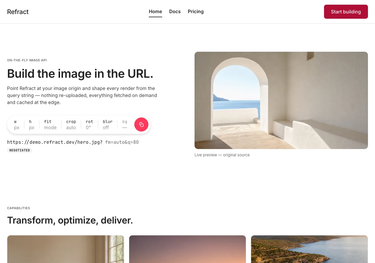
**An image API presented as a photography-led marketplace.** White paper, one red
voltage, soft corners everywhere, and a hero that is not a headline but a
**control**: a single pill-shaped bar, divided by hairlines into labelled
segments, that builds the URL.

Aperture starts from a page that already knows how to be quiet. A consumer travel
marketplace sets its homepage h1 at 28px — smaller than a SaaS page would dare —
and gets away with it, because a photograph of a room is doing the work the
headline would otherwise have to do. Point that page at a URL-driven image API and
most of it falls away: no listings, no places, nothing to book, and a visitor who
came to read a query string. One thing survives the move, and it is the thing this
design is built out of: **an image API is a developer tool whose product is,
literally, photographs.**

So the borrowed restraint is not a costume here. A photograph on this page is not
decoration standing in for an idea — it is the file the API is about to resize,
crop, rotate, and blur while the visitor watches. It has already earned its space;
the type never has to argue for any. Everything downstream follows from that one
sentence: the display scale stops at 40px, the palette holds a single hue, the
elevation stops at one tier, and when a band looks thin the answer is a bigger
plate, not a heavier line.

An **aperture** is a ring of segments you turn to set exposure — which is exactly
the shape of the system's one hero object: **the aperture bar**, a 64px pill at
9999px radius whose hairline-divided cells are `w` · `h` · `fit` · `crop` · `rot`
· `blur` · `bg`, closed by a circular red orb. Everything else on the site is
subordinate to it. The bar is the argument made into an object: *the URL is the
product, so the URL gets the hero.*

The source language is **Airbnb's**: a pure white canvas (`#ffffff`) under a
near-black ink (`#222222`); one voltage of Rausch red (`#ff385c`), spent on a CTA
and a search orb and nothing more; display type held at 22–28px in weights
500–700; a fully-pill search bar divided by hairlines into Where / When / Who;
softly-clipped photo-first cards; a single shadow tier for the whole system; and a
white footer, because the page never inverts. Its licensed voice (Airbnb Cereal
VF, with Circular beneath it) is substituted here by **Inter**, the substitute its
own reference notes name. Most of the furniture transfers one for one — three
product tabs become three pages, the search bar becomes the parameter builder, the
property card becomes the transform card. The one piece that does not transfer
intact is the 64px rating figure, the single loud typographic moment the reference
allows itself; here it becomes the stats readout and is **capped at 40px**,
because in this system the photograph is the scale and the type is not. That
lineage is named in this document and **nowhere else**: the built page carries only
the product's own name, **Refract**, in English.

The other three designs under this brief take the same ten parameters somewhere
aperture will not follow. `cutaway` works in the dark — graphite and nickel,
magenta-and-cyan voltage, an industrial readout at 88px, radius ≤ 4px, no pills —
and it opens the image up to show the stages inside it. Aperture never inverts,
never carries a second hue, and never takes anything apart: it keeps the frame
whole and shows the finished picture. `folio` builds a print grid — serif display
at weight 400, exposed columns, hairline rules, square corners, and type that
stays off the photograph. `carton` is the loud one — cream stock, typewriter mono,
four type voices mixed on purpose, hand-drawn boxes that wobble, copy that will
not stop talking. Aperture is neither paper design: **white, soft, and quiet**, one
sans, no visible grid, no rule used as ornament, and not one square corner in the
system.

It is also the only one of the four that hands its visual weight to
**photography**. `cutaway` uses photographs as planes in a diagram, `folio` as
reportage plates beneath captions, `carton` as deliberately plain snapshots. Here
they are the depth model. Take the plates out and what remains is white, grey,
near-black, and one red mark — no gradient, no true black, no type above 40px.
Every gradient in this design lives inside a photograph; so does every color the
palette does not name; so does anything that reads as large. That is what lets the
interface around the plates stay flat white — and it is why, if a band ever looks
thin, the fix is a bigger photograph and never a heavier headline.

## Palette

White paper, near-black ink, and **one hue of red**. The reference is sparing with
its red — most of its pages are white and ink with one or two red moments — and
this design is sparing with it further still.

| Token              | Hex       | Role                                                                              |
| ------------------ | --------- | --------------------------------------------------------------------------------- |
| `--canvas`         | `#FFFFFF` | Pure white — the page floor, every card surface, the nav, and the footer.          |
| `--canvas-soft`    | `#F7F7F7` | The lightest tonal step — demo band, stats band, code block, popover fields.       |
| `--canvas-strong`  | `#F2F2F2` | A heavier fill — circular icon-button surfaces (steppers, popover close).          |
| `--ink`            | `#222222` | Dominant text, headlines, nav, the focus ring. Never pure black.                   |
| `--ink-body`       | `#3F3F3F` | Long-form running copy where full ink reads too heavy.                             |
| `--ink-soft`       | `#6A6A6A` | Secondary copy, segment values at rest, table meta, the server-side URL fragments. |
| `--ink-faint`      | `#929292` | Placeholders and disabled labels — **short labels only, and never on a tint.**     |
| `--hairline`       | `#DDDDDD` | The 1px rule: segment dividers, table rules, card borders, section separators.     |
| `--hairline-soft`  | `#EBEBEB` | A lighter divider for long row stacks (FAQ, quickstart).                           |
| `--hairline-strong`| `#C1C1C1` | Input outlines at rest and emphasized dividers.                                    |
| `--accent`         | `#FF385C` | Rausch. **Non-text marks only** (see the rule below) — the orb, the selected rule. |
| `--accent-deep`    | `#B00F35` | The same hue, one stop down. **Every red that carries text**: CTA fill, red text.  |
| `--accent-press`   | `#8E0A2A` | The press state of `--accent-deep`. Fill only.                                     |
| `--on-accent`      | `#FFFFFF` | White label on `--accent-deep` / `--accent-press`. Never on `--accent`.            |

Rules:

- **One hue. Three stops. Adding a second hue is not a variant — it is a
  defect.** The reference ships a Luxe purple (`#460479`), a Plus magenta
  (`#92174d`), a legal-link blue (`#428bff`), and a separate error red
  (`#c13515`). **None of them exists here.** Links are ink with an underline; a
  validation message — a malformed hex typed into the `bg` field, which is the one
  place in the bar that takes free text, the steppers, option lists and slider
  having no invalid state to reach — is set in `--accent-deep`, which is the same
  red, not a semantic second one. There is no
  green, no amber, no blue anywhere in this system — not in a badge, not in a
  status dot, not in a chart.
- **Contrast (measured, WCAG 2.1, computed from the sRGB relative-luminance
  formula).** On `--canvas` (`#FFFFFF`): `--ink` **15.9:1**, `--ink-body`
  **10.5:1**, `--ink-soft` **5.4:1**, `--accent-deep` **7.1:1**. On `--canvas-soft`
  (`#F7F7F7`): `--ink` **14.9:1**, `--ink-body` **9.8:1**, `--ink-soft` **5.1:1**,
  `--accent-deep` **6.6:1**. On `--canvas-strong` (`#F2F2F2`): `--ink-soft`
  **4.8:1**. On the `--accent-deep` fill: `--on-accent` **7.1:1**. On
  `--accent-press`: `--on-accent` **9.4:1**. Everything named in this paragraph
  clears AA body text (4.5:1) with margin.
- **`--accent` (`#FF385C`) measures 3.5:1 on white and does NOT hold AA.** This is
  the reference's own brand red and it fails the 4.5:1 body threshold — so it is
  confined, exactly and only, to:
  1. **Non-text marks**, where WCAG asks 3:1 and 3.5:1 clears it — the run orb's
     fill and the 2px rule under a selected segment. Those are the only two
     non-text marks this system spends the bright hue on.
  2. **Text at 24px and larger**, where the 3:1 large-text threshold applies.
     **The display scale starts at 22px, so the 22px tier may never be red** — a
     one-tick difference, and precisely the kind of thing this rule exists to
     catch. In practice the design does not use it: no headline in the built page
     is red.

  It sets no paragraph, no label, no value, no button text, no table cell, and no
  caption. If red text appears below 24px anywhere, it is `--accent-deep` (7.1:1)
  or it is a defect.
- **White text on `--accent` is a defect, and it is the reference's own defect.**
  The contrast ratio is symmetric: white-on-Rausch is the same **3.5:1** as
  Rausch-on-white, so the reference's primary CTA — a 16px/500 white label on an
  `#ff385c` fill — **fails AA**, and transplanting it unchanged would ship that
  failure. This design corrects it rather than inheriting it: **every red fill
  that carries text is `--accent-deep`** (`#B00F35`, white label at 7.1:1). The
  bright Rausch survives in the one place it is honest — **the orb, which carries
  a glyph and not a word**, and where the 3:1 non-text bar applies (3.5:1 passes).
  That is the whole reason the palette has two red stops instead of one, and it is
  the only reason it is allowed to.
- **`--ink-faint` (`#929292`) does NOT hold AA and is label-only.** It measures
  **3.1:1 on `--canvas`** — below the 4.5:1 body threshold. Use it for
  placeholders and disabled labels and nothing else. **It never sets a paragraph,
  a parameter value, a price, a stat, or anything a visitor must actually read** —
  those step up to `--ink-soft` (5.4:1). And it **never appears on `--canvas-soft`,
  where it falls to 2.9:1** and fails even the 3:1 large-text bar.
- **The hairlines are decorative and carry no meaning.** `--hairline` measures
  **1.4:1** on white, `--hairline-soft` **1.2:1**, `--hairline-strong` **1.8:1** —
  all far below the 3:1 non-text bar. Therefore **no control's identity and no
  control's state may rest on a hairline alone.** Every segment of the aperture bar
  is identified by a persistent `--ink` label (15.9:1), not by its divider; focus is
  a **2px `--ink` ring (15.9:1)**, never a red-only ring; and the selected segment is
  marked by *three* changes at once — a white surface lifted onto the shadow tier, a
  2px `--accent` rule, and a label stepping 500 → 600 — so state is never carried by
  color alone.
- **No gradients anywhere, and therefore no scrim.** Every surface is flat color.
  This has a consequence worth stating outright: since a scrim is a gradient,
  **type never sits on top of a photograph in this system** — there is no legible
  way to do it within the rules. Captions and titles sit beneath the plate.
- **No dark canvas anywhere.** There is no dark hero band, no dark section, and no
  dark footer. The reference has no contrast footer and neither does this — the
  footer is `--canvas`, the same white as the page. **The page never inverts.**

## Typography

Two voices, cleanly split, **both self-hosted as woff2 under `assets/fonts/`** via
`@font-face` — no font CDN, no Google Fonts `<link>`.

**Interface — Inter.** The substitute the reference's own Font Substitutes section
names for its licensed variable face. It carries display, body, navigation, labels,
buttons, captions, and every figure. There is no second sans and no serif anywhere
in this system.

**Code — JetBrains Mono.** The one voice the transplant has to *add*, because the
reference has no monospace: a travel marketplace has no code, and a URL-driven API
is nothing but code. It is confined, absolutely, to **the URL string, the SDK
snippet, and the ten parameter names**. It never sets a heading, a label, a
paragraph, or a price.

| Role         | Face           | Size / Leading | Tracking | Features | Use                                              |
| ------------ | -------------- | -------------- | -------- | -------- | ------------------------------------------------ |
| Display XL   | Inter 600      | 40px / 1.15    | -0.6px   | —        | Index hero line — the largest type in the system  |
| Display L    | Inter 600      | 32px / 1.2     | -0.4px   | —        | Page openers on docs and pricing, section heads   |
| Display M    | Inter 600      | 28px / 1.25    | -0.2px   | —        | Sub-section heads, tier names                     |
| Display S    | Inter 500      | 22px / 1.18    | -0.44px  | —        | Card titles, FAQ questions                        |
| Readout      | Inter 700      | 40px / 1.1     | -1px     | **tnum** | The four stats figures, and the three tier prices |
| Title        | Inter 600      | 16px / 1.25    | 0        | —        | Nav tabs, table heads, popover titles             |
| Body         | Inter 400      | 16px / 1.5     | 0        | —        | Default running copy                              |
| Body S       | Inter 400      | 14px / 1.43    | 0        | —        | Card meta, table cells, footnotes                 |
| Figure       | Inter 500      | 16px / 1.4     | 0        | **tnum** | Quota, bandwidth, and overage figures in columns  |
| Segment      | Inter 500      | 14px / 1.29    | 0        | —        | Aperture-bar segment labels (`w`, `fit`, `crop`)  |
| Button       | Inter 500      | 16px / 1.25    | 0        | —        | Button labels                                     |
| Caption      | Inter 400      | 13px / 1.23    | 0        | —        | Photo captions, legal line                        |
| Tag          | Inter 600      | 11px / 1.2     | 0.4px    | **case** | Uppercase `NEGOTIATED` tag, uppercase eyebrows    |
| URL string   | JetBrains Mono | 16px / 1.5     | 0        | **zero** | The live URL under the aperture bar               |
| Code         | JetBrains Mono | 14px / 1.6     | 0        | **zero** | The SDK snippet, parameter names in the table     |

Principles:

- **Display type stays small: 22–40px, weights 500–700, and nothing above 40px.**
  There is no 72px hero shout in this system and no 64px number either. The
  reference permits itself exactly one loud typographic moment — a 64px rating
  figure, on the theory that a rating is the peak trust signal and has earned the
  scale. This design inherits the *idea* and refuses the *size*: the four stats
  figures are this page's trust signal and they render at **40px / 700**, the top
  of the allowed range and no further. **The photograph is the scale, not the
  type.** If a band feels weak, enlarge the plate; do not enlarge the headline.
- **Weight is the only emphasis, and it stops at 700.** No italics for emphasis,
  no underlines except on links, no letter-spaced display, no ornament.
- **The mono never leaks.** Parameter names are mono because they are literal API
  tokens — `w`, `fit`, `fm=auto` — and that is the only reason anything is mono.
  A price is not mono. A stat is not mono. A tier name is not mono. Prose about a
  parameter is Inter; the parameter itself is JetBrains Mono.
- **Tabular figures where figures must align.** The Readout and Figure roles set
  `font-feature-settings: "tnum"`. **Inter genuinely ships `tnum`** (verified in
  its GSUB feature list), so the stats band's `62%` / `21 ms` / `98.6%` / `99.95%`
  lock to one column width, and the pricing figures line up down the tier cards.
- **The slashed zero is load-bearing, not a flourish.** The URL string and the code
  block set `font-feature-settings: "zero"`, which **JetBrains Mono genuinely
  ships**. In a system whose entire subject is a URL that a developer will copy and
  retype, a `0` that cannot be mistaken for an `O` is a functional requirement:
  `?w=1200&q=80` must be unambiguous at 14px.
- **Three features are declared in this system and no others: `tnum` (Inter),
  `case` (Inter), `zero` (JetBrains Mono). All three were verified present in the
  faces' real GSUB tables.** Three more are *deliberately absent* and must not be
  added by a later hand:
  - **`liga` is never declared.** Neither Inter nor JetBrains Mono ships a `liga`
    feature (both route their contextual behavior through `calt`, which is on by
    default). Declaring `liga` on either face is a silent no-op — it looks like a
    decision and does nothing.
  - **`onum` is never declared.** Inter ships no old-style figures at all. Its
    figures are lining, always.
  - **`tnum` is never declared on JetBrains Mono.** The face has no `tnum` in its
    GSUB — and does not need one, because it is a monospace: every glyph is already
    one width, so the URL and the code block align by construction. Declaring it
    would be harmless and dishonest, which is worse than harmless.

## Spacing & layout

Whitespace is generous at the bands and tight in the grids. The reference calls
this "open hero, dense marketplace below," and it survives the transplant intact:
the hero gets air, the card grid does not.

- **4px base unit** (with a 2px micro-step). Tokens: 2 · 4 · 8 · 12 · 16 · 24 · 32 ·
  48 · 64 · 96.
- **Section rhythm: 64px** top and bottom between major bands — deliberately
  tighter than the 80–96px a SaaS marketing page would take, because the page
  wants more cards per scroll. **The hero alone takes 96px.**
- **Card padding: 24px.** Card grid gutters: **16px** — the cards sit close
  together on purpose. Footer column gutters: 24px.
- Content centers in a **1280px container**. The index and pricing pages run to
  1280px; the docs page caps at **1080px**, because a parameter table and a code
  block stop being readable when they are stretched.
- **Radius rule — there is no 0px corner anywhere in this system.** Buttons and
  inputs **8px**. Cards, photo plates, and the code block **12px**. Large cards,
  popovers, and the tier cards **16px**. The aperture bar, its chips, and every
  tag **9999px**. The run orb and the stepper buttons are **circles**. A square
  corner is not a variant — it is a defect, and it is the fastest way to turn this
  design into `folio`.
- **Elevation: exactly one shadow tier, and it is a token.**
  `box-shadow: rgba(0,0,0,0.02) 0 0 0 1px, rgba(0,0,0,0.04) 0 2px 6px 0, rgba(0,0,0,0.1) 0 4px 8px 0`
  — carried by the aperture bar at rest, its popovers, and a card on hover. There
  is no second tier, no glow, no inset, and no ambient shadow on a band. **Depth
  comes from the photographs, the white-on-white surface separation, and the
  rounded clipping — never from stacked shadows.**

Breakpoints (the reference's own, unchanged — they are load-bearing for the bar):

| Width               | Behavior                                                                                                                          |
| ------------------- | --------------------------------------------------------------------------------------------------------------------------------- |
| Mobile <744px       | Display steps to **28px**; nav collapses to wordmark + menu; **the aperture bar collapses to a single tappable pill** showing the live URL, which opens a full-screen parameter sheet; cards 1-up |
| Tablet 744–1128px   | Display **32px**; the bar keeps four segments visible (`w` · `h` · `fit` · `crop`) and folds the rest behind an "adjust" segment; cards 2-up |
| Desktop 1128–1440px | Display **40px**; **all seven segments visible in one 64px pill**, orb at the right; cards 3-up                                     |
| Wide >1440px        | Content caps at 1280px; the gutters absorb the rest. The bar never grows past the container.                                        |

Band rhythm — `--canvas` dominates, `--canvas-soft` is the only tonal step, and
**no band is dark**:

- **index** — hero (canvas, 96px: eyebrow, one 40px line, one-line sub, **the
  aperture bar**, the live URL string beneath it, and the live preview plate) →
  capability trio, three photo cards, Transform / Optimize / Deliver (canvas, 64px,
  16px gutters) → live-transform demo, the before/after pair (`--canvas-soft`, 64px)
  → stats band, the four figures at 40px (`--canvas-soft`, 64px) → CTA band (canvas,
  64px, hairline-bracketed, one `--accent-deep` button: **"Start building" →
  `./docs.html`**).
- **docs** — page opener (canvas, 32px line) → quickstart, three hairline-divided
  numbered rows, the third carrying the SDK code block, with one square photo plate
  set beside the first (canvas) → parameter reference, the ten-row printed table
  (canvas) → caching & limits, three hairline rows of figures (`--canvas-soft`, 64px).
- **pricing** — page opener (canvas, 32px line, one tall photo plate) → tier cards,
  three of them (canvas, 64px) → overage & billing semantics (`--canvas-soft`, 64px)
  → FAQ, four hairline-divided disclosure rows (canvas, 64px).

## Signature

Four devices. Each is a direct translation of one of the reference's own.

### 1. The aperture bar — the parameter playground's control surface

The reference's signature is a **pill-shaped search bar**: white fill, 9999px
radius, 64px tall, divided by 1px vertical hairlines into Where / When / Who cells,
each cell an uppercase label above a value, the whole thing terminated by a circular
red orb — and clicking a cell opens a popover beneath the bar (a calendar, a guest
stepper). **Every part of that survives; only the nouns change.**

The aperture bar is a **white 64px pill at 9999px radius**, resting on the single
shadow tier, divided by 1px `--hairline` rules into **seven segments**. Each segment
carries a `Segment`-role label (14px / 500, `--ink`) above its current value (16px,
`--ink-soft` at rest, `--ink` at 600 when set). Clicking a segment opens a **white
16px-radius popover** beneath it on the same shadow tier. The bar terminates in the
**run orb**.

The seven segments are exactly the seven **browser-honest** parameters — the ones a
browser can genuinely apply to the preview image, live, with no server and no lying:

| Segment | Control in the popover                     | Honest browser mechanism            |
| ------- | ------------------------------------------ | ----------------------------------- |
| `w`     | Numeric stepper + drag, px                 | Rendered width of the plate          |
| `h`     | Numeric stepper + drag, px                 | Rendered height of the plate         |
| `fit`   | Option list: `cover` `contain` `fill` `crop` | `object-fit`                       |
| `crop`  | Option list: `smart` `center` `edges`      | `object-position`                    |
| `rot`   | Option list: `90` `180` `270`              | `transform: rotate()`                |
| `blur`  | Slider, 0–100                              | `filter: blur()`                     |
| `bg`    | Hex swatch grid + hex field                | The plate's background color         |

**Manipulating any control mutates the preview immediately and rewrites the URL
string beneath the bar.** The bar is wired, not drawn: a segment that moves and
changes nothing on the plate is a segment that has been faked.

Three rules bound the bar, and each of them costs the design something:

- **`fm`, `q`, and `dpr` are in the URL string and are NOT in the bar.** They appear
  in the live URL set in `--ink-soft` rather than `--ink`, each tagged
  `NEGOTIATED` in the 11px uppercase Tag role, and the docs table repeats the tag.
  The label is literal, not defensive: `fm=auto` negotiates AVIF → WebP → JPEG from
  the request's `Accept` header, and a browser cannot demonstrate a re-encode. The
  tempting alternative is to stage
  one — run a file-size counter down, print a byte count under the plate, let the
  demo feel a little more alive. **That would put an invented number in the one
  place a developer is certain to check, and this system prints no figure the brief
  did not supply.** The tag is what the design says instead of the number.
- **An unset parameter is absent from the URL.** There is no `rot=0` and no `blur=0`
  in the string, because the brief defines `rot` as `90`/`180`/`270` and the design
  does not invent a fourth value. A segment at rest shows a `--ink-faint`
  placeholder and contributes nothing to the URL.
- **`bg` is disabled unless `fit=contain`.** The brief scopes `bg` as the background
  fill *for `contain`* — so the segment is inert (label `--ink-faint`, no popover)
  in every other fit mode, and becomes live the moment `contain` is chosen. It is
  the only conditional in the bar, and it is not styling: it is the parameter's own
  scope, showing.

**On scroll, the bar collapses into the nav** — a compact pill, still live, still
showing the current URL, expanding back on click. It is present on every screen of
the index page, and it is the only playground in the design: **there is not a
second bar, and the demo band does not get its own.** The hero and the demo band
read from one state.

### 2. The transform card

The reference's property card, transplanted: a **photo-first card** with a
12px-clipped plate on top and four lines of meta beneath. The photograph fills the
card's whole width; the meta hangs below it in a 16px block — a title in the 22px
`Display S`, a one-line descriptor in `--ink-soft`, and a **parameter line set in
JetBrains Mono** where the reference would put a price:

```
w=1200 · fit=cover · fm=avif
```

That single line is the joke the whole design is built on, and it should be played
straight: the marketplace card's price line has become a query string. The card is
`--canvas` on `--canvas`, separated from the page by nothing but its photograph and
a 1px `--hairline`, and it lifts onto the one shadow tier on hover. The three
capability cards — **Transform**, **Optimize**, **Deliver** — are three of these.

**The reference's hand-illustrated 32px product icons do not survive.** Illustration
is banned in this system (see *Image treatment*), and there is no icon set standing
in for them. The three capabilities are carried by **a photograph and a sentence**,
which is the entire thesis of the design.

### 3. The before / after plate

The live-transform demo. Two 12px-clipped plates side by side on the
`--canvas-soft` band: **the source photograph on the left, the transformed result on
the right** — and the right plate is *derived from the left one in the browser* by
the seven parameters currently set in the aperture bar. There is no second image
asset. There is no "optimized" version generated ahead of time. The right plate is
the left plate under `object-fit`, `object-position`, `transform`, `filter`, and a
background color — **the browser drew the boundary of this demo, and the design simply
stopped where the browser stopped.**

Beneath the pair, a `Caption`-role line names what changed. **It names parameters.
There are no bytes on this page for it to name.** Below 744px the pair stacks
vertically. **It never becomes a drag-slider comparison**: this design handed the
photographs the page, and a wipe handle takes half of each one back.

### 4. The trust readout

The reference's one loud typographic moment is a 64px rating number, because a
rating is the signal a visitor is actually shopping on. This design's equivalent
signal is its **four stats** — and they get the same treatment, at the size this
system's ceiling allows: **40px / 700, `tnum`, `--ink`**, four across on a
`--canvas-soft` band, each figure over a 14px `--ink-soft` label.

```
62%        21 ms      98.6%      99.95%
average    median     cache      uptime SLA
payload    cached     hit ratio  (Scale)
reduction  response
```

Tabular figures are the whole point: the four numbers sit in one row and their
digits must line up. **No icons, no sparklines, no charts, no animated count-up.**
The figures are the readout; the band carries nothing else.

## Components

- **Nav bar.** `--canvas`, **80px** tall, 1px `--hairline` beneath. The wordmark
  **Refract** sits flush left in the 22px `Display S`. Three page tabs sit in the
  dead center — **Home · Docs · Pricing** — in the 16px `Title` role; the active tab
  takes `aria-current="page"` and a **2px `--ink` underline** (never a red one).
  Flush right: a `button-primary` reading **"Start building"**. On the index, the
  collapsed aperture pill docks between the wordmark and the tabs as the page
  scrolls; docs and pricing have no bar to dock. **The tabs are type only** — the
  reference's illustrated icons and its "NEW" badges both fail to survive the
  move: the icons because illustration is banned here (see *Image treatment*), the
  badges because a badge has to announce something, and the brief hands this
  product nothing to announce.
- **`button-primary`.** `--accent-deep` (`#B00F35`) fill, `--on-accent` white label
  at the 16px `Button` role (7.1:1), **8px** radius, 48px tall, 14×24px padding.
  Press flips the fill to `--accent-press` — **no transform, no shadow change.**
  This is the site's primary action and it appears at most twice per page.
- **`button-secondary`.** `--canvas` fill, `--ink` label, 1px `--ink` outline, 8px
  radius, 48px tall. Used for **all three tier CTAs — Free, Pro, and Scale alike** —
  and for "Copy" actions. No tier CTA is ever `button-primary`: the three cards are
  identical in weight, and a red CTA on exactly one of them would single it out as
  recommended, which is the one thing this system refuses to claim.
- **`button-tertiary`.** Plain `--ink` text, no surface, no border, underlined on
  hover. Used for "Show more" and for the FAQ disclosure rows.
- **`run-orb`.** The 48px **circle** terminating the aperture bar: `--accent`
  (`#FF385C`) fill with a white glyph, and the single hottest color moment on the
  page. **It copies the live URL** — the honest primary act for a product whose
  interface is a URL — and it carries a glyph rather than a word, which is exactly
  why the bright Rausch is permitted here (3.5:1, a non-text mark against the 3:1
  bar). Only one other mark shares that licence — the segment's own 2px `--accent`
  rule when it is selected — and nowhere else does the bright hue appear.
  Confirmation is a `--ink` toast, never red text.
- **`segment`.** One cell of the aperture bar: transparent fill, a 14px `Segment`
  label, a 16px value, 8px×24px padding, divided from its neighbours by a 1px
  `--hairline`. Hover fills it `--canvas-soft`. Selected: white surface on the
  shadow tier + a **2px `--accent` rule** + the label at 600. Disabled (`bg` outside
  `contain`): label `--ink-faint`, no popover, `aria-disabled="true"`.
- **`popover`.** White, **16px** radius, the one shadow tier, 24px padding, opening
  beneath its segment. Holds a stepper, an option list, a slider, or a swatch grid.
  Steppers use **circular** `--canvas-strong` icon buttons. Dismisses on `Escape`
  and on outside click; focus returns to the segment that opened it.
- **`transform-card`.** `--canvas`, **12px** radius, 1px `--hairline`, 24px meta
  padding, photo plate clipped to the top corners. Lifts onto the shadow tier on
  hover. The three capability cards are these.
- **Parameter table.** The ten-parameter reference, built as the reference builds
  its amenity list: **hairline-divided full-width rows — no card, no shadow, no
  zebra striping, no border box.** Each row is 12px of vertical padding with a 1px
  `--hairline-soft` between rows, and the section is closed by a 1px `--hairline`
  above and below. Three columns: the **parameter name in JetBrains Mono `--ink`**,
  the accepted values in `Body S`, and the description in `--ink-soft`. The `fm`,
  `q`, and `dpr` rows each carry the `NEGOTIATED` tag; the other seven do not.
  Defaults that the brief states (`q` default 75) are printed; defaults it does not
  state are not invented.
- **`negotiated-tag`.** An 11px uppercase pill (9999px radius) in the `Tag` role,
  `--ink` on `--canvas-strong`, 2×8px padding, reading `NEGOTIATED`. It marks the
  three server-side parameters in the URL string and in the table, and it is used
  for nothing else. **It is never red** — it is a statement of fact, not an alarm.
- **Code block.** `--canvas-soft` fill, **12px** radius, 24px padding, no border, no
  shadow. JetBrains Mono at 14px / 1.6 in `--ink` (14.9:1) with `zero`. A
  `button-secondary` "Copy" sits at its top-right. **No syntax-highlight color
  palette** — this system has one hue and will not spend it on a keyword. Emphasis
  inside the block, where needed, is weight 700 in `--ink`, and nothing else.
- **`tier-card`.** The reference's sticky reservation card, transplanted: `--canvas`,
  **16px** radius, 1px `--hairline`, 24px padding, on the shadow tier. Inside, in
  order: the tier name (28px `Display M`), the **price in the 40px `Readout` role
  with `tnum`** ($0 / $29 / $249 per month), a full-width `button-secondary` CTA, and
  a quota stack beneath in the `Figure` role — transforms, bandwidth, support, and
  the tier's extras. **No tier is marked "recommended," "popular," or "best
  value."** The three cards carry what the brief gave them and nothing further. A badge
  would be an opinion the content never expressed, set in type as though it had.
  The three cards are identical in weight; only their content differs.
- **FAQ row.** A full-width disclosure row, 1px `--hairline-soft` between rows: the
  question in the 22px `Display S`, a circular `--canvas-strong` chevron button at
  the right, and the answer in `Body` `--ink-body` when open. **Nothing is drawn
  around it** — no card, no fill, no shadow, no accordion box. A hairline, a question,
  and a chevron.
- **Footer.** `--canvas` — **white, exactly like the page.** The reference has no
  contrast footer and neither does this one. 48×80px padding, three columns of
  `Body S` `--ink` links, 24px gutters, closed by a `--hairline` legal band in the
  13px `Caption` role at `--ink-soft`. **There is no dark slab at the bottom of
  this site.**

## Motion

**Restrained, and never decorative.** Motion has one job in this design — to make a
control feel immediate — and it is not asked to do anything else.

- **The preview answers in the same frame as the control that moved.** Nothing is
  inserted to make that feel expensive — no delay, no skeleton, no shimmer, no
  spinner standing in for a wait the browser is not having. The plate simply
  changes, the way a viewfinder does.
- **Popovers** fade and rise 4px in **150ms ease-out**. **Cards** lift onto the one
  shadow tier on hover in **120ms**, with no scale and no translate beyond that
  shadow. **The bar's collapse into the nav** is a 200ms width-and-radius transition.
- Hover and focus are **color, border, and shadow swaps only** — no bounce, no
  spring, no parallax, no scroll-jacking, no reveal-on-scroll, and **no count-up
  animation on the stats band**. The four figures are printed, not performed.
- **Focus is a 2px `--ink` ring** (15.9:1) with a 2px offset, on every interactive
  element, and it is never removed.
- Under **`prefers-reduced-motion: reduce`**, every transition is dropped and every
  element renders in its final state. The bar's collapse becomes an instant swap; the
  popovers appear without fade. **Turn all of it off and nothing is lost but the
  easing** — the bar still builds the URL, the plate still shows the result, and the
  photograph was never moving in the first place.

## Image treatment

**Every photograph in this bundle looks as though it came from the same afternoon.**
One register, held across all three pages, in the reference's own light: a **real
photograph** — warm, natural daylight, generous framing, a real place, clean and
unstyled. **There is no illustration, no vector art, no icon set, no diagram, no
chart, no 3D render, and no "flat" anything.** The reference's own hand-illustrated product icons are the one
part of its language this design deliberately drops, and dropping them is what
forces the photographs to carry the page — which is the entire design.

**How every image in this system is prompted.** These are binding rules, and a
generated image that breaks one is rejected and re-generated rather than accepted
and cropped around.

1. **Nothing in frame carries language.** Every prompt must state, explicitly and in
   its own clause, that the image contains **no text, no lettering, no numerals, no
   labels, no logos, no brand markings, no signage, and no packaging print** — not
   on a wall, a sign, a crate, a book, a screen, or anything else in the frame. A
   generated still left to itself will invent lettering, and invented lettering on
   a plate this page is about to enlarge is a counterfeit brand, printed at size,
   inside the one thing the design asked the visitor to look at.
2. **No people. No hands.** Not one, not in the background, not out of focus. The
   rule is worth saying twice, because the lineage argues against it — a travel
   marketplace wants somebody standing in every doorway, and the prompt will drift
   back toward one if it is allowed to. Two reasons to hold the line. The model
   cannot draw fingers; it fuses them into a knuckleless mass, and the way past
   that is **to stage the shot without hands in it, rather than roll the same
   prompt again and hope**. The better reason is what these pictures are for. Each
   one is a file the API is about to crop and blur in front of a developer — **a
   sample input, not a lifestyle photograph**. Put a person in the doorway and the
   frame stops offering itself to the demo and starts selling a holiday.
3. **The frame is quiet and uncluttered.** No props beyond the subject each
   description names, no scattered incidental objects, no busy lived-in scenes. The
   photographs must survive being cropped to `1:1` and blurred to 100 and still look
   deliberate, because **the demo will do exactly that to them, live, in front of the
   visitor.** A photograph with a fussy corner becomes a fussy corner enlarged.
4. **The subject sits off-center, always.** The brief promises that smart crop keeps
   subjects in frame, and the demo makes good on it by cropping these photographs
   where the visitor can watch. A subject parked in the middle survives any crop:
   `smart` and `center` land on the same pixels, the two options look identical,
   and the visitor learns nothing about either. Push the arch, the window, the bowl
   to one side and the strategies visibly disagree — which is the only way the
   claim gets tested.

Beyond those, each prompt carries the constant tone words: **warm natural daylight,
soft even light, generous open framing, calm, real place, editorial travel
photography, no people, no text.** No image ever has type set on top of it (there is
no scrim in this system to make that legible), no image is ever full-bleed, and every
plate is clipped to a 12px radius.

Needed images (referenced `./assets/<id>.webp`):

- `hero-preview` (16:9) — A sunlit whitewashed terrace with a deep arched opening
  set well off-center to the left, a calm blue sea beyond it, warm morning light,
  no text, no lettering, no numerals, no labels, no logos, no brand markings, no
  signage, no packaging print, no people, no hands, quiet and uncluttered.
- `capability-transform` (4:3) — A bright interior room with a tall window pushed
  hard to the right of the frame, warm daylight falling across a plain floor, an
  empty wooden chair, no text, no lettering, no numerals, no labels, no logos, no
  brand markings, no signage, no packaging print, no people, no hands, generous
  negative space on the left.
- `capability-optimize` (4:3) — A coastal horizon at golden hour with long smooth
  tonal gradients across the sky and water, a single dark headland low and to the
  left, no text, no lettering, no numerals, no labels, no logos, no brand markings,
  no signage, no packaging print, no people, no hands, no boats.
- `capability-deliver` (4:3) — An aerial view of a coastal road curving between
  cliffs and open sea, shot from high above, warm afternoon light, no text, no
  lettering, no numerals, no labels, no logos, no brand markings, no signage, no
  packaging print, no people, no hands, no vehicles.
- `demo-source` (4:3) — A shallow ceramic bowl of whole citrus on a pale wooden
  table beside a window, placed off-center to the right, warm daylight, plain
  background, no text, no lettering, no numerals, no labels, no logos, no brand
  markings, no signage, no packaging print, no people, no hands.
- `docs-origin` (1:1) — A neat stack of blank, unlabeled photographic prints resting
  on a pale table in soft daylight, the top print completely empty, no text, no
  lettering, no numerals, no labels, no logos, no brand markings, no signage, no
  packaging print, no images printed on them, no people, no hands.
- `pricing-hero` (3:4) — A sunlit stone stairwell climbing to the upper right of a
  tall frame, warm daylight from above, plain plastered walls, no text, no
  lettering, no numerals, no labels, no logos, no brand markings, no signage, no
  packaging print, no people, no hands, tall portrait.

## Do / Don't

Do:

- Keep the canvas white (`--canvas` `#FFFFFF`) and the ink near-black (`--ink`
  `#222222`), and keep the footer the same white as the page.
- Spend the red the way the spec actually rations it, and no more: the docs and
  pricing pages carry exactly **one** red mark — the nav's `button-primary`
  ("Start building") — and the index page carries **three at rest** — that same nav
  CTA, the CTA-band `button-primary`, and the `--accent` run orb. The system permits
  two additions beyond that baseline, both transient, both gone the instant their
  condition ends, and both confined to the index because both belong to the bar: the
  2px `--accent` rule under whichever segment is open, and a validation message in
  `--accent-deep` while the `bg` field holds a malformed hex. Nothing else, on any
  page, in any state, is red.
- Make the aperture bar the hero object — a 64px pill at 9999px radius, seven
  hairline-divided segments, a circular orb, and a popover under whichever segment
  is open.
- Keep the seven browser-honest parameters (`w` `h` `fit` `crop` `rot` `blur` `bg`)
  interactive and truly wired to the preview, and keep `fm` `q` `dpr` in the URL
  string with the `NEGOTIATED` tag.
- Hold display type between 22px and 40px at weights 500–700, and let the
  photographs carry the scale.
- Set the stats and the prices in the 40px Readout role with `tnum`.
- Give every corner a radius: 8px buttons, 12px cards and plates, 16px popovers and
  tier cards, 9999px pills, circles for the orb and the steppers.
- Use exactly one shadow tier, and let the photographs be the depth.
- Keep `--ink-soft` (5.4:1) for anything a visitor must read, and keep `--ink-faint`
  (3.1:1) for placeholders only.

Don't:

- **No dark canvas anywhere** — no dark hero band, no dark section, no dark footer.
  The page never inverts. That is `cutaway`, and it is a different design.
- **No second hue.** No purple, no magenta, no blue link, no green success, no amber
  warning, no syntax-highlight palette. One red, three stops.
- **Never put white text on `--accent` (`#FF385C`)** — 3.5:1, and it is the
  reference's own AA failure. Red that carries text is `--accent-deep` (7.1:1). Red
  below 24px that is not `--accent-deep` is a defect.
- **`--ink-faint` (`#929292`) is never body copy** — 3.1:1 fails AA — and it never
  appears on `--canvas-soft`, where it falls to 2.9:1.
- **No 0px corners.** Not on the code block, not on a photo plate, not on the
  parameter table, not anywhere. Square corners are `folio`'s language.
- **No gradients, no glassmorphism, no neon, no glow, no scrim** — and therefore no
  type on top of a photograph.
- **No illustration, no vector art, no icon set, no diagram, no chart.** Every image
  is a photograph. If it is not a photograph or type, it probably does not belong.
- **No people and no hands in any generated image**, however strongly the travel
  lineage suggests otherwise.
- **No invented facts, and no invented numbers.** No byte count beside the preview,
  no file size shrinking in an animation, no latency the brief did not supply, no
  "most popular" tier, no "NEW" badge on a capability. **Every figure printed on
  this site is taken from `content.md`** — the stats (62%, 21 ms, 98.6%, 99.95%),
  the edge count and the cold-transform latencies, the rate limit and the 30-day
  cache window, the prices, the quotas, the overage rates, the parameter ranges,
  the default `q` of 75. A number that cannot be pointed back to that file does not
  get set.
- **No monospace outside the URL, the code block, and the parameter names.** No mono
  headings, no mono prices, no mono captions.
- **No count-up animation, no charts, no sparklines** on the stats band. Four
  numbers, set once, at rest.
- No emoji anywhere, and **no naming of the source reference in the built page** —
  the reference is named in this document's prose only. The site carries the
  product's own name, **Refract**, in English, and nothing else.