DESIGN.md
# Terra — Design System

## Concept

The other designs on this brief write coffee down as a record — cream pages and
code windows, olive logbook paper. Terra does the opposite: it remembers the
coffee house of the 1970s, when a cup of coffee was warm, loud, and a little bit
of a party. This is the roastery as a sun-drenched room — burnt orange, ochre,
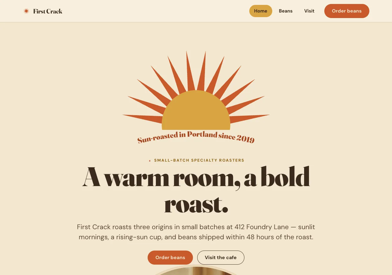
avocado, and roasted brown — with arched doorways, a rising-sun mark on the wall,
and headlines that curve overhead like a hand-painted sign.

The name is **Terra** — earth, terroir, the roasted ground itself. It sets the
register: warm, characterful, nostalgic, expressive. Where the neighbors are
quiet, Terra has swagger. But swagger is not chaos — a rich multi-color palette
is held in a strict hierarchy, every loud gesture is deliberate, and the result
reads as designed nostalgia, not kitsch pastiche.

The subject is still the coffee: three origins, two brews, a room you can visit
on a Saturday. Terra just tells it the way a 1970s poster would — big, warm, and
sure of itself.

## Palette

A rich 70s set, used expressively but ranked. Sand is the ground; one accent
leads each band; the others appear only as trim.

| Token            | Hex       | Role                                                                 |
| ---------------- | --------- | ------------------------------------------------------------------- |
| `--sand`         | `#f3e7d0` | Warm cream ground. Page floor, dominant surface. Never pure white.  |
| `--sand-deep`    | `#ecd9b8` | Deeper cream. Alternate bands, card bodies, arch mats.              |
| `--sand-raise`   | `#f8f0dd` | Lightest tint. Nav bar, raised recipe tickets.                     |
| `--cocoa`        | `#3a2a1e` | Deep roasted-brown ink. Primary text, dark bands.                  |
| `--cocoa-deep`   | `#2c2015` | Deepest brown. Footer floor, dark-band base.                       |
| `--cocoa-soft`   | `#4d3a2a` | Elevated dark cards, secondary buttons on dark.                    |
| `--burnt`        | `#c85a2b` | Burnt orange. PRIMARY accent: CTAs, active states, the sun's rays.  |
| `--burnt-deep`   | `#a5461f` | Press/active orange; large display fills sitting near text.        |
| `--ochre`        | `#d9a441` | Mustard ochre. SECONDARY accent: the sun disc, highlight fills.    |
| `--ochre-ink`    | `#8a5e14` | Deep ochre for small labels/eyebrows on cream (ochre itself can't). |
| `--avocado`      | `#6b7a3a` | Avocado green. TERTIARY accent: tabs, small curves, dark-roast trim.|
| `--avocado-deep` | `#54622c` | Deeper avocado; borders and label text on cream.                  |
| `--ink`          | `#3a2a1e` | Headlines and body (= cocoa).                                       |
| `--ink-soft`     | `#5c4632` | Secondary running text on cream. Holds ≥4.5:1 on `--sand`.         |
| `--on-dark`      | `#f3e7d0` | Cream text on dark bands (echoes the ground).                     |
| `--on-dark-soft` | `#cbb490` | Secondary text in dark bands and the footer.                      |
| `--hairline`     | `#dcc9a6` | 1px warm borders on cream surfaces.                                |

Rules:

- **Sand dominates.** The cream family is ~70%+ of every viewport; accents ride
  on top of warmth, never replace it.
- **One lead accent per band.** A band commits to exactly one of burnt / ochre /
  avocado as its voice; the other two appear only as small trim (a badge, a
  curve, a tab, a rule). Never three accents at equal weight in one component.
- **Burnt is the loudest and the only interactive fill** (buttons, active
  states) and the sun's rays. **Ochre is a graphic/fill color** (sun disc,
  highlight blocks) carrying cocoa text on top — never small text on cream; use
  `--ochre-ink` for that. **Avocado is the cool counterpoint,** kept scarce.
- **Roast-level color map (fixed, so color means something):** light roast →
  ochre, medium → burnt, dark → avocado. Applied only to origin arch trim and
  roast badges.
- **No gradients-as-sheen, no box shadows.** Depth comes from the sand-vs-cocoa
  band contrast, 1px warm hairlines, and the arch silhouettes. The *one* allowed
  retro device is a hard-edged flat-color sunburst (no blur). No neon, no cool
  gray, no drift to pink or red.

## Typography

Two faces, two jobs. All self-hosted woff2 under `assets/fonts/` via
`@font-face`; no font CDN.

- **Display — Fraunces.** The expressive, characterful voice — a soft old-style
  serif with wonky, high-contrast terminals that carry the vintage warmth. Use
  its heavier optical cuts big: **900** (opsz≈144, SOFT≈60, WONK on) for
  Display XL/L and the curved headline; **700** (opsz≈72) for Display M/S and
  titles. This is where the swagger lives. At most one Display XL per viewport.
- **Body / UI — DM Sans** 400 / 500 / 700. Clean, friendly, geometric-humanist.
  Body, nav, buttons, badges, meta rows, brew-parameter labels. Sentence case.

Type scale (desktop / mobile):

| Role       | Desktop      | Mobile       | Face        |
| ---------- | ------------ | ------------ | ----------- |
| Display XL | 88px / 0.98  | 46px / 1.02  | Fraunces 900 |
| Display L  | 60px / 1.02  | 36px / 1.05  | Fraunces 900 |
| Display M  | 40px / 1.1   | 30px / 1.14  | Fraunces 700 |
| Display S  | 28px / 1.2   | 24px / 1.25  | Fraunces 700 |
| Lead       | 22px / 1.5   | 19px / 1.5   | DM Sans 400  |
| Title      | 19px / 1.4   | 18px / 1.4   | DM Sans 700  |
| Body       | 18px / 1.65  | 16px / 1.6   | DM Sans 400  |
| Meta       | 15px / 1.5   | 14px / 1.5   | DM Sans 500  |
| Eyebrow    | 13px / 1.3   | 12px / 1.3   | DM Sans 700  |

Display letter-spacing: XL `-0.02em`, L `-0.015em`, M `-0.01em`, S `-0.005em`.
Eyebrows uppercase `+0.16em`. Body and title tracking 0.

Principles:

- Set Fraunces big and let its soft curves and WONK show — the display voice is
  meant to be seen. The curved-path headline is Fraunces 900.
- The big brew numbers (dose, ratio, yield) are set as **Fraunces 700 figures**
  in `--burnt` — the retro-menu move — while their units and labels stay DM Sans.
- Eyebrows open sections in uppercase DM Sans 700, wide-tracked, in `--ochre-ink`
  on cream or `--ochre` on dark, often preceded by a tiny three-ray sun tick.

## Spacing & layout

- 8px base unit. Section padding 112px top/bottom desktop, 64px mobile; feature
  bands may tighten to 72px for playful density.
- Content max-width 1180px, 12-column grid, 28px gutters.
- Mixed alignment: the hero is centered under the sun; editorial bands are
  left-aligned; origins are a 3-up grid. Composed asymmetry, never scatter.
- Border radius tokens:
  - `--r-pill` `9999px` — buttons, nav links, badges (very 70s).
  - `--r-lg` `20px` — recipe tickets, info panels, card bodies.
  - `--r-arch` — the signature. Top corners are a **full semicircle**
    (radius = half the frame's width); bottom corners are `--r-lg`. Never a
    guessed pixel — see Signature / build-time geometry.
- Warm 1px `--hairline` borders; dividers may be a thin flat-stripe sunburst
  segment rather than a plain rule.
- **Band rhythm:** alternate surface + lead accent so no two neighbors share a
  voice: sand/burnt hero → sand-deep/ochre → cocoa/ochre band → sand → burnt CTA
  band → cocoa-deep footer.

## Signature

Three related elements carry the identity — the warm 70s geometry.

### 1. The arched sun / rays mark

An inline-SVG sunburst behind the hero, reused small as the wordmark mark in nav
and footer.

- **Construction:** a center disc in `--ochre` (radius R) ringed by N tapering
  rays in `--burnt`. Each ray is an isosceles triangle whose tip points outward
  and whose base sits on the disc edge; ray *i* is rotated by *i*·(360/N). The
  hero uses a **half-sun** variant — rays spanning only the top 180°, rising
  behind the arch like a sunrise.
- **Colors:** disc `--ochre`, rays `--burnt`; on dark bands disc `--ochre`, rays
  `--sand`. The small wordmark mark is a single-color 24px sun in `--burnt`
  (`--sand` on dark).

### 2. Curved type on a path

- The hero tagline ("Sun-roasted in Portland since 2019") is set on an arc via
  SVG `<textPath>` following a circular arc that hugs the top of the hero arch,
  in Fraunces 900. Used at most once per page (hero only); Beans/About may reuse
  a shorter curved eyebrow over a section head.

### 3. Arch-topped frames

- Every photo sits in an arch frame: top corners a full semicircle
  (radius = half the frame width), bottom corners `--r-lg`, with a 6px
  `--sand-deep` inner mat and a 1px `--hairline`. The arch echoes 70s doorways
  and the rising sun.

### Build-time geometry (required)

All geometric graphics are **computed by a small build-time script, never
hand-eyeballed.** One Node script takes the parameters below and writes exact
coordinates into the markup:

- **Sunburst:** N (24 full / 12 half), disc radius R, ray length L, ray base
  half-angle → emits every ray `polygon`/`path` point and the disc circle, plus
  the half-sun start/stop angles.
- **Curved headline:** arch width → emits the arc `<path d="…">` (radius, sweep,
  start/end points) and the baseline offset so cap-height clears the arch. No
  hand-tuned `d` strings ship.
- **Arch masks:** any SVG arch/clip coordinates are script-computed from the
  rendered frame width (pure-CSS arch frames may use `border-radius`, but SVG
  masks come from the script).

## Components

- **Nav.** `--sand-raise` bar, ~72px, 1px bottom hairline. Left: 24px sun mark +
  "First Crack" wordmark (Fraunces 700, small). Right: pill nav links (Beans,
  Visit) in DM Sans 700 15px; active link gets an `--ochre` pill backing and
  `aria-current="page"`. Far right: burnt pill "Order beans" button.
- **Buttons.** Pill (`--r-pill`), DM Sans 700. Primary: solid `--burnt` fill,
  `--sand` text; active `--burnt-deep`. Secondary: `--sand` fill, `--cocoa`
  text, 1.5px `--cocoa` border. On dark bands the secondary becomes `--cocoa-soft`
  fill with `--on-dark` text; the primary stays burnt (never inverts to a light
  button on dark).
- **Eyebrow label.** Uppercase DM Sans 700, `+0.16em`, `--ochre-ink` on cream /
  `--ochre` on dark, preceded by a tiny three-ray sun tick.
- **Origin card.** Arch-topped: arch image frame on top, body on `--sand-deep`
  with `--r-lg` bottom corners. Origin name in Fraunces 700 (Display S), a roast
  badge pill colored by the roast map (ochre / burnt / avocado), tasting notes in
  body, and a meta row (process · elevation) in DM Sans 500. **San Agustin**
  (medium, the house origin) is featured: the whole card flips to `--cocoa` with
  cream text and burnt arch trim — the dark card is the featured signal, one per
  grid.
- **Brew ticket.** Terra's warm answer to a spec table — explicitly **not** a
  code window. Pour-over and espresso each sit in an arch-topped `--sand-raise`
  card, `--r-lg`, with a small avocado filing-tab at top reading `POUR-OVER` /
  `ESPRESSO`. The headline figures (dose, ratio) are big Fraunces 700 numerals in
  `--burnt`; each parameter is a DM Sans row joined by a dotted leader
  (`WATER · · · · · 250 g @ 94°C`). Pour-over carries 15 g / 250 g @ 94°C /
  medium-fine / 3:00 / 1:16.7; espresso carries 18 g in / 36 g out / 28 s /
  93°C / 1:2.
- **Info panel.** `--sand-deep`, `--r-lg`, 32px padding, for the visit block:
  412 Foundry Lane, cafe hours Wed–Sun 8:00–15:00, and free Saturday 10:00
  cupping (no reservation).
- **Sunburst divider.** A thin full-bleed band of flat burnt/ochre/sand stripes
  (hard edges, no blur), or a single half-sun sitting on a hairline, separating
  bands.
- **Footer.** Full-width `--cocoa-deep`, `--on-dark` text, `--on-dark-soft`
  secondary. Sun mark + wordmark in `--sand`, ochre/burnt link accents, column
  links, and the roast-day note (roasts Tue & Thu; ships within 48 hours). Never
  inverts to cream.

## Motion

One orchestrated moment: on load the hero sun's rays sweep in ~8–10° and fade up
over ~1.2s, settling into place; the curved headline fades in just after.
Interactive elements use a 120ms ease-out color transition with a 1px pill lift
on hover; origin cards may scale to 1.02 on hover. Nothing else animates.

Under `prefers-reduced-motion: reduce`, the sun renders settled with no rotation
or fades, cards do not scale, and only the flat color transitions on hover
remain.

## Image treatment

Warm, sun-washed, slightly grainy **retro-film** coffee/roastery photography with
a 1970s color grade — oranges, ochres, and avocado greens, lifted (faded)
shadows, gentle highlight halation, and fine film grain. Golden-hour or warm
window light. Subjects: the pour, green beans and burlap, the roaster drum and
cooling tray, the origin landscapes, the room, the Saturday cupping table.

Every photo sits in an arch-topped frame with the `--sand-deep` mat. A single
subtle grain-texture overlay is allowed (it is period-correct). No cool tones, no
crushed blacks, no latte-art lifestyle stock, no white-marble flat lays.

Needed images (referenced as `./assets/<id>.png`):

- `index-hero` — the pour or roaster drum in golden window light, warm grain,
  headroom to sit beneath the sun mark.
- `index-sourcing` — hands cradling green beans over burlap, sun-washed.
- `index-process` — roaster drum / cooling tray with orange flame-glow.
- `origin-yirgacheffe` — Ethiopian Gedeo highland terraces, jasmine-bright light
  (light roast, ochre voice).
- `origin-san-agustin` — Colombian Huila hillsides, caramel warmth (medium, the
  house origin).
- `origin-kerinci` — Sumatra highlands under cloud, deeper green (dark roast,
  avocado voice).
- `about-space` — the First Crack cafe room, 70s warmth, wood and ochre.
- `about-cupping` — the Saturday cupping table, spoons and bowls, from above.

## Do / Don't

Do:

- Keep the sand family the ground on every page; let accents ride on warmth.
- Commit each band to one lead accent; use the other two only as small trim.
- Set Fraunces big and characterful for display; keep DM Sans for everything
  readable.
- Compute every sunburst ray, curved-type arc, and arch mask with the build-time
  geometry script — never hand-eyeball path data.
- Set brew numbers as big Fraunces figures in warm recipe tickets, not a code
  window.
- Honor the roast-level color map so color carries meaning (light = ochre,
  medium = burnt, dark = avocado).
- Frame every photo in an arch with a sand mat and warm grain.

Don't:

- No white or cool-gray ground; no drift to neon, pink, or red.
- No three accents at equal weight in one component; no accent as body text on
  cream (ochre especially — use `--ochre-ink`).
- No gradients-as-sheen and no box shadows; the only retro device is the
  hard-edged flat sunburst.
- No bloom-style dark code/recipe window; no restrained single-accent
  minimalism — Terra has swagger.
- No hand-tuned SVG path data for the geometric motifs.
- No emoji, and no decorative icons doing a label's job.