Coffee Roastery
Roast Log
DESIGN.md
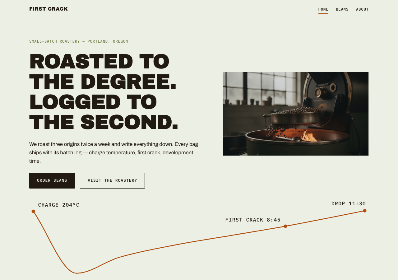
# Roast Log — Design System

## Concept

Specialty roasting is a craft measured in degrees and seconds. Every batch has
a charge temperature, a first-crack timestamp, a development ratio — and good
roasters keep the log. This design borrows its entire visual language from
that logbook: green-cast paper (the color of unroasted coffee), roast-black
ink, monospace data annotations, and a single copper accent reserved for the
moment of first crack. Warmth comes from the photography; the layout stays
precise and disciplined, like a well-kept record.

The register is documentary, not lifestyle. No cafe romance, no latte art.
The subject is the work: green coffee in, roasted coffee out, everything in
between written down.

## Palette

| Token          | Hex       | Role                                                        |
| -------------- | --------- | ----------------------------------------------------------- |
| `--paper`      | `#ECEFE3` | Green-cast parchment. Page background, dominant surface.    |
| `--paper-deep` | `#DFE3CE` | Tinted fill. Cards, table stripes, quiet panels.            |
| `--ink`        | `#211A13` | Roast black. All text, solid buttons, rules.                |
| `--green-bean` | `#737E4B` | Unroasted-bean olive. Eyebrow labels, borders, secondary UI.|
| `--drum`       | `#2B2E21` | Dark olive-charcoal. Footer and CTA band backgrounds.       |
| `--crack`      | `#B14E12` | First-crack copper. Accent only: links, active nav, curve.  |

Rules:

- Paper dominates. Copper never exceeds roughly 5% of any viewport and is
  never used as a large fill.
- No gradients anywhere. Flat fills only.
- Dark sections use `--drum` with `--paper` text and copper accents.

## Typography

Three faces, three jobs. All self-hosted woff2 under `assets/fonts/` via
`@font-face`; no font CDN.

- **Display — Archivo Black.** Uppercase, tight tracking (-0.01em). Crate-
  stencil energy. Page titles and section headlines only; never body text.
  At most one display-size headline per viewport.
- **Body / UI — Archivo** 400 and 600. Sentence case, plain and legible.
- **Data — IBM Plex Mono** 400 and 500. Every number, spec row, annotation,
  and eyebrow label. Labels are uppercase with 0.08em letter-spacing.

Type scale (desktop / mobile):

| Role     | Desktop        | Mobile        |
| -------- | -------------- | ------------- |
| Display  | 64px / 1.02    | 40px / 1.05   |
| H2       | 40px / 1.1     | 30px / 1.15   |
| H3       | 22px / 1.3     | 20px / 1.3    |
| Body     | 17px / 1.6     | 16px / 1.6    |
| Data     | 14px / 1.5     | 13px / 1.5    |
| Label    | 12px / 1.2     | 12px / 1.2    |

## Spacing & layout

- 8px base unit. Section padding 96px top/bottom on desktop, 56px on mobile.
- Content max-width 1140px, 12-column grid, 24px gutters.
- Everything left-aligned. Centered text only in the CTA band.
- Section dividers are 1px solid rules at 15% ink opacity, annotated with a
  small mono label sitting on the rule like a logbook margin note.
- Border radius: 2px maximum (buttons, tags). Images are square-cornered.
- No box shadows. Depth comes from 1px borders (ink at 20%) and
  `--paper-deep` fills.

## Signature: the annotated roast curve

One element carries the identity: a thin 2px copper line tracing a real roast
profile (slow climb, turning point, steeper finish), rendered as inline SVG.
It crosses the hero, and shorter segments reappear as section dividers. Tick
marks along the curve carry mono annotations — `CHARGE 204°C`,
`FIRST CRACK 8:45`, `DROP 11:30`. The curve is the one loud thing on the
page; everything around it stays quiet.

## Components

- **Nav.** Slim top bar on paper, 1px bottom rule. Wordmark left (Archivo
  Black, small), page links right in uppercase mono. Active page gets a 2px
  copper underline and `aria-current="page"`.
- **Batch tag.** The origin card, styled like a kraft batch tag:
  `--paper-deep` fill, 1px ink border, a punched-hole detail (12px circle,
  paper fill, ink border) in the top corner. Header in Archivo 600, then mono
  spec rows.
- **Spec row.** Mono key/value pair joined by a dotted leader
  (`ORIGIN ........ Gedeo Zone, Ethiopia`). Used inside batch tags and brew
  guides.
- **Buttons.** Primary: solid ink fill, paper text, 2px radius, uppercase
  mono label; hover shifts fill to copper. Secondary: transparent with 1px
  ink border; hover border and text go copper. On `--drum` dark bands the
  primary inverts — paper fill, ink text — so it stays legible; hover still
  goes copper.
- **CTA band / footer.** Full-width `--drum` background, paper text, copper
  for links and the curve motif.

## Motion

One orchestrated moment: on load, the hero roast curve draws itself in over
1.2s (stroke-dashoffset), then its tick labels fade in. Nothing else animates
except hover transitions (100ms ease-out on color and underline). Under
`prefers-reduced-motion: reduce`, the curve renders complete with no
animation.

## Image treatment

Documentary and workmanlike: beans, machines, hands, the room. Natural
diffuse daylight, slight desaturation, tones harmonized toward olive-green
and roast-brown; copper highlights (flame glow, roasted-bean sheen) welcome.
Close, honest compositions — the trier, the cooling tray, the burlap seam.
No latte art, no smiling-customer cafe stock, no white-marble flat lays.
Images sit square-cornered with no filters or overlays.

## Do / Don't

Do:

- Keep copper scarce; if it stops feeling rare, remove some.
- Set every number in IBM Plex Mono, including inline ones.
- Use uppercase mono eyebrows to open sections.
- Use real roasting vernacular where the content allows: charge, first
  crack, development, cupping.

Don't:

- No serif type anywhere.
- No gradients, no box shadows, no radius above 2px.
- No cream or terracotta drift — the paper stays green-cast.
- No emoji. No decorative icons doing a label's job.
- Never more than one display-size headline per viewport.