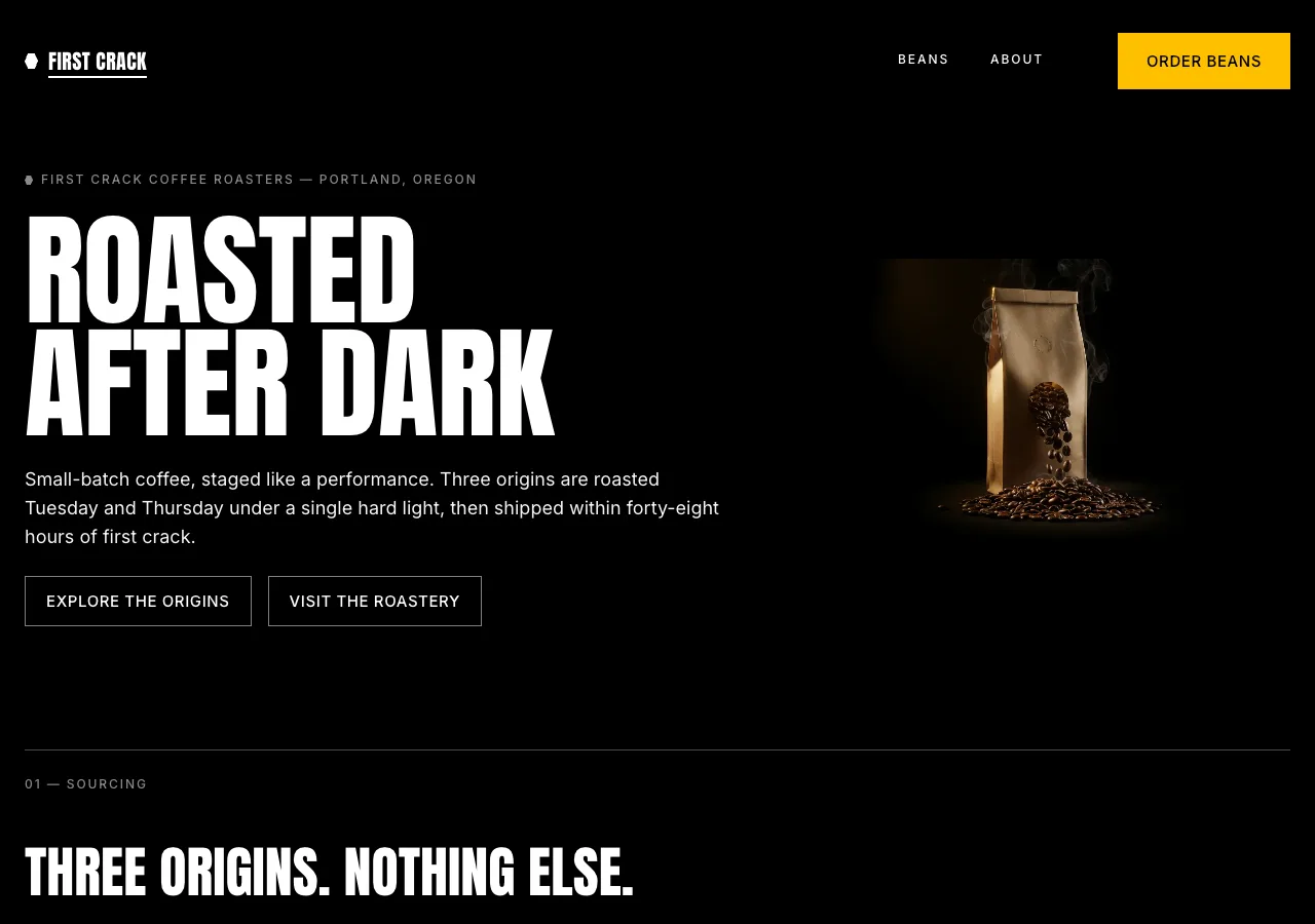
DESIGN.md
# Onyx — Design System

## Concept

Most roasteries sell warmth: cream paper, soft daylight, a friendly cup. Onyx
does the opposite. It stages First Crack Coffee Roasters as a performance held
after dark — the roaster as a machine under a spotlight, the drum as an engine,
the batch as a reveal. The canvas is a cathedral of true black. Beans, the bag,
the drum emerge from that black under a single hard light; everything else is
void. This is roasting as spectacle: high heat, the audible first crack when the
beans ignite, the dark-roast theater of a nocturnal, exclusive craft.

The name is **Onyx** — the black stone, and the color the whole page is cut
from. First crack is the pivotal, loud moment of a roast; the design keeps that
register everywhere. Type SHOUTS in uppercase at architectural scale. Corners
are sharp — zero radius, non-negotiable. There is exactly one warm color in the
building, **Lamborghini Gold**, and it is spent on a single thing: the button
that says order. Everything else is white, gray, and darkness.

The register is theatrical and technical, not cozy. No latte-art romance, no
smiling-customer stock, no daylight. Darkness is the whitespace. A single origin
name floating in a black viewport carries the weight of an exhibit on a gallery
wall — the absence of color *is* the design.

## Palette

| Token           | Hex                    | Role                                                              |
| --------------- | ---------------------- | ---------------------------------------------------------------- |
| `--void`        | `#000000`              | True black. Dominant canvas — page floor, hero, nav, most panels.|
| `--iron`        | `#181818`              | Deepest elevated surface. Footer and deep sections.              |
| `--charcoal`    | `#202020`              | Primary card / panel surface sitting above the void.             |
| `--graphite`    | `#494949`              | Top surface layer, 1px hairlines, dividers, hex strokes.         |
| `--gold`        | `#FFC000`              | Lamborghini Gold. **Primary CTA fill only** — nothing else.      |
| `--gold-press`  | `#917300`              | Dark gold. Active / pressed state of the gold CTA.               |
| `--gold-text`   | `#FFCE3E`              | Inline gold accent. Scarce: text links (hover), featured badge.  |
| `--white`       | `#ffffff`              | Display headlines, primary text on the void.                     |
| `--smoke`       | `#f5f5f5`              | Lead paragraphs, subheads — a half-step under pure white.        |
| `--ash`         | `#b0b0b0`              | Default running body text on the void.                           |
| `--steel`       | `#8a8a8a`              | Captions, metadata, spec labels, fine print (AA-safe on black).  |
| `--ghost-line`  | `rgba(255,255,255,.5)` | Ghost secondary button border — 1px white at 50% opacity.        |

Rules:

- Black dominates. `--gold` never exceeds roughly 3% of any viewport; there is
  **one** gold element per view — the primary CTA — and nothing decorative is
  ever gold.
- No gradients on UI. No drop shadows — on a black canvas shadows are invisible.
  Depth is built by surface layering only: `--void` → `--iron` → `--charcoal`
  → `--graphite`. Elevated elements are literally lighter than their ground.
- All grays stay achromatic — pure neutral, no warm or cool tint. The only
  warmth in the interface is the gold CTA and the gold light inside photography.
- `--gold-text` is the single place gold touches running content: a text link on
  hover, and the roast-level word inside the featured origin's hex badge. Never a
  gold headline, never gold body copy.

## Typography

Two faces, two jobs. Both self-hosted woff2 under `assets/fonts/` via
`@font-face`; no font CDN.

- **Display — Anton** 400. The shouting voice: an ultra-condensed grotesque that
  stands in for Lamborghini's LamboType. Uppercase always at display sizes, tight
  line-height, near-zero tracking (the face is already dense). Weight 400 carries
  every headline — Anton is distinctive enough that bold would be noise. At most
  one hero-scale headline per viewport.
- **Body / UI — Inter** 400 and 500. Plain, legible, upright. Body copy, nav,
  buttons, spec labels, captions. Eyebrow labels and button text are uppercase
  Inter 500 with positive tracking; running body stays sentence case.

Type scale (desktop / mobile):

| Role            | Desktop      | Mobile       | Face      |
| --------------- | ------------ | ------------ | --------- |
| Hero Display    | 120px / 0.92 | 56px / 0.95  | Anton 400 |
| Display L       | 80px / 1.0   | 44px / 1.05  | Anton 400 |
| Section Title   | 54px / 1.05  | 34px / 1.1   | Anton 400 |
| Sub-section     | 40px / 1.1   | 28px / 1.15  | Anton 400 |
| Feature Heading | 27px / 1.19  | 22px / 1.25  | Anton 400 |
| Body Large      | 18px / 1.56  | 17px / 1.6   | Inter 400 |
| Body / UI       | 16px / 1.5   | 15px / 1.55  | Inter 400 |
| Button          | 15px / 1.0   | 15px / 1.0   | Inter 500 |
| Label           | 12px / 1.4   | 12px / 1.4   | Inter 500 |
| Micro           | 10px / 1.6   | 10px / 1.6   | Inter 400 |

Principles:

- **Uppercase is the default voice** at every display tier — Hero through
  Feature Heading. Mixed case appears only in body-size Inter.
- **Tight line-heights at scale** (0.92–1.19) stamp headlines into dense,
  architectural blocks that read as steel, not typeset paragraphs.
- Anton tracking sits near 0 (Hero `-0.5px`, Section Title `0`). Uppercase Inter
  **labels track `+0.16em`**, buttons `+0.04em`, Micro `+0.02em` for legibility.
- Numbers matter here: brew and roast figures are set large in Anton inside the
  spec panel (see Components), not buried in a sentence.

## Spacing & layout

- 8px base unit. Section padding 120px top/bottom desktop, 64px mobile — the
  generous void between blocks is the breathing room; darkness is the whitespace.
- Content max-width 1280px, 12-column grid, 24px gutters. Hero and full-bleed
  photography break the grid to fill the viewport edge to edge.
- **Border radius is 0px everywhere — buttons, cards, panels, images, the hex
  badge's straight edges.** Sharp rectangles and sharp vertices are the
  signature; there is no radius token and no exception. Images are square-cut.
- Left-aligned display and content throughout. Centered text appears only in the
  full-bleed CTA band.
- Hero and story bands use a 7/5 split (headline left, image right), collapsing
  to a single column on mobile — headline first, image below.
- Section dividers are 1px `--graphite` rules, occasionally carrying a small
  uppercase Inter label (e.g. `02 — SOURCING`) sitting on the rule like a plate.

## Signature

Two elements carry the identity, both direct translations of the reference's
hexagonal DNA and spotlight staging into coffee.

### 1. The hex roast badge

The hexagonal motif, made coffee-native. A **flat-top hexagon** (inline SVG,
sharp vertices — it obeys the zero-radius law by nature) encloses the roast
level: `LIGHT`, `MEDIUM`, or `DARK` in Inter 500 uppercase. A 1px `--graphite`
stroke by default; on the featured origin it strokes `--gold` and the word turns
`--gold-text`. A small **roast dial** rides beneath — three hex pips, filled
`--white` up to the batch's level (one for light, two for medium, three for
dark) — so the badge reads at a glance without color-coding. A tiny solid hex
also replaces the list bullet before every eyebrow label and footer link,
threading the geometry through the whole interface.

### 2. The spotlight origin card

The three origins are staged like machines under a spotlight, emerging from
black. Each card is a full-bleed high-contrast studio shot of the beans on the
void — no visible frame, the image crushing to true black at its edges so it
bleeds into the canvas — with the origin name in Anton (Section Title) laid
over the dark base, the hex roast badge, tasting notes, and a spec row. The
**house origin, San Agustin (medium), is featured**: it takes a 1px `--gold`
hairline frame, the gold hex badge, and a 2px gold underline beneath its name.
The two others stay white/graphite. On an all-dark stage, gold *is* the
spotlight — that is the featured signal, the way a car reveal lights one vehicle.

## Components

- **Nav.** Floats in the darkness: transparent (inherits `--void`), fixed to
  top, **no background, no border, no shadow** — just marks hanging in black. A
  small solid hex + `FIRST CRACK` wordmark (Anton, small, uppercase) at left;
  `BEANS` / `ABOUT` links right in Inter 500 uppercase 12px `--white`; the single
  gold `ORDER BEANS` button at the far right. Active page gets a 2px `--white`
  underline and `aria-current="page"`.
- **Primary button (gold CTA).** The only gold surface on the page. `--gold`
  fill, `--void` text, **0px radius**, 20px/28px padding, Inter 500 uppercase,
  `+0.04em` tracking. Active/press darkens to `--gold-press`. Carries the
  content's one CTA intent — "Order beans" → the beans page. One per view.
- **Ghost button (secondary).** Transparent fill, 1px `--ghost-line` border
  (white at 50% opacity), `--white` text at full opacity, 0px radius, 16px
  padding, uppercase Inter 500. Hover: border goes full-opacity white and the
  fill shifts to `--charcoal`. Never becomes a light-filled button — only the
  gold CTA fills. Used for "Read the story" / "Visit us" secondary actions.
- **Text link.** `--white` with a 1px underline; hover shifts text to
  `--gold-text`. The one place gold appears inside running copy.
- **Spotlight origin card.** As specified in Signature — image bleeding into the
  void, Anton origin name, hex roast badge, tasting notes in `--ash`, and a spec
  row of uppercase Inter labels: `WASHED · 1,950 M · GEDEO ZONE, ETHIOPIA`.
  Featured (San Agustin) carries the gold frame, badge, and underline.
- **Brew spec panel.** Parametric data staged as a machine's technical readout.
  A `--charcoal` panel, 0px radius, titled `POUR-OVER` or `ESPRESSO` in Anton
  Sub-section. Each parameter is a stat block: the **figure large in Anton**
  (`250`, `94°C`, `28 S`) over a small uppercase `--steel` Inter label
  (`WATER`, `TEMP`, `SHOT TIME`), separated by 1px `--graphite` rules. Pour-over
  reads 15 g coffee · 250 g water @ 94°C · medium-fine grind · 3:00; espresso
  reads 18 g in · 36 g out · 28 s · 93°C. Numbers are the hero here, not prose.
- **CTA band.** Full-bleed `--void` (or dark photography), centered: an Anton
  Display L line and the single gold CTA. The one centered moment on the site.
- **Footer.** Full-width `--iron` — the deepest surface. Hex mark + `FIRST CRACK`
  wordmark in `--white`, uppercase Inter column links in `--steel` (each led by a
  small hex bullet), the 412 Foundry Lane address, cafe hours, and roast-day
  note. Never inverts to a light surface.

## Motion

Color and opacity only — **no scale, no translate** (movement of the geometry
would contradict the stamped-steel stillness). On load, the hero headline fades
in (opacity 0 → 1 over 0.6s), then the gold CTA and hex badge fade in staggered
just after. Everything else is hover feedback: 120ms ease on color, opacity, and
border — the gold CTA darkening to `--gold-press`, a ghost border going solid, a
link turning `--gold-text`. Under `prefers-reduced-motion: reduce`, all content
renders complete and static with no fade.

## Image treatment

Cinematic and nocturnal. Every subject emerges from true black under a single
hard, warm key light — beans, the bag, the drum, the pour — with deep shadows
crushing to `#000000` at the frame edges so the photograph bleeds seamlessly
into the canvas with no visible border. Desaturated throughout except a gold
rim-light catching bean sheen, steam, or the drum's flame-glow. High contrast,
low key, 16:9 or wider for heroes and near-square for origin product shots.
Square-cut, no filters or rounded frames. No latte-art, no smiling-customer
cafe stock, no bright daylight flat-lays — light is the exception, darkness the
rule.

Needed images:

- `hero-bag` — index hero. A First Crack coffee bag and a cascade of roasted
  beans emerging from pure black, single gold rim-light along one edge, faint
  steam. Full-bleed 16:9+.
- `drum` — index roasting-process section. The drum roaster under a hard
  spotlight on black, gold flame-glow at the drum mouth, deep shadow surround.
- `origin-yirgacheffe` — light-roast Yirgacheffe beans as a high-contrast studio
  shot on black, cool low-key light, pale bean sheen. Near-square.
- `origin-san-agustin` — the featured house origin: medium-roast San Agustin
  beans, warmer gold rim-light, staged like a spotlighted reveal on black.
- `origin-kerinci` — dark-roast Kerinci beans, oily sheen, deepest shadow,
  emerging from black. Near-square.
- `pour` — beans page brew section. A pour-over mid-pour, dark scene, a
  gold-lit water stream and steam against black.
- `space` — about page visit section. The 412 Foundry Lane roastery/cafe at
  night, industrial and low-key, a single warm light source, on black.
- `cupping` — about page story section. A cupping spoon and bowls under a
  spotlight, dark documentary framing, steam catching the light.

## Do / Don't

Do:

- Anchor every page on true black `#000000`. Dark gray as a substitute reads as
  any other dark theme; the uncompromising void is the brand.
- Spend gold on exactly one thing per view — the primary CTA. If a second gold
  element appears, remove it.
- Set every display headline in Anton, uppercase, weight 400, with tight
  line-height. Let the type SHOUT.
- Keep corners sharp — 0px radius on buttons, cards, panels, images, and the hex
  badge, everywhere, always.
- Build depth by surface layering (`--void` → `--iron` → `--charcoal` →
  `--graphite`), never by shadow.
- Thread the hexagon through the interface — roast badge, bullet, footer mark.
- Let cinematic photography carry the emotion; keep the UI as infrastructure.

Don't:

- No second accent color — the monochrome-plus-gold system is sealed. No gold
  headlines, gold body, or decorative gold.
- No border-radius, anywhere. No rounded buttons, cards, or images.
- No bold display type — Anton stays 400; the face is loud enough.
- No gradients, no drop shadows, no glows on UI.
- No lowercase in display headings; uppercase is the authority.
- No hover scale or translate — interactions are color and opacity only.
- No light canvas as the default; light is the rare exception, darkness the rule.
- No emoji, no decorative icons doing a label's job, no latte-art lifestyle
  photography.