DESIGN.md
# Gallery — Design System

## Concept

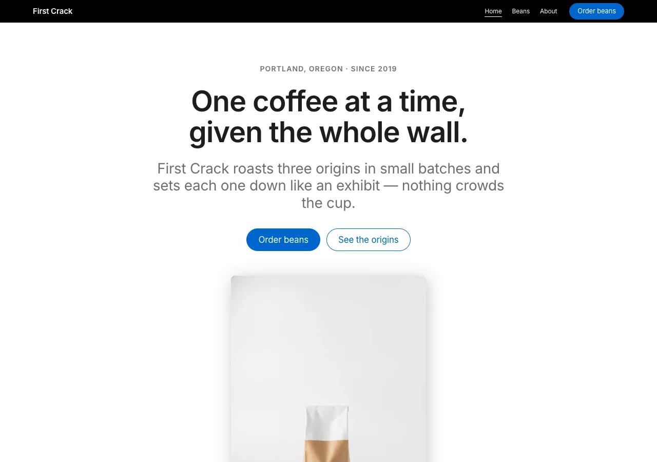
Most roastery sites crowd the coffee: textured backdrops, warm gradients, a
second and third accent color fighting for attention. **Gallery** does the
opposite. It treats First Crack Coffee Roasters the way a museum treats a
single sculpture — the wall disappears and the object takes over. Each origin
is photographed reverently, set down on a clean surface, and given room to
breathe. Nothing decorative competes with it.

The whole page is a stack of **edge-to-edge tiles** that alternate between light
(pure white or a faint parchment) and near-black. There are no section borders,
no divider rules, no drop-shadows on the chrome — the *color change itself is
the divider*, and the only shadow in the entire system falls beneath a product:
a coffee bag, a filled cup, a scatter of beans resting on the tile surface. One
interactive color, Action Blue, carries every link and every button; there is
no second accent, and that restraint is the entire point.

The register is confident and quiet. Headlines are tight, set in a single
sans face with negative tracking. Body copy runs a notch larger than usual —
17px — so the page reads at a considered pace rather than a scanning one. This
is a catalog that behaves like a gallery: the coffee is the exhibit, and the
interface is the frame that knows to get out of the way.

## Palette

| Token               | Hex       | Role                                                                 |
| ------------------- | --------- | ------------------------------------------------------------------- |
| `--canvas`          | `#ffffff` | Pure white. Dominant light tile, utility cards, brew spec sheets.   |
| `--parchment`       | `#f5f5f7` | Signature off-white. Alternate light tile + footer. Breaks two whites. |
| `--pearl`           | `#fafafc` | Near-white fill for the secondary ghost button on parchment.        |
| `--tile-dark-1`     | `#272729` | Primary near-black tile. The main dark band in the stack.           |
| `--tile-dark-2`     | `#2a2a2c` | Micro-step lighter. Only when a dark tile abuts another dark tile.  |
| `--tile-dark-3`     | `#252527` | Micro-step darker. Bottom of stack + the featured origin surface.   |
| `--void`            | `#000000` | True black. The slim global nav bar only — nowhere else.            |
| `--action`          | `#0066cc` | Action Blue. THE single interactive color: links + pill CTAs + focus root. |
| `--action-focus`    | `#0071e3` | Marginally brighter sibling. Keyboard `:focus-visible` outline only. |
| `--action-on-dark`  | `#2997ff` | Sky-blue link, dark tiles only — Action Blue would sink into near-black. |
| `--ink`             | `#1d1d1f` | Near-black. Every headline + body paragraph on light. Not pure black. |
| `--ink-muted`       | `#6e6e73` | Secondary captions, sub-heads, spec labels on light. Holds AA (≥4.5:1). |
| `--ink-faint`       | `#86868b` | Fine print + legal on light. Non-essential text only.               |
| `--on-dark`         | `#ffffff` | All text on dark tiles and the global nav.                          |
| `--on-dark-muted`   | `#a1a1a6` | Secondary copy on dark tiles where pure white is too loud (≥4.5:1). |
| `--hairline`        | `#d2d2d7` | 1px border on utility cards, chips, spec rows.                      |
| `--divider-soft`    | `#f0f0f0` | Soft ring on the secondary ghost button — reads as edge, not line.  |

Rules:

- **One accent, no exceptions.** `--action` is the only chromatic color in the
  system. If an element is not interactive, it is ink, white, parchment, or
  near-black. Never introduce a warm coffee-brown accent — the photography
  carries all the warmth.
- **No gradients anywhere. No shadow on chrome.** Depth comes only from the
  light-tile ↔ dark-tile surface change. The lone shadow lives under products.
- **The color change is the section divider.** Never two consecutive tiles on
  the same surface (the `-2`/`-3` micro-steps exist only to separate two
  unavoidably-adjacent dark tiles). The page pulses:
  white → dark → parchment → dark → white → parchment-footer.
- On dark tiles, in-copy links flip to `--action-on-dark`; buttons keep
  `--action` (Action Blue still reads on near-black). Never use
  `--action-on-dark` on a light surface.

## Typography

One face, self-hosted. All weights are **Inter** woff2 under `assets/fonts/`
via `@font-face` — no font CDN, no Google Fonts `<link>`. Inter is the closest
open substitute for Apple's SF Pro; at display sizes it needs a touch more
negative tracking to land the "Apple tight" cadence.

- **Inter 600** — every headline. Weight 600, never 700, is the headline voice.
- **Inter 400** — all body, captions, nav, buttons, spec values.
- **Inter 300** — the rare airy read: one large lead paragraph and the store-hero
  CTA. A deliberate light-atmosphere cue, used sparingly.
- **Inter 700** — reserved for a single assertive tagline/eyebrow when 600 is not
  quite enough. Scarce.
- **Weight 500 is deliberately absent.** The ladder is 300 / 400 / 600 / 700.
  Any mid-weight reading resolves to 600, never 500.

Type scale (desktop / mobile):

| Role         | Desktop       | Mobile       | Face      |
| ------------ | ------------- | ------------ | --------- |
| Hero Display | 56px / 1.07   | 34px / 1.1   | Inter 600 |
| Display L    | 40px / 1.1    | 30px / 1.12  | Inter 600 |
| Display M    | 34px / 1.2    | 27px / 1.22  | Inter 600 |
| Lead         | 28px / 1.2    | 21px / 1.25  | Inter 400 |
| Lead Airy    | 24px / 1.45   | 20px / 1.5   | Inter 300 |
| Tagline      | 21px / 1.2    | 19px / 1.25  | Inter 600 |
| Body Strong  | 17px / 1.4    | 17px / 1.4   | Inter 600 |
| Body         | 17px / 1.47   | 17px / 1.47  | Inter 400 |
| Caption      | 14px / 1.43   | 14px / 1.43  | Inter 400 |
| Nav          | 12px / 1.0    | 12px / 1.0   | Inter 400 |
| Fine print   | 12px / 1.3    | 12px / 1.3   | Inter 400 |

Letter-spacing: Hero `-0.02em`, Display L/M `-0.018em`, Lead `-0.012em`, Body
`-0.011em`. Tagline and Caption `0`. Nav `-0.01em`. Negative tracking is applied
at every 17px-and-up size and never below 14px.

Principles:

- **Body at 17px / 400 / 1.47, not 16px.** The extra pixel and the open leading
  set the brand's unhurried reading pace. Never tighten body line-height below
  1.47, never set body at weight 500.
- **Negative tracking is the headline signature.** Without it, Inter reads
  generic; with it, the display sizes get the tight, machined cadence.
- **Numerals are tabular.** Brew parameters and elevations use
  `font-variant-numeric: tabular-nums` so figures align down a spec column.

## Spacing & layout

- **8px base unit.** Tokens: 4 · 8 · 12 · 17 · 24 · 32 · 48 · 80.
- **Section padding: 80px** top/bottom inside a tile desktop, **48px** mobile.
  Tiles stack **edge-to-edge with 0 gap** — the surface change is the break.
- Content max-width: **980px** on text-led sections (story, sourcing), **1200px**
  on the origin/brew grids, **full-bleed** for hero tiles. Hero content is a
  centered single-column stack; origin grid is 3-up desktop → 1-up mobile.
- Card padding **24px**. Button padding 11×22px (pill), 8×15px (dark utility).
- **Whitespace is the pedestal.** At least 64px of air above a tile headline,
  48–64px below; the nearest content to a product render sits ≥40px away. The
  footer is the one deliberately dense region.
- Border radius: `sm` 8px (dark utility button, inline card imagery), `md` 11px
  (pearl secondary capsule), `lg` 18px (utility / info / origin cards),
  `pill` 9999px (primary CTA, chips, search). Full-bleed tiles are radius `0`.

## Signature

Two elements, both direct translations of the reference's own signatures.

### 1. The gallery-tile stack

The load-bearing structure. Every page is a vertical stack of full-bleed tiles
that alternate light (`--canvas` / `--parchment`) and near-black
(`--tile-dark-1/2/3`). No borders, no divider rules, no rounded corners — **the
color change is the divider.** Each tile is a single reverent frame: a centered
headline (Display L), a one-line Lead tagline, at most two Action-Blue CTAs, and
one product render. The rhythm across a page is a predictable pulse, and
emphasis is created by *flipping the surface*, never by adding chrome.

### 2. The single product shadow

There is exactly **one** shadow token in the whole system:
`box-shadow: rgba(0, 0, 0, 0.22) 3px 5px 30px 0;`. It is applied **only** beneath
a photographic product render resting on a tile surface — the hero coffee bag,
each origin bag, the filled cup. It gives the object physical weight. It never
appears on a card, a button, a chip, an input, or text. If an element that is
not a product photo has a shadow, the design is wrong. All other elevation is
surface-color change alone.

## Components

- **Global nav.** Persistent, ultra-slim `--void` (`#000000`) bar, 44px tall,
  pinned top. Left: "First Crack" wordmark in Inter 600 small. Center-right:
  quiet links (Home, Beans, About) in `--on-dark` at Nav size (12px / 400),
  ~20px apart. Far right: the primary **Order beans** pill. The true-black bar
  is the only place pure black appears. Active link carries a 1px `--on-dark`
  underline + `aria-current="page"`. Collapses to a wordmark + menu button at
  ≤833px.
- **Primary pill CTA.** `--action` fill, `--on-dark` text, Body size, full pill
  (`border-radius: 9999px`), padding 11×22px. The full-pill radius *is* the
  brand's action signal. Label: "Order beans" (→ beans page). Active state:
  `transform: scale(0.95)` — the system-wide press micro-interaction. Focus:
  2px solid `--action-focus` outline.
- **Secondary ghost pill.** Transparent (or `--pearl` on parchment) fill,
  `--action` text, 1px `--action` border, full pill, same padding. The second
  CTA when a pair appears ("Read the origin" / "Order beans").
- **Dark utility button.** Global-nav-adjacent actions if needed. `--ink` fill,
  `--on-dark` text, Caption size, radius `sm` (8px), padding 8×15px. Rect, not
  pill — utility, not action.
- **Origin / product tile.** The three origins presented as reverently-shot
  products. Each is a full-bleed tile: eyebrow (roast level, Tagline 700, e.g.
  `LIGHT ROAST`), origin name (Display L), a one-line Lead of tasting notes, a
  hairline spec micro-row (process · elevation), and the bag render carrying the
  single product shadow. **San Agustin — the house / featured origin — is the
  featured tile:** its surface flips to `--tile-dark-3` with `--on-dark` text.
  The dark surface *is* the featured signal; no badge, no border, no second color.
- **Brew spec sheet.** The pour-over and espresso parameters, presented like an
  Apple tech-spec panel — a `--canvas` card, radius `lg`, hairline `--hairline`
  rows: label left in `--ink-muted` Caption, value right in Body Strong with
  tabular numerals. Pour-over: `Dose 15 g · Water 250 g @ 94 °C · Grind
  medium-fine · Time 3:00 · Ratio 1:16.7`. Espresso: `Dose 18 g in · Yield 36 g
  out · Time 28 s · Temp 93 °C · Ratio 1:2`. No color-coding — the grid and the
  aligned figures carry it.
- **Utility / info card.** `--canvas` fill, 1px `--hairline` border, radius `lg`
  (18px), padding 24px. Used for visit info (address, cafe hours, Saturday
  cupping) and roast-schedule. Title in Body Strong, detail in Body, a
  `--action` text link out. No shadow — the border is the only edge.
- **Footer.** Full-width `--parchment`, text `--ink-muted`. Dense link columns
  in Body with relaxed 2.0+ leading; column headings in Caption 600. Legal row
  at the very bottom in Fine print with `--ink-faint`. Wordmark + address (412
  Foundry Lane, Portland, Oregon). Vertical padding 64px. The one dense region.

## Motion

Restrained to match the quiet. **Buttons** press with `transform: scale(0.95)`
on `:active` — the single system-wide micro-interaction. **Text links**
transition color only (120ms ease-out). Optionally, an above-fold product render
may fade + rise 8px once on load over ~0.6s. No parallax, no scroll-jacking, no
looping motion. Under `prefers-reduced-motion: reduce`, every element renders in
its final state with no transition or transform — the press feedback becomes an
instant color change.

## Image treatment

Photography-first and reverent — the images *are* the content, so they get the
room. Even, diffuse studio light on clean neutral surfaces (white, pale gray,
soft parchment) that read as continuous with the tile background. Product
renders (bags, cup, beans) are shot with transparency or on a matched surface so
they appear to *rest on the tile* and pick up the single product shadow. Origin
tiles alternate light and dark backdrops to serve the gallery-stack rhythm; the
San Agustin shot sits on a dark surface for the featured tile. Compositions are
generous and centered, never crowded, never filtered, never overlaid with a
gradient. No latte-art romance, no smiling-customer cafe stock, no busy flat
lays — a single subject, beautifully lit, given air.

Needed images (referenced `./assets/<id>.png`):

- `index-hero` — a single filled cup or a sealed coffee bag resting on a pale
  seamless surface, edge-lit; the hero product render that carries the shadow.
- `index-sourcing` — raw green coffee: a scoop or handful of unroasted beans on
  a neutral surface, for the sourcing statement.
- `index-process` — the roast in progress: the drum roaster or beans mid-tumble,
  editorial and clean, for the roasting-process tile.
- `origin-yirgacheffe` — a Yirgacheffe bag / light-roast beans on a **light**
  surface (washed, Ethiopia; jasmine, bergamot, dried apricot).
- `origin-san-agustin` — the house origin bag / medium-roast beans on a **dark**
  surface for the featured dark tile (washed, Colombia; caramel, red plum, cocoa
  nib).
- `origin-kerinci` — a Kerinci bag / dark-roast beans on a neutral surface
  (wet-hulled, Sumatra; dark chocolate, cedar, molasses).
- `beans-brew` — a clean pour-over setup or a pulled espresso shot, resting on a
  surface, to sit beside the brew spec sheet.
- `about-space` — the roastery / cafe at 412 Foundry Lane: an architectural,
  people-free interior with even daylight.
- `about-cupping` — the Saturday cupping table: cups and spoons lined up on the
  counter, still and considered.

## Do / Don't

Do:

- Stack full-bleed tiles and let the light ↔ dark surface change be the divider.
- Keep `--action` (Action Blue `#0066cc`) as the one and only interactive color —
  every link, pill, and focus ring, and nothing else.
- Set headlines in Inter 600 with negative tracking (`-0.018em` to `-0.02em`) for
  the tight cadence; run body at 17px / 400 / 1.47.
- Reserve the full pill (`9999px`) for the primary CTA and other true "actions"
  (chips, search); reserve radius `lg` for utility cards.
- Apply the single shadow (`rgba(0,0,0,0.22) 3px 5px 30px`) only under product
  renders resting on a surface.
- Signal the featured origin (San Agustin) by flipping its tile to a dark
  surface — never by adding a badge or a second color.
- Keep the global nav true black (`#000000`); it is the only pure black.

Don't:

- No second accent color; no warm coffee-brown or amber highlight anywhere.
- No shadows on cards, buttons, chips, inputs, or text — shadow is for products.
- No gradients as decorative backgrounds; atmosphere comes from photography.
- No weight 500 — the ladder is 300 / 400 / 600 / 700, 500 absent; body is
  always 400, strong is 600, headlines are 600.
- No rounded full-bleed tiles; no two consecutive tiles on the same surface.
- No body copy below 17px or with line-height under 1.47.
- No emoji, no decorative icons doing a label's job.
- No `--action-on-dark` (Sky Blue) on light surfaces — it is dark-tile only.