DESIGN.md
# Drum — Design System

## Concept

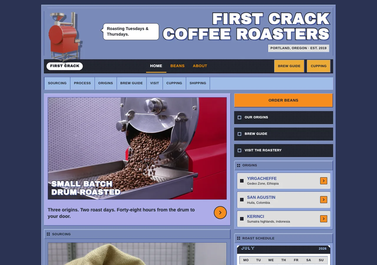
Most roastery sites are laid out. **Drum** is *assembled*. The argument it borrows
from Nintendo.com circa 2001 is that a web page can be a manufactured object —
not a document with regions, but a **faceplate**: injection-molded periwinkle
plates butted edge to edge, each one edge-lit on top and shadow-lined beneath,
with a near-black command layer bolted across it carrying the controls. Nothing
here floats. Every module has a physical edge, and you can see where the seams
are. The layout is a bill of materials.

The subject earns it. A roastery *is* a machine — a drum turning inside a heated
cylinder, a thermocouple, a batch clock, a fixed schedule. First Crack roasts on
Tuesdays and Thursdays and ships within 48 hours, and that is a machine's
timetable, not a mood. So the page is the roaster's own faceplate: brushed
periwinkle plates, silkscreened legends, a chrome-indigo bevel under every one,
and the drum itself leaning out of the masthead as a glossy Y2K product render.
**The machine is the mascot** — there is no character, no face, no anthropomorphic
device anywhere in the system.

And warmth is under law. In a building made of cool chrome, the only warm color
is the color of *action*: nav-gold for the words that take you somewhere, amber
for utility chips and classification marks, signal orange for every forward cue —
the round arrow badges, the chevron chips, the "Order beans" button. Warmth never
decorates. If something is orange and it does not advance you, it is a bug. That
single rationing rule is what keeps a dense, packed, ten-module page navigable:
your eye finds the warm pixels and they are always, only, where you can act.

## Palette

| Token             | Hex       | Role                                                                     |
| ----------------- | --------- | ------------------------------------------------------------------------ |
| `--canvas`        | `#7a8aba` | Periwinkle metallic. The body every plate is stamped from.               |
| `--periwinkle`    | `#8ba1d4` | One step brighter. Raised mid plates — system tiles, rail modules.       |
| `--canvas-soft`   | `#9fbee7` | Pale sky. Secondary nav strip; secondary text **on carbon** (8.10:1).    |
| `--platinum`      | `#dedede` | Platinum gray. Inset content surface — spec rows, form panels.           |
| `--surface`       | `#ffffff` | White. Content cards, readout fields, calendar, speech bubble.           |
| `--carbon`        | `#21242e` | Carbon navy. The command layer (nav, rail, footer) **and all dark ink**. |
| `--carbon-lift`   | `#2c3040` | Carbon, one step up. Hover fill on command-layer buttons only.           |
| `--chrome-indigo` | `#3d4f97` | The bevel shadow line under every plate. Text **only** on white/platinum.|
| `--chrome-light`  | `#a9b8dd` | The bevel highlight on every plate's top/left edge.                      |
| `--muted-indigo`  | `#60619c` | Dotted hairline dividers. Never text.                                    |
| `--floor`         | `#2b3352` | The dark indigo desk the 1000px machine sits on. Carries no text, ever.  |
| `--nav-gold`      | `#e48600` | Nav gold. **Primary nav words on carbon only** (5.68:1).                 |
| `--amber`         | `#ecab37` | Amber. Utility chips, info-box tabs, roast-level marks. A **fill**.      |
| `--signal`        | `#f68d1f` | Signal orange. Every forward cue. A **fill**.                            |
| `--signal-press`  | `#e07a12` | Signal, pressed.                                                         |
| `--tint-index`    | `#acace7` | Page tint — index hero field (lavender).                                 |
| `--tint-beans`    | `#c0d5e6` | Page tint — beans hero field (pale ice).                                 |
| `--tint-about`    | `#206479` | Page tint — about hero field (workshop teal).                            |

Rules:

- **The warmth-rationing law.** `--nav-gold`, `--amber`, and `--signal` are the
  only warm pixels in the building, and each has exactly one job: gold = the
  primary nav words; amber = utility chips, the info-box tab, roast-level marks,
  the footer shipping badge; signal = *forward motion only* (round arrow badges,
  chevron chips, the Order-beans button). **Cool chrome never carries action
  color, and warm color never decorates.** A tasting-note pill in amber, an
  orange rule under a heading, a gold hairline — all forbidden.
- **Even the page tints stay cool.** The three hero fields are the only sanctioned
  accents outside the warm trio, and all three are cool (lavender / ice / teal),
  so warmth remains unambiguously actionable. No fourth tint, and no warm tint.
- **The bevel colors are not text colors.** `--chrome-indigo` and `--chrome-light`
  exist to draw edges. See below for exactly where indigo may be read.

**AA findings (measured, not assumed).** The reference is a 2001 site and was not
accessible. Its own combinations fail in four places; all four are corrected here.

| Combination | Ratio | Verdict |
| --- | --- | --- |
| `--carbon` on `--canvas` #7a8aba | **4.55:1** | Legal — and the **only** legal ink on periwinkle. |
| `--carbon` on `--periwinkle` / `--canvas-soft` / `--platinum` / `--surface` / `--amber` / `--signal` | 6.01 / 8.10 / 11.51 / 15.48 / 7.70 / **6.45** | All legal. Carbon reads on everything. |
| `--chrome-indigo` on `--platinum` / `--surface` | 5.65 / 7.60 | Legal — the secondary ink, **insets only**. |
| `--canvas-soft` on `--carbon` · `--nav-gold` on `--carbon` | 8.10 / 5.68 | Legal — footer/collapsed-nav text; nav words. |
| `--carbon` on `--tint-index` / `--tint-beans` | 7.23 / 10.25 | Legal. |
| **White on `--signal`** (the reference's Submit) | **2.40:1** | **FAILS — corrected.** |
| `--chrome-indigo` on `--canvas` / `--periwinkle` | 2.23 / 2.95 | **FAILS.** Bevel color, not a text color. |
| `--nav-gold` / `--amber` as text on `--surface` | 2.72 / 2.01 | **FAILS.** Both are fills, never ink on white. |
| `--carbon` on `--tint-about` #206479 | 2.33:1 | **FAILS.** On teal, support text is white (6.64:1). |

The two corrections that change the build:

1. **Signal orange never carries white.** Every chevron, arrow glyph, and label on an
   orange fill is `--carbon` (6.45:1). This also fixes a *non-text* failure: an orange
   disc is 2.40:1 on white and 1.42:1 on periwinkle, far below the 3:1 boundary floor —
   so **every signal control carries a 1–2px `--carbon` ring.** The ring, not the fill,
   proves the shape's edge.
2. **The periwinkle canvas admits exactly one text color.** Even pure black tops out at
   6.17:1 on `#7a8aba`, so there is no headroom for a lighter secondary ink — carbon is
   the ceiling. Therefore **running body copy never sits directly on periwinkle.** The
   canvas carries carbon *labels and headings only*; every paragraph, spec value, and
   caption moves onto a `--platinum`, `--surface`, or `--canvas-soft` inset. Not a
   compromise — it is what the reference did with its platinum rows, now made law.

## Typography

Self-hosted woff2 under `assets/fonts/` via `@font-face`. No CDN, no Google Fonts
`<link>`. The reference used Arial/Helvetica with no webfont at all, so the
faithful move is an **Arial-metric open grotesque**, not a lookalike display face:

- **Liberation Sans** (OFL) 400 / 700 — chrome, body, labels, nav, buttons,
  numerals. Metric-compatible with Arial, so the reference's tight 11–14px
  silkscreen-label rhythm lands at the intended widths. (**Arimo** is a drop-in
  substitute if Liberation is unavailable; same metrics.)
- **Archivo Black** (OFL) 400 — the outlined display wordmarks *only*. It stands in
  for Arial Black, whose weight the box-art convention depends on.
- **Silkscreen** (OFL) 400 — the period bitmap voice, shipped but **tightly
  scoped**: stencil numerals on plate corner tabs (`01` `02` `03`) and the calendar
  month caption. Silkscreen only renders crisply on its native pixel grid, so it is
  set at **16px** and nowhere else — *not* at 10–11px, where it turns to mush. Every
  other micro-label is Liberation Sans 700 uppercase.

Type scale (desktop / mobile):

| Role            | Desktop        | Mobile        | Face                 |
| --------------- | -------------- | ------------- | -------------------- |
| Hero wordmark   | 52px / 1.0     | 34px / 1.02   | Archivo Black 400    |
| Plate wordmark  | 26px / 1.05    | 22px / 1.05   | Archivo Black 400    |
| Hero tagline    | 16px / 1.35    | 15px / 1.4    | Liberation Sans 700  |
| Nav link        | 13px / 1.0     | 15px / 1.0    | Liberation Sans 700  |
| UI label        | 11px / 1.15    | 11px / 1.15   | Liberation Sans 700  |
| Link / row title| 14px / 1.4     | 14px / 1.4    | Liberation Sans 700  |
| Body            | 14px / 1.55    | 14px / 1.55   | Liberation Sans 400  |
| Readout figure  | 15px / 1.2     | 15px / 1.2    | Liberation Sans 700  |
| Micro           | 11px / 1.35    | 11px / 1.35   | Liberation Sans 400  |
| Stencil         | 16px / 1.0     | 16px / 1.0    | Silkscreen 400       |

Letter-spacing: UI label and Nav link `+0.5px`; Hero/Plate wordmark `+0.01em`;
everything else `0`. Body, Link, and Micro **never** track.

Principles:

- **Uppercase + 0.5px tracking is the chrome voice.** Every structural label — nav
  words, `section-label-bar` titles, button text, spec keys, the roast-level mark —
  is uppercase Liberation Sans 700 at 11–13px with a half-pixel of tracking. It
  reads as a silkscreened legend printed on a controller shell. Sentence case
  appears *only* in body paragraphs.
- **The outlined-display law.** A hero or origin wordmark is **never** flat text.
  It is always:
  ```css
  .wordmark {
    font-family: "Archivo Black", sans-serif;
    text-transform: uppercase;
    color: #ffffff;
    -webkit-text-stroke: 5px var(--carbon);  /* 3px at Plate size */
    paint-order: stroke fill;                /* stroke behind fill — letterforms stay full */
    text-shadow: 3px 3px 0 var(--chrome-indigo);  /* hard offset, zero blur — 2px at Plate size */
  }
  ```
  `paint-order: stroke fill` is load-bearing; without it the stroke eats the counters
  and the wordmark closes up. The shadow is **hard** (0 blur). A wordmark without the
  outline and the hard offset has lost the box-art reference entirely.
- **Body stays small and quiet.** 14px / 400 / 1.55, bumped from the reference's
  12px because 12px running copy is not defensible — but *not* one pixel further.
  The hierarchy is carried by the labels and the photography, never by big body type.
- **Numerals are tabular.** `font-variant-numeric: tabular-nums` on every brew
  parameter, elevation, and calendar cell, so figures column-align in the readouts.

## Spacing & layout

- **Base unit 4px.** Tokens: `xxs` 2 · `xs` 4 · `sm` 8 · `md` 12 · `lg` 16 · `xl` 24 · `xxl` 32.
- **The fixed canvas.** A **1000px** machine, centered, sitting on the `--floor`
  (`#2b3352`) — the desk. 8px of machine padding; a 984px interior.
- **The split.** `grid-template-columns: 1fr 336px; gap: 12px;` → a **636px content
  column** beside a **336px right action rail**. Roughly 2/3 : 1/3, and the rail is
  part of the command layer, not part of the content.
- **Whitespace is an engineered seam, not breathing room.** Plates butt against each
  other separated by a **12px seam** and their own 1px bevel lines. Plate interior
  padding is **12px** (`md`); large content modules **16px** (`lg`). There is no
  section padding of 48px, 64px, or 80px anywhere in this system. **Do not air it
  out.** The density is the brand: a packed control panel where everything is one
  click away.
- **No narrow reading measure.** Body copy fills its module's width. Do not
  introduce a 640px prose column inside the 636px content column — that is a
  magazine move, and this is not a magazine.
- **Corners.** Default `0px` (sharp). `xs` 2px — chips, badges, readout fields.
  `sm` 4px — small plates, tiles, calendar, spec rows. `md` 6px — form panels.
  `lg` 10px — the speech bubble, and nothing else. `full` 9999px — **only** the
  logo racetrack pill, the calendar's roast-day dot, and the round arrow badges.
  The largest slabs (masthead chrome, footer) are **chamfered**, not rounded:
  ```css
  clip-path: polygon(12px 0, 100% 0, 100% calc(100% - 12px),
                     calc(100% - 12px) 100%, 0 100%, 0 12px);
  ```
  `clip-path` destroys borders on the cut edges, so a chamfered slab is built as
  **two stacked clipped layers**: an outer `--chrome-indigo` div, and an inner
  `--carbon` div inset by 1px with the same clip. The bevel survives the cut.
- **Touch targets: 44×44px minimum**, no exceptions. The reference's 18–28px
  controls are enlarged: the nav bar goes 28px → **48px**, the subnav strip →
  **44px**, arrow badges → **44px discs**, and the 24px chevron chip is centered
  inside a 44px-tall clickable row. Static, non-interactive elements (calendar day
  cells, roast-day markers, spec readouts) are exempt because they are **not
  focusable and carry no click target** — they are printed, not pressed.

**Responsive strategy** — this is a pre-responsive design and it does **not** reflow
on its own. The collapse is authored:

| Width | Behavior |
| --- | --- |
| ≥1024px | Fixed 1000px machine on the floor. Dual nav. 3-up system tiles. |
| 720–1023px | Machine goes fluid: `width:100%`, 12px page margins. Grid → `1fr 300px`. Nav stays dual; the subnav strip scrolls horizontally. Tiles 3-up. |
| <720px | **Rail stacks beneath the content column.** Dual nav → **one 56px carbon bar**: wordmark + a 44×44 disclosure toggle opening a carbon panel that lists the primary nav words in `--nav-gold`, then a dotted divider, then the secondary strip links in `--canvas-soft` (8.10:1 on carbon). Tiles 1-up. Plates keep every bevel — the machine becomes a *stack* of plates, never a set of airy cards. |

## Bevel & depth

Depth is **physical bevel simulation**. There is no blurred drop-shadow anywhere in
this system. Four levels, all buildable:

**Level 0 — Inset** (recessed into the chrome). List rows, readout fields, the
canvas body itself. Dark edge on top/left, light edge on bottom/right — the
inverse of a plate.
```css
.inset {
  background: var(--platinum);
  border-top:  1px solid var(--chrome-indigo);
  border-left: 1px solid var(--chrome-indigo);
  border-right:  1px solid var(--chrome-light);
  border-bottom: 1px solid var(--chrome-light);
}
```

**Level 1 — Plate** (flush, the default). Content panels, system tiles, the info box.
```css
.plate {
  background: var(--canvas);          /* or --periwinkle for a raised mid plate */
  border-top:  1px solid var(--chrome-light);
  border-left: 1px solid var(--chrome-light);
  border-right:  1px solid var(--chrome-indigo);
  border-bottom: 1px solid var(--chrome-indigo);
  box-shadow: inset 0 1px 0 rgba(255,255,255,0.28);  /* hard edge-light: ZERO blur */
}
```
That `inset` is an **edge-light, not an elevation shadow** — blur radius is 0 and it
is inside the box. It is the only `box-shadow` permitted in the system.

**Level 2 — Raised chip** (a pressable control). Utility chips, arrow badges,
Order-beans. Bright top-left, a **doubled** dark bottom-right so it stands proud.
```css
.chip {
  border-top:  1px solid var(--chrome-light);
  border-left: 1px solid var(--chrome-light);
  border-right:  2px solid var(--chrome-indigo);
  border-bottom: 2px solid var(--chrome-indigo);
}
.chip:active {                        /* the bevel inverts — the chip goes down */
  border-width: 2px 1px 1px 2px;
  border-color: var(--chrome-indigo) var(--chrome-light) var(--chrome-light) var(--chrome-indigo);
  transform: translate(1px, 1px);
}
```

**Level 3 — Command slab** (above the chrome). Nav, right rail, footer. Carbon with
the halftone dot-matrix — a repeating radial-gradient reading as a recessed speaker
grille. **This is the only gradient in the system, and it is a texture, not a wash.**
```css
.slab {
  background-color: var(--carbon);
  background-image: radial-gradient(circle at 50% 50%,
    rgba(159,190,231,0.10) 0.5px, transparent 0.6px);
  background-size: 3px 3px;
  border-top:    1px solid #3a3f52;   /* faint top edge-light on the slab */
  border-bottom: 1px solid #000000;
}
```

## Signature

Two elements. Both are the reference's own signatures landing exactly on this
brief's content.

### 1. The roast-schedule calendar widget

The reference's News page carried a white month-calendar with highlighted event
dates. First Crack roasts **Tuesdays and Thursdays**. So the roast schedule is not
a sentence — **it is that calendar.**

A white `--surface` widget, radius `sm` (4px), Level-1 bevel, 8px padding, headed by
a **carbon caption bar** (28px, halftone, chamfered top corners) carrying the month
in **Silkscreen 16px** `--canvas-soft` and the year in Liberation Sans 700 11px.
Below it a 7-column grid, Monday-first:

- Weekday header row: `--platinum` inset, `MO TU WE TH FR SA SU` in UI label
  (11px / 700 / +0.5px) `--carbon`.
- Day cells: 34px tall, white, **11px tabular numerals** in `--carbon` (15.48:1),
  hairline-separated by 1px `--platinum` rules. Cells are **static text, not
  buttons** — no focus, no click, so the 44px floor does not apply.
- **Roast days** — every cell in the Tuesday and Thursday columns — are stamped with
  a `--signal` marker: a filled square, radius `xs` (2px), **with a 1px `--carbon`
  ring** (orange on white is only 2.40:1 and cannot prove its own edge), with the
  numeral in `--carbon` on top (6.45:1).

The payoff is that the markers form **two clean orange stripes running straight down
columns 2 and 4** — the schedule made visible as a machine's duty cycle, which is
the entire point. Render a real month with arithmetically correct leading blanks; if
the build hard-codes one, its blanks must be right for that month.

Beneath the grid: a dotted divider, then a legend row — an 11px signal swatch (carbon
ring) + `ROAST DAY` in UI label — and one line of body copy: *"Orders ship within 48
hours of roast."* The widget's full form lives in the **about** page's roast-schedule
section; a compact single-week strip variant (one row, seven cells) may ride the
**index** right rail.

### 2. The masthead cutout + speech bubble

The reference broke its own rectangular grid with a transparent character cutout
paired with a white speech bubble. Drum keeps the **structure** and drops the
character.

The masthead is a 148px `--canvas` plate, chamfered top-left, spanning the full 984px
interior. Out of it leans **`masthead-roaster`** — a transparent-PNG, Y2K-glossy
product render of the **drum roaster itself**: red-enamel body, chrome drum face,
airbrushed specular highlights, a hard (unblurred) cast shadow baked into the cutout.
It is positioned to break the masthead's bottom edge and **overlap the carbon nav
slab below by ~24px** (`position: relative; z-index: 3; margin-bottom: -24px;`) — a
manufactured object sitting *on top of* the chrome, not inside a box.

Beside it, a white `--surface` speech bubble at radius `lg` (10px) — the one place
10px radius is spent — with a 1px `--carbon` border and a CSS tail (a `::after`
triangle, carbon-outlined), carrying **"Roasting Tuesdays & Thursdays."** in Link
(14px / 700) `--carbon`.

**There is no mascot.** No eyes, no face, no limbs, no anthropomorphic device
anywhere in this design. **The machine is the mascot** — that is the whole concept,
and a friendly bean with a face would destroy it in one image. If the render acquires
a face, regenerate it.

To the masthead's right: the outlined **FIRST CRACK COFFEE ROASTERS** wordmark (Hero
wordmark, per the outlined-display law) over a `--platinum` inset strip reading
`PORTLAND, OREGON · EST. 2019` in UI label `--carbon`.

## Components

- **`nav-primary`** — Level-3 carbon slab, **48px** tall, sharp. Left: the
  `logo-pill` — a white `full`-radius racetrack pill, 1px carbon ring, "FIRST CRACK"
  in Archivo Black 13px `--carbon`. Center: **HOME / BEANS / ABOUT** in Nav link
  (13px / 700 / +0.5px) uppercase `--nav-gold` (5.68:1), each in a 44px-tall hit area
  with 14px side padding. Right: two `--amber` utility chips (Level 2, radius `xs`,
  carbon text, 44px tall) — **BREW GUIDE** → `beans.html#brew`, **CUPPING** →
  `about.html#cupping`. Active page: the word turns `--surface` white and its cell
  takes a 3px `--amber` bottom rule + `aria-current="page"`. Active state is a *mark*
  (amber), never a *forward cue* (signal).
- **`nav-secondary`** — the pale-sky strip directly beneath, `--canvas-soft`, 44px,
  sharp, Level-0 inset. Carbon UI-label links (8.10:1): `SOURCING · PROCESS ·
  ORIGINS · BREW GUIDE · VISIT · CUPPING · SHIPPING`, separated by 1px
  `--chrome-indigo` vertical rules. **Never merge this into the primary bar** — the
  gold-over-pale two-tier command hierarchy is signature.
- **`section-label-bar`** — the silkscreened legend voice; the header of *every*
  module. `--canvas` strip, 32px, sharp, Level-1 bevel, 8px padding: a CSS-drawn
  10×10px carbon 2×2 grid glyph, then an uppercase UI-label title in `--carbon` —
  `SOURCING`, `THE ROAST`, `ORIGINS`, `POUR-OVER`, `ESPRESSO`, `VISIT`,
  `ROAST SCHEDULE`.
- **`system-tile`** — the three origins as console tiles. `--periwinkle` Level-1
  plate, radius `sm`, 8px padding. Top to bottom: a carbon corner tab with the
  **stencil number** (`01`/`02`/`03`, Silkscreen 16px `--canvas-soft`); a 4:3 image
  framed 1px `--chrome-indigo`; the **origin wordmark** in Archivo Black 26px,
  outlined per the display law, over the image's lower-left; an `--amber` roast-level
  mark (radius `xs`, carbon UI-label — `LIGHT` / `MEDIUM` / `DARK`); a `--platinum`
  inset spec strip (`WASHED · 1,950 M`); a 44px `button-icon-arrow` bottom-right.
  3-up on index, 1-up below 720px. On **beans** it expands to a full-width variant:
  image left (280px), specs + tasting notes right in a white inset.
- **`spec-row`** — the reference's news row, repurposed. `--platinum` Level-0 inset,
  radius `sm`, 10px padding, **min-height 44px**. A 12px carbon square glyph, a
  Link-size title in `--chrome-indigo` (5.65:1 on platinum — the one place indigo is
  readable), a trailing `button-arrow-chip`. Carries the index's four process steps
  (`GREEN INTAKE`, `CHARGE`, `FIRST CRACK`, `DROP & COOL`) and its origin list.
- **`form-panel`** — the brew guide. `--platinum` panel, radius `md` (6px), 16px
  padding, capped by a `section-label-bar`. Two side by side on **beans**
  (`POUR-OVER` / `ESPRESSO`), stacking below 720px. Each parameter is a `field-label`
  (Link 14px / 700 `--carbon`) left, and a **readout field** right: white Level-0
  inset, radius `xs`, value in Readout figure with tabular numerals. It is a `<dl>`,
  **not a form control** — it looks like an instrument readout and carries no input
  semantics.
  - Pour-over: `DOSE 15 g` · `WATER 250 g` · `TEMP 94 °C` · `GRIND medium-fine` ·
    `TIME 3:00` · `RATIO 1:16.7`
  - Espresso: `DOSE 18 g in` · `YIELD 36 g out` · `TIME 28 s` · `TEMP 93 °C` ·
    `RATIO 1:2`
- **`info-box`** — the Saturday cupping explainer. White `--surface` card, radius
  `sm`, 1px `--carbon` border, 12px padding, with an **amber header tab** straddling
  its top edge (radius `xs`, carbon UI-label, 7.70:1): `WHAT IS — SATURDAY CUPPING`.
  Body 14px `--carbon`: every Saturday at 10:00, free, no reservation. Lives in the
  **about** rail; may copy into the **index** rail.
- **`rail-button`** — the rail is command layer, so its buttons are Level-3 carbon
  slabs: full-width (336px), 44px, sharp, white UI-label, a CSS-drawn 12px leading
  glyph. Set: `OUR ORIGINS`, `BREW GUIDE`, `VISIT THE ROASTERY`. **The exception is
  the law working:** **`ORDER BEANS`** is the site's one true action, so it is not a
  carbon slab — it is a **`--signal` fill with `--carbon` text** (6.45:1), Level-2
  bevel, radius `xs`, 48px, always first in the rail on every page. → `beans.html`.
- **`button-icon-arrow`** — a **44px** `--signal` `full`-radius disc, **2px `--carbon`
  ring**, carbon chevron (inline SVG path, never a glyph font). The ring carries the
  shape's edge; the fill alone cannot (1.42:1 on periwinkle).
- **`button-arrow-chip`** — a 24px `--signal` chip, radius `xs`, 1px carbon ring,
  carbon chevron, centered in a 44px-tall clickable `spec-row`.
- **`dotted-divider`** — `border-top: 1px dotted var(--muted-indigo);` **Dotted, never
  solid** — a recurring Y2K-chrome tell. Separates sub-sections inside form panels,
  rail modules, and the calendar legend.
- **`cta-band`** (index) — a full-984px chamfered plate on the `--tint-index` field: a
  roaster render right, an outlined Plate wordmark (`SHIPPED WITHIN 48 HOURS`), one
  Hero-tagline line, and the `ORDER BEANS` signal button. The one place the content
  column and the rail merge.
- **`footer`** — a **chamfered** Level-3 carbon slab (two-layer clip), halftone, 24px
  padding. `--canvas-soft` Micro text (8.10:1): `FIRST CRACK COFFEE ROASTERS · 412
  FOUNDRY LANE, PORTLAND, OREGON · EST. 2019`; cafe hours (`WED–SUN · 8:00–15:00`);
  roast days. Links `--canvas-soft` with a 1px dotted underline. One `--amber` badge,
  radius `xs`, carbon UI-label: `SHIPS WITHIN 48 HOURS OF ROAST`.

## Motion

The machine responds instantly or not at all. There is no easing curve in this system
and nothing eases in on scroll.

- **The bevel press is the entire motion language.** On `:active`, a Level-2 chip
  inverts its bevel (dark to top-left, light to bottom-right) and shifts
  `transform: translate(1px, 1px)`. The bevel swap is **not transitioned** — a
  physical button does not tween.
- **Hover** is a fill change only, 90ms linear: `--nav-gold` words brighten to
  `--amber`; carbon `rail-button` fills lift to `--carbon-lift` (white text holds at
  13.09:1); `--signal` fills deepen to `--signal-press` (carbon text holds at 5.13:1).
- **Focus** is a 2px `--carbon` outline with a 2px offset — carbon reads on every
  surface in the system (≥4.55:1 on the lightest, the periwinkle canvas).
- No parallax, no scroll-jacking, no fade-up reveals, no loops, no transitions on
  layout properties.
- Under `prefers-reduced-motion: reduce`, drop the 1px `translate` on press. **Keep
  the bevel inversion and the fill change** — those are *state*, not motion, and
  removing them would remove the press feedback entirely.

## Image treatment

Two registers, and nothing in between.

**Cutout renders** — transparent PNG, **Y2K glossy**: saturated red-enamel and chrome
surfaces, airbrushed specular highlights and a bright hotspot, a **hard-edged (never
blurred) cast shadow** baked into the cutout, three-quarter product-catalog angle.
These break their plate's edge and overlap the chrome. They are objects, not scenery.

**Field plates** — full-bleed photography clipped to a beveled rectangle over a page
tint, always on a **mechanical or textured backdrop**: perforated steel, a shallow
grid, burlap weave, roasted-bean gravel. Every framed image takes a **1px
`--chrome-indigo` edge**. High key, high saturation, hard light.

Never: soft-focus lifestyle warmth, latte art, people, hands cradling a mug, moody
low-key film grain, or a blurred bokeh backdrop. The register is a product catalog
and a machine spec sheet, not a cafe.

**The warmth law governs chrome, not photography.** The roaster is red enamel, the
beans are brown, the flame is orange — images carry all the warmth they want, because
an image is content sitting *inside* a beveled frame, not a UI surface. Do **not**
desaturate the photography trying to obey the palette. The law is only ever violated
by a *styled element* — a fill, a border, a rule, a type color — that is warm without
being actionable. An image is never in scope; a `<div>` always is.

Needed images (referenced `./assets/<id>.png`):

- `masthead-roaster` — **transparent cutout.** A red-enamel drum roaster, three-quarter
  view, chrome drum face and a glass bean-viewing port, airbrushed highlights, hard
  cast shadow, Y2K product-render gloss. **No face, no eyes, no character.** The
  hero object of the whole design.
- `index-hero` — field plate. Roasted beans cascading out of the drum's chute onto a
  perforated-steel tray, hard light, saturated, on a lavender-washed field.
- `index-sourcing` — field plate. Raw green coffee in a burlap sack, cut open, on a
  workshop bench — the sourcing statement.
- `index-process` — field plate. The roaster's control face: gauges, the batch
  thermometer, the drum door — shot square-on like a faceplate.
- `origin-yirgacheffe` — 4:3 tile field. Light-roast pale beans on a bright textured
  backdrop; jasmine, bergamot, dried apricot; a washed-process, high-altitude read.
- `origin-san-agustin` — 4:3 tile field. Medium-roast beans, caramel-brown, warmer
  backdrop; caramel, red plum, cocoa nib.
- `origin-kerinci` — 4:3 tile field. Dark-roast oily beans, deep and glossy, cedar and
  dark-chocolate register, wet-hulled Sumatran backdrop.
- `beans-brew` — field plate. A pour-over cone and a portafilter side by side on steel,
  hard-lit like equipment in a catalog — sits beside the two `form-panel`s.
- `about-space` — field plate. The 412 Foundry Lane roastery interior: machinery,
  bench, sacks, industrial and people-free, bright and square-on.
- `about-cupping` — field plate. The Saturday cupping table shot from directly above:
  bowls and spoons in a rigid grid, laid out like an instrument tray.

## Do / Don't

Do:

- Build **every** region as a beveled plate: `--canvas` body, `--chrome-light` top/left
  edge, `--chrome-indigo` bottom/right shadow line. The page is assembled, not laid out.
- Keep warmth as **wayfinding only** — gold for nav words, amber for utility chips and
  marks, signal for every forward cue. If it is warm, it means "act here."
- Set every structural label in **uppercase Liberation Sans 700 at 11–13px with +0.5px
  tracking**. It is the silkscreened legend voice of the whole machine.
- Render every hero and origin wordmark **outlined + hard-shadowed** Archivo Black with
  `paint-order: stroke fill`.
- Use `--carbon` + halftone for the **command layer** (nav, rail, footer) so system
  controls are visibly a different material from content.
- Let plates **butt together** on 12px seams. Density is the intended texture.
- Default corners to **sharp or chamfered**; spend roundness only on the logo pill, the
  round arrow badges, and the calendar's roast dot.
- Put every `--signal` control inside a **1–2px carbon ring** — the fill cannot prove
  its own edge.

Don't:

- **Don't round every corner into a uniform card system.** If a plate that is not the
  logo pill, an arrow badge, or the speech bubble has a radius above 6px, the design is
  wrong — uniform rounding erases the manufactured-faceplate identity.
- **Don't introduce a soft blurred drop-shadow.** The only legal `box-shadow` is the
  zero-blur `inset 0 1px 0 rgba(255,255,255,0.28)` edge-light. Any shadow with a blur
  radius > 0 is a bug. Depth is hard bevels and pictorial photography.
- **Don't let `--signal` or `--amber` decorate.** No orange rules, no amber tasting-note
  pills, no gold hairlines, no warm background washes. Warm color always means "act
  here." If a warm element is not clickable and is not a classification mark, delete it.
- **Don't add accent colors outside the three page-tint hero fields.** The steady-state
  chrome is strictly cool periwinkle + carbon. No coffee-brown, no cream, no fourth tint.
- **Don't air out the layout.** No section padding above 16px, no prose column narrower
  than its module, no 64px whitespace. The packed, near-fixed density is the brand.
- **Don't flatten the dual nav** into one bar — the gold primary words over the pale
  secondary strip are the command hierarchy, and it only collapses below 720px, into a
  disclosure toggle, on purpose.
- **Don't render a wordmark as flat text.** Without the `-webkit-text-stroke` outline
  and the hard offset `text-shadow`, it is not a box-art wordmark, it is a heading.
- **Don't put white text on `--signal`** (2.40:1), gold or amber text on white
  (2.72:1 / 2.01:1), `--chrome-indigo` text on any periwinkle surface (2.23:1), or body
  copy directly on the periwinkle canvas. Every one of those fails AA.
- **Don't add a mascot, a face, or an anthropomorphic bean.** The machine is the mascot.
- No emoji. No icon fonts. No decorative icon doing a label's job.