Coffee Roastery
Bloom
DESIGN.md
# Bloom — Design System
## Concept
Most of the trade writes coffee down as a spec sheet: cold numbers, clinical
tables. Bloom does the opposite. It treats a roastery the way a literary
publication treats its subject — warm cream pages, a serif display voice, and
long editorial breathing room — and then, when precision matters, it shows the
work as *code*. Brew recipes and roast profiles are set in a dark, monospaced
"recipe window," the way a developer tool shows a real code block instead of a
marketing illustration of one. Grams, degrees, seconds, ratios: honest data,
rendered honestly.
The name is **Bloom** — the moment ground coffee first meets water and swells,
releasing gas. It is the gentle, considered, human beat in an otherwise
technical craft, and it sets the register: warm and literary on the surface,
exact underneath. Warmth comes from the cream canvas, the serif headlines, and
sparing copper; rigor comes from the monospace data and the disciplined
cream-to-dark band rhythm.
The register is editorial, not lifestyle. No latte-art romance, no
smiling-customer stock. The story is the coffee — where it grew, how it was
roasted, exactly how to brew it — told well.
## Palette
| Token | Hex | Role |
| ------------------------ | --------- | -------------------------------------------------------------- |
| `--canvas` | `#faf9f5` | Tinted cream. Page floor, dominant surface. Never pure white. |
| `--surface-soft` | `#f5f0e8` | Soft band background, quiet dividers. |
| `--surface-card` | `#efe9de` | Cream feature/info cards. One step darker than canvas. |
| `--surface-cream-strong` | `#e8e0d2` | Emphasized bands, active tabs. |
| `--roast` | `#181715` | Warm near-black. Dark bands, recipe windows, footer. |
| `--roast-elevated` | `#252320` | Elevated cards / secondary buttons inside dark bands. |
| `--roast-soft` | `#1f1e1b` | Inner code block inside a recipe window. |
| `--ember` | `#cc785c` | Roasted-copper coral. Primary CTA + full-bleed callouts only. |
| `--ember-active` | `#a9583e` | Press / active variant of ember. |
| `--ink` | `#141413` | Headlines, primary text. Warm off-black. |
| `--body-strong` | `#252523` | Lead paragraphs, emphasis. |
| `--body` | `#3d3d3a` | Default running text. |
| `--muted` | `#6c6a64` | Sub-heads, breadcrumbs, secondary labels. |
| `--muted-soft` | `#8e8b82` | Captions, fine print, code line numbers. |
| `--hairline` | `#e6dfd8` | 1px borders on cream surfaces. |
| `--hairline-soft` | `#ebe6df` | Barely-visible in-band dividers. |
| `--on-dark` | `#faf9f5` | Cream-tinted text on dark surfaces (echoes the canvas). |
| `--on-dark-soft` | `#a09d96` | Secondary text in dark bands and recipe windows. |
| `--teal` | `#5db8a6` | Recipe-window syntax: units and comments. Scarce. |
| `--amber` | `#e8a55a` | Optional inline highlight / roast-level cue. Scarce. |
Rules:
- Cream dominates. `--ember` never exceeds roughly 5% of any viewport; it is
scarce on individual elements and generous only on a full-bleed callout.
- No gradients anywhere. No box shadows. Depth comes from the cream-vs-dark
surface contrast and 1px hairlines.
- Never two consecutive bands on the same surface. The page alternates:
cream -> cream-card -> dark -> cream -> ember-callout -> dark-footer.
- Inside recipe windows, color is meaning, not decoration: keys stay
`--on-dark`, numeric values go `--ember`, units and comments go `--teal`.
## Typography
Three faces, three jobs. All self-hosted woff2 under `assets/fonts/` via
`@font-face`; no font CDN.
- **Display — Cormorant Garamond** 500, letter-spacing `-0.02em`. The literary,
considered voice: page titles, section headlines, origin names, large numbers
in callouts. Never bold (500, never 700). Negative tracking is non-negotiable
— Cormorant without it reads generic. At most one display-XL headline per
viewport.
- **Body / UI — Inter** 400 and 500. Humanist, plain, legible. Body, nav,
buttons, badges, captions. Sentence case.
- **Data — JetBrains Mono** 400. Every brew parameter, roast spec, line number,
and eyebrow label. This is the "recipe as code" mechanism. Eyebrow labels are
uppercase with `0.12em` tracking.
Type scale (desktop / mobile):
| Role | Desktop | Mobile | Face |
| ---------- | -------------- | ------------- | ------------------ |
| Display XL | 64px / 1.05 | 40px / 1.08 | Cormorant 500 |
| Display L | 48px / 1.1 | 34px / 1.12 | Cormorant 500 |
| Display M | 34px / 1.15 | 27px / 1.2 | Cormorant 500 |
| Display S | 27px / 1.2 | 24px / 1.25 | Cormorant 500 |
| Title | 18px / 1.4 | 17px / 1.4 | Inter 500 |
| Body | 17px / 1.6 | 16px / 1.6 | Inter 400 |
| Data | 14px / 1.6 | 13px / 1.6 | JetBrains Mono 400 |
| Label | 12px / 1.4 | 12px / 1.4 | JetBrains Mono 400 |
Display letter-spacing: XL `-1.5px`, L `-1px`, M `-0.5px`, S `-0.3px`. Labels
`+0.12em`. Body and title tracking is 0.
## Spacing & layout
- 4px base unit. Section padding 96px top/bottom desktop, 64px mobile.
- Content max-width 1200px, 12-column grid, 24px gutters.
- Editorial left-alignment throughout. Centered text only inside the ember
callout band.
- Hero and story bands use a 6/6 split (headline left, artifact right),
collapsing to single column on mobile — text first, artifact below.
- Border radius: `md` 8px (buttons, inputs, badges' square kin), `lg` 12px
(all cards + recipe windows), `xl` 16px (hero artifact container), `pill`
9999px (badges). Images sit in `lg`/`xl` rounded containers.
- Section dividers are 1px `--hairline` rules; occasionally annotated with a
small mono label sitting on the rule.
## Signature
Two elements carry the identity. Both are direct translations of the reference's
own signatures into coffee.
### 1. The bloom mark
A small inline-SVG glyph: three concentric rings with a center dot, seen from
above — coffee blooming in a pour-over cone. It anchors the wordmark
("[bloom-mark] First Crack") in the nav and footer, and appears once, larger, as
a quiet section ornament. Drawn in `--ink` on cream, `--on-dark` on dark. This
is our own coffee-native mark — not a borrowed logo.
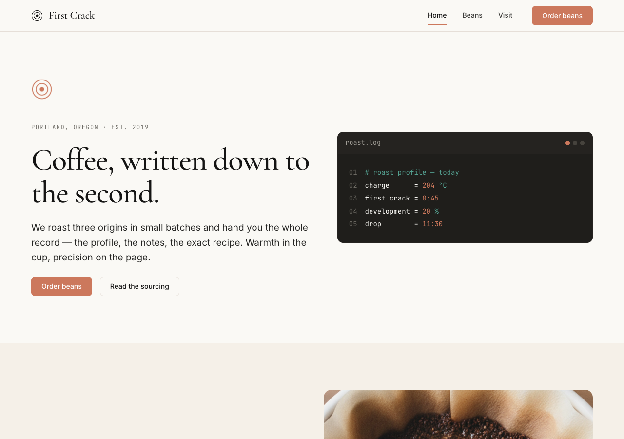
### 2. The recipe window
The load-bearing component. Any parametric data — brew guides, the roasting
process, the roast schedule — is rendered as a dark editor "window," the way a
developer tool shows real code:
- `--roast` card, rounded `lg`, with a title bar carrying a mono filename
(`pour-over.brew`, `espresso.brew`, `roast.log`) at left and a small
three-dot cluster at right.
- Inner block on `--roast-soft`, gutter of line numbers in `--muted-soft`,
content in JetBrains Mono.
- Syntax coloring is semantic: parameter keys `--on-dark`, numeric values
`--ember`, units + `#` comments `--teal`.
Example (pour-over):
```
# First Crack pour-over
dose = 15 g
water = 250 g @ 94 °C
grind = medium-fine
time = 3:00 total
ratio = 1:16.7
```
Example (espresso):
```
# First Crack espresso
dose = 18 g in
yield = 36 g out
time = 28 s
temp = 93 °C
ratio = 1:2
```
The recipe window is where the design earns its concept; it should feel exact
and a little bit code, surrounded by warm editorial calm.
## Components
- **Nav.** Cream top bar, 64px, 1px bottom hairline. Bloom mark + "First Crack"
wordmark left (Cormorant 500, small). Page links right in Inter 500 14px
(Beans, Visit). Primary ember "Order beans" button at the far right. Active
page gets a 2px ember underline and `aria-current="page"`.
- **Buttons.** Primary: solid `--ember` fill, white text, 8px radius, Inter 500;
active darkens to `--ember-active`. Secondary: `--canvas` fill, `--ink` text,
1px hairline border. On dark bands the secondary becomes `--roast-elevated`
fill with `--on-dark` text (never inverts to a light button on dark).
- **Text link.** Inline `--ember` link, underline on hover — the one small place
copper appears in running text.
- **Origin comparison card.** The three origins presented as a comparison triad
(like a model/pricing lineup). `--canvas` fill, 1px hairline, rounded `lg`,
32px padding. Serif origin name (Display M), a roast-level badge pill, tasting
notes in body, and a mono micro-row for process/elevation. The house origin
(San Agustin, medium) is **featured**: its surface flips to `--roast` with
`--on-dark` text — the dark surface is the featured signal.
- **Feature / info card.** `--surface-card` fill, rounded `lg`, 32px padding.
Used for visit info (address, hours, cupping).
- **Badge pill.** `--surface-card` fill, `--ink` text, Inter caption, pill
radius, 4x12px. Roast-level pills read `LIGHT ROAST` / `MEDIUM ROAST` /
`DARK ROAST` in mono label style; no color-coding beyond the label to keep
ember scarce.
- **Recipe window.** As specified in Signature.
- **Ember callout band.** Full-bleed `--ember` card, white text, rounded `lg`,
48px padding, centered. Carries a Display S serif line and an inverted cream
button. The copper surface is the voltage — the CTA lives here.
- **Footer.** Full-width `--roast`, `--on-dark-soft` text, bloom mark + wordmark
in `--on-dark`, column links. The footer never inverts to cream.
## Motion
One orchestrated moment: on load, the hero bloom mark's three rings expand
outward once over 1.2s (scale + fade), settling into place; the hero recipe
window's first line may fade in just after. Nothing else animates except hover
transitions (100ms ease-out on color and underline). Under
`prefers-reduced-motion: reduce`, everything renders complete with no animation.
## Image treatment
Warm and editorial, used sparingly — the recipe windows carry the "product
chrome" load, so photography stays a supporting voice. Natural diffuse daylight,
tones harmonized toward cream, copper, and roast-brown. Close, considered
compositions: the bloom in the cone, green beans in the hand, the cooling tray,
the cupping table, the room. Images sit in rounded `lg`/`xl` containers with no
filters or overlays. No latte-art, no smiling-customer cafe stock, no
white-marble flat lays.
Needed images: a hero roasting/pour moment, a sourcing image, one per origin
(Yirgacheffe, San Agustin, Kerinci), a roasting-process image, and for About a
space image and a cupping-table image.
## Do / Don't
Do:
- Anchor every page on the cream canvas. Pure white or cool gray reads as any
other tool; the warm tint is the brand.
- Use Cormorant serif for every display headline, with negative tracking.
- Keep ember scarce on individual elements; spend it generously only on the
full-bleed callout.
- Render every brew parameter and roast spec inside a recipe window, in
JetBrains Mono. Set every inline number in mono too.
- Alternate cream and dark bands; let the contrast do the pacing.
- Anchor the wordmark with the bloom mark.
Don't:
- No pure-white or cool-gray canvas; no cream-to-terracotta drift.
- No bold serif — Cormorant stays 500, never 700.
- No coral scattered as decoration; no coral text outside links and callouts.
- No Inter (or any sans) for display headlines.
- No two consecutive bands on the same surface.
- No gradients, no box shadows, no radius above 16px.
- No emoji. No decorative icons doing a label's job.
- No latte-art lifestyle photography.